LaunchCentre Pro masterclass on MacStories

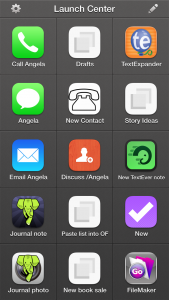
Imagine that you could have one button on your iPhone that, say, opens OmniFocus and goes straight to entering a new task. Or one button that dials your mother. Send a description of a meeting to Fantastical in one tap.

lcp

And then imagine that it’s faster to just go to OmniFocus yourself, or to tap on your mother’s name or to start typing directly in Fantastical.

That’s what happened to me. LaunchCentre Pro does all this one-button lark and it is very impressive but it takes two buttons. One to launch LaunchCentre Pro and then one to do the thing you want. As fast as it is, as clever as it is, that’s two taps and I was finding that it is quicker to things directly.

Consequently LaunchCentre Pro vanished off my home screen.

But it comes back each time there’s a new version and each time someone finds a vastly cleverer use for it than I ever came up with. Now, MacStories has come up with a more comprehensive guide to using this thing than even the makers do.

I know I sound down on LaunchCentre Pro but I like the idea and it is cycling round to my homescreen again. I do still keep Drafts on there, which is a text editor that has similar functions and that can work well with LaunchCentre Pro. So I may be down on it, but I’d like you to be up on it so you can see for yourself. Read this first and very comprehensive guide.

New: Clear To Do app adds Reminders

This just in from Realmac:

…we’ve just launched a big (and much-requested) feature in Clear for Mac and iOS: reminders. With this great new feature, you’ll never forget a to-do – and as Clear syncs your tasks and reminders via iCloud you’ll be notified on all your Apple devices.

We’ve also got some new sound packs in Clear so you can customise the sounds as you complete tasks.

Clear with Reminders is of course a free update, and available on the App Store and Mac App Store.

Clear has always looked great yet not been powerful enough for me and in part that’s been because of the lack of reminders. Take a look at Realmac’s Clear website for a video of how this latest version works.

Force your To Do app to have start dates

Most To Do apps don’t have this but you need it and there’s a way to fake it on any software:

Screen Shot 2014-04-26 at 16.52.19

This is the ideal: you write one task and you give it both a start date – called “deferred until” in that screenshot – and a date that really have to do it by. All in one. (Actually, no, the ideal is to not use either start or end dates, especially not end dates. But that’s another story.)

There’s a good, solid, practical reason why this is the ideal when you have a deadline and there is a more nebulous yet enormously more important reason too. First, the practical one:

Having one task with start and end means you’ve one place to go change its details if you need

The nebulous one is:

Software that has start dates will keep your task hidden away from you until then.

It’s in your system, you won’t forget it, you just won’t have to consider it at all until the time you’ve said you should start.

Set it, forget it, get on with the stuff you have to do now.

I mean it when I say this is enormous. It’s the difference between a To Do list that you will use and one that just becomes this enormous long stupid hateful damn bloody list of a million things you still haven’t done yet, you total failure.

So it’s a shame that not every To Do app does start dates. My beloved OmniFocus does. (The screenshot above comes from OmniFocus for Mac where start dates are now called Defer Until dates. Apparently people got confused. But start dates are so crucial that the term is now burnt into me.) Other apps have it too: the online one Asana, the iPhone one Appigo To Do. It’s hard to give you a definitive list of what does and doesn’t have it because it changes a lot – and because some software firms look like they’ve only added start dates because customers wouldn’t stop shut up about them. The feature is there but, my lights, it’s hard to find.

You’d think you could just google like “omnifocus start date app review” or somesuch and get the answer for any app, but you simply can’t. Do try it. If you’re considering a particular To Do app, definitely google whether it has start dates. Be prepared to dig through articles. If the app is free, just get the bleedin’ app and try looking in that. But look for it, hope to find it, be prepared that you may not.

And if you don’t, fake it.

Do this:

  1. Give your task a deadline, a due date, that is really the day you should start it
  2. Call that task something like “Do that thing which is due on 1st May”
  3. Create another task called “Do that thing” and give it a due date of 1st May or whatever the the real deadline is

It’s two tasks instead of one. And you may see both on your list every day, but typically your app will at least put them at the bottom of the list until the first deadline appears.

It works. It’s not elegant. There’s a strong chance that it’ll go wrong: if you tick the first one, the starting task, when you begin it but you don’t finish on that day, you have to remember to continue it tomorrow.

Have you noticed that I’ve avoided saying oh, to hell with it, just buy OmniFocus?

Bugger.

Let’s turn to the phones

I swear to you that this is a thing. It really is. Just Google “iPhone home screen” and you will find literally half a dozen articles with people talking about what’s on their iPhone front page. I don’t think it’s such a big with Android users but then I wouldn’t be bothered looking. So. Maybe it’s Android too, maybe it’s everyone, maybe I’m not crazy. But I do have one thought about showing you my iPhone front screen.

Is there any better way of recommending software apps to you than showing what I actually use?

And since we’re talking about the front page, these must be the apps that I use the most. Yes. I use these to run my life. One caveat: I also have an iPad but that would be far too big a screengrab to show you. I also have a 27in iMac, but let’s be serious. You’d have to serialise a screengrab from that.

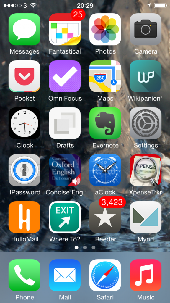
So here’s my iPhone and this is what it’s got on it that is practically worn out from the amount of use I put it all to:

iphone homescreen today


Some of this stuff you know, some of it just does what it says underneath. Phone, for instance. Music. Let’s just wallop through the biggies:

Top row, second from the left – Fantastical 2 for iPhone. I’ve already talked about that and also Mynd, way down there toward the bottom, one up from Music, in Three Calendars, No Waiting. I was testing out Fantastical 2 then and also Mynd, which I’d only just realised is also a calendar. (I thought it was about meetings. It is. It’s just more.) Time has moved on and you can see that Fantastical 2 has kept its space on my home screen so I must like it. Whereas Mynd – wait, Mynd is still there. Bugger. It’s very good when it’s very good and when I need it but, oddly, I haven’t needed it much. Despite having many meetings. I’m afraid Mynd may be on its way out. I’ll think about it and get back to you. But Fantastical 2, unreserved recommendation: get it here.

Second row from the top, first on the left – Pocket. Read something here on the phone in Safari or in my RSS reader, or on my iPad, or my Mac or someone else’s PC, anything and anywhere, and I can lob it off to Pocket. Pocket is not the first Read It Later service, but it is the first that I used consistently often to save things and also to later remember that I had them and finally read the things.  Pocket is free, by the way. Off you go.

Second row from the top, second on the left – OmniFocus 2 for iPhone. Need I say any more? Can I say any more? I can? Start reading here – and bring a mug of tea. Then go buy this version of OmniFocus for your iPhone. It’s been updated fairly recently and the iPad one hasn’t so I’m havering over whether to recommend that to you. Up to a couple of weeks ago I’d have said yes even though it’s not quite as whizzy as the iPhone one. The iPad version of OmniFocus has traditionally been the best of the three – but that third one, the Mac version, that’s zooming up. It used to be very hard to use, now a vastly easier yet still powerful one is in beta and I’m addicted to it. Right now, I think the Mac one is the best. Go to the Omni Group’s website and find out about all three.

Third row down, second from left – Drafts. I don’t use this remotely as much as I would expect and chiefly because that’s Evernote right next to it. I’ve now got muscle memory that if I want to write anything quickly, it goes in Evernote. Drafts is possibly a nicer writing experience and it is definitely more flexible. Anything you write in Evernote stays in Evernote and that’s great because it stays there in Evernote on your phone, your computer, your tablet and so on. Anything you write in Drafts stays in Drafts but with one tap can go almost anywhere else. Write something and send it from Drafts to OmniFocus or to a text message or to an email. Or, I’ve just this week found out, to Fantastical. I found it tricky to set up but now it works so smoothly that I wonder if it’s even working. All I definitely do with it at the moment is jot down ideas that it then automatically appends for me to a Story Ideas note in Evernote. Get Drafts here and Evernote there.

Fourth row down, first on the left – 1Password. Actually, see today’s The Blank Screen newsletter for more details of this and then go buy it while it’s on sale. If the sale is over by the time you catch this, go buy it anyway. I paid full price, I’m happy. And buy 1Password for iOS here.

Fourth row down, second from the left – Concise Oxford Dictionary. Not only the dictionary text but also an audio pronunciation guide for many words. Every word I’ve ever tried, actually, and I’ve had this app since about 2008. I use it a lot. I wish it were upgraded for iOS 7 or even just to the stretched out iPhone 5 that I use and I wish all sorts of things, but it’s a great dictionary. Unfortunately, it is sufficiently old that I don’t think you can get it anymore. You can get many similar versions but not quite the one I know, so I can’t recommend a particular one. But do have a look at them all, okay?

Fourth row down, third from the left – Awesome Clock. I use this as a bedside analogue clock. It’s very customisable but now I’ve found an arrangement of clock face and hands that I like, I like it a great deal. Unfortunately, it ain’t around. Not today, anyway. Vanished from the App Store.

Fourth row down, fourth from the left – XpenseTracker.  That fourth row sees some action, doesn’t it? I use this for recording all my expenses. Are you okay? Did you just faint with surprise? Someone, bring us hot towels and some whisky. And tell me how much that costs because I need to pop it into XpenseTracker

Fifth row down, first from the left – HulloMail. I used to be on O2 and got Visual Voicemail. (Whereby instead of dialling in for your messages and listening to eight spam calls before you finally get to one from your client and, wait, hang on, she said a number there, bugger, where’s my pencil, you just tap. Here’s a list of the calls you’ve missed and which left messages. Tap on the one you want to hear first, you hear it first. Missed a phone number or couldn’t quite catch a word? Scrub back and forth through the recording.) It is so good that I had no idea there were iPhones that didn’t have it. Until I left O2 for 3 and despite in all other ways being far better, it didn’t have Visual Voicemail. HulloMail brings it back. It brings it back with ads and I keep meaning to upgrade but it’s a subscription and I’m not certain I use it enough. Take a look at HulloMail here.

Fifth row down, second from left – Where To? I keep wanting to call this Exit. Actually, I keep calling it Exit. And I rotate between using this and Localscope: both are easy of finding out what’s near you. I love this kind of app and I pummel mine: the first App Store review I ever wrote was for one called Vicinity and I could not get over what a stunningly great and useful idea this is. Where’s the nearest bank? Where’s a pizza place? Tap, there it is. With business details. I can’t remember why I fell away from Vicinity but I regularly bounce between Where To? and Localscope. Where To? looks very old to me and I just don’t enjoy using it as much as I do Localscope, but it’s given me more accurate information somehow. And I also understand it: I find I have to keep thinking with Localscope about where a certain feature is. But here’s Where To? and here’s Localscope: do have a look at both, would you?

Last one. Fifth row down, third from the left, Reeder 2 for iOS. This is my RSS reader of choice and I have done an awful lot of choosing. Here’s what I wrote about it when a new version came out late last year. There’s now also a Mac version in beta, which I enthused about here. But just go buy the iPhone version.

I’m worn out from enthusing.

My iPhone home screen, like everybody else’s I presume, changes a lot. You can see I’m havering over a couple of these apps. But the rest, the ones that stay there, tend to stay for the very good reason that they are very good. If you want a recommended app, this is what I recommend.

I hope you find they are as good for you as they have been for me.

Microsoft lowering cost of Office for iPad – a bit

Microsoft gives and Microsoft takes away. It’s interesting that this is in any way interesting: Microsoft Word for iPad, especially, is so much better than expected that it has become a genuine, serious contender. Enough so that if the pricing weren’t an issue, you’d have bought it and tried it already. Pricing is an issue, though, because you can’t buy Office for iPad at all, you can only rent it.

From launch to now, that meant paying $99 or so per year for an Office 365 subscription. Office 365 predates the new iPad offering so people and businesses who had already bought in to that programme for their home or work computers could just shrug, download Office for iPad and start working. While the price is a barrier to casual users, for serious regular users and devotees it was as close to a bargain as you could get. Office 365 effectively gave it to you for free: it cost you no extra to have a couple of iPads in your subscription.

That’s changed.

Now there is Office 365 Personal. There’s also Office 365 Home: Microsoft will never give up on making you study the feature list and regret your choice later.

Office 365 Home has UK pricing here and it’s £79.99 per year or £7.99 per month which gets you Microsoft Office on up to five PCs or Macs plus up to five iPads.

Office 365 Personal is £59.99/year or £5.99/month and for that much less you get much, much less. Only one PC or Mac (not even one of each) plus one tablet.

The two programmes also have storage but, hand on heart, I don’t understand the options. Whatever it’s all about, the principle is the same: the higher price gets you lots more.

But if you can live with the Personal constraints and you know you need Office for iPad, go take a look. Bring a calculator.

Readdle Printer Pro for iPhone free today

Actually, it's free for 24 hours – but I can't tell when that period started so just go grab it now.

As ever with these things, don't bother thinking about it. Grab it while it's free, ignore it or even delete it – and when you need what it does, there it is. Or you can re-download it for free. And you get updates for free. But only if you bought it during this free period.

I just went to check the details and discovered that I've done this before. I knew I had with a lot of apps – a year or two ago there was a massive spate of travel apps going briefly free and I nabbed the lot, have since used a couple too – but I found I'd done it with Readdle Printer Pro for iPhone too.

No idea when that was. But I don't believe I've ever used it. So this isn't a review, isn't a recommendation for the app per se, it's a recommendation that you take advantage of this chance to get a popular app and try it out.

US-only (for now): Refresh app briefs you on people

New in the US App Store for iPhone, Refresh parses your calendar for the names of people you’re meeting and then compiles as much information about them as it can.

The information is gathered from social media sources in much the same way that you could and perhaps do yourself. Mynd does the same thing. But Refresh feels like it digs deeper and then it makes certain connections. Small but smart things: it will see, for instance, that someone’s Linkedin profile says they joined a company in 2010 but it will tell you they’ve “…been at Acme for nearly four years”.  A tiny difference but one that more fits how we might think of someone or how we might phrase it if we opened a conversation with them.

That bothers me a touch. On the way in to a meeting, it’s working to prompt you with things you might need to know about folk. It feels a little bit icky and especially so when it directly suggests conversation-starting topics related to their previous employment, their holiday or whatever.

Personally, my only conversation-starter is “Hello”.

But I am ferociously interested in people. It’s exciting meeting someone new and up to that conversation prompt, Refresh is good. I like the name: it’s really refreshing my memory of whomever I’m meeting.

Any time you dig too deep or you make, I don’t know, intense briefing notes about their pet dogs just so you can appear matey or chummy in future, I am uncomfortable. Embarrassed. Yet when you meet a lot of people and they are all doing work that you really want to know more about, it’s not an awful idea to make the odd note.

Recently I’ve been adding just a line to the Notes field in my OS X Contacts. I might say what we’re working on together. There was one woman whose husband’s name would simply never stick in my mind so I did write that down.

Refresh wants you to do more and it prompts you to do so.

refresh-app-blurredI got a push notification on my way out from a thing today and it’s still on my Notifications list as illustrated here in by far the most blurred-out screen grab I have ever taken.

I don’t like the line “What’s worth remembering about…” because the answer is EVERYTHING.

Still, if I wanted to, I could note that this fella was doing that work, this woman was doing that other work. And actually there was a fella today who is now doing a gig that he told me when we met back in November. If I’d made a note then, I might have remember to book a ticket in time.

So Refresh is very useful and it has some smart ideas that it has implemented well. I think it’s usefulness is directly tied in to how you think about people you meet and what you feel about briefing yourself this much.

It’s a free app so you can try it out very easily – but only if you have a US iTunes Store account. I asked the company and they confirm there will be an international release but there’s no date yet.

If you have a US account, you can find the Refresh app here. And whether you do to not, you can read more about it and the company on their official website.


France wants to stop emails after 6pm

You have to be in France. You have to be a manager there, too, because ordinary workers can lump it: if your boss needs you to answer your emails all day and night, you’ll answer them or else. But if a French plan to protect stressed bosses works, it will logically help everyone. Follow. When your boss is not allowed to go on email in the evenings then he or she can’t be emailing you anything. Everybody wins.

In many jobs, work email doesn’t stop when the employee leaves the office. And now France has decided to act. It has introduced rules to protect about a million people working in the digital and consultancy sectors from work email outside office hours. Those are taken to be before 9am and after 6pm. The deal signed between employers federations and unions says that employees will have to switch off work phones and avoid looking at work email, while firms cannot pressure staff to check messages.

Michel de La Force, chairman of the General Confederation of Managers, has said that “digital working time” would have to be measured. Some emailing outside of office hours would be allowed but only in “exceptional circumstances”.

Could work emails be banned after 6pm? BBC News

I’m more sympathetic to this idea that I might have been before. I used to live by the bleep of my incoming emails and now I’ve switched it all off. Almost all. Certain people’s emails make a bleep but the majority don’t. And I switched off push notifications too. Suddenly my battery life is longer and I am able to concentrate on more work because I just don’t get interrupted so often.

And I can tell you exactly where in Damascus I had this blinding revelation. Do read the BBC article because it is interesting but for useful ideas – specifically for useful ideas you can use right this moment – buy David Sparks’s book about Email from the iBooks Store.

You don’t have to be creepy about it

But do your homework about people. I just had a terribly fun meeting with someone – er, I hope she enjoyed it as much as I did – and before I got to her, I'd read her blog. I'd seen her professional pages, I'd read what she did, I had an idea of some of the work she did.

I intended to stop there. The idea of coming to a meeting entirely cold makes me wince but equally I'm there to meet you, I'm not there to show off my deep research. I really want to meet you: easily the best part of journalism is that you get to bound off and say hello to people you might otherwise never come across. Utterly love that.

And I stopped intentionally looking into this woman's background. But I've been trying a free iPhone app called Mynd and it did some digging for me without my realising it.

Mynd is like a calendar assistant; I found it because I was exploring calendars and looking for why I nearly missed an appointment recently. I also found it because it got mentioned a few times by Katie Floyd on the Mac Power Users podcast. All it does, I thought, is show me my entire day in one screen: how many events I've got to get to, where the next one is, what the weather's like today. I also found that it calculates how long it's going to take me to drive to somewhere and it will say so right there on the screen: you need to leave in 10 minutes if you're going to make the appointment. Sometimes it sounds a notification too. I haven't figured out why it's only sometimes.

But I have figured out that it believes I drive everywhere when really it's more that I drive almost nowhere. So I got a Mynd notification that I ought to get out of Dodge and start the car right now when I was already on a train to London.

I was going to ditch it for doing that. I have Fantastical now that does all the work I need of managing my appointments and events. (Fantastical 2 for iPad is £6.99 UK, $9.99 US. Fantastical 2 for iPhone is £2.99 UK, $4.99 US. The iPad prices are launch offers and will shortly increase by about 33%.) Plus I don't care about the weather and when I do have a mind to wonder about whether it's going to rain, I ask Siri.

But.

There is a panel on this Mynd screen called People and up to now it has always been blank. Today it showed a photo of the woman I was meeting. And it got that photo from LinkedIn. When I tapped on that photo, it showed me her short LinkedIn bio and then it had options for calling her. If you're running late, you open Mynd, tap the person's photo, then tap to send her a message. If you've got the number of her mobile, anyway. Or an email address.

That would be spectacularly handy if I were ever late for anything but usually I'm cripplingly early. Still, it's impressive.

What was even more impressive is that I scrolled to tomorrow, saw the first meeting had a fella's photo there – and behind it was a list of related Evernote documents. It's just reminded me of the last note I made when talking to him. Right there. I'd forgotten I'd ever made a note but there it is.

It's like Mynd gives you a personal briefing before you go to meet someone. I don't think that means you should skip looking in to them yourself, but I feel wildly efficient about tomorrow now. And I won't feel wildly stupid if he mentions the topic of my last note.

Mynd is free for iPhone on the App Store. There's no iPad or Android version.

Have a look at the Mynd website too. It proposes using the software as your sole calendar for a week and I've just learnt that you can do that. Bugger. I think I'll continue using it as an adjunct to Fantastical but it's handy to know that all the ordinary calendar functions are in this Mynd app as well.

I nearly missed an event today

And I have fallen behind on a project I am very keen to do.

I am compelled to make an excuse about the event, at least. It’s one that was rearranged to this afternoon, okay? And I caught it when I checked my calendar at 5am this morning. So when I say I nearly missed it, it’s not like I spilt my tea and had to run for the car. But somehow even though I want to go to this, and I will go to it, for some reason it wasn’t on my mental map of the week.

This is happening to me more often now and part of it is how I think my business is in a bit of a transition. Previously I was almost completely task-focused: I had this enormous list of things to do. It wasn’t event-based: I didn’t have a lot of meetings, for instance. Now I tend to run more talks and workshops – I did ten sessions in March – so my calendar is more important than it was.

I vehemently refuse to join up my tasks and my calendar: To Dos do not belong on certain dates. Or at least, they rarely really do. If something has to be delivered on Tuesday, you could put that on the calendar, fine. But do you then put a date on there that you’ll start the job too? Odds are, you won’t start it then. Instant failure. Instant unnecessary failure. Put the flexible start date in your To Do list, if you must, put the deadline in there too and then everything to do with that task is in one place.

I have zero question about this, absolute zero doubt. If you’re looking at me now thinking you’re not so sure, the strongest chance is that I have failed to convey to you why I think this. That’s how sure I am that I’m right. This is a rare feeling: let me have it. (Unless you really do think I’m wrong and you can tell me. I would prefer to know.)

But right or wrong, it is how I am working and today that isn’t working. So I’m taking steps.

And this has become a kind of live blog as I try to get a handle on it all. The aim is to get back on top of everything and to be creating new work, producing material, instead of losing most of my time to managing it all. And I know that the way this will work for me is in software. That’s just easily obvious because of prior experience. So taking a step back from that overall aim, I think that I can have two contributory aims:

1) Restore my previous excellent grip on all my tasks
2) Find a way to cope with my newfound extra need for handling events

The shorthand for number 1 there is OmniFocus. Much as I love that software, much as it as truly transformed my working life, my copy of it is a mess at the moment.

I think the shorthand for number 2 would be Calendar plus a regime of checking it. I do currently have a task in OmniFocus called “Check calendar for today and week ahead”. That repeats every week on Mondays, Wednesdays and Fridays. I’m not sure why that isn’t working, then. I don’t want to make it a daily task but we’ll see what happens. Okay, it’s 07:47 and I’ve decided to temporarily make checking my calendar a daily task for Monday to Friday.

And I’ve just downloaded the new Fantastical 2 for iPad. I’ve been reading about this since its launch yesterday and I’ve been reading about its iPhone version since, oh, just about the day I bought Fantastical 1 for iPhone and had it superseded. I agree with the consensus that Fantastical is a good, strong app but for me it wouldn’t stay, I didn’t keep using it on my iPhone because I just found the standard Apple calendar better. Not in features, not in ease of use, but both of those are fine and the Apple one has the killer feature that it can include the current date in its icon. I struggle to believe how often I have to check today’s date but with that right there, job done. With Fantastical, I had to go into the app. Job not done.

But Fantastical 2 can show the current date as a red badge notification on its icon. I’m hoping that will be enough for me because I like what I see about the rest of Fantastical. I like how it feels holding your month and week in your hand, seeing the shape of it all. I’ll play with this and try to get it into my habitual working pattern. If it doesn’t work, I’m out £6.99. If it does, I’m out a lot more because I can see me buying the iPhone update and the Mac version too.

For now, though, at 07:52, let’s say that my second aim is at least addressed if not necessarily solved.

So it’s time for aim 1: OmniFocus.

This is going to take some time. It’s going to be a huge change for me. I’ve let OmniFocus sprawl a bit too much, I’ve let it become a repository for everything in my life. Things I want to read, for instance. I save those to Pocket but I often send them straight into OmniFocus: maybe they relate to a project, maybe I just want to remember them and OmniFocus’s mail drop service is too handy. Whatever the reason, I need to use Pocket and Evernote more, and to keep this stuff out of OmniFocus. That’ll take some re-training. But I’ll create an Evernote notebook for it all and get into the habit of using the Evernote equivalent of mail drop.

But things have also changed in my business and life. I am very pleased to say that I am still on Room 204, a Writing West Midlands development programme, but I’ve finished the formal, official year there. So about a year ago, I created OmniFocus projects to do with Room 204 and the eight separate things I was doing with them. I’m still doing them, I’m still doing them with Writing West Midlands, but the Room 204 projects need to go.

I’ve also got very lazy. If a great benefit of OmniFocus is that you know what you need to do now, that works because it hides from you everything you don’t need to do now. Only, for that to work day to day, you have to often review absolutely everything: go through all your tasks and see what’s done, what isn’t but can be, what will never be done and should be deleted. The idea is that you work through every task and you spend time on every task. This is more than an idea, it’s a principle and I have found that it works brilliantly for me.

Except lately.

Lately, I’ll do the review process and see – wait, let me try it right now – okay, I only have 12 projects review. Last time it was 67. (You set this project by project. You have to review everything but one project is my shopping list: I’ve set that to be reviewed once a year. Other stuff has to be reviewed every day.)

Especially when I’ve got 67 projects ahead of me, I’ll look at the list and I won’t patiently dwell on each separate task. Rather than do them right there and then or consciously test the task – why isn’t it done? what do I need to do it? – I just think yeah, yeah, haven’t got to that yet. And then I move on.

I can’t let that continue because I’m missing things and I’m not getting stuff done as much as usual.

So. It’s 08:03 and I am going to pull out the list of projects. I’m going to do a MindNode mind map of everything I actually have to do and compare that with what I’ve got. It’s slate-clean time.

Later…

Four days later. That is a hell of a slate-cleaning. I would like to point out that I did have that meeting to go and then there was something else on Friday, plus I worked the weekend… and all the way through, I was thinking of this. Right now, Monday at 12:12, I’m happier and I think I have proof that I am.

Let me tell you the proof first: I have no overdue tasks in OmniFocus.

And only 16 more things to do today.

It’s funny but having overdue tasks was proving to be a huge weight. It’s not really funny because it isn’t funny but it also isn’t funny because that’s how things used to be. That’s how they were before I moved to OmniFocus. Maybe it was worth letting things slide because I am reminded with extreme gusto that I do not ever want to feel this weight again. It’s paralysing: you feel you can’t clear that backlog, that there’s no point doing anything more.

So you now you’ve got to know how I did it. And it turns out I was right: it was a two-step thing.

The first was the Calendar and it was Fantastical 2 for iPad. I found that I still had Fantastical 1 for iPhone and I’ve been using that too – I’m honestly not sure what the difference is beyond some obvious aesthetic ones – and the combination has been useful. I’ve had to train myself to turn to my iPad whenever something comes up that needs me to look at my Calendar: even if I’m at my Mac, I turn now to the iPad for this. It’s not a habit yet but it’s becoming so and each time Fantastical does something clever, I am that much more sold on it. The most specific clever thing it does is accept natural language statements: typing “Lunch tomorrow with Steph at Birmingham” pops all the details into my calendar in the right spot. It reckons lunch is 1pm and actually I needed to change that but it was easy enough. But it new Birmingham, actually it knew the more detailed place name I put, and it knew what day tomorrow was. It’s very satisfying entering an event like this because it parses what you type as you type it: you see the place name flying off to that section of the appointment, you see the time going there too and you can see the calendar zipping along to the right day.

Also, it turns out that having today’s date as a red badge notification means that my muscle memory automatically makes me open the calendar. See the badge, intellectually know that it’s the date, but still open it as if there is something I need to be notified about. It’s made me open the Calendar about thirty times since last Thursday and as irritating as I suppose that is, it’s helping me to reinforce this new habit of using both Calendars and OmniFocus.

The second thing began with the way that a friend pointed out how casually I had planned her working year for her in a chat one day and she was back now with a pen to do mine.

Terrifying.

And we didn’t finish. But we’re still in play and I’ve been taking her advice to heart. That coupled with the most massively tedious reorganisation of OmniFocus has all proved part of it.

I’ve been using the new OmniFocus 2 for Mac beta because it’s the quickest version and also, I now think, the most pleasant to use. But this reorganisation meant replacing every old project with an entirely new system, then seeing what fitted the new plan and what did not. I have very ruthlessly and with only a little blood deleted gigantic chunks of tasks because I haven’t done them and, William, I ain’t going to. So they’re gone. Kiss ’em goodbye.

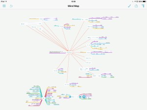
I did a MindNode map as I told you and this is how that looks. You know I can’t let you see the details, there’s plenty of confidential stuff in there but this is the shape of what I was dealing with.
mindmap


Look at that mass of colour in the bottom left corner. The centre word there is ‘Kill’ – these are all the entire projects I deleted as part of this reorganisation. The smaller blog of colour is a set of seven other projects that I have taken out of OmniFocus and put into Evernote: they’re all research jobs, all reading ones where I was amassing things to read but no actual tasks yet.

Then the rest is everything I am in fact going to do. The central word, the white blob around which all the rest of the colours flow, is “OmniFocus”. And that’s apt: this app is that central to everything I do.

I still need to work out a system for tying those Evernote documents in to the tasks as they come up. It’s easy enough technically, you copy one thing from Evernote and paste it into OmniFocus – or vice versa – and are thereafter just a clicked-link away from either. But it’s the mental system that’s hard, the decisions I need to make about putting stuff in OmniFocus or in Evernote.

Similarly, if I get an email from you with a task in, you can bet I forward it on to OmniFocus but when do I then archive that email, when do I put it into my Follow-up inbox to make sure I see it? For that matter, when do I only put it into Follow-up, when do I not bother making it an OmniFocus task?

I’ve still got to work all that out but it will come and right now, I’m exhausted yet much happier. I mean, much. If you’ve read this far, you’re a mensch and I want you to take away this single point: getting on top of everything you have to do – just getting on top of it, not necessary even doing it all – makes you feel infinitely better.