I completely do not recognise any part of this in me at all. Nope. No. Not a bit. Noooo.
To Do
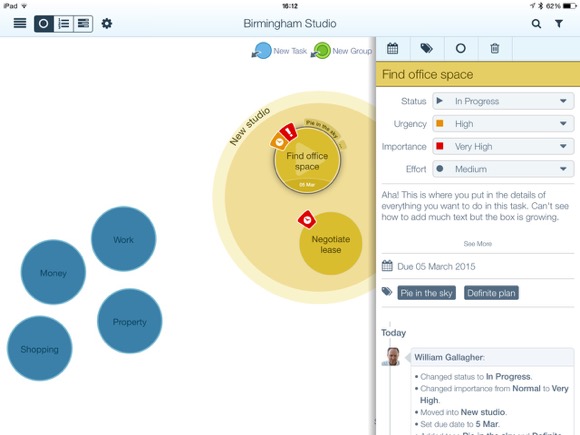
Living with OmniFocus
I’ve reviewed To Do apps for MacNN, and I’ve written books about creative productivity that recommend such apps. If it’s a To Do app that ran online or on Apple gear, it’s likely that I’ve at least tried it. Yet in November of 2011, I bought OmniFocus for iPhone, and while I have since bought five more To Do apps for myself, every one of them was OmniFocus.
There’s OmniFocus for Mac which I bought 21 days later. There’s OmniFocus for iPad, which I bought the day after that. This is not a casual investment: none of the three apps are exactly cheap, and while you don’t have to buy all three, you sort of do. Yet I used to often tell people in creative productivity workshops that OmniFocus is so good and so deeply, even profoundly, useful to me that I would pay that price all over again.
So I did.
Living with: OmniFocus – William Gallagher, MacNN (19 March 2015)
“Living With” is a series on MacNN.com that sees what you think after long-term testing of something. In my case, it’s over three years. That’s a bit more thorough, that’s a bit more time than you can get for any other review and time turns up things. In this case it did turn up some problems but then it turned up solutions and I turned out to be a fan of OmniFocus. Quite right too.
Do read the whole piece.
A tease about the new OmniFocus, sorry
Oh, the pleasure I get from great software: it’s immeasurable and terribly surprising. Today the Omni Group released a new beta of OmniFocus and I shouldn’t talk about it. Not because I’ve signed anything, not because of spoilers, but because it is a bit mean of me when you can’t get the new version yet.
You will soon. You will.
But I’ve been waiting for one feature in this beta and was taken by surprise by another one.
The one I was expecting was that when this comes out in the next few days or weeks, we will finally be able to do a Review on the iPhone. Previously, Review was a feature of the Mac and iPad versions of OmniFocus but not the iPhone one. I’ve said this before and lamented it before and scratched my head before, but no longer.
It is weirdly freaky seeing such a familiar feature in an unfamiliar place. But then I’m also beta testing OmniOutliner which is coming to the iPhone for the first time ever. That is seriously odd, just seeing the icon my iPhone home screen. Mind you, it’s only odd in that one way. In every other way it is fantastic to have this app on my iPhone and it went straight onto my home screen.
The unfamiliar feature, the one that took me by surprise, was that the Omni Group has revamped how the iPhone and iPad handle Notification Centre. Previously, even just a few days ago, I wrote a piece for MacNN about Notification Centre and how To Do apps were using this. At that time, OmniFocus was doing okay with this thing: whatever you’re doing on your iOS device, just swipe your finger down from the top and you get Notification Centre. Within that, OmniFocus showed you the most urgent To Dos on your list.
Or it did. Now it can show you that or it can show you other things that you decide within the main app. I expect to be fiddling for days and I expect to be using Notification Centre more.
And every time I do, I promise I’ll feel rotten for saying there’s this great OmniFocus update and you can’t have it. Not yet. Not quite yet. But soon. Honest.
Review: DropTask
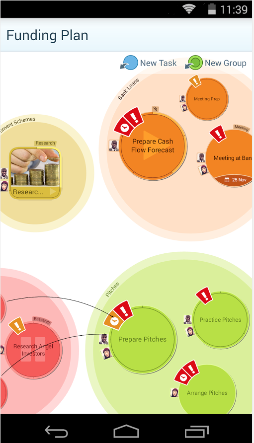
If there is anything greater than the number of To Do apps on the App Store, it is the number of productivity gurus who say you should use them. They are right. But unhelpful. If you loathe To Do lists, it may be that you abhor lists of any kind. So telling you to buckle down to it, telling you how great To Do lists can be, it’s never going to work for you. You’re too busy to write out silly shopping lists of tasks, you need to be doing this urgent work. Also, when you’ve got a list, it’s far too much tedium checking it and maintaining it. Nonetheless, if you are a visual thinker, you were out of luck. Until DropTask.
DropTask aims to do two key things. The first and in every possible way the most apparent is that it is a visual To Do list. No rows and columns, no indents and tabs, just circles that you drag around. That dragging is part of the second purpose of DropTask: it wants to be very, very fast to use. You don’t have to fiddle with the onscreen keyboard to do everything, just for adding detail. Drag a blue dot onto the centre of your iPad screen and that’s a task. Drag a green dot the same way and that’s a group: it’s a large circle into which you can then drag tasks.
Picture Venn diagrams but without any overlapping circles.
Set yourself circles for Office, Home and any other main area of your life, then start filling each with tasks. The group circles grow as you add or drag tasks into them. Circles are always the same, big and clear size: they don’t get smaller when you add more, DropTask just widens your canvas. You can tap on a task to set due dates and add details of what exactly it is you need to do to complete the task. Nicely, you can separately set urgency and importance so later you can filter to see just, say, the urgent and important tasks. It’s akin to the Dwight Eisenhower grid method and is very much better than assigning random priority levels.
That’s a nice touch and the visual nature is DropTask’s killer feature. It isn’t going to cut it for you if you have a massive number of To Do tasks and entering details of the task take more taps than we’d like given the speed of everything else in the app.
There’s no OS X version but there is an online one at droptask.com and that is very quick at smoothly keeping in sync with the iPad edition. That’s particularly useful for Droptask Pro which is built to work with groups so that you can assign tasks to colleagues via the app and they can work through them anywhere.
Droptask comes as two separate iPhone and iPad editions, both of which require iOS 5.1.1 or later and both of which are free. For $65/year you get the Pro group features and subtasks. There’s also an Android version, which is free as well.
It’s definitely not for you if you’re currently looking at OmniFocus or Things. But then it’s also not for you if you’re on Wunderlist or Reminders. This is a mid-range powerful To Do manager which is good but has this visual system, which you may find unbeatable.
Droptask comes to Android
It’s a To Do manager especially for visual thinkers – and as of today it is on Android as well as iOS and the web. Droptask does this:
DropTask is a powerful productivity tool enabling you to visualize your workload in a unique and engaging way. Simply drag and drop tasks for all your essential to-dos, and organize them within larger colorful circles to truly see the bigger picture. With powerful functionality delivered intuitively to the user, DropTask adds simplicity to even the most complex projects and provides effortless task management for teams and individuals alike.
Take a look at the official site or go straight to the Google store for the new Android version.
Alternatively, wait for me to get my finger out and review the iOS version like I’ve been trying to do for two months. There is an irony in how I fail to do a review of a To Do app, but it’s not an irony that helps you much. But if you like Droptask on Android or the web, do take a lookout it on iPhone and iPad too.
“Why I Left iCloud Reminders for Todoist”
I’m just after telling you that Things is briefly free now on iOS and I was thinking of saying it’s the second-best To Do app on Apple gear. But there is this: Todoist. I’ve used it and haven’t in fact got one single pixel of a memory of what I thought about it. But MacStories writer Federico Viticci is a fan and a compellingly persuasive one.
In a three-biscuit long article, he talks about how Apple’s Reminders turned out to be much better than he’d expected yet eventually he had to move on:
Reminders isn’t built to scale for people who manage dozens of projects and collaborate with others to assign tasks and keep track of due dates. It’s not Apple’s fault – it’s right there in the name: Reminders. It’s not called “Projects” or “Todo Pro”: Reminders is a lightweight list system with support for dates, alerts, and lists shared with others.
I guess it was naive of me to think that, with a growing business and changes to my personal life, I wouldn’t face an increased amount of responsibilities. Reminders couldn’t keep track of the new complexities and people in my life. I started forgetting about things I needed to do; sometimes I forgot to mark tasks as done so other people wouldn’t know what my status was; and, other times Reminders wasn’t working for them but I was forcing them to use it because “iCloud never had issues for me”. Both the Reminders app for Mac and Fantastical for iOS were overflowing with assignements and notes that were hard to find and that just kept piling on each other day after day.
Why I Left iCloud Reminders for Todoist – Federico Viticci, MacStories (19 November 2014)
Read the full piece.
Very important: Things for iOS is briefly free
Stop reading this and go get both the iPad and the separate iPhone version of Things on the App Store.
Are you back? Things is important because it’s a very good To Do manager and I don’t believe it’s ever gone free before. I could be wrong, but To Do apps fall into four tiers that they generally stay in. There’s your free ones, your low-price, your higher price and your OmniFocus.
To my mind OmniFocus is the best by far and what it does for me is worth an awful lot more than its asking price. I used to say that I relied on OmniFocus so much that if I had to pay the money again, I would. I don’t say that any more – because I did pay the money again. New versions came out and I bought them faster than you can read this sentence.
But.
Before I found OmniFocus, I very strongly considered Things.

In its favour, it has a great name. I’ve got Things to do. Sold. I am a sucker for a good name and this is a good name. Then it seemed to me that it was more powerful than anything else I’d tried up to then and at the time I was moving to needing something with much, much more oomph. I had so much more to do at that point and actually it’s only got worse.
Also, Things looks great. Today I’d say OmniFocus looks very good and even if it didn’t, the look wouldn’t be enough to make me switch. Right now, this minute, nothing is enough to make me switch. But you spend a hell of a lot of time in your To Do app so the look – both in terms of its aesthetics and in how it works for, what you press and what you tap – that’s important. You can’t quantify it but you also can’t deny it.
In the end, I think I tried the Mac version and it just didn’t take. Not for me. I wish I could tell you why, I wish I could point to something. I can with the iPad version that I’ve just downloaded and played with: there doesn’t appear to be a way to set a start date for a task. A deadline, sure, but not a start date. I regularly now have work that is scheduled months out and while I need to plan for them, it’s unproductive of me to plan now, to plan the day before, or to have a reminder every day in between. So I tell OmniFocus that my planning task should first show up on my list about a week or a fortnight before the due date. Can’t see a way to do that with Things.
Sometimes this stuff can be a bit buried under preferences and suchforth so I could be wrong.
And I told you I just downloaded this to play with. I did that to get you the screenshot above and to see what Things looks like now, a few years down the road. Why not? It’s free.
Until 28 November.
Because the reason for this rare free-dom is that Apple has chosen Things as its app of the week. Come next week, something else will go free.
So go grab Things right now. Remember that the iPhone and iPad ones are separate, they’re not universal. So grab them both right now. Even if you haven’t the time to play with them, grab now and you can use them tomorrow, next week, next year, whenever you have a minute or a need.
“To Do lists are evil, use your calendar”
To say I don’t agree with this is to emphasise how I put the advice in speech marks. Tasks and events are different and if you try mixing them you are screwed. For instance, say you have to phone the Mormon Tabernacle Choir – wait, that’s exactly the example that popped into my head when writing the book of The Blank Screen:
…you can be tempted to start putting some tasks in your calendar and some in a To Do app and that way begins with a certain amount of sanity but ends in an overwhelming amount of madness. You start putting things in that are really obvious like that phone call to the Mormon Tabernacle Choir that you said you’d do on Thursday, that’d go in to your calendar easily. But the MTC is a busy bunch, if you’re not to waste the call, you need to plan what you’re going to ask them and when exactly do you put that in your calendar?
Maybe you pick a date for that and go into this cycle of moving the task to tomorrow and tomorrow and tomorrow until you end up doing it right before the call. Or you put the planning into your To Do app and then you are stuffed. If you look at the To Do app, it doesn’t tell you when the call is due. If you look in your calendar, it doesn’t tell you whether or not you’ve finished the planning. Sooner or even sooner, you end up having to look in both and you end up having to keep looking in both. Over and over. And each time you think about whether this task in your calendar has an associated task in your To Do app, or vice versa, you’re wasting time you could spend on doing this stuff. I’m more okay with wasting time than I sound but I’d rather waste it doing something I like.
Now, a To Do application that includes a calendar: that’s different. Those I love. It seems such a simple thing, but to have my list of things I’ve got to do today followed by a stolen peek at my calendar is just great. It’s everything I need to know in one glance.
But just because I believe this, it only means I’m right for me. Your mileage may vary and since I want you to be more productive more than I want you to say nice things about agreeing with me all the time because I’m a special little snowflake, I’d like you to take a look at someone who disagrees with me. They have many points. But they boil down to this one plus a lot of justification:
To-Do Lists Are Evil. Schedule Everything.
To-do lists by themselves are useless. They’re just the first step. You have to assign them time on your schedule. Why?
It makes you be realistic about what you can get done. It allows you to do tasks when it’s efficient, not just because it’s #4.
Until it’s on your calendar and assigned an hour, it’s just a list of wishful thinking.Do read the full feature: I usually think Barker has a lot of good things to say.
Google revamping Gmail
I know this is just me, but Gmail is confusing. And sometimes even announcements about Gmail confuse me. Such as this one. I read Google’s news about a new email solution called Inbox and it felt like I was swimming in a little ocean of very gorgeously photographed images but not an awful lot of information. I did get that Inbox by Google wants you to include your To Do list in your email and that’s just a bag of spanners waiting to fall on you.
But a lot of smarter people who do like Gmail have been reading that same information and understanding it. Here’s one:
Today, Google unveiled a new email solution called Inbox, which looks like a marriage between Gmail and Google Now. Currently available by invitation only, this new app takes bits from your email like purchase invoices and bank statements and groups them together for fast access. Like Google Now, Inbox adapts to the way you operate, highlighting key pieces of emails like flight plans, photos, documents and upcoming event information.
Read the full piece and let me know what it means.
Todoist Premium on special offer (briefly)
As featured in this week’s email newsletter, you can currently get a free six months subscription to the premium version of Todoist.
The deal is via Appsumo, it’s here and it’s worth looking at – but before you buy, check out the free version. It may well be all you need in which case Premium is a waste of your money. It’s a nice waste, mind: you’d be supporting the firm that makes this To Do app you so like, but still.
When you follow that Appsumo link, scroll down. The front page looks like a big ad for Appsumo but it’s just the top: scroll down for a lot of detail about Todoist.