Quickie: Reeder update review

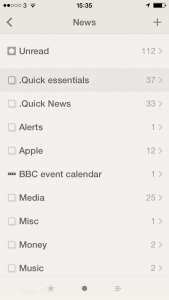
Previously… yesterday the new 2.2 version of Reeder came out and amongst bug fixes and a couple of visual twiddles, the reason to remark was that it added background refresh. (Where instead of my getting the app to add the latest news whenever I open it, the app itself does that continually through the day.) I wondered whether this would work and whether it would make any difference if it did. Now read on.

It worked.

It makes a big difference.reeder

On the one hand it’s slightly disappointing because I’m used to the anticipation of waiting to see if there’s anything new to read and now I just know at a glance. But it’s unexpectedly faster. Logically, rationally, it can’t be saving me more than a few seconds compared to when I would have to wait for it to update in front of me, but it feels faster. Much faster.

I’m also reading more because of it. I find I clear down all the remaining articles and then the next time I pick up my iPhone, there’s an unread news notification. Who can resist?

Reeder for iOS is a universal app (so it’s for both iPhone and iPad) and costs £2.99 UK or $4.99 US. The Mac version is currently still free in beta but the finished and to-be-paid-for version was reportedly submitted to Apple about a week ago.

Reeder updated with background refresh

reederMy favourite newsreader app for iPhone and iPad has today been updated to version 2.2. It includes a lot of bug fixes (can’t say I ever noticed any bugs in my daily, near hourly use) and behind the scenes differences to how many news feeds it can handle. But the biggie, the reason to mention this instead of just update it on my iOS devices and forget about it is this:

Background app refresh (per account setting, disabled by default)

It sounds like such a small thing and perhaps it will be but I’m looking forward to trying it. Background app refresh means that Reeder will get news stories for me behind the scenes. I won’t even have to be in the app. So instead of opening it and refreshing the list for myself, I can pick up Reeder and know that it us up to date right now.

But.

You saw that bit about it being “disabled by default”. It took me a minute to find out where to switch the thing on.

To do that, go to Reeder and swipe left-to-right until you reach a screen with a settings cog wheel. Tap that, choose your account name toward the top of the screen that appears. In there, tap on Sync and change it from On Start or Manually to Background refresh. Then tap the < arrow to get out of that screen and the √ tick to confirm the change. Reeder for iOS is a universal app (so it’s for both iPhone and iPad) and costs £2.99 UK or $4.99 US. The Mac version is currently still free in beta but reportedly not for very much longer.

Let’s turn to the phones

I swear to you that this is a thing. It really is. Just Google “iPhone home screen” and you will find literally half a dozen articles with people talking about what’s on their iPhone front page. I don’t think it’s such a big with Android users but then I wouldn’t be bothered looking. So. Maybe it’s Android too, maybe it’s everyone, maybe I’m not crazy. But I do have one thought about showing you my iPhone front screen.

Is there any better way of recommending software apps to you than showing what I actually use?

And since we’re talking about the front page, these must be the apps that I use the most. Yes. I use these to run my life. One caveat: I also have an iPad but that would be far too big a screengrab to show you. I also have a 27in iMac, but let’s be serious. You’d have to serialise a screengrab from that.

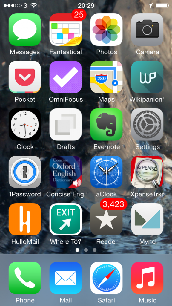
So here’s my iPhone and this is what it’s got on it that is practically worn out from the amount of use I put it all to:

iphone homescreen today


Some of this stuff you know, some of it just does what it says underneath. Phone, for instance. Music. Let’s just wallop through the biggies:

Top row, second from the left – Fantastical 2 for iPhone. I’ve already talked about that and also Mynd, way down there toward the bottom, one up from Music, in Three Calendars, No Waiting. I was testing out Fantastical 2 then and also Mynd, which I’d only just realised is also a calendar. (I thought it was about meetings. It is. It’s just more.) Time has moved on and you can see that Fantastical 2 has kept its space on my home screen so I must like it. Whereas Mynd – wait, Mynd is still there. Bugger. It’s very good when it’s very good and when I need it but, oddly, I haven’t needed it much. Despite having many meetings. I’m afraid Mynd may be on its way out. I’ll think about it and get back to you. But Fantastical 2, unreserved recommendation: get it here.

Second row from the top, first on the left – Pocket. Read something here on the phone in Safari or in my RSS reader, or on my iPad, or my Mac or someone else’s PC, anything and anywhere, and I can lob it off to Pocket. Pocket is not the first Read It Later service, but it is the first that I used consistently often to save things and also to later remember that I had them and finally read the things.  Pocket is free, by the way. Off you go.

Second row from the top, second on the left – OmniFocus 2 for iPhone. Need I say any more? Can I say any more? I can? Start reading here – and bring a mug of tea. Then go buy this version of OmniFocus for your iPhone. It’s been updated fairly recently and the iPad one hasn’t so I’m havering over whether to recommend that to you. Up to a couple of weeks ago I’d have said yes even though it’s not quite as whizzy as the iPhone one. The iPad version of OmniFocus has traditionally been the best of the three – but that third one, the Mac version, that’s zooming up. It used to be very hard to use, now a vastly easier yet still powerful one is in beta and I’m addicted to it. Right now, I think the Mac one is the best. Go to the Omni Group’s website and find out about all three.

Third row down, second from left – Drafts. I don’t use this remotely as much as I would expect and chiefly because that’s Evernote right next to it. I’ve now got muscle memory that if I want to write anything quickly, it goes in Evernote. Drafts is possibly a nicer writing experience and it is definitely more flexible. Anything you write in Evernote stays in Evernote and that’s great because it stays there in Evernote on your phone, your computer, your tablet and so on. Anything you write in Drafts stays in Drafts but with one tap can go almost anywhere else. Write something and send it from Drafts to OmniFocus or to a text message or to an email. Or, I’ve just this week found out, to Fantastical. I found it tricky to set up but now it works so smoothly that I wonder if it’s even working. All I definitely do with it at the moment is jot down ideas that it then automatically appends for me to a Story Ideas note in Evernote. Get Drafts here and Evernote there.

Fourth row down, first on the left – 1Password. Actually, see today’s The Blank Screen newsletter for more details of this and then go buy it while it’s on sale. If the sale is over by the time you catch this, go buy it anyway. I paid full price, I’m happy. And buy 1Password for iOS here.

Fourth row down, second from the left – Concise Oxford Dictionary. Not only the dictionary text but also an audio pronunciation guide for many words. Every word I’ve ever tried, actually, and I’ve had this app since about 2008. I use it a lot. I wish it were upgraded for iOS 7 or even just to the stretched out iPhone 5 that I use and I wish all sorts of things, but it’s a great dictionary. Unfortunately, it is sufficiently old that I don’t think you can get it anymore. You can get many similar versions but not quite the one I know, so I can’t recommend a particular one. But do have a look at them all, okay?

Fourth row down, third from the left – Awesome Clock. I use this as a bedside analogue clock. It’s very customisable but now I’ve found an arrangement of clock face and hands that I like, I like it a great deal. Unfortunately, it ain’t around. Not today, anyway. Vanished from the App Store.

Fourth row down, fourth from the left – XpenseTracker.  That fourth row sees some action, doesn’t it? I use this for recording all my expenses. Are you okay? Did you just faint with surprise? Someone, bring us hot towels and some whisky. And tell me how much that costs because I need to pop it into XpenseTracker

Fifth row down, first from the left – HulloMail. I used to be on O2 and got Visual Voicemail. (Whereby instead of dialling in for your messages and listening to eight spam calls before you finally get to one from your client and, wait, hang on, she said a number there, bugger, where’s my pencil, you just tap. Here’s a list of the calls you’ve missed and which left messages. Tap on the one you want to hear first, you hear it first. Missed a phone number or couldn’t quite catch a word? Scrub back and forth through the recording.) It is so good that I had no idea there were iPhones that didn’t have it. Until I left O2 for 3 and despite in all other ways being far better, it didn’t have Visual Voicemail. HulloMail brings it back. It brings it back with ads and I keep meaning to upgrade but it’s a subscription and I’m not certain I use it enough. Take a look at HulloMail here.

Fifth row down, second from left – Where To? I keep wanting to call this Exit. Actually, I keep calling it Exit. And I rotate between using this and Localscope: both are easy of finding out what’s near you. I love this kind of app and I pummel mine: the first App Store review I ever wrote was for one called Vicinity and I could not get over what a stunningly great and useful idea this is. Where’s the nearest bank? Where’s a pizza place? Tap, there it is. With business details. I can’t remember why I fell away from Vicinity but I regularly bounce between Where To? and Localscope. Where To? looks very old to me and I just don’t enjoy using it as much as I do Localscope, but it’s given me more accurate information somehow. And I also understand it: I find I have to keep thinking with Localscope about where a certain feature is. But here’s Where To? and here’s Localscope: do have a look at both, would you?

Last one. Fifth row down, third from the left, Reeder 2 for iOS. This is my RSS reader of choice and I have done an awful lot of choosing. Here’s what I wrote about it when a new version came out late last year. There’s now also a Mac version in beta, which I enthused about here. But just go buy the iPhone version.

I’m worn out from enthusing.

My iPhone home screen, like everybody else’s I presume, changes a lot. You can see I’m havering over a couple of these apps. But the rest, the ones that stay there, tend to stay for the very good reason that they are very good. If you want a recommended app, this is what I recommend.

I hope you find they are as good for you as they have been for me.

Reeder for Mac now in public beta

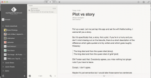
Screen Shot 2014-04-11 at 20.45.55

The short news for Reeder fans: download it right now from here.

The slightly longer news for anyone who isn’t a Reeder fan: it is terrific and you should download it right now from here.

Reeder is a news reading app, an RSS one where you tell it what websites you like and forever afterwards it gets news from all of those sites. Depending on the site, you can read the headline, the standfirst, an extract or the whole article and whichever you get, it looks gorgeous. One tap in the morning and I am reading news from BBC, New York Times, Lifehacker, The Onion and myriad more.

There are many RSS readers like Reeder but I don’t think there is another one that is really anything like Reeder. I’ve long loved its design – most of it, at least – and how well done its text was. Routinely, if I found an article on a site that was just too ugly to read, I’d either bung that piece into Pocket to read later or I’d subscribe to it in Reeder and read it there.

I still remember the instant when I learnt that Reeder for iOS was out. Last September, a new version was released partly to deal with how Google shut down its service that powered all RSS readers. It was a paid update and I paid instantaneously. That’s how much I liked the old one and now it’s how much I like the new.

Yet as good as Reeder is for RSS, I missed having it on my Mac too. That Google shutdown made the Mac one literally unusable and that is almost a year ago. Here’s how good Reeder is: I haven’t replaced it. Not on my Mac. I’ve tried others on iOS but as much as I used to use RSS on my Mac, I simply stopped reading any RSS there.

Until tonight.

What’s been released is a beta version of Reeder 2 for Mac and the final version will be a paid-for app. I don’t know the price yet and I don’t truly care: I have read many thousands of articles through the various versions of Reeder and I open it practically as often as I do my email.

So go download it now from here and be ready to pay whatever the maker demands when it’s out of beta.

Stop visiting websites. Make them come to you.

It genuinely astonishes me how many people haven't even heard of RSS. If you have and you're even now looking at this through an RSS newsreader, hello. I've got nothing for you: skip along to the next story from your next favourite website. But if you haven't heard of it before, you have now and I want to evangelise you into trying it yourself.

This is what happens when you try it, this is what I do every day. Sometimes many dozens of times a day. Waiting for the kettle. Standing in a queue. Taking a break from work. I'll just read the news on my iPhone or my iPad or my Mac, whichever is in front of me at that moment. And whatever news has broken since I last looked. There are websites I read every single article on yet rarely go to. There are others whose headlines I read every day and often then go to in order to read the full article.

It definitely means I read more websites than many people, but I don't take any longer doing it.

To do this, you need an RSS newsreader. There are eleventy-billion newsreaders in the world and there are ones for PCs, Macs, iOS and I presume also Linux and Android. Windows, OS X, anything. Everything. There are free ones aplenty but I bought one called Reeder for iPhone/iPad which cost me a whole £2.99. I would be surprised if I haven't read a million words in that app.

But just Google “RSS” and your computer or phone of choice and take your pick.

Then go to a website you like and look for the RSS button. It's that orange one with white stripes like radiating waves and it's often the orange one that says RSS next to it. Click on that and you'll either wallop off automatically to your RSS newsreader with the site just waiting for you to say yes, add this one forever – or you'll get a new webpage. Copy the link, open that in your RSS reader, say yes, add this one forever, and you're done.

RSS isn't the friendliest concept: you understand it but some sites make it hard to find and then offer you options you're not interested in. If you're given a choice of RSS links, one will be called Atom and one will be called RSS. I truly have not one single clue what Atom is: I've never tried it.

And I have tried a lot of sites. Something like 300 at the moment.

Two quick things. You'll notice I've now said RSS umpteen times and not told you what it stands for. I think it's like DVD; you know what it is and you watch a billion DVDs but you may not know that it stands for Digital Versatile Disc (or was going to stand for Digital Video Disc originally). RSS stands for Really Simple Syndication. Exciting.

The other thing is just that I can't recommend Reeder without warning you that the Mac version isn't on sale at the moment. Various changes to the world meant it stopped working and the update isn't here yet. It's taking quite a time but I like Reeder so much I'm waiting for it.

That's it, carry on. And see you in my RSS feed. I've got two. Oh, yes. Two. Get me. Actually, yes, get me: my personal Self Distract blog has an RSS feed at http://williamgallagher.com/selfdistract/feed and The Blank Screen is on http://williamgallagher.com/feed

‘Appy days 2013

I’m a bit disappointed with Apple’s Best of 2013 pick of apps. There’s no real reason I should be, it’s just a list of what’s sold best and what Apple staff seem to like, but I thought I’d find something great in there that I wasn’t already using. And I admit, I unthinkingly expected to see software that helps you be more productive. This year, more than any, I’ve leant on software to get my work done and it’s been a terribly rewarding, satisfying kind of time because I’ve done so much more in so many more areas.

So when I wrote to you about Apple’s pick yesterday, I started in the expectation that I could show you some great tools.

Since that didn’t really work out, since the Best of 2013 became more of a curiosity than a grab bag of productivity tools, let me do what I wanted it to do. Let me show you the best productivity apps of the year.

Two very, very big caveats. One, I’m on a Mac so if you’re on a PC today then this is of precisely zero use to you. Well, not quite: there are some things here that are cross-platform. Platform-agnostic. But I’ll never have the patience to read through a list of Windows applications to find the single thing that will also run on my Mac, so if you’re in that boat, have a mug of tea instead and we’ll chat later.

Two, I’m sure some of these apps came out in 2013 but I’m never going to check. These are the tools that have made me enormously and enjoyably productive in 2013 and that includes ancient apps I’ve only just discovered and it includes old stalwarts that I have used for years. I know. Crazy. Maybe that’s why Apple’s list is more entertainment and games: maybe not much came out this year.

Enough. Here’s the list. I tell you now, it’s not as long as I thought it would be.

OmniFocus

(Mac: £54.99/US$79.99, iPhone £13.99/US$19.99, iPad £27.99/US$39.99)

Yes, I have all three and once you’ve bought any of them, you’ll go get the other two as well. So let me add that up for you: in the UK, the triptych costs you £96.97 and in the US it’s $139.97. Prices must vary a bit as I’m sure I spent nearer £80 when I bought them but if you’ve gulped, so have I: I’m going to be buying them again in 2014.

That amuses me a little: I keep saying that this price is incredibly cheap considering what OmniFocus has meant to me and that I would gladly pay it again – and now I’m going to. Because there are new versions coming and they are all paid upgrades. I expect there’ll be a discount for existing users of the Mac one but I know there won’t be for the iPad version because there wasn’t for the new iPhone one.

Nonetheless, the second that new iPhone version was out, I bought it. Actually, it requires iOS 7 so what I did was upgrade to iOS 7 and then immediately buy OmniFocus 2 for iPhone. I liked the previous version very much but I like this even more and use it even more. I’m not entirely sure that is possible, but I do.

All of which is a lot of detail to throw at you when you may have never even heard of OmniFocus. It’s a To Do task manager. But that is a bit like saying War and Peace is a stack of paper with some ink on it. 

OmniFocus may not be for you: it is very powerful and it tends to do your head in a bit at first before you get a whole series of Damascus moments and love it. I wrote in a Mac magazine once that “first it destroys your mind, then it owns your soul” and I meant it as a compliment.

But if it’s more than you need or it’s more than you can face, then £96.97 isn’t cheap, it’s suddenly a lot of cash. So tread carefully but do tread, okay? 

While The Omni Group has not announced its plans, the fairly smart money says that the new OmniFocus 2 for iPhone will be followed soon to soonish by version 2 for the iPad and then at some point for the Mac. This makes things a tiny bit tricky. I’d like to tell you to wait but I also want you to get the benefits of this right now. If the Mac version were easier to use, I’d say pull the trigger: the odds are that if you buy OmniFocus 1 for Mac now you will get version 2 for free when it comes. No guarantees, but it’s highly likely. And that dispenses with the money concern.

But it is a concern that this Mac one is hard to use. I’m happy that I put the work in and I enjoy that the Mac one is very powerful. But I got on the beta test for OmniFocus 2 for Mac early in 2013 and have found it hard to go back. That beta has closed and it looks like whenever OmniFocus 2 for Mac comes out for real, it will look and act substantially different to the beta because OS X Mavericks has brought some new possibilities. But still, even the unfinished beta was easier enough to use that I suddenly found version 1 to be a chore.

How’s this? Right now the very best version of OmniFocus is the one for iPad. It will be updated and it will be radically updated if the iPhone is a clue, but even if you buy it an hour before a new version comes out, it’s still a fantastically tremendous application that will transform you. Not your life, it will transform you.

Enough so that I really did pay the money again for the iPhone one and I really will immediately, no IMMEDIATELY, buy the new versions for iPad and Mac whenever they come. 

Take a look at the video about the iPhone version on this Omni Group page. Then this is a longer video about the iPad version – did I mention it’s great? – and a much, much longer but very good series of videos by independent writer David Sparks about the Mac version.

I promise to be more concise about everything else on the list. <Smiles nicely but has fingers crossed behind his back>

Evernote

Free or US$35/year for premium (gets you extra features)

It’s an app you can make notes in. There must be eleventy-billion such apps. And okay, you can also pop PDFs in there. Images. You can make a clipping from a web site and drag that in to Evernote. Okay.

But I was in a meeting, right, and suddenly needed a contract that had nothing to do with that day’s work. “Oh, yeah, that one,” I said and then called it up on my iPad exactly as if I’d been a soothsayer and known to bring it with me.

That worked and made me look very good because whatever you put in Evernote, you can get out of Evernote – wherever you are. I enter a gigantic number of notes in Evernote for iPhone and Evernote for iPad but I also use the Mac one a lot and I’ve used the PC version on occasion. I’ve been waiting in someone’s office and I’ve used their computer to open the Evernote website. And in each case, wherever I am, whatever I’m using, every single note I’ve ever made is right there.

Pages

Now free

I was on a bus going to my mother when I had an idea for a book. Because I had my iPad and it had the Pages word processor on it, I started to make some notes – and by the time I’d got to her, I’d written the first thousand words of what became The Blank Screen book. That book became a workshop that I’ve now run for individuals, students, university staff, colleges and in online seminars. And it became this blog, which is how I got to meet you. I’d call that worth the price of admission.

Mind you, I would like to mention now that I paid for Pages. It only became free toward the end of 2013 and if you think I’m narked by that, no. Fine. I think it is very undervalued but if you can get it for free, terrific. I’ve got so much out of this software already that I am completely fine with having paid whatever it was. Something preposterously cheap, I remember that.

Incidentally, I do have Word on this Mac. I’ve had Microsoft Word on every machine since the 1980s and I’ve used it on every machine. But the other day someone emailed me a Word document when I was using my MacBook. I’d had a problem with the hard disk on that and had wiped it completely, installed OS X Mavericks and got back to work. And there I was with this Word attachment, suddenly realising that I didn’t have Word.

Not only did I not have Word on there, for the first time in all those years, but I also hadn’t noticed. I’d reformatted that drive a month before and used the machine endlessly. Hadn’t noticed Word was gone.

And I didn’t have to notice now, either. Because my Mac just opened the document for me in Pages. 

I had to send that document back in Word format and Pages just did that for me too.

Adobe InDesign

Part of Adobe Creative Cloud, monthly rental cost varies

I used to work a lot on Radio Times, the website, and a bit on the magazine. There was this job where the site regularly needed some text from the mag and by chance of the schedules, it was always a bit easier to get it straight out of the magazine pages before they went to press. I leapt at it. It was a tedious, trivial and surprisingly slow job and I sped it up with some Word macros that would take the heavily formatted magazine text and make it heavily unformatted for the website.

But it also meant using the page layout program, Adobe InDesign. It is ridiculous how little you needed to know in order to do the thing I needed to do, but I would take the time to just explore InDesign for a minute or two each week. And over the years, especially since I was taking text from some superbly designed Radio Times pages, I learnt a lot. Taught myself InDesign.

To the extent that earlier this year Radio Times hired me back to work on a book specifically because I knew Adobe InDesign. And I learnt even more from doing that book work, to the extent that when I got back to my own office, I could and did design my The Blank Screen book in Adobe InDesign.

Read more about it and the whole Adobe Creative Cloud.

Keynote

Now free

Presentation software. This – and the Pages and Numbers spreadsheet that I use daily – is part of Apple’s iWorks suite of productivity applications and I’m really surprised they weren’t in the company’s pick of the year. They were great and cheap, now they’re pretty great and free. This year’s new versions shed some features (that are apparently coming back slowly) and gained some others. 

For the work I do, I have barely missed any of those features, whatever they are, and I have very much enjoyed using the latest versions. So far I’ve only used Keynote to present The Blank Screen workshop once but it was a pleasure. No one has ever said that about PowerPoint.

Read more about Keynote for Mac (and the iPhone/iPad ones are the same) on Apple’s page.

Reeder 2

Universal for iPad and iPhone: £2.99

In 2012, it was for iPhone, iPad and Mac. And I used them all. It’s a newsreader, an RSS newsreader, which means rather than my going to a couple of hundred websites to read news and articles, they come to me. I’ve already messed with your head and your patience by going in to immense detail, so lemme just say that the world has changed. Right now Reeder for Mac is no longer available while a lot of work is being done under the hood.

I miss it more than I can say. And I’ve used alternatives but still Reeder and most particularly the new Reeder 2 are so well designed and just, you know, right, that I simply don’t read RSS on my Mac any more. The second it’s back out for Mac, I’m having it and I’ll get back to using it on all my machines.

Read more about Reeder and a tiny bit more about what’s happening with the Mac version on the official site.

1Password

Angela showed me this on her iPhone one day and I wondered why anyone would want such a thing as a password manager. By the end of that one day, it was on my iPhone and on the front screen too. Later, I showed Angela the Mac version and that’s now on her machine.

This is why. I need to do some financial things in a minute so I’ll press the Apple and / keys here on my Mac and it will open 1Password. With one tap 1Password will open up my bank’s online banking website, enter my account numbers, passwords and all that. It doesn’t go all the way on that site: I have one last page to go through, one last piece of security, but it’s so fast getting to that point that I use it constantly.

And then later if I am booking train tickets – I’m always booking train tickets – 1Password will log me in to thetrainline.com and it will enter all my credit card details when I tell it to. 

I appear to have a preposterous number of websites I use that require passwords and so I have a preposterous number of passwords – an increasing number of which are generated by 1Password to be extra hard to crack. No more using the word ‘pencil’ as a password here. 

There is one thing I don’t like and it is the agony when you upgrade from one version to the next on iOS. It isn’t an upgrade, it isn’t an installer, it is alchemy. I can’t fathom how it can be so hard to do but once it’s done or if when you’re buying it for the first time, everything is so well done and easy that I can’t resist it. I know for certain that I use 1Password every single day, without fail, and I suspect I usually use it many times.

We could stop now

Those are the tools I spend my life in at the moment. I do also lean on iTunes a lot because I like telling it to play me an hour’s worth of music and then I’ll write until it stops. Plus I’ve been addicted to the new iTunes Radio which this very day also went live in the UK.

Then I came to really relish using iBooks Author to do the iBooks version of The Blank Screen (here’s the UK iBooks one and here’s the US iBooks one). TextExpander is one of those utilities that is so useful you forget it isn’t part of the Mac generally, but I’ve forgotten that it isn’t part of the Mac generally. Same with Hazel and Keyboard Maestro, both of which I’m just coming to use.

I really did expect that this would be a vastly longer list. Can you imagine that? In any average day I must surely use above twenty different software applications and I use them hard, but it’s only this set that I can honestly point to do as being the key productivity tools for me this year.

Next year may be a little different. I expect to carry on with all of these but I did a couple of projects using OmniOutliner for Mac (an outlining program from the same firm that makes my beloved OmniFocus) and now I’ve just got that for iPad too so it’s featuring more in my usual workflow. Bugger. I’ve been trying to avoid the word workflow. Ah, what can you do?

Similarly, I’m actually writing this to you in MarsEdit, the blogging tool that I’ve heard so much about for so long. I’m only on the trial version but it’s pretty much as good as advertised so I may very well continue with it. We’ll see. It doesn’t exist on iOS and I write a huge amount there so it’s not a guaranteed mandatory purchase or if it were, it isn’t guaranteed that I’ll use it a lot.

Whereas I want to give an honorary mention to some hardware. The best thing I ever bought was my 27in iMac last December: Macs do last a long time so my previous office Mac was a good six or seven years old and this new one boomed, just boomed into my working life. But then maybe the best thing I ever bought was my iPad Air as right now it is the thing I use most. I use it more than my kettle. I know.

I had thought that I used my original iPad a lot and while I didn’t regret giving it to my mother, I missed it more than I expected. And then I bought the iPad Air and am using it perhaps ten times as much as I did that original one.

I know what you’re thinking. You’re thinking that I never step away from one keyboard or another and I see why you say that, but I can prove you’re wrong. By going now.

I need tea. Can I make you one?