Dayflow productivity app (briefly) free

This isn’t for me, but it may well be for you: Dayflow is for alloting time to specific tasks or goals. The example given is that you want to read for an hour every day. So you set that up and this app reminds you to do it, then tells you when you have.

I’ve been thinking about allotting time to particular projects so that I did keep them going, tootling along, so I’ve grabbed the app while it’s free. Usually Dayflow costs either 69p/£1.99 UK and 99c/$2.99 US so if it’s right for you, it’s bargain even if the brief sale is over by the time you click just about here.

Free (and paid) week planners for creative people

The site Productive Flourishing makes a good point:

After years of struggling with the planners designed for and by office workers, I figured out that it wasn’t me that was the problem: it was the design of the planners.

Creative people approach their work differently. Most of us don’t work 8–5, and we don’t have projects that we can plan to get done during the same times each day. The limiting factor for us is not the amount of time we have available, but rather the type of time we have available.

One size does not fit all when it comes to planners. Check out the planners below to see which ones best relate to what you’re trying to do, and give them a try!

Free Planner – no credited author, Productive Flourishing (undated but July 2014)

And here’s an example of what one such plan looks like. This is a month’s action plan:

20140720-205100-75060849.jpg

The full article contains very many such free planners but also links out to a set of paid premium ones.

Five paid apps to replace free Apple ones

They’ve got to be good to be worth buying for cold hard cash when you already have Apple’s own apps that do exactly the same thing. Yes. They are. This is Cult of Mac round up for nearly half a dozen such very good apps.

I’d like you watch this even if you have previously had no intention of replacing your existing free apps with new paid ones. Because I was like that, I thought I was still like it: since my iPhone comes with a calendar, for instance, and I actually find it fine, I resisted changing.

But now of the five they mention here, I’m already and regularly using two; Dark Sky and Fantastical 2. See why, and what else might go next:

Concluding the streaming music debate – a bit

Previously… I write to music, always have done, I get into ferociously irritating habits of listening to exactly the same piece over and over again. I get a lot of headphones as Christmas presents. I resisted streaming music because I had what I feel is a big collection. But then I tried streaming.

Actually, just to break the Previously and tell you something new: I’ve realised why I tried. I said before that it was iTunes Radio and that’s true, I got access to that early and enjoyed hearing new music. I’ve steadily less enjoyed the steadily increasing number of ads on iTunes Radio but I’ve also realised that its way of playing you types of music rather than letting you specify artists or albums and hearing only those got a bit wearing.

And I heard a song.

I forgot that I could check back in iTunes history to see what it was and instead stupidly spent a while googling every lyric I could be fairly sure I remembered. And I found it.

It was Come to My Window by Melissa Etheridge. Love it.

And I love it enough that I once again tried Spotify. At least with Spotify, I thought, you could name a specific track and play that.

This is sort of true. And it’s also definitely true now that Spotify is free on iPhone and iPad – which is almost certainly true because of the competition from services such as iTunes Radio. Everybody wins, and it earns the artists nothing. Or very little, anyway.

Last time I mentioned this, it was because I’d found this article explaining all the various streaming services and I intended to investigate them. I intended to do this because I was sick of iTunes Radio – I’ve since come back around to it, it’s a mood thing with me – and because Spotify was irritating. I realise they want you to pay a subscription price and not only do I understand that but, spoiler alert, I’m now today thinking of it. But for trying out the service, I thought free was helpful.

But Spotify wouldn’t stick to the music I asked for, it would bound off places playing me other things that might be fine, yes, but I couldn’t stop them when I wanted to. In the end, I would just quit Spotify and force it to restart again. You can’t do that very easily while driving.

Only, today I tried it again. Instead of my usual beloved BBC Radio 4, I had Spotify and a playlist with about 25 songs on it. Including the Etheridge. For 170 miles driving, maybe 2 miles walking and for 90 minutes on buses today, I listen to those 25 songs. Over and over.

There were many, many interruptions for ads and it worries me a bit that most of them were what’s called a house ad: if you can’t sell an ad spot to someone, you use it yourself to advertise something of your business. You want to have some house ads, but you need the revenue from outside companies.

But apart from those understandable interruptions, Spotify played me those songs of mine for a not-very-understandably long time.

I’m a fan. I think. I’m going to play it a bit more to see if I go off it as I have at times with iTunes Radio. And I’m going to wait a bit to see when iTunes Radio officially launches in the UK because the price for it includes some extra benefits and is also substantially cheaper than Spotify. Both Spotify and iTunes Radio start at free but then to get the benefits of the paid-for services, it’s £9.99 UK or $9.99 US per month for Spotify and £21.99 or $24.00 US per year for iTunes Radio.

But for the meantime, I think I’m a convert. That’s a very strange feeling for a man who remembers vinyl, who remembers CD coming in, who lived through DVD coming in and then dying away. But it’s true: I had a very good time today with Spotify.

Macworld’s pick of the best free iPhone apps

Some of these are free up to a point and then is worth your paying cash. But it is worth that. Macworld’s David Price has picked out a good set that I think is free of the biases one usually sees: it isn’t packed out with games, it isn’t a selection of deliberately obscure or geeky apps that are fun to fiddle with. Instead, it’s 42 apps that if you’re not already using, you could well find become deeply important to you.

Case in point: of this 42, I use 16 regularly, 5 of them many times today and overall I’ve tried out 28.

Have a look at the lot, would you?

Day One journal app goes free (briefly)

Even if you can’t get around to looking at using it yet, grab this now: the acclaimed Day One diary app has just been made free for iOS.

I bought it a couple of years ago and it changed things. I recorded more diary details than I ever normally do and I enjoyed it.

I made a calculated decision to move away from it, though, because I use Evernote so much. I thought it would be the same, that I would journal just as much. Technically speaking, I was right. There’s no real difference between tapping out a diary entry in Day One than there is a note in my Journal notebook in Evernote.

Except that there is a massive difference. For the months I used Day One, I bet I wrote an entry every day. In the year since I stopped, maybe I’ve made two notes.

I should go back to Day One and if you haven’t already, you should go get into it now.

Now, don’t skip this too quickly…

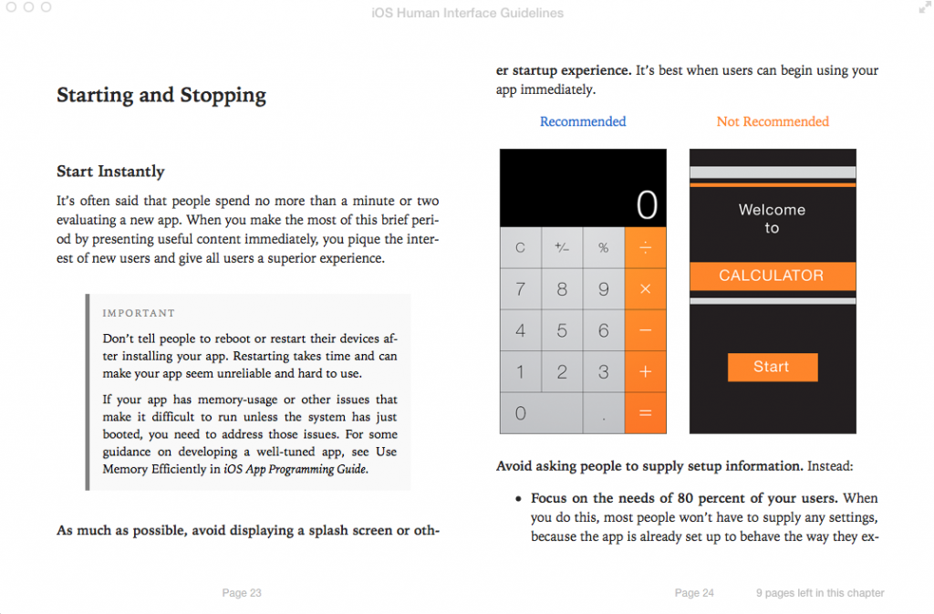
Apple has released its iOS Human Interface Guidelines as a free iBook. And the thing of it is that even if you don’t like Apple, even if you’re looking at me like that because you can’t conceive of being interested in interfaces, the book is a good read. I think everything is interesting, except football, and behind anything is a lot of thought. Read this to see what lies behind the apps we use every day.

Screen Shot 2014-05-14 at 07.49.47From iOS Human Interface Guidelines, free on the iBooks Store


That’s a page recommending that an app just gets on with it. No fancy startup screen, just wallop straight in there.

Startup screens, sometimes called splash screens, are where a company’s logo or the app’s name are displayed at the start. Lots of people hate these and argue that they’d rather get on with using the software but the splash is often there because it takes time for certain apps to load and the alternative is that you have nothing to look at. The alternative is that you wouldn’t be sure it had even started. So they can be necessary. But Apple is really keen on you making apps that load quickly enough that you don’t need them.

I read the old Mac Human Interface Guidelines in paperback a lot of years ago and I’ve never designed a Mac app. It’s still like getting a peek at a philosophy of craft. I don’t believe there’s a Microsoft or an Android equivalent book but I’d read it if there were. Mind you, Microsoft has done something similar in blogs and I did read those until they suddenly took a daft turn into being demonstrably ridiculous. That’s where I read about a redesign of Microsoft Word and its last blog post showed a final screenshot and you could see what huge flaws remained.

Having a Bad Day? Read this for free

As part of the Birmingham Independent Book Fair this weekend, I gave away a free PDF of what's proved to be the most popular section of my book, The Blank Screen. It's called Bad Days and it is meant for those times when you are seriously under water: there is fast advice to get you out of it now and then there is a lot more to help you avoid the situation in the future.

I want you to have a copy too so please feel free: here is the entire and uncut Bad Days chapter from The Blank Screen.

I think it will help you. I hope you also like it and if you do, have a look at the complete book: The Blank Screen on Amazon UK and on Amazon US.

You don’t have to be creepy about it

But do your homework about people. I just had a terribly fun meeting with someone – er, I hope she enjoyed it as much as I did – and before I got to her, I'd read her blog. I'd seen her professional pages, I'd read what she did, I had an idea of some of the work she did.

I intended to stop there. The idea of coming to a meeting entirely cold makes me wince but equally I'm there to meet you, I'm not there to show off my deep research. I really want to meet you: easily the best part of journalism is that you get to bound off and say hello to people you might otherwise never come across. Utterly love that.

And I stopped intentionally looking into this woman's background. But I've been trying a free iPhone app called Mynd and it did some digging for me without my realising it.

Mynd is like a calendar assistant; I found it because I was exploring calendars and looking for why I nearly missed an appointment recently. I also found it because it got mentioned a few times by Katie Floyd on the Mac Power Users podcast. All it does, I thought, is show me my entire day in one screen: how many events I've got to get to, where the next one is, what the weather's like today. I also found that it calculates how long it's going to take me to drive to somewhere and it will say so right there on the screen: you need to leave in 10 minutes if you're going to make the appointment. Sometimes it sounds a notification too. I haven't figured out why it's only sometimes.

But I have figured out that it believes I drive everywhere when really it's more that I drive almost nowhere. So I got a Mynd notification that I ought to get out of Dodge and start the car right now when I was already on a train to London.

I was going to ditch it for doing that. I have Fantastical now that does all the work I need of managing my appointments and events. (Fantastical 2 for iPad is £6.99 UK, $9.99 US. Fantastical 2 for iPhone is £2.99 UK, $4.99 US. The iPad prices are launch offers and will shortly increase by about 33%.) Plus I don't care about the weather and when I do have a mind to wonder about whether it's going to rain, I ask Siri.

But.

There is a panel on this Mynd screen called People and up to now it has always been blank. Today it showed a photo of the woman I was meeting. And it got that photo from LinkedIn. When I tapped on that photo, it showed me her short LinkedIn bio and then it had options for calling her. If you're running late, you open Mynd, tap the person's photo, then tap to send her a message. If you've got the number of her mobile, anyway. Or an email address.

That would be spectacularly handy if I were ever late for anything but usually I'm cripplingly early. Still, it's impressive.

What was even more impressive is that I scrolled to tomorrow, saw the first meeting had a fella's photo there – and behind it was a list of related Evernote documents. It's just reminded me of the last note I made when talking to him. Right there. I'd forgotten I'd ever made a note but there it is.

It's like Mynd gives you a personal briefing before you go to meet someone. I don't think that means you should skip looking in to them yourself, but I feel wildly efficient about tomorrow now. And I won't feel wildly stupid if he mentions the topic of my last note.

Mynd is free for iPhone on the App Store. There's no iPad or Android version.

Have a look at the Mynd website too. It proposes using the software as your sole calendar for a week and I've just learnt that you can do that. Bugger. I think I'll continue using it as an adjunct to Fantastical but it's handy to know that all the ordinary calendar functions are in this Mynd app as well.