Apple has released its iOS Human Interface Guidelines as a free iBook. And the thing of it is that even if you don’t like Apple, even if you’re looking at me like that because you can’t conceive of being interested in interfaces, the book is a good read. I think everything is interesting, except football, and behind anything is a lot of thought. Read this to see what lies behind the apps we use every day.
 From iOS Human Interface Guidelines, free on the iBooks Store
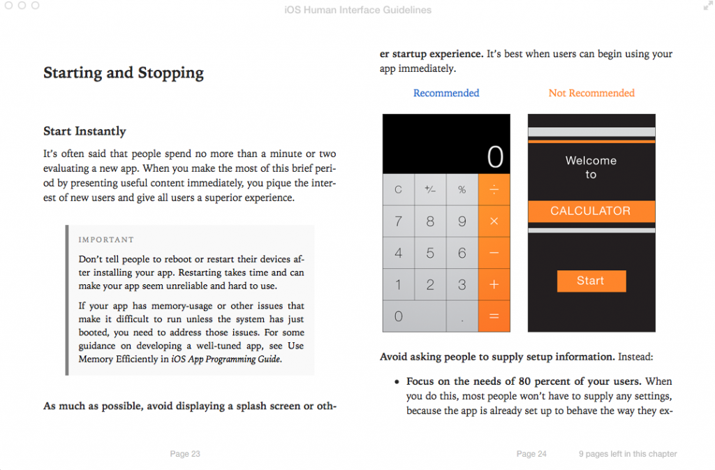
That’s a page recommending that an app just gets on with it. No fancy startup screen, just wallop straight in there.
Startup screens, sometimes called splash screens, are where a company’s logo or the app’s name are displayed at the start. Lots of people hate these and argue that they’d rather get on with using the software but the splash is often there because it takes time for certain apps to load and the alternative is that you have nothing to look at. The alternative is that you wouldn’t be sure it had even started. So they can be necessary. But Apple is really keen on you making apps that load quickly enough that you don’t need them.
I read the old Mac Human Interface Guidelines in paperback a lot of years ago and I’ve never designed a Mac app. It’s still like getting a peek at a philosophy of craft. I don’t believe there’s a Microsoft or an Android equivalent book but I’d read it if there were. Mind you, Microsoft has done something similar in blogs and I did read those until they suddenly took a daft turn into being demonstrably ridiculous. That’s where I read about a redesign of Microsoft Word and its last blog post showed a final screenshot and you could see what huge flaws remained.
