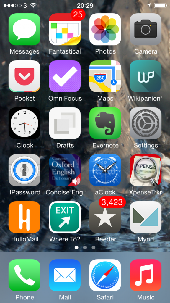
I swear to you that this is a thing. It really is. Just Google “iPhone home screen” and you will find literally half a dozen articles with people talking about what’s on their iPhone front page. I don’t think it’s such a big with Android users but then I wouldn’t be bothered looking. So. Maybe it’s Android too, maybe it’s everyone, maybe I’m not crazy. But I do have one thought about showing you my iPhone front screen.
Is there any better way of recommending software apps to you than showing what I actually use?
And since we’re talking about the front page, these must be the apps that I use the most. Yes. I use these to run my life. One caveat: I also have an iPad but that would be far too big a screengrab to show you. I also have a 27in iMac, but let’s be serious. You’d have to serialise a screengrab from that.
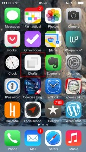
So here’s my iPhone and this is what it’s got on it that is practically worn out from the amount of use I put it all to:

Some of this stuff you know, some of it just does what it says underneath. Phone, for instance. Music. Let’s just wallop through the biggies:
Top row, second from the left – Fantastical 2 for iPhone. I’ve already talked about that and also Mynd, way down there toward the bottom, one up from Music, in Three Calendars, No Waiting. I was testing out Fantastical 2 then and also Mynd, which I’d only just realised is also a calendar. (I thought it was about meetings. It is. It’s just more.) Time has moved on and you can see that Fantastical 2 has kept its space on my home screen so I must like it. Whereas Mynd – wait, Mynd is still there. Bugger. It’s very good when it’s very good and when I need it but, oddly, I haven’t needed it much. Despite having many meetings. I’m afraid Mynd may be on its way out. I’ll think about it and get back to you. But Fantastical 2, unreserved recommendation: get it here.
Second row from the top, first on the left – Pocket. Read something here on the phone in Safari or in my RSS reader, or on my iPad, or my Mac or someone else’s PC, anything and anywhere, and I can lob it off to Pocket. Pocket is not the first Read It Later service, but it is the first that I used consistently often to save things and also to later remember that I had them and finally read the things. Pocket is free, by the way. Off you go.
Second row from the top, second on the left – OmniFocus 2 for iPhone. Need I say any more? Can I say any more? I can? Start reading here – and bring a mug of tea. Then go buy this version of OmniFocus for your iPhone. It’s been updated fairly recently and the iPad one hasn’t so I’m havering over whether to recommend that to you. Up to a couple of weeks ago I’d have said yes even though it’s not quite as whizzy as the iPhone one. The iPad version of OmniFocus has traditionally been the best of the three – but that third one, the Mac version, that’s zooming up. It used to be very hard to use, now a vastly easier yet still powerful one is in beta and I’m addicted to it. Right now, I think the Mac one is the best. Go to the Omni Group’s website and find out about all three.
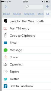
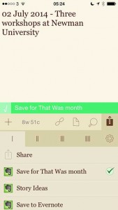
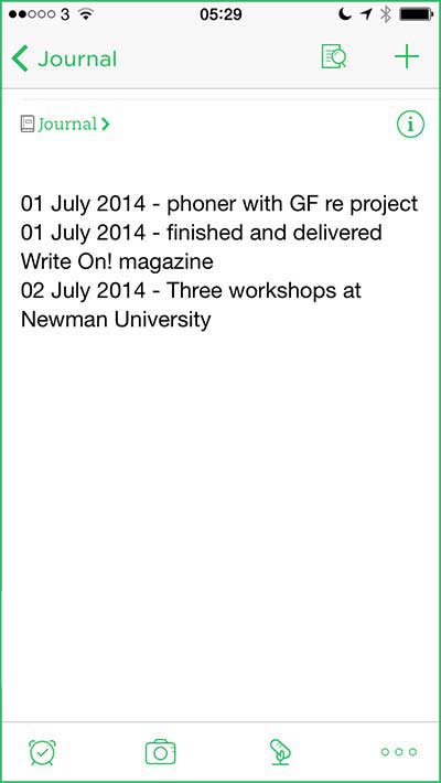
Third row down, second from left – Drafts. I don’t use this remotely as much as I would expect and chiefly because that’s Evernote right next to it. I’ve now got muscle memory that if I want to write anything quickly, it goes in Evernote. Drafts is possibly a nicer writing experience and it is definitely more flexible. Anything you write in Evernote stays in Evernote and that’s great because it stays there in Evernote on your phone, your computer, your tablet and so on. Anything you write in Drafts stays in Drafts but with one tap can go almost anywhere else. Write something and send it from Drafts to OmniFocus or to a text message or to an email. Or, I’ve just this week found out, to Fantastical. I found it tricky to set up but now it works so smoothly that I wonder if it’s even working. All I definitely do with it at the moment is jot down ideas that it then automatically appends for me to a Story Ideas note in Evernote. Get Drafts here and Evernote there.
Fourth row down, first on the left – 1Password. Actually, see today’s The Blank Screen newsletter for more details of this and then go buy it while it’s on sale. If the sale is over by the time you catch this, go buy it anyway. I paid full price, I’m happy. And buy 1Password for iOS here.
Fourth row down, second from the left – Concise Oxford Dictionary. Not only the dictionary text but also an audio pronunciation guide for many words. Every word I’ve ever tried, actually, and I’ve had this app since about 2008. I use it a lot. I wish it were upgraded for iOS 7 or even just to the stretched out iPhone 5 that I use and I wish all sorts of things, but it’s a great dictionary. Unfortunately, it is sufficiently old that I don’t think you can get it anymore. You can get many similar versions but not quite the one I know, so I can’t recommend a particular one. But do have a look at them all, okay?
Fourth row down, third from the left – Awesome Clock. I use this as a bedside analogue clock. It’s very customisable but now I’ve found an arrangement of clock face and hands that I like, I like it a great deal. Unfortunately, it ain’t around. Not today, anyway. Vanished from the App Store.
Fourth row down, fourth from the left – XpenseTracker. That fourth row sees some action, doesn’t it? I use this for recording all my expenses. Are you okay? Did you just faint with surprise? Someone, bring us hot towels and some whisky. And tell me how much that costs because I need to pop it into XpenseTracker
Fifth row down, first from the left – HulloMail. I used to be on O2 and got Visual Voicemail. (Whereby instead of dialling in for your messages and listening to eight spam calls before you finally get to one from your client and, wait, hang on, she said a number there, bugger, where’s my pencil, you just tap. Here’s a list of the calls you’ve missed and which left messages. Tap on the one you want to hear first, you hear it first. Missed a phone number or couldn’t quite catch a word? Scrub back and forth through the recording.) It is so good that I had no idea there were iPhones that didn’t have it. Until I left O2 for 3 and despite in all other ways being far better, it didn’t have Visual Voicemail. HulloMail brings it back. It brings it back with ads and I keep meaning to upgrade but it’s a subscription and I’m not certain I use it enough. Take a look at HulloMail here.
Fifth row down, second from left – Where To? I keep wanting to call this Exit. Actually, I keep calling it Exit. And I rotate between using this and Localscope: both are easy of finding out what’s near you. I love this kind of app and I pummel mine: the first App Store review I ever wrote was for one called Vicinity and I could not get over what a stunningly great and useful idea this is. Where’s the nearest bank? Where’s a pizza place? Tap, there it is. With business details. I can’t remember why I fell away from Vicinity but I regularly bounce between Where To? and Localscope. Where To? looks very old to me and I just don’t enjoy using it as much as I do Localscope, but it’s given me more accurate information somehow. And I also understand it: I find I have to keep thinking with Localscope about where a certain feature is. But here’s Where To? and here’s Localscope: do have a look at both, would you?
Last one. Fifth row down, third from the left, Reeder 2 for iOS. This is my RSS reader of choice and I have done an awful lot of choosing. Here’s what I wrote about it when a new version came out late last year. There’s now also a Mac version in beta, which I enthused about here. But just go buy the iPhone version.
I’m worn out from enthusing.
My iPhone home screen, like everybody else’s I presume, changes a lot. You can see I’m havering over a couple of these apps. But the rest, the ones that stay there, tend to stay for the very good reason that they are very good. If you want a recommended app, this is what I recommend.
I hope you find they are as good for you as they have been for me.
