Firefox: 29’s the charm

Firefox works on everything. When it came out, it made Internet Explorer look embarrassing. (More embarrassing.) Firefox was the darling of every serious technology-minded geezer because it worked better, it worked faster.

I just didn’t like it.

It’s a funny thing. I like Safari and I swear to you that it feels light, that it feels like you just get on with things instead of having chunky buttons and options to slog through. What’s funny is that this is precisely, to the letter, what fans of Firefox say is wrong with Safari.

So, plainly, your choice of browser is surprisingly personal. (As long as it isn’t Internet Explorer. You can go too far.)

I’ve always kept a copy of Firefox around because there is often a site that just doesn’t work in Safari – or doesn’t work in Firefox, I don’t know why I keep finding picky websites. Each time I start up Firefox it irritates me by feeling heavy, kludgy and for CONSTANTLY telling me it is updating itself. I just want to go to a site. I want to go once, I want to go now, I want to get the hell out of Dodge and go back to Safari but, no. UPDATING.

It’s been worse since 2011 when the company announced it was going to update every six weeks or so. I applaud them for not doing the dots: Safari is currently on version 7.0.3. But at first it was wearisome seeing an entirely new version of Firefox coming down the chute: version 6, version 7, version 8… and on and on. I’m sure the developers intend this to seem like they are truly on the ball, at the cutting edge, bringing us the latest technology faster than anyone else. Version 9, version 10, version 11… I just think “Again?” or often “Already?”

My current copy of Firefox is version 26 and it is practically prehistoric: apparently I downloaded it on 14 March, a whole 47 days ago. I don’t even remember using it 47 days ago but I imagine I did and that it updated itself. Hang on.  Yep, I’ve just opened it and it’s just updated itself.

To version 27.

I have no clue why it isn’t 29. I do have a clue that I could, with a wee bit of effort, go off now to already get versions 30 or even 31 in beta.

You can tell I’m not going to. But many will and they have very good reasons to find that version 29 is a great one. It’s very customisable, it’s got oodles of features. Hear what from someone who is far more of a fan than I am:

And then read more plus get a download at the official site.

LaunchCentre Pro masterclass on MacStories

Imagine that you could have one button on your iPhone that, say, opens OmniFocus and goes straight to entering a new task. Or one button that dials your mother. Send a description of a meeting to Fantastical in one tap.

lcp

And then imagine that it’s faster to just go to OmniFocus yourself, or to tap on your mother’s name or to start typing directly in Fantastical.

That’s what happened to me. LaunchCentre Pro does all this one-button lark and it is very impressive but it takes two buttons. One to launch LaunchCentre Pro and then one to do the thing you want. As fast as it is, as clever as it is, that’s two taps and I was finding that it is quicker to things directly.

Consequently LaunchCentre Pro vanished off my home screen.

But it comes back each time there’s a new version and each time someone finds a vastly cleverer use for it than I ever came up with. Now, MacStories has come up with a more comprehensive guide to using this thing than even the makers do.

I know I sound down on LaunchCentre Pro but I like the idea and it is cycling round to my homescreen again. I do still keep Drafts on there, which is a text editor that has similar functions and that can work well with LaunchCentre Pro. So I may be down on it, but I’d like you to be up on it so you can see for yourself. Read this first and very comprehensive guide.

New: Clear To Do app adds Reminders

This just in from Realmac:

…we’ve just launched a big (and much-requested) feature in Clear for Mac and iOS: reminders. With this great new feature, you’ll never forget a to-do – and as Clear syncs your tasks and reminders via iCloud you’ll be notified on all your Apple devices.

We’ve also got some new sound packs in Clear so you can customise the sounds as you complete tasks.

Clear with Reminders is of course a free update, and available on the App Store and Mac App Store.

Clear has always looked great yet not been powerful enough for me and in part that’s been because of the lack of reminders. Take a look at Realmac’s Clear website for a video of how this latest version works.

Video – designing how we use computers

This hits me in so many interests. Design. Computers. Or more specifically, how we use computers to get our work done. How the efforts of software designers enable every single thing I ever do. And this video grabs me because it's about the history of the user interface. It still feels weird using the word history about a time I went through, but there you go.

John Gruber talks history, design, computers, software and people in this talk primarily about Apple's operating systems. It's from 2011 so it's already lagging behind but I just enjoyed the lot over a late breakfast:

Webstock '11: John Gruber – The Gap Theory of UI Design from Webstock on Vimeo.

Force your To Do app to have start dates

Most To Do apps don’t have this but you need it and there’s a way to fake it on any software:

Screen Shot 2014-04-26 at 16.52.19

This is the ideal: you write one task and you give it both a start date – called “deferred until” in that screenshot – and a date that really have to do it by. All in one. (Actually, no, the ideal is to not use either start or end dates, especially not end dates. But that’s another story.)

There’s a good, solid, practical reason why this is the ideal when you have a deadline and there is a more nebulous yet enormously more important reason too. First, the practical one:

Having one task with start and end means you’ve one place to go change its details if you need

The nebulous one is:

Software that has start dates will keep your task hidden away from you until then.

It’s in your system, you won’t forget it, you just won’t have to consider it at all until the time you’ve said you should start.

Set it, forget it, get on with the stuff you have to do now.

I mean it when I say this is enormous. It’s the difference between a To Do list that you will use and one that just becomes this enormous long stupid hateful damn bloody list of a million things you still haven’t done yet, you total failure.

So it’s a shame that not every To Do app does start dates. My beloved OmniFocus does. (The screenshot above comes from OmniFocus for Mac where start dates are now called Defer Until dates. Apparently people got confused. But start dates are so crucial that the term is now burnt into me.) Other apps have it too: the online one Asana, the iPhone one Appigo To Do. It’s hard to give you a definitive list of what does and doesn’t have it because it changes a lot – and because some software firms look like they’ve only added start dates because customers wouldn’t stop shut up about them. The feature is there but, my lights, it’s hard to find.

You’d think you could just google like “omnifocus start date app review” or somesuch and get the answer for any app, but you simply can’t. Do try it. If you’re considering a particular To Do app, definitely google whether it has start dates. Be prepared to dig through articles. If the app is free, just get the bleedin’ app and try looking in that. But look for it, hope to find it, be prepared that you may not.

And if you don’t, fake it.

Do this:

  1. Give your task a deadline, a due date, that is really the day you should start it
  2. Call that task something like “Do that thing which is due on 1st May”
  3. Create another task called “Do that thing” and give it a due date of 1st May or whatever the the real deadline is

It’s two tasks instead of one. And you may see both on your list every day, but typically your app will at least put them at the bottom of the list until the first deadline appears.

It works. It’s not elegant. There’s a strong chance that it’ll go wrong: if you tick the first one, the starting task, when you begin it but you don’t finish on that day, you have to remember to continue it tomorrow.

Have you noticed that I’ve avoided saying oh, to hell with it, just buy OmniFocus?

Bugger.

Let’s turn to the phones

I swear to you that this is a thing. It really is. Just Google “iPhone home screen” and you will find literally half a dozen articles with people talking about what’s on their iPhone front page. I don’t think it’s such a big with Android users but then I wouldn’t be bothered looking. So. Maybe it’s Android too, maybe it’s everyone, maybe I’m not crazy. But I do have one thought about showing you my iPhone front screen.

Is there any better way of recommending software apps to you than showing what I actually use?

And since we’re talking about the front page, these must be the apps that I use the most. Yes. I use these to run my life. One caveat: I also have an iPad but that would be far too big a screengrab to show you. I also have a 27in iMac, but let’s be serious. You’d have to serialise a screengrab from that.

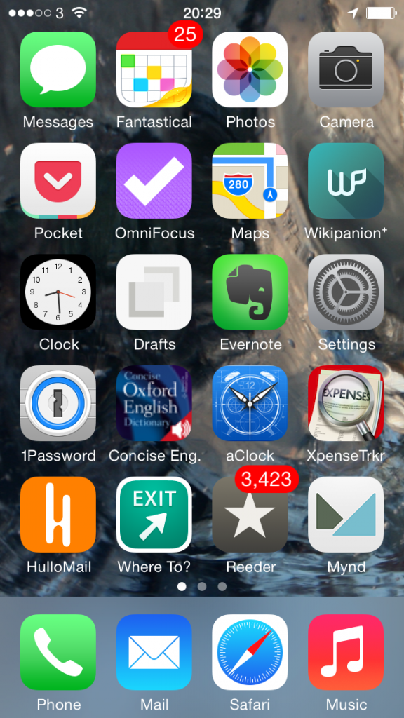
So here’s my iPhone and this is what it’s got on it that is practically worn out from the amount of use I put it all to:

iphone homescreen today


Some of this stuff you know, some of it just does what it says underneath. Phone, for instance. Music. Let’s just wallop through the biggies:

Top row, second from the left – Fantastical 2 for iPhone. I’ve already talked about that and also Mynd, way down there toward the bottom, one up from Music, in Three Calendars, No Waiting. I was testing out Fantastical 2 then and also Mynd, which I’d only just realised is also a calendar. (I thought it was about meetings. It is. It’s just more.) Time has moved on and you can see that Fantastical 2 has kept its space on my home screen so I must like it. Whereas Mynd – wait, Mynd is still there. Bugger. It’s very good when it’s very good and when I need it but, oddly, I haven’t needed it much. Despite having many meetings. I’m afraid Mynd may be on its way out. I’ll think about it and get back to you. But Fantastical 2, unreserved recommendation: get it here.

Second row from the top, first on the left – Pocket. Read something here on the phone in Safari or in my RSS reader, or on my iPad, or my Mac or someone else’s PC, anything and anywhere, and I can lob it off to Pocket. Pocket is not the first Read It Later service, but it is the first that I used consistently often to save things and also to later remember that I had them and finally read the things.  Pocket is free, by the way. Off you go.

Second row from the top, second on the left – OmniFocus 2 for iPhone. Need I say any more? Can I say any more? I can? Start reading here – and bring a mug of tea. Then go buy this version of OmniFocus for your iPhone. It’s been updated fairly recently and the iPad one hasn’t so I’m havering over whether to recommend that to you. Up to a couple of weeks ago I’d have said yes even though it’s not quite as whizzy as the iPhone one. The iPad version of OmniFocus has traditionally been the best of the three – but that third one, the Mac version, that’s zooming up. It used to be very hard to use, now a vastly easier yet still powerful one is in beta and I’m addicted to it. Right now, I think the Mac one is the best. Go to the Omni Group’s website and find out about all three.

Third row down, second from left – Drafts. I don’t use this remotely as much as I would expect and chiefly because that’s Evernote right next to it. I’ve now got muscle memory that if I want to write anything quickly, it goes in Evernote. Drafts is possibly a nicer writing experience and it is definitely more flexible. Anything you write in Evernote stays in Evernote and that’s great because it stays there in Evernote on your phone, your computer, your tablet and so on. Anything you write in Drafts stays in Drafts but with one tap can go almost anywhere else. Write something and send it from Drafts to OmniFocus or to a text message or to an email. Or, I’ve just this week found out, to Fantastical. I found it tricky to set up but now it works so smoothly that I wonder if it’s even working. All I definitely do with it at the moment is jot down ideas that it then automatically appends for me to a Story Ideas note in Evernote. Get Drafts here and Evernote there.

Fourth row down, first on the left – 1Password. Actually, see today’s The Blank Screen newsletter for more details of this and then go buy it while it’s on sale. If the sale is over by the time you catch this, go buy it anyway. I paid full price, I’m happy. And buy 1Password for iOS here.

Fourth row down, second from the left – Concise Oxford Dictionary. Not only the dictionary text but also an audio pronunciation guide for many words. Every word I’ve ever tried, actually, and I’ve had this app since about 2008. I use it a lot. I wish it were upgraded for iOS 7 or even just to the stretched out iPhone 5 that I use and I wish all sorts of things, but it’s a great dictionary. Unfortunately, it is sufficiently old that I don’t think you can get it anymore. You can get many similar versions but not quite the one I know, so I can’t recommend a particular one. But do have a look at them all, okay?

Fourth row down, third from the left – Awesome Clock. I use this as a bedside analogue clock. It’s very customisable but now I’ve found an arrangement of clock face and hands that I like, I like it a great deal. Unfortunately, it ain’t around. Not today, anyway. Vanished from the App Store.

Fourth row down, fourth from the left – XpenseTracker.  That fourth row sees some action, doesn’t it? I use this for recording all my expenses. Are you okay? Did you just faint with surprise? Someone, bring us hot towels and some whisky. And tell me how much that costs because I need to pop it into XpenseTracker

Fifth row down, first from the left – HulloMail. I used to be on O2 and got Visual Voicemail. (Whereby instead of dialling in for your messages and listening to eight spam calls before you finally get to one from your client and, wait, hang on, she said a number there, bugger, where’s my pencil, you just tap. Here’s a list of the calls you’ve missed and which left messages. Tap on the one you want to hear first, you hear it first. Missed a phone number or couldn’t quite catch a word? Scrub back and forth through the recording.) It is so good that I had no idea there were iPhones that didn’t have it. Until I left O2 for 3 and despite in all other ways being far better, it didn’t have Visual Voicemail. HulloMail brings it back. It brings it back with ads and I keep meaning to upgrade but it’s a subscription and I’m not certain I use it enough. Take a look at HulloMail here.

Fifth row down, second from left – Where To? I keep wanting to call this Exit. Actually, I keep calling it Exit. And I rotate between using this and Localscope: both are easy of finding out what’s near you. I love this kind of app and I pummel mine: the first App Store review I ever wrote was for one called Vicinity and I could not get over what a stunningly great and useful idea this is. Where’s the nearest bank? Where’s a pizza place? Tap, there it is. With business details. I can’t remember why I fell away from Vicinity but I regularly bounce between Where To? and Localscope. Where To? looks very old to me and I just don’t enjoy using it as much as I do Localscope, but it’s given me more accurate information somehow. And I also understand it: I find I have to keep thinking with Localscope about where a certain feature is. But here’s Where To? and here’s Localscope: do have a look at both, would you?

Last one. Fifth row down, third from the left, Reeder 2 for iOS. This is my RSS reader of choice and I have done an awful lot of choosing. Here’s what I wrote about it when a new version came out late last year. There’s now also a Mac version in beta, which I enthused about here. But just go buy the iPhone version.

I’m worn out from enthusing.

My iPhone home screen, like everybody else’s I presume, changes a lot. You can see I’m havering over a couple of these apps. But the rest, the ones that stay there, tend to stay for the very good reason that they are very good. If you want a recommended app, this is what I recommend.

I hope you find they are as good for you as they have been for me.

What’s so great about OmniFocus part 2: handle everything

Previously… Barely a minute goes by without my mentioning that I am life-support-dependent upon the To Do manager OmniFocus. Rather than just keep telling you why, I’m showing you how. In Part 1, you jotted down To Do tasks, you whispered them to Siri, you forwarded an email right into OmniFocus. Now you’ve got eleventh-billion To Dos and you haven’t looked at one of them. Read on…

Every stray thought goes into your Inbox

Think of it, add it to OmniFocus, move on with your day. Every task that occurs to you gets out of your head and into your OmniFocus inbox. The mess in your mind becomes the mess in the inbox. Like this, this is my Inbox right now:
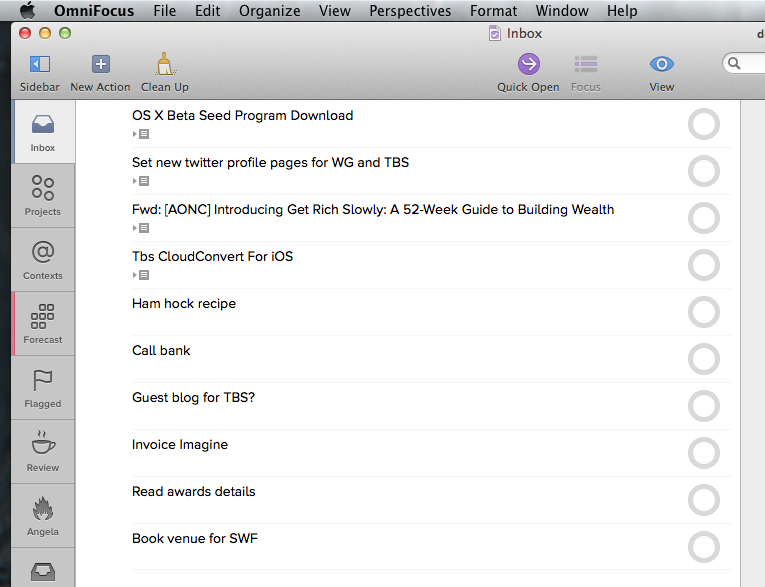
omnifocus inbox example

That shot is from the new beta version of OmniFocus 2 for Mac which, incidentally, is very good. I bunged a few of those items in there on my Mac just to show you but I know for certain that they are all now on my copy of OmniFocus 2 for iPhone:
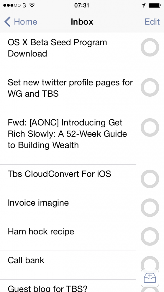
OmniFocus 2 for iPhone shot


And on my iPad version of OmniFocus too:
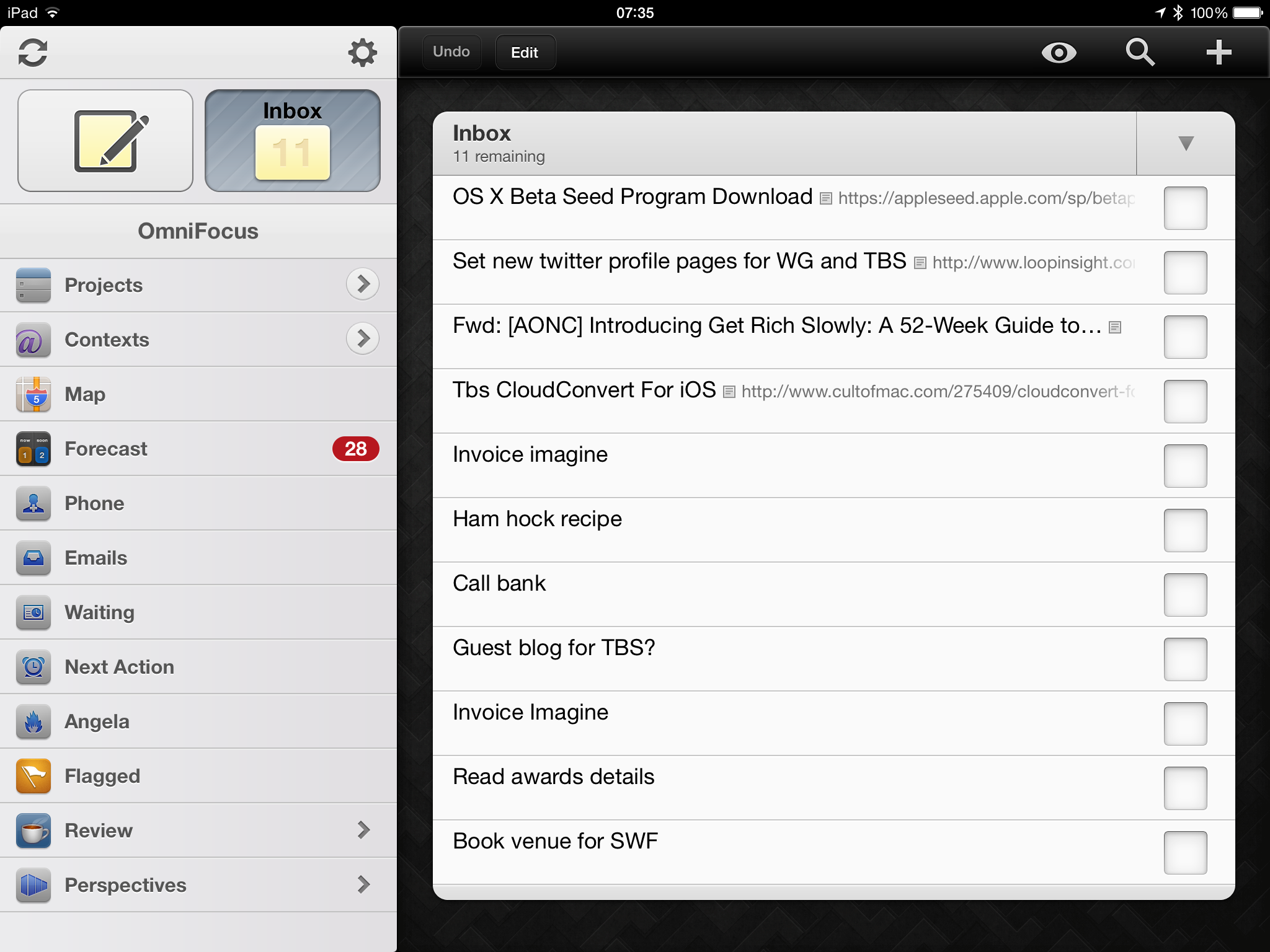
OmniFocus iPad shot

 I hadn’t consciously realised this before taking those shots but you can see very clearly how similar OmniFocus for iPhone and Mac now are. The iPad version looks different, older to my eyes.  It’ll be updated next, after the Mac version.

But now, if you’ve read The Blank Screen (UK edition, US edition) then you’ll know that almost every one of those tasks is wrong.

“Invoice Imagine”? For what? How much? Who do you send the invoice to? Do they use Purchase Order numbers or what? To do this task quickly, to get it done and get you back to your real work, you need to take a moment to write that task as if someone else is going to do it. So I’d write it as “Invoice Imagine Magazine for Acme feature…”. It’s not a big difference but it’s significant when you’re doing a lot of invoicing. (I don’t like invoicing but I love having invoiced. Consequently I let invoices build up a bit and then I need to run through them as fast as possible. Writing the task this way means I see it, I do it, it’s done. Writing just “Invoice Imagine” means I have to go check which feature I’m talking about: what have I already invoiced, what haven’t I? It’s still small stuff yet it adds up.)

One thing: notice the ellipses at the end of that task. That’s all. Just notice. Okay?

The thing with the inbox is that you can and I do bung anything and everything in there. I’m fine with stray thoughts and hurried jottings. Sometimes it catches me out because I can’t remember what in the world I needed to call the bank about. So I should and I do try to write it always as if it’s for someone else: hence the only entry in that inbox that I would say is correct –

Set new twitter profile pages for WG and TBS

Last night I read that Twitter has emulated Facebook’s design of a personal home or profile page. I’m not that fussed but I think without it, my two Twitter accounts would look a bit bare. So I made this note and actually this morning, I did it. Saw it in my Inbox, understood what I needed to do, did it.

So all I’ll do now with that task is tick it as completed.

Why would you do anything else? It’s done, let it go. But I will do other things to the rest of the list, I will rewrite them as if for someone else so:

OX X Beta Seed Program Download

becomes

Install OS X Beta Seed on MacBook Pro

Apple is now allowing anyone to download early test versions of the next OS X and I’m interested so I signed up when I heard about it. But I heard about it while reading on my iPad and OS X is for Macs. Rather than go to my office, I just forwarded the website’s link to OmniFocus so I’d deal with it today.

I could do what I did with Twitter and simply get that task done and tick it as completed. But while I’m interested and I will do this, it’s hardly urgent. Doesn’t have to be done today at 9am or whatever.  But if I leave it in the inbox, it will get lost in what I promise you becomes a sea of tasks in there. On a day rushing around, I will very easily end up with twenty tasks in the inbox and I’ll probably have done five or six by the time I get around to checking the inbox. So tick, tick, tick, tick, tick, very satisfying. But that leaves 15 tasks in there and the odds are that I didn’t do them because I need to get something, ask someone, do something that can’t be done right this moment.

If you just left the task in your inbox, OmniFocus would be an ordinary To Do application.

Here’s what we do instead. I’ll show you on the iPad version but you can do this on them all and the key thing of it is that it takes me close to infinitely less time to do this than to tell you.

First, I just tap the task on my iPad and this pops up:
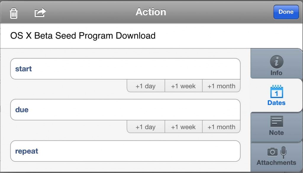
box1

If this were a magazine feature, I’d have a deadline and I’d put that in the Due section. If the work was going to take me a couple of days, I’d put an earlier date in the Start one. And you can guess with Repeat: if I had to install this OS X beta every day or every month or whatever, I’d say that here.

But I don’t have a deadline and I don’t have a start date and I’m only going to do this once. Despite every muscle tempting me to put Today as the Due date, I won’t do it. I change the task name but otherwise I write nothing at all in this box: I just tap on the grey Info button to the right. That gets me this:
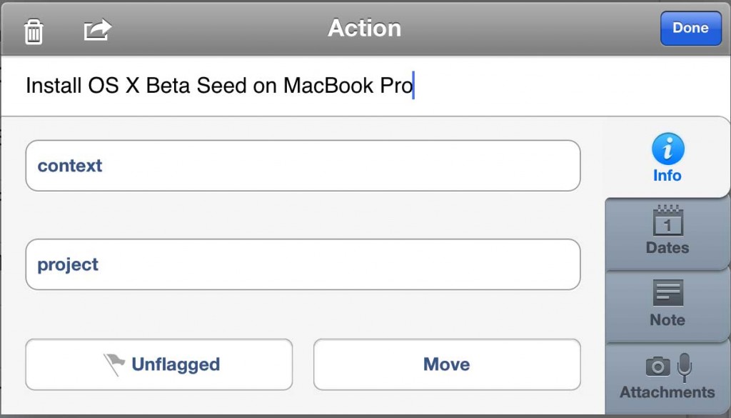
box2

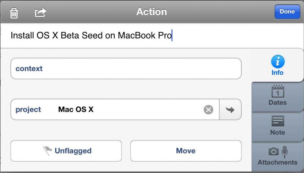
I don’t have to do anything here either. But I do. I have a project called Mac OS X where I bung in tasks to do with this stuff, so why wouldn’t I bung this in there too? Tap on the project field, find the project. OmniFocus shows me a list of all the projects I’ve got on but – utterly gorgeously – I can just type the bit of the name I remember. If I just typed X, it would find “Mac OS X”. If I typed the initials MOX, it would get it.
box3

There’s an Unflagged button below this. I never use it. There’s a Move button too and I do: if it turned out that installing this OS X beta was somehow a massive job involving lots of people or oodles of steps, I could take this one task and turn it into a new project replete with its own tasks. I’ve done that. I’ve done that a lot.

There’s also that Context field up above Project. I use this to excess. But not today. Not for this task, it doesn’t need it. So let me leave that for now and, actually, let me leave all of this. Leave the Note button, leave the Attachments.

No, I can’t do it.  I won’t use them here for this task because I don’t need to but I can’t let you go without knowing about them. Here’s Contexts:

A context is where you’re going to do a task or it’s something you need, someone you need, to do it with. It’s a little tricky to paint your living room when you’re out at work, so you could make a Context called Home and mark “Paint the living room lilac” with that. Some people do.

Or you could mark a task as being a phone call. I do that: it’s usually obvious from the task name – “Call Anne to get the purchase order number” but still I’ll mark it with my Phone context. It’s quick to do, for one thing, but it also means that when my train is delayed, I can get OmniFocus to list all Phone tasks and then I’ll just start knocking them off. No need to dig into projects, no need to check anything, it’s right there in front of me so I do it.

Many of my jobs are to do with my wife Angela Gallagher and I so I have a Context called Angela. Anything I need to discuss with her when we’re both back in the evening, bung it in there and skip through it all later while I’m cooking.

By far the most useful context for me, though, is the location context. Not as in this task is to be done at Home and this one at Work, but that this is to be done when I get home. That sounds the same but I mean it literally: I have a Home context and within that I have another one called Arriving. If I mark a task as having the Context of Home: Arriving then as I pull onto our front drive, OmniFocus will remind me.

Seriously, it’s infinitely faster to do this than to talk about it.

I’ll try to be faster with Notes:

Write anything you like in here. Anything. If you get an email with a task in it and you forward it into OmniFocus, the email’s subject becomes the task’s name and the body of the email goes in notes. Very often I need to remember quite a bit about a task, more than can go in its name, so I’ll write a short, clear task name and then lob notes in here. So that I notice when I’ve done this, I add ellipses to the end of the task name. It means there’s more to read.

Attachments, I can do that even faster:

Add documents, photographs, anything you need to help you get this task done. Most common example for me: when I’m shopping for something  that’s unfamiliar because Angela likes it more than I do, I’ll take a quick photo of the empty box so that I can get the right size and type.

But you don’t need attachments, you don’t have to write notes, you can ignore Contexts for the rest of your life and never care about them.

Except, to get a task out of your Inbox, you need to set a Project or a Context. Either of them. Set either and, whoosh, that task is out of your inbox.

It’s a bigger deal than it sounds. I said that tasks get out of the mess of your head and into the mess of the inbox. Doing this with setting a project or a context, choosing to add a start date and a due date, making it repeat, including a photo, all of this gets rid of the mess. You’re not actually doing the task, you’re just changing the details, but it makes a massive difference.

It’s gone from your inbox so you don’t have to keep thinking about it, thinking about whether you can do it now or if you’ve still got to wait for Bert to return that spanner.

That’s all. But is huge. The task is there, you’re going to do it, you won’t forget, but it isn’t slapping you in the face. It isn’t making you give up the will to live because there are eleventy-billion To Dos in your inbox.

One more thing. You are better at doing jobs than you are at remembering them. If you get a task, you can do it. If you get a giant list and you have to schlep through just remembering what’s important and what’s urgent, you won’t do it.

Handling tasks in OmniFocus is about getting them out of your way. Hiding them, really. That’s what this processing through your inbox does but it also puts each task back in your head for a moment. You’re examining it like it’s a thing on Antiques Roadshow: you’re sizing up the job, whether it’s worth keeping, that kind of thing. Then you put it down in a project and pick up the next inbox tasks to appraise.

You’re brilliant at that. Whack it into your inbox, have a think about it later, tap that Done button and go get some work done. If that’s what you do, if this adding tasks and processing your inbox is all you do, you will run fine for weeks. To run longer, to never forget anything and to always get things done, you need to one more thing. I’d shock you now and say that it’s what we’ll talk about in part 3. But I’ll also surprise you now by telling you what it is. It’s reviewing. You review all your tasks just like you did when they were in your inbox. And for much the same reasons.

Fortunately, there is more to say or part 3 will be very empty when it comes out.
 

Big new 1Password for iOS update

If you already have 1Password then the odds are that your iPhone has updated it for you. Just as it did to me, exactly as I opened the old one to take a screengrab so that you could see the difference.

“Oh,” I said as the icon changed under my finger. “Well.”

So I can't show you what it used to look like, you just need to trust me that it looks very nice now. It was fine before, I liked it before, but I like it better now. And if your phone hasn't done the update or you don't yet have 1Password, I could copy-and-paste Agile Bits' description of their changes. But I'd rather just highlight one apparently trivial one. More than apparently trivial, it is definitely trivial and yet:

For those upgrading from 1Password 3 for iOS, the import process is much improved.

My lights, it was bad before. You had to open 1Password 3, then open 1Password 4 and the later version would magically figure out you were updating. It would set you up, easy. No bother. Except it wasn't easy and it was all bother and it didn't figure out anything. I felt like an alchemist going through that upgrade and maybe it was satisfying when everything suddenly worked, but I'd rather have been satisfied an hour or two sooner.

Then even knowing what I had worked out, it took more hours to get my wife Angela Gallagher's 1Password 4 upgrade to work.

Once you're on, though, you're away. It is superb. This is the bit of the page that would get quoted in an internal Agile Bits report and quite right too: it really is superb. Once you get beyond the upgrade.

But you do, you will, and apparently it's easier now. Fingers crossed for whenever 1Password 5 comes out.

Go get the new 1Password for iOS for the first or the next time right here. And right now.

US-only (for now): Refresh app briefs you on people

New in the US App Store for iPhone, Refresh parses your calendar for the names of people you’re meeting and then compiles as much information about them as it can.

The information is gathered from social media sources in much the same way that you could and perhaps do yourself. Mynd does the same thing. But Refresh feels like it digs deeper and then it makes certain connections. Small but smart things: it will see, for instance, that someone’s Linkedin profile says they joined a company in 2010 but it will tell you they’ve “…been at Acme for nearly four years”.  A tiny difference but one that more fits how we might think of someone or how we might phrase it if we opened a conversation with them.

That bothers me a touch. On the way in to a meeting, it’s working to prompt you with things you might need to know about folk. It feels a little bit icky and especially so when it directly suggests conversation-starting topics related to their previous employment, their holiday or whatever.

Personally, my only conversation-starter is “Hello”.

But I am ferociously interested in people. It’s exciting meeting someone new and up to that conversation prompt, Refresh is good. I like the name: it’s really refreshing my memory of whomever I’m meeting.

Any time you dig too deep or you make, I don’t know, intense briefing notes about their pet dogs just so you can appear matey or chummy in future, I am uncomfortable. Embarrassed. Yet when you meet a lot of people and they are all doing work that you really want to know more about, it’s not an awful idea to make the odd note.

Recently I’ve been adding just a line to the Notes field in my OS X Contacts. I might say what we’re working on together. There was one woman whose husband’s name would simply never stick in my mind so I did write that down.

Refresh wants you to do more and it prompts you to do so.

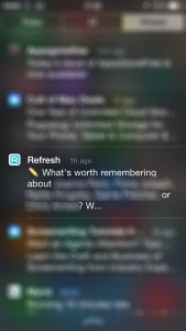
refresh-app-blurredI got a push notification on my way out from a thing today and it’s still on my Notifications list as illustrated here in by far the most blurred-out screen grab I have ever taken.

I don’t like the line “What’s worth remembering about…” because the answer is EVERYTHING.

Still, if I wanted to, I could note that this fella was doing that work, this woman was doing that other work. And actually there was a fella today who is now doing a gig that he told me when we met back in November. If I’d made a note then, I might have remember to book a ticket in time.

So Refresh is very useful and it has some smart ideas that it has implemented well. I think it’s usefulness is directly tied in to how you think about people you meet and what you feel about briefing yourself this much.

It’s a free app so you can try it out very easily – but only if you have a US iTunes Store account. I asked the company and they confirm there will be an international release but there’s no date yet.

If you have a US account, you can find the Refresh app here. And whether you do to not, you can read more about it and the company on their official website.


Reeder for Mac now in public beta

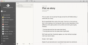
Screen Shot 2014-04-11 at 20.45.55

The short news for Reeder fans: download it right now from here.

The slightly longer news for anyone who isn’t a Reeder fan: it is terrific and you should download it right now from here.

Reeder is a news reading app, an RSS one where you tell it what websites you like and forever afterwards it gets news from all of those sites. Depending on the site, you can read the headline, the standfirst, an extract or the whole article and whichever you get, it looks gorgeous. One tap in the morning and I am reading news from BBC, New York Times, Lifehacker, The Onion and myriad more.

There are many RSS readers like Reeder but I don’t think there is another one that is really anything like Reeder. I’ve long loved its design – most of it, at least – and how well done its text was. Routinely, if I found an article on a site that was just too ugly to read, I’d either bung that piece into Pocket to read later or I’d subscribe to it in Reeder and read it there.

I still remember the instant when I learnt that Reeder for iOS was out. Last September, a new version was released partly to deal with how Google shut down its service that powered all RSS readers. It was a paid update and I paid instantaneously. That’s how much I liked the old one and now it’s how much I like the new.

Yet as good as Reeder is for RSS, I missed having it on my Mac too. That Google shutdown made the Mac one literally unusable and that is almost a year ago. Here’s how good Reeder is: I haven’t replaced it. Not on my Mac. I’ve tried others on iOS but as much as I used to use RSS on my Mac, I simply stopped reading any RSS there.

Until tonight.

What’s been released is a beta version of Reeder 2 for Mac and the final version will be a paid-for app. I don’t know the price yet and I don’t truly care: I have read many thousands of articles through the various versions of Reeder and I open it practically as often as I do my email.

So go download it now from here and be ready to pay whatever the maker demands when it’s out of beta.