Thirty years of new resolutions

Just wow.

When first released in 1984, the Apple Macintosh shipped with a black-and-white 512 x 342 display. Fast forward 30 years to the release of the iMac with Retina 5K display, which ships with a 5,120 x 2,880 display with support for millions of colours. That’s an increase from 175,000 pixels to more than 14.7 million – an 8,400% increase. 80 of the original Macintosh displays fit within a single Retina 5K display1.

The stats are astounding, but to really put things in perspective, take a look at the image below, showing the original Macintosh display overlaid on a promotional image that Apple has been using to showcase the massive size of the new iMac’s display.

The Difference 30 Years Makes: iMac with Retina 5K display vs. the Original Apple Macintosh – Kent Akgungor, Things of Interest (22 October 2014)


Here’s a small version of that image but go read the full piece for a better shot and also an explanation of how it works and why it’s only sort-of true. Read the full piece.

It’s the little things

I’m spending today running a workshop for the Federation of Entertainment Unions: that means I’ll have people from the Writers’ Guild, the Musician’s Guild, NUJ and Equity. It’s a day-long workshop version of The Blank Screen and I’ve done it many times but it is always different.

I don’t mean because every person is their own special little snowflake and the day runs in different directions, though it does so I suppose they are. I mean it’s different because I change it.

Sometimes I’m just changing the presentation and the workshop plan because something new has come up and I might do that any time between these days. But there is also one thing that I don’t write and don’t change until the morning, until just before I leave.

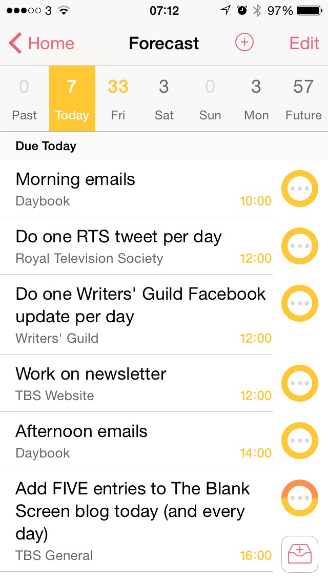
It’s just this. I spend a lot of time in the workshop talking about To Do lists and how to make them something you use and that you enjoy using rather than something dreaded that you avoid. And I feel obligated to include my real To Do list. So I do, I add in a slide that (today) has this:

What I like very much is the simple thing that is doubtlessly complex yet I don’t have to care, I can just relish it. This. I added that To Do list image and I made various twiddles to the presentation on the 27in iMac in my office. I present from a MacBook Pro. And as I turned from the iMac to set up that MacBook Pro, my new presentation was already there. It was already on the MacBook and I didn’t do anything. Didn’t AirDrop it across, didn’t use a USB thumb, didn’t email it.

I wrote it on the iMac and it is on my MacBook as if I wrote it there.

And here’s another thing. I’m writing to you in Drafts 4 on my iPad and that image above of my To Do list comes from my iPhone. I didn’t send it over to my iPad, didn’t copy it, didn’t do anything. It’s just there where I need to use it.

As I say, this is doubtlessly complex stuff behind the scenes but to me, it’s just that everything I need is where I need it, when I need it. I think that is heady and gorgeous stuff.

Hmm. Samsung Galaxy Note 4 vs Apple iPhone 6 Plus

The site 9 to 5 Mac has done a comparison video and – stop right there, did you just think that there might maybe perhaps be a teeny bit of Apple bias in a site called 9 to 5 Mac? And if not on that site then on this, given that thirty seconds reading The Blank Screen will tell you Apple is better for productivity? But no. The 9 to 5 video does a good job of stepping away from the platform bias that both sides of the iPhone vs Android camps have.

(Just as an aside, isn’t it interesting how there can be this schism? I can’t comprehend how you have the patience for Android or why you can enjoy the necessitated twiddly fiddling to get it to work and Android fans are equally unable to understand what it’s like having a phone that works. I’m at times quite passionate about my kettle but I couldn’t even tell you who its manufacturer was, let alone when the last time there was an upgrade to its firmware.)

So. The 9 to 5 Mac video is fair, balanced, and therefore not all that exciting. I think it’s a good watch if you’re in the market for a Samsung Galaxy Note 4 or you’re in the market for an iPhone 6 Plus: it shows you everything you need to know to make your choice, you just have to sit through the bits about the other phone.


Apple’s iOS 8.1 is out and adds some goodies

I’ve a friend I like a lot who doesn’t have an iPhone. I know. But when she texts me, I can be knee deep in my Mac or on my iPad and I’ve got to get out my phone and send her a reply from there. I know, crazy.

As of now, in fact as of about midnight last night, that ends.

With iOS 8.1, when she texts me in her ordinary texting way, my iPhone will get it in its ordinary way but will automatically, unthinkingly, un-setting-up-ily pass that text on to my Mac and iPad. She’ll be there in amongst everyone else I exchange iMessages with.

And I’ll be able to reply to her from there.

So, yes, I’ll type at my Mac and it will pass the text over iMessage to my iPhone and my iPhone will text it out to her but you are reading the only time I will ever have to spend even this long thinking about it. It’ll just be what happens.

You can get iOS 8.1 on your iPhone and iPad now. Open Settings, General and tap on Software Update.

My favourite OS X Yosemite feature… yet to be

It’s not fair to say this to you yet because I’m only tried it exactly once and exactly one minute ago. But it didn’t entirely work and I can’t see why, so I want to explore it. And also, frankly, tease you.

This is the feature and this is the bit that is working: I can now make phone calls from my Mac. It uses my iPhone but that’s the thing, it uses it, I don’t. Scroll through my Contacts list and click or right click on any phone number anywhere – in an email, on a website, in an OmniFocus task – and I can dial it from there. It may ring using my phone but you don’t care and I don’t notice: the sound comes out of my Mac’s speakers and my voice is sent via the Mac’s microphone.

I found the call quality to be a bit crackly and the person I called – okay, it was my mother – had trouble hearing me but it did work and it was useful.

Except.

I realise now that I will use this for all my calls when I’m in my office because it’s just so handy but I did originally want to use it for recording interviews. And that’s the bit I can’t get to work yet. I use Rogue Amoeba’s Audio Hijack Pro a lot and it’s the obvious choice for this kind of thing but it isn’t working for me yet. I tried grabbing the audio from FaceTime, the application that the Mac uses to do these calls and got exactly nothing recorded. I tried switching to have Audio Hijack Pro grab my system audio – so every little bleep and whistle my Mac makes – and that did work except it audibly dropped the volume on the call so that now I was having trouble hearing my mother.

I wonder what we’ve both just agreed to.

So let’s consider the interview-recording to be a work in progress but, blimey, calling from your Mac. As with so many things, this is the way it should always have been – and so this is the way it will be. If you’re on a PC then thank you for reading this far but you’re going to get this Mac feature as soon as Microsoft finishes its cycle. That would be stage 1) deriding Apple, stage 2) claiming you could always do that anyway with a PC, stage 3) announcing it as a new feature and hoping you don’t notice Apple’s already done it, stage 4) eventually shipping the new feature and stage 5) eventually shipping a version that works.

Jony Ive on design, theft and tomatoes

It’s clearly an edited video and you’ll want them to have posted the full thing but Vanity Fair has done an interesting interview with Apple’s Jony Ive:

Vanity Fair editor Graydon Carter and Apple’s senior vice president of design, Jonathan Ive, sat down for a wide-ranging discussion at the Vanity Fair New Establishment Summit in San Francisco.

Ive spoke candidly about what he learned from late Apple founder and C.E.O. Steve Jobs, how he feels about competitors whose products border on “theft,” and his own development as a designer. He also shared the specifics of his daily routine, and offered an in-depth look at the creative process of Apple’s core design team.

Apple’s Jonathan Ive in Conversation with Vanity Fair’s Graydon – Kia Makarechi, Vanity Fair (16 October 2014)

Here’s the video.

When you’ve seen it, you’ll like Ive. And if you do, let me recommend the book Jony Ive: The Genius Behind Apple’s Greatest Products by Leander Kahney. I don’t tend to read many biographies, I’m less interested in people’s childhoods than I am in what they’ve done to make me hear of them. But I bought this quite gingerly and then had a really good time with it.

Bless

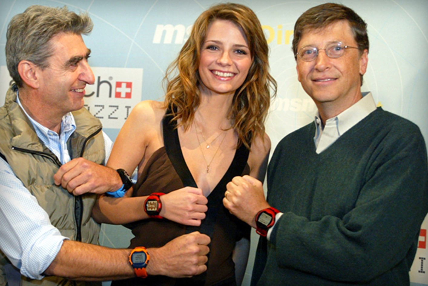
Microsoft is launching a smart watch that will help with your fitness, according to Forbes. Maybe it’s just the cheesy photo but I want to look at Microsoft and give them a friendly tilt of my head, a warm moment’s crinkling of my nose. Microsoft is a gigantic, astonishingly gigantic corporation yet it acts like a little kid, “we can do that, we can do it too, in fact we did it first, yeah, no comebacks, to infinity”.

Apple tends to roll up late to a category of product and then just totally change how everybody ever makes that stuff again. (Look at mobile phones before the iPhone and then look at mobile phones after it. It’s equal parts impressive, laughable and a bit depressing how you can spot a massive seachange and pin it down to the single hour when Steve Jobs unveiled that iPhone.)

Whereas Microsoft, not so much. I didn’t know that Microsoft would bring out a smart watch but I should’ve bet. I did read the top of the Forbes article and know this much for certain, for absolute certain: whether it was a leaked report or a formal Microsoft press release, it would still end with information that the company isn’t saying when it will be released or what it will cost. And to think I wasn’t impressed that Apple said “early 2015” for its watch. At least they gave a starting price.

Here’s Forbes, doing its thing:

Microsoft MSFT +2.08% is gearing up to launch a wearable device within the next few weeks, Forbes has learned. The gadget is a smart watch that will passively track a wearer’s heart rate and work across different mobile platforms. It will also boast a battery life of more than two days of regular use, sources close to the project say.

That could put it ahead of Samsung’s Galaxy Gear smart watch and Moto 360 which both need to be charged around once a day. The wearable will hit stores soon after launch in a bid to capture the lucrative holiday season, a timeline Apple AAPL +1.46% was reportedly targeting before it delayed its own Watch to early 2015.

Forbes first reported in May that Microsoft was working on a smart watch that drew on optical engineering expertise from its Kinect division, and which would sync with iPhones, Android devices and Windows Phones. It is unclear what Microsoft will name the device, or what it will cost at retail

Microsoft Plans To Launch A Wearable Device Within Weeks – Parmy Olson, Forbes (10 October 2014)

Read the full piece.

Here it is: the novella-length review of OS X Yosemite

You know whether you’re going to read this or not. Each time Apple releases a new operating system, John Siracusa reviews it at length. Specifically, at novella length. Typically he takes 40,000 words to say what Apple’s heavily illustrated web page does.

But Siracusa is not Apple and Siracusa is also serious. This time out, he practically leads with a complaint:

For the most part, a new look for an operating system doesn’t need to justify itself. It’s fashion. We all want something new every once in a while. It just needs to look good. But things start to get complicated when fashion butts heads with usability—then we want reasons.

OS X 10.10 Yosemite: The Ars Technica Review –John Siracusa, Ars Technica (16 October 2014)

Do read the full piece. As ever, it is very interesting and really well done. I would rather that it didn’t come on 25 pages as it feels like that’s done just to get 25 clicks out of you, but as an article and as a read, it is excellent.

What I’ll be buying after yesterday’s Apple announcements

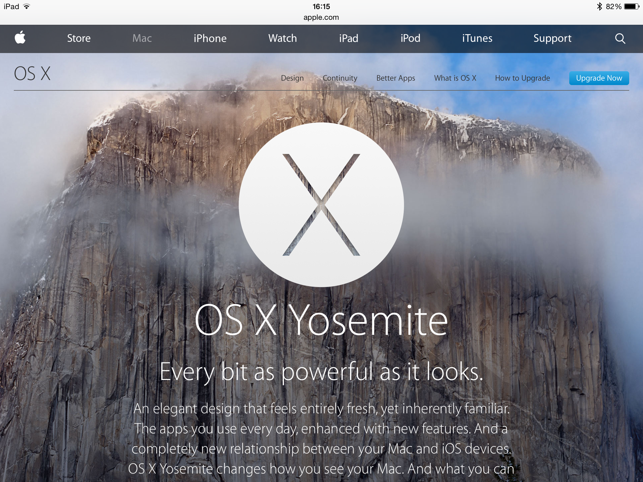
Nothing. That’s no reflection on the new hardware, it is a semantic reflection on how the three things I will take away are all free software. Apple announced OS X Yosemite and I know this is good because I’ve been using it for months.

It’s one of those that, like OS X Mavericks before it and iOS 8 now, you can’t necessarily point to a feature that is overwhelming and an absolute must-have, but you try going back to the iOS 7 or the previous OS X.

Tell a lie. Continuity. I’ve experienced this feature already and it’s going to become normal. Start a message on my iPhone and finish it on my Mac without doing anything in between. Just pop the iPhone down on the desk, if I like, and carry on typing mid-sentence, mid-word on my Mac. Answering calls on the iPad when my iPhone is in another room. Definitely a killer feature.

So much so that if you have a Mac that will run OS X Yosemite, go get it. Available now and free on the Mac App Store.

An update to iOS 8 is also free but coming on Monday. The biggest new feature is Apple Pay and I don’t yet know how that will work here in the UK but for the States, it’s great.

Just to wrap up the three, there are actually two more three free things and Apple calls them all iWork. I honestly don’t know whether anyone else ever uses or remembers that term now as I think of the three parts of iWork as separate things. They’re Pages, the word processor, Numbers, the spreadsheet and Keynote, the presentation software. All very good, now all updated – twice. Once for OS X Yosemite, once for iOS 8.

In late 2012, I think it was the possibility of a Retina-screen iMac that made me look at replacing my ancient Mac Pro. They didn’t bring out a Retina one, not until yesterday, but I am so very happy with the 27in iMac I did buy that I’m not fussed. And I will remain unfussed until I see one in the flesh and covet its screen.

Down at the cheaper end of the Mac line, there is the newly revamped Mac mini. If I were in the market, I’d be looking seriously at that.

Still, who knew that Apple’s advertising line for yesterday’s event would be a gag? “It’s been way too long,” it said, and I don’t know what people expected but not that it was a reference to the iPhone 6 launch a few weeks ago.

Scrivener updated to play nice with OS X Yosemite

Apple is expected to at least announce a definite shipping date for the new OS X Yosemite in a few hours and may even do that “available today” tricky the company loves doing. In anticipation of that, the writing platform – I struggle to find a phase for it as it’s much more than a word processor – has been updated to work with the new operating system. It’s also got a couple of twiddles and a temporary stop to your sharing Scrivener documents directly to Facebook and Twitter. Never knew it had that in it.

But then I am a particularly new and light user of Scrivener. Let Bryan Chaffin of The Mac Observer tell you more:

The binary code love of my life—Scrivener—was updated to version 2.6 Thursday morning. The update includes support for OS X 10.10 Yosemite, which Apple is expected to either release later on Thursday during a media event, or announce a release date.

Scrivener is the premier writing environment for the Mac, and it’s aimed at novelists, screenwriters, playwrights, and researchers. The release includes a ton of general bug fixes, as well as a couple of new features specific to Yosemite.

Literature and Latte also included a new import/export option relating to which version of Java gets used, removed Draft, Research, and Trash folder results from searches,and changed the way items dragged to the Binder are viewed.

Lastly, the company said that a 64-bit version of Scrivener was coming in the future. Until that time, Twitter and Facebook sharing services won’t be available in Scrivener in Yosemite.

Scrivener Updated to Support Yosemite – Bryan Chaffin, The Mac Observer (16 October 2014)

Read the full piece.