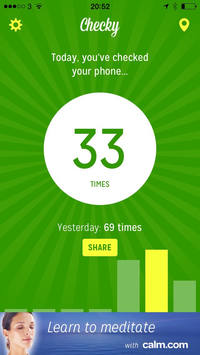
It is not true that I used my iPhone 33 times today

There’s a new free iPhone app called Checky that counts each time you tap your iPhone awake. It is fun and a bit sobering but unfortunately it’s also wrong. Listen, I’m not in denial here. I noticed around 1pm today that it reset to 0.

Go grab Checky anyway. It’s free and if you’ve just got an iPhone 6 or Plus, it might give you a sense of your new-toy addition.

IMG_2815.JPG

More good stuff from iOS 8

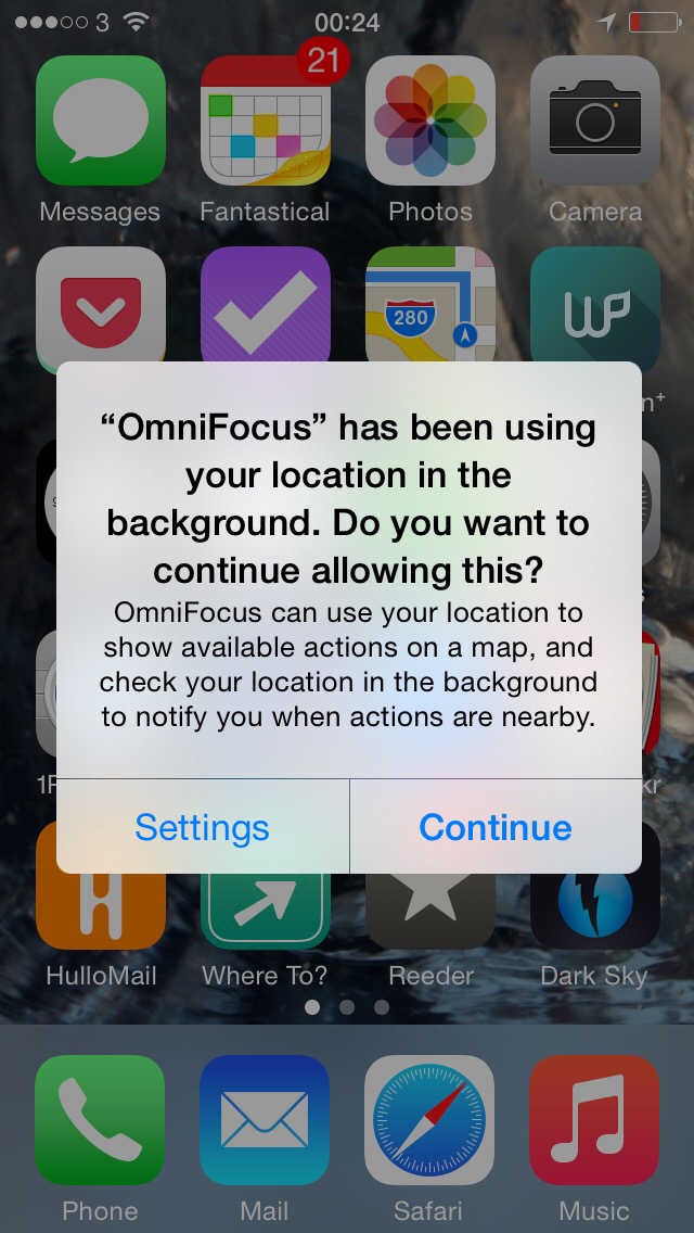
It’s the update that keeps on giving little gorgeous details. This is a favourite of the less-obvious ones: iOS 8 gives you a bit of a nudge about what’s using your phone’s location-aware feature. Often you need that, more often you don’t.

It’s funny how many apps want to use your current location, it’s as if the developers fancied trying it out because it was new. The result is that every app seems to ask you to allow it to keep tabs on your location and over time you say yes enough that it becomes a long list.

Which eats into your battery power because they all keep yelling “are we there yet?” at the phone.

Now iOS 8 will nudge you. Just occasionally and just the odd app at a time. But when it happens, you get this. (And I said yes to this one.)

IMG_2806.JPG

If you can buy only one OmniFocus, get the iPad version

That used to be obviously true. Today, it’s obviously true.

The thing is that in between those two sentences lies a huge amount of movement on the Mac and the iPhone versions which went through revisions to become OmniFocus 2. Now OmniFocus 2 for iPad is out and it’s not only regained this ground as the best version, it now really works on its own.

Officially, all three do. There is no requirement to buy OmniFocus 2 for Mac, iPhone and iPad, you can get any of them. Or none, obviously, but you wouldn’t have be missing out on the single best productivity tool I know.

But in practice, it has been that you start with one version and you are drawn to the others. Partly through how useful each one seems, partly because they work best as a set. Or put another way: they don’t work so well on their own.

The Mac edition has always been the closest working on its own. Its problem used to be that it was just hard to use. Hard to grasp, somehow. Now with OmniFocus 2 for Mac that’s gone, that’s completely gone and the app is as improved in ease of use as it is in features. Today I’d argue that the only problem with the Mac one is that it’s necessarily less portable. You need your To Do list with you everywhere you go because it’s through this that you can make best use of an unexpected delay or a chance meeting.

So if you were intending to buy just one version you would look at the iPhone and the iPad editions first.

Rule out the iPhone one. It is very good. I’ve used it directly perhaps ten times today. I’ve added tasks to it via Siri a couple of times. I’ve now used the new Today View maybe seven or eight times. The iPhone version of OmniFocus is very good and I’d call it essential.

However, it doesn’t include the Review feature that the iPad and the Mac one do.

That’s a really important feature and I think a big omission from the iPhone OmniFocus. It’s how you take a step back and go over every task to see what’s on your plate and think about it all. You do that one or more times a week, then you forget stepping back and instead dive in to do things. It keeps you focused but it also keeps you concentrating on what needs to be done now.

Review is in the iPad version. Now with the new edition, so are improved Perspectives. This is a tool to slice up your tasks in myriad ways so that you can see what you can use and what you can do right now.

OmniFocus comes with some baked-in Perspectives such as the Forecast view that shows you what’s on your plate today plus lets you look ahead to tomorrow and the rest of the week. It used to be that you could only create these Perspectives on your Mac but now, there they are, right there, in the iPad version.

I imagine that OmniFocus 2 for iPad lacks some of the power of the Mac one but in my stress-testing today, I’ve not seen any of that.

So I would say that if expense means you can only really get one version of OmniFocus that it should be the iPad one. But I won’t say that. Because you won’t do it. Whichever OmniFocus you buy, you will pretty soon want the set and pretty soon after that you will be buying the lot.

It’s just that today all three versions are genuinely superb.

Small but gorgeously formed: OmniFocus gets Extensions

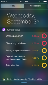
If you have an iPhone or an iPad, just look at this:

New_OmniFocus_extensions_-_iPhone

One of the good things about OmniFocus is that you don’t tend to spend all day in it. You don’t go in, look at your next task, do it and then pop back for the next. It’s like you stock up your head with the things you need to do today and then you toddle off. But it’s handy to be able to check quickly and that’s what is going on there.

That’s the notification screen you get from swiping down on an iPhone. You can swipe down without unlocking the phone so it’s pick up phone, one swipe, read your OmniFocus tasks, done.

This Today view, as Apple calls it, has been around since at least iOS 7 but I can’t be certain when it started because I use it so rarely that I’ve forgotten. This is going to change now.

More details on The Omni Group blog.

Very nice: Microsoft OneNote adds superb iOS 8 feature

The new iOS 8 for iPhone and iPad – which will be available for free from tomorrow – includes a new feature called Extensions. And one Extension is a Sharing one that Microsoft has leapt on for its OneNote app.

If you use iPhone or iPad at the moment, you know that there is usually a Share button somewhere on the screen: it looks like a rectangle with an up arrow coming out of it. When you tap that, you get the option to share whatever is on your screen with anybody you like via email, for instance. Or AirDrop. If you’re looking at a photo you can Share it to your own photo library.

Now you will be able to share it right into OneNote. See something, write something, watch anything, tap and pop it straight into OneNote. It is a great feature from iOS 8 and it is really well adopted by Microsoft.

I’d say that I can only hope Evernote does the same thing but there is more to it than hope: you can be pretty sure that Evernote will. My Share button is going to get crammed with this stuff.

Not including OneNote. I don’t use OneNote. But it’s good touches like this that would make me think about it. Have a look at all this in action in Microsoft’s video.

Don’t update OmniFocus 2 for iPhone yet

You may not have a choice: I just found that my copy has been updated automatically. Reportedly this update was released “inadvertently” and wasn’t intended to launch until iOS 8 arrives in a few days.

The reason I know this is that the update in the App Store says so. It also says that people have been finding problems with it on iOS 7 and that therefore The Omni Group is working to resolve things.

But in my casual use of OmniFocus 2 for iPhone tonight I’ve not hit any snags. Plus, I’m updating to iOS 8 the instant it’s available so the worst that can happen is that I stick to OmniFocus on my Mac and iPad for a little while.

So. If you can avoid the automatic update, do. If you can’t or you haven’t, hopefully it’s a shrug. But at least you’ll know why if you hit a snag suddenly.

What happens when you switch off your smartphone

I mean, seriously switch it off. Keep it as a phone instead of the entire world in your pocket and knocking at your door. Spoiler 1: it works out just fine.

Spoiler 2: I’m not going to find out for myself.

I’m fine with reading about it in a happy piece from someone who has now clearly achieved the kind of zen utopian state we can all aspire to just so long as we never get there:

In 2012, I realized I had a problem.

My iPhone made me twitchy. I could feel it in my pocket, calling me, like the Ring called Bilbo Baggins. It distracted me from my kids. It distracted me from my wife. It distracted me anytime, anywhere. I just didn’t have the willpower to ignore email and Twitter and Instagram and the whole world wide web. Infinity in my pocket was too much.

I wanted to get control, but I didn’t want to give up my iPhone altogether. I loved having Google Maps and Uber and Find Friends and an amazing camera.

So I decided to try an experiment. I disabled Safari. I deleted my mail account. I uninstalled every app I couldn’t handle. I thought I’d try it for a week.

My year with a distraction-free iPhone (and how to start your own experiment) – Jake Knapp, Medium (31 August 2014)

Find out what exactly happened and how to do it yourself, if necessary.

Wunderlist 3 – the best free To Do app?

Usually a question in a headline means the article will conclude ‘nope’ but this time, it’s more ‘perhaps’. When I do The Blank Screen as a full-day workshop, I include a section on To Do apps that begins with why you should use OmniFocus but pretty quickly goes on to why you shouldn’t and what you can use instead.

The reasons you shouldn’t use OmniFocus boil down to two: it doesn’t work on PCs or Android so if you do, there’s no point. And as reluctant as I am to say this since it has been such a big part of my life for a couple of years now, OmniFocus is not for everyone. It’s powerful and it’s complex and it costs a lot more than free.

Personally, it’s worth it. But if you’re just looking into this whole business of To Do apps, it’s hard to slap down a lot of cash straight away. Still, any To Do app is better than none and all of them are better than working on Post-It Notes that you keep losing.

So I recommend Wunderlist. Full disclosure: I’ve barely used it myself as I came across it after I’d swapped to OmniFocus. But I like what I see very much and, more importantly, it’s been recommended to me by attendees of The Blank Screen workshop too.

Now version 3 is out and the makers say:

Ten months ago – after launching Wunderlist 2, introducing Wunderlist Pro and Wunderlist for Business – we set out on a journey that we knew would take some time. Seeing millions of you organize your daily life with Wunderlist, share your grocery lists, track your favorite movies and run your business, we made a plan to rebuild Wunderlist from scratch, with the goal to make it better, faster and most importantly, ready for the future.

Although you couldn’t see the complex technology behind Wunderlist 2’s simple interface, you certainly felt the bumps in the road. Your lists didn’t always sync smoothly from your phone to your computer, you were missing a more modern interface or you wanted Wunderlist to be integrated with your calendar and others apps you were using.

Today, with Wunderlist 3 we are introducing the product we’ve always envisioned. One that sets the foundation for all the great new features and regular improvements that are going to come until the end of the year and beyond. It’s the fastest, simplest and most powerful Wunderlist you’ve ever used.

Wunderlist 3 is here – Wunderlist official site

Take a look at the makers’ video:

And now go download Wunderlist for iOS, Android, Mac, PC and more on the official site.

Why? Microsoft releases celebrity app

So far it is only available on the US iTunes Store but Microsoft has released a free iPhone app that lets you stalk – I mean, track your favourite celebrities. Seriously, why?

Okay, I’ve never bought a celebrity magazine, I have never chosen a film based on the actor in it – or the director, for that matter, though I have because of the writer – so I’m not the target market here.

I’m also not someone who would find the app’s name anything but irksome: it’s called SNIPP3T. All caps and with the 3 instead of an E. Cool. Like a naff password. If you’re interested and if you have a US iTunes account, knock yourself out here.