App Store bug fixed

As of thirty minutes ago, Apple has fixed a serious bug in the App Store. If apps were instantly crashing on launch, try them again.

If they still aren’t working, check for updates and that will sort it out.

It’s not clear how many apps were affected: it wasn’t limited to any one manufacturer.

Late last night I installed OmniFocus on Angela’s iPad – because we have family sharing on she can use my copy – and it wouldn’t launch. Whereas I installed my OmniOutliner for her two and that’s fine.

This is one of those cases where the next time you get chance to look at the problem, it’s already been solved.

So that’s good. But I don’t know, bendgate followed by iOS 8.0.1 and .2, it’s not great.

Evernote radically changing its web version

Even Evernote users forget this: there is a version of it that runs on the web. We forget it because we’re forever in the PC, Mac, iPhone or Android client editions and have rarely any need to go to evernote.com. But we can and it has always seemed as if the Evernote company believed we did. Suddenly, though, there is a reason to.

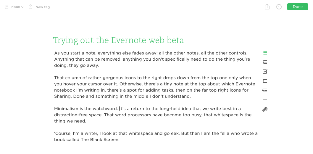
Revealed in beta form this week is a new online version that is fast and is meant to turn Evernote into the place where you do all your writing. I don’t know: the handiness of the client versions is hard to beat. But the new Evernote.com does look very nice:

IMG_9352.PNG

It’s very clean and distraction-free. I quite like some distractions. But if you’re already an Evernote user and you’re okay with using beta versions of software, go to evernote.com and have a look. More details on the official Evernote blog.

New iOS keyboards: TextExpander in use

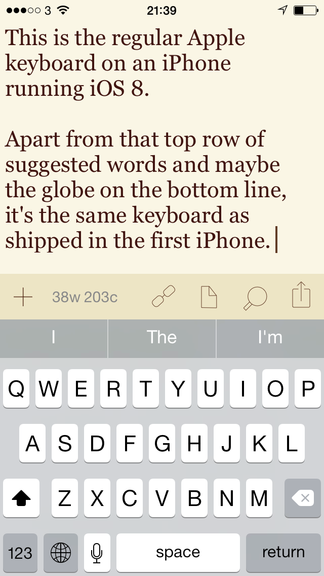
Android users have long, long had the option to replace whatever the standard onscreen keyboard is with anything else they like. Keyboards that are in some way better, if not for everyone then at least for some. That’s cool. The same idea has now come to iOS for iPhones and iPads and that’s cool too.

I just didn’t care. I type fine on the Apple one. Yet if the first thing I bought for iOS 8 was OmniFocus 2 for iPad, the second was the TextExpander keyboard. Switch that on and whatever you’re doing on your iOS device, you can instantly call up every snippet of text you use a lot or just want a lot or just always misspell.

No question: I was going to buy that TextExpander keyboard and I was never going to look at the Apple one again.

But.

All this about using TextExpander snippets where you couldn’t before – such as Mail or any Apple app – is true.

Yet.

I just don’t like it.

The TextExpander keyboard itself saves you all this time with expanding out snippets of text that I use a lot but then it loses me far more time because it is substantially harder to type on. The overall QWERTY keyboard is smaller than the regular Apple one but also each key is remarkably smaller and harder to hit.

I make far, far and three times far more mistakes typing on that TextExpander keyboard. And what you gain in its snippets you lose with the autocorrection and suggested words. There are no suggested words and ‘d like to say that there is no autocorrection but every now and again suddenly I will get a correction automatically applied.

Plus, getting this keyboard means both downloading it and setting it up. The final stage of setting it up is to tell your iPhone that yes, you want the TextExpander keyboard to have full access to your device. Fine, but that option doesn’t appear at all until you’ve been in once, set up everything else on the keyboard, come out and gone back in again.

And then regularly, even routinely, you will swap to the TextExpander keyboard and it will warn you that you haven’t set this full access up. Oh, yes, I have. Oh no, you haven’t.

I suspect that’s a a bug at Apple’s end but the fact that I get it is often is probably tied to how I don’t, afterall, stick with TextExpander’s keyboard. I swap back to it to do a particular complex snippet, then I return to Apple’s own where I can actually type.

That can only happen when you’re using the onscreen keyboard: I’m writing now on my iPad using a keyboard case and it is impossible to use the TextExpander keyboard or switch it on so that I can use my snippets.

So it’s a great idea but it has this first version bug which is probably Apple’s, it won’t or can’t use the regular autocorrection service and the keys are tiny. I think it’s also an ugly keyboard.

Which means I’m a bit disappointed. I wasn’t interested in iOS keyboards before but I am very interested now and it is a disappointment.

TextExpander’s keyboard extension comes with the latest version of the app, which costs £2.99 UK or $4.99 US.

IMG_0729.PNG

IMG_0730.PNG

Evernote for Mac gets needed update

Short version: Mac users who got Evernote from the official site, go back and get the new one. If you got it from the Mac App Store, the update will be with you soon.

Longer version. If you’re an Evernote user then you tend to think that it is great but you have either one or two specific concerns. The one that everybody has is that starting a new note is slow. This is why there are a slew of iPhone apps that do nothing but quickly launch so that you can type something, then squirts your text into Evernote while you go off doing something else.

It’s also why a very welcome iOS 8 Extension is own controls for creating new notes. By itself, that doesn’t make the process much faster but we’re talking nuances here anyway: if it were that slow to start, we’d never start it.

The second concern is chiefly for Mac users. Evernote for Mac could get in knots and become frustrating to use for its speed issues, for how fiddly its tables were.

But I get to say could, past tense, because I’ve been running the updated release all morning and it’s great. From the Evernote blog:

You know what’s better than adding a new feature? Making a bunch of existing ones a million times better. That’s what today’s Evernote for Mac update is all about.

For months, our Mac team has been quietly rebuilding every underlying aspect of the app. This allowed us to tackle speed, sync, and editing in a holistic way rather than piecemeal improvements. On the surface, things look more or less the same. Hidden beneath is an entirely new Evernote, designed to put a smile on millions of faces.

Evernote for Mac: Better Note Editing, Faster Sync and 100s of Fixes – Andrew Sinkov, Evernote blog (22 September 2014)

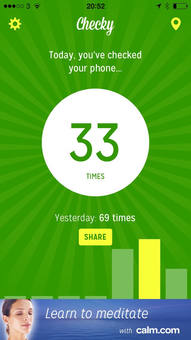
It is not true that I used my iPhone 33 times today

There’s a new free iPhone app called Checky that counts each time you tap your iPhone awake. It is fun and a bit sobering but unfortunately it’s also wrong. Listen, I’m not in denial here. I noticed around 1pm today that it reset to 0.

Go grab Checky anyway. It’s free and if you’ve just got an iPhone 6 or Plus, it might give you a sense of your new-toy addition.

IMG_2815.JPG

Facebook sure loves your iPhone’s battery

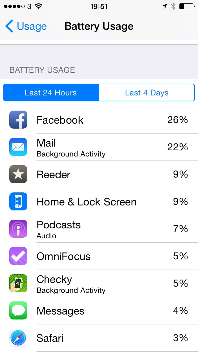
Previously… the Facebook app was shown to be a bugger for sapping your iPhone battery for no damn good reason. It’s still doing it. Ever since learning that about the app, I’ve had a habit of killing it each time I come out.

To be fair, I also kill it because I’ve had people believe I was online when I wasn’t. They got quite ratty.

So that was two good reasons to force-quit the Facebook app and I did, I do, I will. I’ll just avoid using it much more now.

Because of iOS 8’s great new feature that tells you what’s eating your battery time. Look at this. And tell me I really used Facebook five times more than I did OmniFocus yesterday.

IMG_2814.JPG

Location challenge: Localscope vs Where To?

There are many apps that tell you what’s around you or how to find various types of places. The very first and still one of the very few reviews I’ve done on the App Store is for one such app called Vicinity. I still like the title.

You can’t see my gushing review – I’ve just looked for it and it’s gone – and I’ll not give a link to Vicinity because by now you’d be wasting your time. It hasn’t been touched in a couple of years where some of its rivals are even now being iOS 8-ified.

There are two that I like so much I keep swapping between them. At any time, one will be on the front home screen of my iPhone but it’s 50/50 which it will be.

Call it 70/30 now.

Because I’ve just changed back and this time I think it’s going to stick.

But first, let me tell you the contestants so that you can ignore me and just go straight to getting them both yourself. In the green corner we have Where To? for iPhone and in the white corner we have Localscope. Both are very good. Both earn a place on my home screen – just never at the same time because when are you going to ask two different apps where the nearest theatre is?

When you’re testing them out, that’s when.

Both apps work in much the same way. You type in what you want to look for – supermarket, ATM, I don’t know, airport, bank, anything – and these apps show you the nearest ones in order of distance. Then when you’ve got that list, they can hand off directions to your Maps app or they can give you more details about the place.

So that’s four crucial things: 1) searching, 2) finding, 3) directions and 4) details. Let’s throw in 5) other bits too.

Searching

Both apps let you type in a specific keyword or pick from a list. With Where To? the app starts with a big circle containing broad types of categories like food or shopping. With Localscope you don’t get anything. Tap on the search box at the top and then you do, you get a list of categories. I think Localscope loses for being less immediately obvious but it also wins for how that list of categories becomes a history of what you’ve searched for.

You previous searches appear at the top, the categories are below. In my case, since I use it so much, the categories are way, way, way below. But they are there.

I most often search by specific name so this has appealed to me more than categories. Plus, Where To?’s categories are shown in the circle by icons. If you want, say, a hotel, do you tap on the shopping basket icon or the knife and fork one? Is it the Bafta-like drama and comedy mask meaning entertainment? Or the spanner meaning services?

Actually, hotels are under the icon of an aircraft, which stands for travel and transportation.

It makes sense but I regularly, regularly would stare at those icons and just have to go around all of them until I found it or did a general search. I ended up doing a general search a lot yet compared to Localscope, that felt like a bit of a pain. Where Localscope’s search is a box at the top, Where To?’s is a magnifying glass icon so it’s a tap there before you can start writing.

I can’t remember how Localscope looked before its iOS 7 incarnation so maybe they were more evenly matched before. And the reason for talking to you about all this today is that Where To? has just been updated to the iOS 7/8 look. It hasn’t changed or improved the magnifying glass search button nor has it made the icons any clearer to understand, but it has introduced a one-button Favourites option. Tap on that and you can ignore the icons circle entirely in favour of your own selection of broad terms like hotel.

2) Finding
I don’t know where Where To? gets its information from. I do know that Localscope gets its from Foursquare, Instagram, Twitter, Facebook, Flickr, Google, Factual (whatever that is), Yelp, Wikipedia and YouTube. There’s possibly more, these are just the ones I’ve kept on my copy.

I know it uses all of these because that is a key feature. Search for something and it will return the nearest one – I’m guessing via the Google part – but wait a moment and it will also return details from all of these services. So you’ll see a great review of a hotel on Yelp or you’ll see a twitter warning that environmental health officers have just been spotted there and they don’t look happy.

No doubt, Localscope integrates with many services and Where To? doesn’t appear to. But it must get something from somewhere because Where To? does include a photograph of a venue if you tap in far enough from the top level list.

Localscope is very useful for giving you an idea of how popular and/or expensive a local hotel is.

But ultimately it loses for the unbreakable fact that its results aren’t as good as Where To?’s. I was once trying to work out whether I was better off walking to the BIrmingham Rep or waiting for a bus. I knew where the Rep was, it came down to a question of how far that is to walk. So I asked both Localscope and Where To? for theatres.

Both returned a lot of results but Localscope’s didn’t include the Rep where Where To’s did. The End.

Except searching for the words “Birmingham Rep” were poorer on both. Both got it but so far down the list that you’d give up. You’d imagine that an exact match on a search would make that top of the list but in both cases distance wins. On Localscope, trying this right now, that means it thinks I am more likely to be wanting something called DotComSecrets Birmingham.

On Where To? a specific search for “Birmingham Rep” must mean that I want to go to Birmingham first. I can’t fault its logic there. But it’s a big city.

So neither is as fantastic as you would hope but Where To? wins for including places you’re looking for. Mostly.

I found the trick with Localscope was to wait for a bit, let it go through all its sources and then you scroll through them all. If you know what you’re looking for then you may well spot it in there somewhere. You’re stuffed if you don’t know, though.

3) Directions
Localscope threw me at first and for quite a while because its option to get directions is far down the long lost of results. But once you know it’s there, it’s quick enough to get to it and it hands off the address details to your choice of whatever map applications you have.

It’s a similar story in Where To? The directions detail used to be more obvious than in Localscope but in the latest Where To? it’s an easy-to-miss button toward one side of an photograph of the venue.

4) Details

Where To? has a nice display of addresses, phone numbers, and links to websites. Localscope has all of that plus a weblink to a page of more information – which is rarely very useful.

In comparison, Where To? now pulls in a description of the place you’re looking for and shows you that on the page without you having to tap through to anywhere else for it.

Plus, I just searched for my nearest Apple Store and Where To? also displays its opening hours today. I would’ve sworn to you that I’d seen this on Localscope too but I’m looking at both right now and can’t see it.

5) Other bits
I prefer the look of Localscope and until about three hours ago when I bought the new version of Where To? I greatly preferred it. Where To? has been stuck in a wood and leather look for a long time and Localscope’s grasp of the iOS 7 design ethos is part of what convinced me I liked that newer look.

Now Where To? has been iOS 7-erised too. It’s not as overt and obvious as with Localscope but it looks a lot better.

Where To? just loses out a bit on the look and feel plus a lot for how its icon is of a great big Exit sign – and I therefore keep thinking that’s its name. Exit might even be a better name as searching for the words “Where To?” can get you a lot of matches before you find this one.

Conclusion
Both are very good. Localscope looks and feels better; Where To? has recently been radically revised and its appearance is greatly improved.

But for accuracy and usefulness of its lists of what’s around you, Where To? wins. That’s what I have today swapped back to.

For now.

Localscope costs £1.99 UK or $2.99 US and Where To? is £1.49 UK or £1.99 US.
New on the App Store: Bundles of Apps

We’ve had box sets of films and TV series since there were any boxes to put them in yet it’s taken billions of downloads of a million apps before we’ve had the advantage of bundles of them.

The idea – new to the revamped App Store in iOS 8 – is that you can get four or so apps from the same developer and save a little bit of money over buying them separately. Only a little bit, but.

Go to the App Store today and you’ll see a banner ad for app bundles. Take a look.

But easily the one that leaps out at me is the Omni Group bundle. The Omni Productivity Pack contains:

• OmniFocus 2 for iPad
• OmniOutliner for iPad
• OmniPlan 2 for iPad
• OmniGraffle 2 for iPad

Currently that bundle costs £94.99 as opposed to a total of £111.93 if you bought them separately. So that’s a saving of £16.94 which is not to be ignored. But in each case this gets you the standard edition of the apps and it costs more for the Pro versions.

But look at me: I already own OmniFocus and OmniOutliner. For people like me, Apple’s borrowed its pricing model from TV series: I can “complete my bundle” for £53.01. To buy the apps I haven’t got, OmniPlan and OmniGraffle would otherwise cost me £69.98. So that’s a saving to me of £16.97.

I don’t need either OmniPlan yet or OmniGraffle maybe ever, but these are the kinds of savings the new idea brings and that’s got to be good.

Now the great, the great and the not so great of iOS 8

All day I’ve been turning to my iPhone or iPad to do something and finding it subtly different because I’ve taken the free upgrade to iOS 8. And finding it subtly, slightly, gradually and superbly better:

• It’s easier and quicker and clearer to tell Apple Maps you’re walking instead of driving

• Voice iMessages. I had this on WhatsApp when I was reviewing that and thought it a nice idea but, meh, I’ll never remember to use it. Today, the first day it’s on iOS 8, I sent half a dozen voice iMessages, barely having to think

• “Hey Siri, take me home”. Just saying that aloud in the car and finding Siri firing up the map us unnatural

• Recent and favourite contacts. Double tap the home key to switch to another app and along the way there are icons for the people you speak and email and text with most often. Tap on one then text, phone or email them

• Today View. Being able to see my current OmniFocus To Do tasks and tick them off. Being able to launch quickly into Evernote right from there.

• Swipe that Email Down. Push your reply down out of the way while you peek to see what’s just come in to your inbox

• Sharing. Sending a webpage to Pocket, to Evernote, to OmniFocus and being able to add details before it goes

• Using 1Password from within Safari.

• Quick deleting emails with swipes

• Spotlight searching looks through your phone, your email, your browser history and the web and Wikipedia

That’s ten things right there. The killer thing for me is that I know there is more yet they’ve already become so familiar I can’t remember to question whether we’ve always had them. I used an iOS 7 iPad earlier this evening and it just felt old.

So, you know, reading between the lines here, I’d say I think iOS 8 is a hit.