Okay, I’ll bite: the organisational habits of highly successful people

I’m intrigued, cautiously intrigued. (I type that and my heads it in a Bond, James Bond voice. Let’s find out whether highly successful people do this.)

Setting goals, both short and long-term, is one of the simplest ways that highly successful people maintain focus and direction in whatever they do. Take the example of Oprah Winfrey, whose success has been defined by setting multiple goals.
In addition to setting their sights high, highly successful people incorporate deadlines and due dates into the structure of their goals. This ensures their short term goals are met regularly, and long term goals are worked towards steadily and methodically.

The Journl Blog – Inspiring Better Organisation – no author listed (what is it with not listing writers?) (24 October 2012)

Read the full piece with lots of quotes from the aforementioned highly successful people. I’ll leave you to see what they quoted from me.

The case for ditching Microsoft Office if you have a Mac

Well, I think this is part of the case. It’s a fine enough argument but maybe it’s not stating anything new: Apple’s Pages, Numbers and especially Keynote are in many ways better than Microsoft Word, Excel and especially PowerPoint. For better, I don’t just mean free or that they are installed when you buy a new Mac, I mean actually better.

That’s an easy claim to make when one’s work is not stretching the limits of what word processing, spreadsheets or presentations are doing. Except Keynote vs PowerPoint. That’s a separate argument, less because Keynote is as good as it is and more because PowerPoint isn’t.

But it’s this kind of more-complex, depends-on-your-needs argument that maybe this article from Apple Gazette lacks. But for an otherwise good laying out of the situation, take a look:

For years, Microsoft Office has been the gold standard for productivity software for business. If you took an inventory of the applications on most computers used in the corporate environment, chances are you’d find some version of Word, Powerpoint, and Excel installed on the majority of hard drives. MS Office has gotten so ubiquitous in fact, that it is installed on more than 85% of business workstations worldwide, making it as dominant in the productivity software space as Window is amongst operating systems. Fortunately, Apple has created a viable alternative to Office in the form of Pages, Numbers, and Keynote, collectively known as iWork. These apps provide most of the same functionality as Microsoft’s software, but with the simplicity and ease of use that we expect from an Apple product. Here’s iWork is the better software solution for Mac users.

Why Apple’s Productivity Apps Should Replace Microsoft Office for Mac Users – (no byline), Apple Gazette (24 October 2014)

Read the full piece.

Thirty years of new resolutions

Just wow.

When first released in 1984, the Apple Macintosh shipped with a black-and-white 512 x 342 display. Fast forward 30 years to the release of the iMac with Retina 5K display, which ships with a 5,120 x 2,880 display with support for millions of colours. That’s an increase from 175,000 pixels to more than 14.7 million – an 8,400% increase. 80 of the original Macintosh displays fit within a single Retina 5K display1.

The stats are astounding, but to really put things in perspective, take a look at the image below, showing the original Macintosh display overlaid on a promotional image that Apple has been using to showcase the massive size of the new iMac’s display.

The Difference 30 Years Makes: iMac with Retina 5K display vs. the Original Apple Macintosh – Kent Akgungor, Things of Interest (22 October 2014)


Here’s a small version of that image but go read the full piece for a better shot and also an explanation of how it works and why it’s only sort-of true. Read the full piece.

It’s the little things

I’m spending today running a workshop for the Federation of Entertainment Unions: that means I’ll have people from the Writers’ Guild, the Musician’s Guild, NUJ and Equity. It’s a day-long workshop version of The Blank Screen and I’ve done it many times but it is always different.

I don’t mean because every person is their own special little snowflake and the day runs in different directions, though it does so I suppose they are. I mean it’s different because I change it.

Sometimes I’m just changing the presentation and the workshop plan because something new has come up and I might do that any time between these days. But there is also one thing that I don’t write and don’t change until the morning, until just before I leave.

It’s just this. I spend a lot of time in the workshop talking about To Do lists and how to make them something you use and that you enjoy using rather than something dreaded that you avoid. And I feel obligated to include my real To Do list. So I do, I add in a slide that (today) has this:
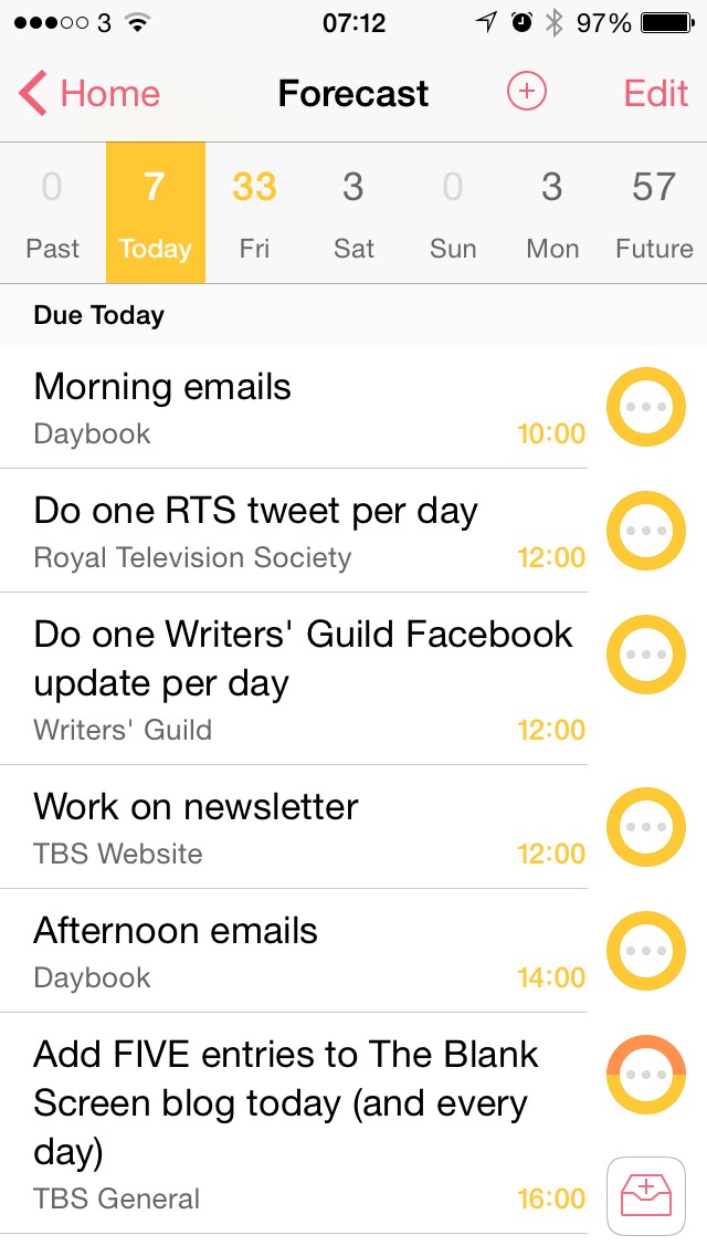
What I like very much is the simple thing that is doubtlessly complex yet I don’t have to care, I can just relish it. This. I added that To Do list image and I made various twiddles to the presentation on the 27in iMac in my office. I present from a MacBook Pro. And as I turned from the iMac to set up that MacBook Pro, my new presentation was already there. It was already on the MacBook and I didn’t do anything. Didn’t AirDrop it across, didn’t use a USB thumb, didn’t email it.

I wrote it on the iMac and it is on my MacBook as if I wrote it there.

And here’s another thing. I’m writing to you in Drafts 4 on my iPad and that image above of my To Do list comes from my iPhone. I didn’t send it over to my iPad, didn’t copy it, didn’t do anything. It’s just there where I need to use it.

As I say, this is doubtlessly complex stuff behind the scenes but to me, it’s just that everything I need is where I need it, when I need it. I think that is heady and gorgeous stuff.

Refresh gets a spot on Notification Centre (still USA-only)

Refresh is the app that seems a bit mystical when it presents you with a dossier (its phrase) about the person you are just walking up to meet. Mystical and maybe a wee bit creepy. But sometimes also so useful. Useful enough that I keep mentioning it to you even though it remains a US-only app.

And useful enough that yesterday’s Forbes roundup video of best productivity apps included it, though the presenters didn’t seem to glom onto the creepy mystical element so much. I’m just sensitive.

It’s also not quite useful enough to be as useful as you’d expect. I reviewed it months ago and forgot I had it until some many weeks later when it chimed up with one of these dossiers. But it does it for this person and not for that, it does it before this meeting and not that. And it hasn’t chimed a dossier at me in two months. Enough so that I forgot I still had it, until I got this email telling me about a new update:

There’s a new Refresh for you to try.

We updated the app you know and love to take advantage of new features in iOS 8. You can now install a Refresh widget in the Notification Center to see who you’re meeting each day, and insights display beautifully on any screen including iPhone 6 and iPad!

To install the new Refresh widget, update your app and then click “Edit” on the bottom of your Today screen. Click the green plus next to Refresh and you’re good to go!

Refresh now available as a Notification Center widget! – email from Bhavin Shah, Refresh (21 October 2014)

I am slightly confused by this: the Refresh app itself says you need to update to the new version and then delete the old. Cool. Happens all the time: a brand new app downloads and until you delete the old one, you’ve got two on your iPhone and it all ends in hilarious consequences. But this time, once I’d tapped its update button, there was no second copy. Can’t see where the old one is to delete. Actually would be hard-pressed to tell you for sure that what I have is the new version, except that it does have that bit in notification centre.

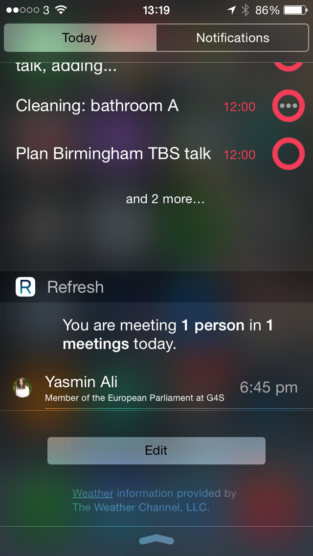
Which on my iPhone right now looks thisaway:

I like that it’s Yasmin I’m meeting because she’s an author who routinely fakes all her personal information on Facebook and Twitter and Linkedin so that description of her is nonsense.

If you’re in the US or, like I do, have a US iTunes account then you can get Refresh here and it’s free.

I’d need the buttons to stay down

This looks like a slice of our past and you want it, you want to try this.

Remember what it felt like to press play and record at the same time? Back before streaming and downloading and blogs and YouTube, music meant CDs and Smash Hits and the NME and taping off the radio — and this delightfully retro Raspberry Pi creation recreates that physical connection with music for the 21st century.

Raspberry Pi is the low-cost computing system that allows you to build all kinds of bespoke gadgets from basic components, teaching novices how to code and limited only by your imagination. British developer and maker Matt Brailsford has used the DIY system to combine the technology of today — Raspberry Pi, Spotify, and NFC tags — with the retro tech of yesterday to build a media server that streams different playlists when different cassette tapes are inserted.

Rewind: This Raspberry Pi cassette player plays Spotify tunes from actual tapes – Rich Trenholm, CNET (21 October 2014)

I don’t miss cassettes except that I guess that’s a lie, I see this and I do. Lots of memories, though a key one is of how the buttons would stay down when you press them:

Read the full piece.

Just say no, for the love of god, say no

We writers have a habit of bowing to authority, which seems a little strange given our jobs and how we avoid regular employment. But if we pitch an idea to a producer, we feel as if we are then waiting for word on high. We do that thing of wondering whether we can dare chase them, whether we can contact many producers at the same time or will we offend them by going to several.

The trouble is that we end up convincing producers and they treat us like that. They’ll get back to us or they won’t, they’ll deign to answer or they won’t. This is changing, this is dying out and I’ve been fortunate with the producers I’ve got but let us and them all remember that this is a job. We both hope that it will also be art, but it’s a job.

I just had a thing where a sudden change meant I needed to find a different producer and I did. But time was tight and I told him straight, if you don’t fancy it, just tell me and I’ll find someone else.

I’ve yet to hear back from him. And there’s little point now as the deadline is gone. What annoys me is that the idea was good and yet it might as well be forgotten forever: there’s a very specific time that this type of thing can be pitched and when that comes around again, even I will think my idea is stale.

We dread rejections but we cope with them. I think some producers dread rejecting us, but for the love og god, get over it and just tell us no. Everybody wants a yes, nobody wants a no, but we can’t do a damn thing without one or the other.

It’s real, ish: Kickstarter has a Hoverboard

No, really. With an ish.

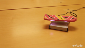
Screen Shot 2014-10-22 at 07.23.46

That’s a grab from a video Re/code shot and its accompanying article explains:

I visited the tiny, cluttered headquarters of Arx Pax [near Los Gatos, California] last Wednesday. In fact, I felt morally and professionally compelled to after reading the subject line of an email early last week: “Sneak Peak: Working Hover Technology.”

My mind immediately leaped to the elaborate hoax that Funny or Die pulled off earlier this year, when a video purportedly showing skate legend Tony Hawk riding the “HUVr” product went viral. But I was assured that, in this case, there were literally no strings attached — and not only could I see the hoverboard in person, I could ride the thing.

So let’s go ahead and get this out of the way: Yes, it works. But with a very, very big caveat.

Unlike the hoverboard that Marty McFly steered around the town square of the fictional Hill Valley in “Back to the Future II,” this one can’t just float above any old solid surface.

It’s not quite Marty McFly, but the Overboard is here (video) – James Temple, Re/Code (21 October 2014)

It’s like a MagLev train: magnets in the hoverboard are repelled by magnets in the surface underneath it. There aren’t a whole lot of surfaces with magnets in: that’s the full and complete ish part of the story. But the Kickstarter is not for a finished Hoverboard per se, it’s for the HENDO Hover Engine developer it. You get the tech, you come up with a way to use it. So that’s a big ish but Re/code’s video has an impressive example of it in use with a small skateboard course and a hoverboard that looks like the Pitbull one from Back to the Future Part II.

Do check out the Kickstarter page too.

Hmm. Samsung Galaxy Note 4 vs Apple iPhone 6 Plus

The site 9 to 5 Mac has done a comparison video and – stop right there, did you just think that there might maybe perhaps be a teeny bit of Apple bias in a site called 9 to 5 Mac? And if not on that site then on this, given that thirty seconds reading The Blank Screen will tell you Apple is better for productivity? But no. The 9 to 5 video does a good job of stepping away from the platform bias that both sides of the iPhone vs Android camps have.

(Just as an aside, isn’t it interesting how there can be this schism? I can’t comprehend how you have the patience for Android or why you can enjoy the necessitated twiddly fiddling to get it to work and Android fans are equally unable to understand what it’s like having a phone that works. I’m at times quite passionate about my kettle but I couldn’t even tell you who its manufacturer was, let alone when the last time there was an upgrade to its firmware.)

So. The 9 to 5 Mac video is fair, balanced, and therefore not all that exciting. I think it’s a good watch if you’re in the market for a Samsung Galaxy Note 4 or you’re in the market for an iPhone 6 Plus: it shows you everything you need to know to make your choice, you just have to sit through the bits about the other phone.


Apple’s iOS 8.1 is out and adds some goodies

I’ve a friend I like a lot who doesn’t have an iPhone. I know. But when she texts me, I can be knee deep in my Mac or on my iPad and I’ve got to get out my phone and send her a reply from there. I know, crazy.

As of now, in fact as of about midnight last night, that ends.

With iOS 8.1, when she texts me in her ordinary texting way, my iPhone will get it in its ordinary way but will automatically, unthinkingly, un-setting-up-ily pass that text on to my Mac and iPad. She’ll be there in amongst everyone else I exchange iMessages with.

And I’ll be able to reply to her from there.

So, yes, I’ll type at my Mac and it will pass the text over iMessage to my iPhone and my iPhone will text it out to her but you are reading the only time I will ever have to spend even this long thinking about it. It’ll just be what happens.

You can get iOS 8.1 on your iPhone and iPad now. Open Settings, General and tap on Software Update.