First look: iOS 10

If you have an iPhone, it’s just told you that there is an update to iOS 10 available: say yes. You want it. If you’re buying an iPhone about now, it’s what you’ll get on it anyway. And this is all good: iOS 10 brings new productivity features to the phone and actually makes it feel like a new iPhone.

It always does. Every year, Apple releases a new version of the phone’s core operating system and it looks more whizzy, it adds big and small new features, it takes some features away. And it’s free.

From our productivity perspective, I think there are really two improvements: one that we all get, one that only people with newer iPhones do.

That second one is the quickest to explain: if you have an iPhone 6s or 7, or the Plus versions of either, then you can now just pick up your phone for it to light up. It’s like the Apple Watch: when you turn your wrist to see the time, the Watch shows you the time. Otherwise the screen is off. On these iPhones, this is called Raise to Wake and it would be a trivial gimmick except for the other improvement.

There is now much more information and much more you can do with it on the iPhone’s lock screen. So the screen that used to just say the time and Swipe to Open, now packs in a lot of detail that means you won’t need to open. (Swipe to Open is gone now, by the way, and I miss it. Even after two months of using iOS 10 in the beta programme, I miss the familiar swooshing swipe. It’s gone because of TouchID, the feature that means the phone recognises your fingerprint. That fingerprint, that touch, is enough to unlock the phone without the old-fashioned swiping.)

From the first beta release right up to today, I had found the new information on the lock screen pretty useful. With your phone awake, you could swipe the entire screen to the right and get a series of little widgets in a column. I’ve got my OmniFocus To Do list showing the next tasks on my plate, I’ve got a short weather notification, a calculator, a top news story.

These widgets are the easiest to explain and to understand if you’ve not seen any of this in action: you read that last sentence and you got it. They each show some information that I might want. The End. But they also let me act on it: I can tap a To Do task as done, for instance.

Now that the beta period is over and iOS 10 is available for everyone – if your iPhone or iPad can’t run iOS 10 then you won’t be offered it – things are getting still better. App developers have been releasing hugely improved widgets. For instance, a writing app I particularly like called Drafts 4 has a new one where right in the screen I can read my latest notes or start a new one. OmniFocus is about to be updated with the ability to add a new task right there in the lock screen, without having to find and open the app. It’s not that opening apps is exactly a slog, but the faster you can jot down a task, the more likely you are to do that and then the more likely you are later to do the task.

Back in iOS 8 and 9, I pretty much ignored these lock screen widgets and to the extent that I’m not even sure what they looked like. Over the course of the beta I’ve found myself swiping right to launch an app called Workflow a lot or to read the news. In the 24 hours or so since iOS 10 was officially released and I’ve been seeing just how many apps I use have now been updated, I have the problem of wanting to put too much into this screen.

There’s a point when you’ve got so much and you have to scroll so far to see it all that you lose the benefit of the speed and I am approaching that. Still, right now, I can pick up my phone and tap a button to log expenses (via Workflow), tick off a To Do task and see what the next one is, write a Draft note, see what’s happened to this heatwave we’ve been promised, use a calculator and read the news.

I can do all this – and I do. You will. Once you’ve realised that this is all there, once you’ve got it into your muscle memory, you’ll use it.

This all comes from swiping right but there is something you can do by swiping left that helps, too: wake up your phone, swipe left and you’re in the camera. I find I’m so quick using TouchID when I pick up the phone that I’m gone by this lock screen stage but when I remember, swiping left into the camera is handy and fast.

There’s a lot of this swiping going on, though, and it can be confusing. You now know about swiping left and right, but there’s also swiping up. That brings up a control centre that has buttons for switching wifi on and off, turning on the phone’s torch, and another 11 possible things. This control centre comes when you swipe up from anywhere, the lock screen, the home screen or within an app and I use it more than I expected.

I’m only now starting to use something else about it: when this control centre is up on your screen, swipe left and you get music controls. Just play/pause, skip and volume, but often there’s not much else you want. I’ve found that a fast way to pause a podcast when I get somewhere I’m going.

One last swipe. From anywhere, you can swipe your finger down from the top of the phone and you get Notification Centre. This used to be a pointless mess of information telling you things like there was a Facebook message sent to you sixteen million years ago. Now it’s better at showing you useful and recent notifications: if you saw something flash on your screen but you weren’t quick enough to read it, you’ll find it waiting in here.

Swipe to the left on any of these notifications and you get the option to see more, to get more detail, really just to open the app the notification came from.

Then this is either great or confusing, I don’t know: when you have your list of notifications, you can swipe to the right and the whole screen moves over to show you your lock screen widgets.

It took me a while to get used to where things are and even today I’m relearning as newly updated apps are making all of this more useful. In every possible way, iOS 10 is an improvement and it speeds up our work.

Well, nearly every possible way. There is one thing that’s gone and I miss it greatly. Sometime during iOS 9’s year in the spotlight, Apple added a feature to Mail where you could tap to select every message at once and then tap to delete them all in one go. That’s gone. You’re back to having to either delete one by one or mark each one separately, then hitting delete. I have a catch-all mailbox that I check each day for the occasional real message and then want to delete everything else. I remember the pleasure when I found this new option and I am still feeling the pain of it being gone.

One more thing. If you look into this topic of iOS 10 and updates today, it won’t take long before an Android user will tut and say that their phone of choice has had all these features before. Say this to them: “Show me on yours”.

It’s peculiar how important our phones have become but they are perhaps the one device that makes us more productive than we ever were. And now iOS 10 helps us more.
First peek: Final Draft 10

A new version of the screenwriting software Final Draft for Mac and Windows has just been released. I was on the beta test program but still I’m going to call this a first peek: call it a full and frank review of the price rather than of the program itself.

The quick summary is that this is definitely the nicest version of Final Draft we’ve had and it does add new features but nothing that would make you pause with your mug of tea halfway to your open mouth. I don’t think it’s fair to dismiss the new features but we’ll come to know whether they’re good or just gimmicks when we’ve been writing scripts in the app.

Script formatting hasn’t changed since time began and the ways in which Final Draft speeds up that part of the job can only go so far. They’ve gone so far. It’s unlikely that there will be some enormous new feature that you must have but there is something that I want. I want Final Draft to stop betraying the fact that it’s written for both Windows and Mac: it has always felt lowest-common denominator, it has always felt like an ancient PC app.

Of course it’s great that the app is on both platforms, the problem is that doesn’t feel as if it’s on either: it previously hasn’t kept up with Microsoft or Apple’s operating system.

Final Draft 10… still can’t quite shake that. Oddly, although the Mac version does still look like a Windows app, it’s still not as ugly as the actual Windows version.

It’s better. It’s getting there. And the reason for buying Final Draft at all remains how great it is at helping you zoom through a scene: forget writing out each character’s name in a fight, just write their line, trade their blow, hit return and give the other guy some words. This is the key part of the software, it is the key reason why it’s used: it means you can write down scenes just about as fast as you can hear them in your head.

If you don’t already have Final Draft, that would be the reason to get it. There are these new features, though. It is features, plural, as it really comes down to two. I’m being harsh: the makers would point to more but then they are obsessed with how Final Draft paginates and every time they boast about that, I think of how it is substantially less important than it was.

The two features that are worth examining begin with the story map. Sorry, Story Map(TM). They must be serious about it, they’ve trademarked it. Click on this and along the top of your screen where you might usually see a ruler, you get a timeline. Every scene has a mark on that time line and significant ones get bigger blobs. Click anywhere to go that screen. Or just look at the spacing between what you’ve said are the bigger blobby scenes.

Then there’s the Beat Board (also trademarked) which is to modern screenwriting what the cork board was to it before. If the cork board is for a single writer to plan out a single project, the beat board is more for a room of writers breaking a TV series.

That said, Final Draft still feels like an app for an individual, not a group. But there is now a collaborative feature: I’ve yet to test it out in anger or even really at all so I can’t tell yet whether it’s Google Docs-level collaboration. It’s certainly a way for many people to see the same script and exchange instant messages about it.

If you’re new to Final Draft then note that it retails for £188.40 ($249) but is temporarily on sale for £127.37 ($169. Education or military people can get some reduced price and upgrades can get version 10 for £75.36 ($99.99), temporarily reduced to £59.54 ($79.99). The reason for the odd Sterling price is Brexit. It will vary every time you look at it, but the trend ain’t going down.

You can buy the software from the official website where there is also a trial edition of both the Windows and Mac versions.

You can’t get a trial of the iPad and iPhone versions of either Final Draft Writer or Final Draft Reader. Never bother with Final Draft Reader. Just don’t. The Writer iOS app has been updated to work with Final Draft 10 features and if you already had it lurking away on your iPad or iPhone, you’ve just got the update for free. If you haven’t, then you need to buy and it costs approximately £23 ($29.99) temporarily discounted to £7.99 ($9.99). You can get this iPad and iPhone version here.

Okay, wait one more day to buy from Apple

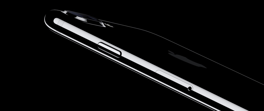
Side view of Apple iPhone 7

Strictly speaking, you could wait as long as you like: it’s less that there was anything so compelling that you must wait for it, more that what was announced is much better than what you’d get in the shop yesterday.

You can’t get any of the new products today, nor really tomorrow either. But from Friday 9 September you can pre-order the iPhone 7 or iPhone 7 Plus. Usually I twitch if I don’t immediately tell you a price but with phones it’s complicated: many or most people buy them subsidised on a contract and not always predictably so. But as a quick guide, whatever you would’ve paid for an iPhone 6s or iPhone 6s Plus on Monday, that’s what you’ll pay for the 7 range from Friday.

From a productivity perspective, the significant improvements are in the battery life, performance and also capacity. In reverse order, the old small 16Gb model is no more and this can only be good. Then performance is fast. Faster than last time. Do you like the level of detail you’re getting here? And lastly the battery life is claimed to be two hours longer, on average, for the iPhone 7 and one hour longer on the iPhone 7 Plus.

There is also a radically improved camera which doesn’t happen to make much difference to what I work on but your mileage may be very improved.

Have a look at the official Apple site for all the details I’ve skimped on, all the other details I’ve skipped, and also the changes to the Apple Watch. I am placing a call to Ms Bank Manager and Mr Claus in order to get myself a jet black iPhone 7 Plus and a ceramic Apple Watch Series 2 but the big advantage in the new Watch is coming to the old one too. The Apple Watch on my wrist is already improved because I’ve been testing watchOS 3 which will be released in public shortly and genuinely makes the watch feel like new.

The new Series 2 Watch appears to be faster and to have a brighter screen: I’m not fussed about the screen, the old one is fine. But you know how it is with Apple gear: if it doesn’t look great in the demos, it does when you hold it in your hand.

Don’t buy anything from Apple today

Apple is making an announcement later today – 18:00 BST, 10:00 PDT – and apparently you can find out pretty much everything already by reading rumour websites. I’ve got an easier solution: just don’t buy any Apple products until after the announcement.

You can wait until tomorrow, you know you can. In the meantime, I will be watching the announcement because Apple puts on a bit of a show. It’s exactly the same show every time but it’s usually well done and I usually end up at least wanting to spend some money afterwards, if I don’t actually end up spending some money afterwards.

Times being what they are, ie September, though, you can be sure that iOS 10 will be included in the show and that’s free. It’s been in beta for some months and I’ve grown terribly keen on almost all of it.

You can watch the Apple announcement direct from the company itself right here. One thing about it does give me pause: the last time Apple made one of its announcements I was writing for a website called MacNN and had a really good time covering it. It was like being back in a newsroom. Now MacNN is closed and so I’ll be watching today’s Apple news like a viewer again. That won’t change the news and it can’t matter to anyone but me, but it matters to me.

Scrivener vs Ulysses book featured on Mac Power Users

Scrivener vs Ulysses featured on Mac Power Users

My new book Scrivener vs Ulysses – Choosing and Using the Best Writing App is featured in this week’s episode of the Mac Power Users podcast. Do have a listen but be prepared for how you’ll be hooked, return every week and end up buying lots of Apple hardware and software because MPU shows you how to use them.

I speak from experience.

The show has covered Scrivener before but like me and my book, this time it’s topical primarily because of the new Scrivener iPad app. Right now, at last, we have both Scrivener and Ulysses on iPad, iPhone and Mac: these are both excellent writing apps.

But that does make it harder to pick and then I think trickier to get to know the one you choose. Cue my book – but, equally, cue this edition of Mac Power Users.

A year in the making: new blogging book for writers

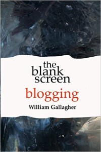
Cover of The Blank Screen: Blogging guide for writers

Buy The Blank Screen: Blogging guide for writers on Amazon

Previously we’ve all faced the blank screen and we’ve filled it with our writing – now it’s time to blog and to blog right. The Blank Screen: Blogging is the writers’ guide to creating a blog, keeping it going and getting an audience. More than that: it’s how to do it all in a way that you’ll enjoy. Because you know this: if you enjoy something you’re writing, that comes through to your readers.

Buy The Blank Screen: Blogging right now on Amazon.

Look me in the eye

Let me guess. Either you keep hearing that you should be writing a blog and you’ve resisted – or you tried one and it was hell. Floundered. You haven’t looked at it in ages and anyway, blogs are dead, Twitter is where it’s at now.

Yes. Twitter is where all the storm of bloggers rushed to and are now happily playing around. Thank goodness. For ages there when blogs where the Next Big Thing, everyone had a blog whether or not they should have. Most were technically perfect with every whizzy web feature you’ve ever heard of and most you’ve never bothered to use. But what they didn’t have is the thing you do.

You’re a writer. By far, by infinitely far the majority of kitten-picture-fan bloggers are not and so, okay, we got some pictures of kittens. We just got nothing else and it was impossible to see blogs as anything but an ego trip for the writer. Certainly they weren’t for the readers.

Cue you. Whatever type of writing you do, however deeply introspective you have to get in order to write it, you are a writer and you write for audiences. That doesn’t just make you qualified to write a blog, it means you will create one that is worth reading.

The reason you keep getting told that you need a blog is that you need your audiences to connect to you but if you write one of those fatuously egotistical blogs, they’ll only come once. I want you to get audiences, I want those audiences to go through your blog to your other writing but I’m also selfish. As much as I’m thinking of you as the writer, I’m thinking of me as a reader: I want to read interesting blogs. I just happen to know that this means I want to read you.

If you’ve already got a blog that you loathed and abandoned, come read my book and you’ll not only revive it, you’ll enjoy reviving it. Honest. If you haven’t done one yet then great, we can start afresh. That does mean starting afresh with the very few technical questions about blogging: there are things you need to know but I want you to know them quickly so that we can get on with the real job and start writing.

The Blank Screen: Blogging has all that technical advice but you will learn that so quickly. It’s really much more about how to create a blog that works for you because it works for your readers. How the blog our editors and commissioners and agents want from us is a fast route to putting off your readers and making you wish you’d got an ordinary job. How exploiting that writer brain of yours is the faster route to a blog you’ll enjoy so much it will take over your writing life.

Okay, we’ll stop it before it gets that good. But only just.

Read how some of the best bloggers walk that line, how some of them have created entire new worlds for themselves with book deals and entire online communities. And read how some of the very finest bloggers write to express and to explore issues that grow them as writers.

Go get the book, okay? There’s a paperback and Kindle edition for the UK right here and the same for the USA over there.

Ha ha: the end of LOL

Hard to tell whether this means text-speak kids are growing up or not but reportedly it’s now rare to see LOL written on Facebook. It’s not that the world is any less laugh-out-loud-able, it’s more that we’re using that archaic but multi-meaning ha.

Facebook’s researchers explain: “The most common are the four-letter hahas and hehes. The six-letter hahaha is also very common, and in general, the haha-ers use longer laughter. The haha-ers are also slightly more open than the hehe-ers to using odd number of letters, and we do see the occasional hahaas and hhhhaaahhhaas. The lol almost always stands by itself, though some rare specimens of lolz and loll were found. A single emoji is used 50 percent of the time, and it’s quite rare to see people use more than five identical consecutive emoji.”

‘Haha’ Has Killed ‘LOL’ Says Facebook – James Vincent, The Verge (10 August 2015)

Read the full piece.

Take notes on paper instead of laptops

But iPads are okay, right? Right?

This final test clarified that the simple act of verbatim note taking encouraged by laptops could ultimately result in impaired learning. “Although more notes are beneficial, at least to a point, if the notes are taken indiscriminately or by mindlessly transcribing content, as is more likely the case on a laptop than when notes are taken longhand, the benefit disappears,” said Mueller and Oppenheimer.

What You Miss When You Take Notes on Your Laptop – Maggy McGloin, Harvard Business Review (31 July 2015)

Read the full piece for exactly what was tested and the – to me – rather distressing reasons for the conclusions.

Handwritten notes and never-ending paper notebooks

Even I like having a new, empty paper notebook. I just can’t read my handwriting. Also, I know I’ll lose it and that irritates me when everything I ever type is saved safely all over the place. Plus, how do people use paper notebooks? How fast do they fill them and then what happens? Have they shelves of these things?

Rocketbook says hang on there, William, enough. Rocketbook is a paper notebook that you scribble away on and its pages are saved to the cloud. Dropbox. Evernote. Google Docs. You snap a photograph of the page with your phone and what is written on the page determines where it’s saved. So handwrite during a meeting, then take a mo to photograph the page and before you’ve put your phone away, the Rocketbook has saved that note to, say, an email that it is even now sending someone.

That covers my problem with potentially losing the book but there is also that business of filling up all the pages. Honestly, this sounds like a joke but it’s serious: put your Rocketbook in the microwave oven and wait for a bit. Every note on every page is erased and you have a crisp, new notebook.

I read that and think you must need special paper: yes, but that’s what the Rocketbook is made of. I read this and think you must need special pens: sort-of. The have to be FriXion pens by Pilot which I’ve never heard of but apparently are common.

There is nothing here to help with my handwriting but that’s my problem. Your pen work is much better than mine, you might love this.

One thing. This is an Indiegogo crowd-funded idea except it’s no longer an idea: it’s achieved its target by more than 3,500%.

Weekend Read – but not on laptops

Last week, at the Aspen Ideas festival, there came an interesting little moment between Kentaro Toyama, a computer scientist, and Jim Steyer, a lawyer and entrepreneur. Both declared that they’d banned laptops and other electronic devices in their lecture halls.

“Many of the students actually appreciate that,” said Toyama, who teaches at the University of Michigan, “because it encourages real discussion, and they know that as soon as there’s a laptop in front of them, they’re going to start Facebooking each other, and that means that they’re not present for the class.”

Steyer jumped right in. “You should know that in my Stanford classes five years ago, I started banning laptops,” he said. “There was no way they were paying attention. They all whined about it constantly for the first three weeks.” He added that his colleague, with whom he co-taught the course, was terrified they’d made the wrong choice. “She was like, They’re gonna just kill us on the reviews!” he said. But by the end, their students, too, expressed gratitude.

The Case Against Laptops in the Classroom — Science of Us

Read the full piece but please print it out first. Concentrate. There will be questions.