Windows version of 1Password updated

You know PCs better than I do: does this sound good to you? Aside from the odd hiccup, I am very much a fan of 1Password so updates are automatically good. It’s just that I read this list of new features and I’m not exactly arrested:

I don’t get to pull ‘chock’ off the shelf very often, but this is a special occasion. 1Password 4.2 for Windows is here with all sorts of new goodies to help you work and play better.

You can use the View menu to hide the Wallet and Accounts groups from the sidebar
Wi-Fi Sync is now clearer about what it’s up to
The password strength meter is much strength-ier
We added Secure Desktop buttons to the Change Password window
The Auto-Save dialog now allows adding tags
We improved how we log into non-web-browser apps

1Password 4.2 for Windows is chock-full of perks and improvements – David Chartier, AgileBits(3 March 2015)

Read the full blog post for more.

Buy of the week: Email – the MacSparky Field Guide

I use email every minute of every day and so do you. I thought I understood it and I really thought I was using it well but the original version of this book gave me so many Damascus moments. I’ve made tiny changes to my email now that get me more time to write and keep the distractions away.

And the new edition, just out, has been updated with new sections on services to mass unsubscribe you from all or your choice of those endless emails companies send you. Lots on the new changes in iOS and Mac Mail. gmail. Outlook 2014.

The best version of it is an iBook: that’s what I have and it’s gorgeously designed and readable. But you can only get that on iPads, iPhone and Mac and the email advice applies to every one of us, everywhere. So there is also a PDF version. Have a look on author David Sparks’s website for details.

MacSparky Email book updated

I’d have said Email: A MacSparky Field Guide by David Sparks was the last word on email but I’d have been wrong. Maybe there can never be such a thing but an already very good go has just been improved. An updated version of the iBook is now available on the iBooks Store. Take a look at David Sparks’ official page about it for more details.

But while you’re at it, have a listen to him and colleague Katie Floyd on the latest MacPowerUsers podcast because that’s about the same thing. I’ve already read the original version of his book, my iPad is downloading the update as weak speak, but still I learnt some things from that.

Not so childish, not quitet: Monument Valley updates

The makers say people keep telling them that Monument Valley is the first game they’ve played. The first game they’ve wanted to. And I believe it because that’s pretty much me: I have played games, I do play Sudoku an awful lot, but that’s it. No interest in games, not usually. But Monument Valley is simply beautiful. And the one thing wrong with it is that it ends. You complete a little journey and then although you can go play it again, it’s never the same.

Now there’s more. If you have the game, there are more levels to it – doesn’t that sound so gamey? levels? – available for £1.49 as an in-app purchase. The game itself costs £2.49. Unbelievable. For such an absorbing, uplifting time.

.

Google Maps updated for iOS

I am alone in this. I find Google Maps really confusing. Confusing to the point of frustration: if I could explain what goes wrong for me, I’d understand what goes wrong and it wouldn’t then go wrong. But just things like telling it I want to go from here to there and I want to walk, I have found myself stabbing at the screen on my iPhone in annoyance.

That would be fine if I liked Apple Maps better and actually for the most part, I do. I like the look, I understand how to use it, I now default to using it first.

But there often comes a time when I have to use something else too. I say that to you about Google Maps being annoying and the time that comes to mind is when I was late for somewhere and I simply could not get this bloody thing to grasp that I wanted directions. And the reason I wanted directions, the reason I was late, was that Apple Maps had only put me down in approximately the right place. I could not see where to go and neither Apple Maps would help me nor would Google Maps step in to save the day.

Common received wisdom is that Google Maps always saves the day. I’ve seen it described as the mapping system that Apple wishes it had. I expect that all the praise is right for things like the level of mapping detail and for the routes it works out, but hand on heart I turn to it as the final option.

I’m a man and still I’d sooner wind down the car window and ask someone for help.

So I was pleased by the news that Google Maps has been updated for iOS and specifically that what has changed is the design. Here’s an example of its new look on iPad:

It’s been iOS 7-and-8-ified, hasn’t it? That’s nice. I like this look.

But I am still confused. I tried it out on a route I used to drive regularly, from my home to BBC Television Centre in White City, London. Had some problems understanding how to do this but the first thing it did was show me the White City area on a map and actually that sent me off down a rabbit hole. I wondered whether TVC was still standing so I tapped on the button to change from the default map view to the satellite image.

Wallop.

Perfect satellite imagery of my home.

Not White City.

Okay, I typed in White City again this time it took me to somewhere in the USA.

I feel like it’s me, that I am just failing to read the instructions but Google Maps is going back into a Miscellaneous folder on my iPad and iPhone.

But it’s free and everybody else loves it, go take a look for yourself.

Microsoft updates OneNote for iOS

I’m an Evernote user so I have little experience of Microsoft’s equivalent but I did work with a guy last week who has the most impressive use of it I’ve seen. And he uses it on a Surface, so it took some impressing. If I weren’t so comfortably settled into Evernote with several gigabytes of data in it, I’d look at OneNote, especially as Microsoft seems to be updating for iOS pretty promptly these days.

Since I don’t use it, here’s someone who knows it better enough to tell you what’s new:

Microsoft has pushed out updates for its OneNote client on both iPhone and iPad, adding support for new features added in iOS 8 and a design that’s optimized for the iPhone 6 and 6 Plus.

Users can now password protect sections of documents directly from mobile devices (a feature that used to require a Windows PC). Those with an iPhone 5s or newer will also find that they can now unlock password-protected sections of documents using Touch ID. That feature isn’t mentioned in the iPad change log, so users on the iPad Air 2 or iPad mini 3 might need to wait for a future update to enable it.

Microsoft OneNote for iPhone and iPad updated with iOS 8 support, iPhone 6 design, and more –Mike Beasley, 9to5Mac (28 October 2014)

Read the full piece.

Windows PCs: 1Password updated to firm’s “1Passwordiest”

I have to say, 1Password 4 for Windows has been our 1Passwordiest yet. You’ve given us a ton of great feedback, so we’re back with our first big, free update.

To put it simply, you get more control over some of 1Password’s little details that make a big difference…

1Password 4.1 for Windows puts more control at your fingertips – David Chartier, Agile Blog (23 October 2014)

Read the full piece and links to get 1Password for Windows.

Refresh gets a spot on Notification Centre (still USA-only)

Refresh is the app that seems a bit mystical when it presents you with a dossier (its phrase) about the person you are just walking up to meet. Mystical and maybe a wee bit creepy. But sometimes also so useful. Useful enough that I keep mentioning it to you even though it remains a US-only app.

And useful enough that yesterday’s Forbes roundup video of best productivity apps included it, though the presenters didn’t seem to glom onto the creepy mystical element so much. I’m just sensitive.

It’s also not quite useful enough to be as useful as you’d expect. I reviewed it months ago and forgot I had it until some many weeks later when it chimed up with one of these dossiers. But it does it for this person and not for that, it does it before this meeting and not that. And it hasn’t chimed a dossier at me in two months. Enough so that I forgot I still had it, until I got this email telling me about a new update:

There’s a new Refresh for you to try.

We updated the app you know and love to take advantage of new features in iOS 8. You can now install a Refresh widget in the Notification Center to see who you’re meeting each day, and insights display beautifully on any screen including iPhone 6 and iPad!

To install the new Refresh widget, update your app and then click “Edit” on the bottom of your Today screen. Click the green plus next to Refresh and you’re good to go!

Refresh now available as a Notification Center widget! – email from Bhavin Shah, Refresh (21 October 2014)

I am slightly confused by this: the Refresh app itself says you need to update to the new version and then delete the old. Cool. Happens all the time: a brand new app downloads and until you delete the old one, you’ve got two on your iPhone and it all ends in hilarious consequences. But this time, once I’d tapped its update button, there was no second copy. Can’t see where the old one is to delete. Actually would be hard-pressed to tell you for sure that what I have is the new version, except that it does have that bit in notification centre.

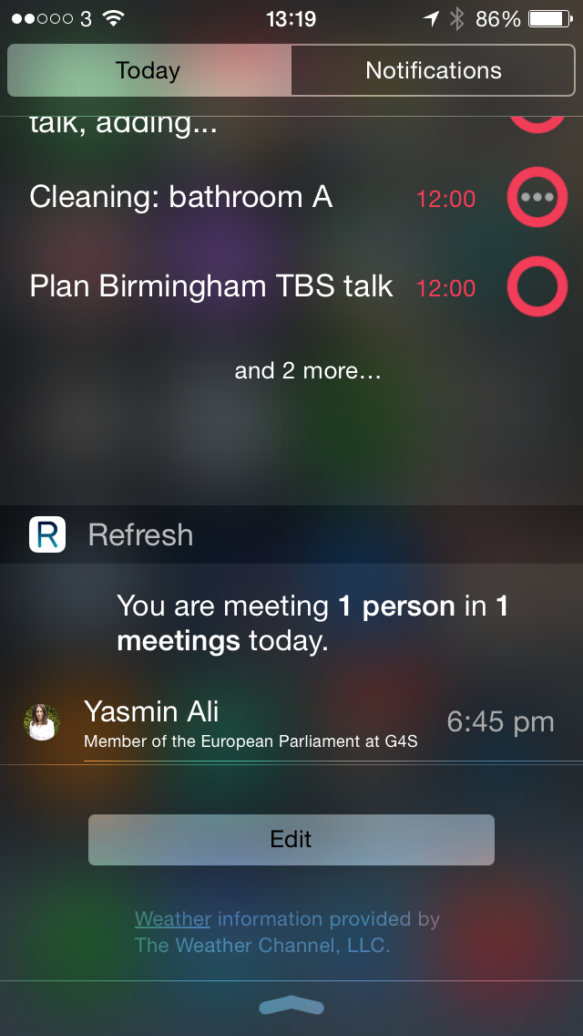
Which on my iPhone right now looks thisaway:

I like that it’s Yasmin I’m meeting because she’s an author who routinely fakes all her personal information on Facebook and Twitter and Linkedin so that description of her is nonsense.

If you’re in the US or, like I do, have a US iTunes account then you can get Refresh here and it’s free.

How to fix problems updating 1Password (yet again)

I enthuse about 1Password all the time and there genuinely isn’t a day and possibly not even a couple of hours that don’t see me using it. But allow me this one grumble because it’s infuriating: there simply is never a 1Password update that works the way it should.

Previously I’ve written about how I’ve lost passwords because of 1Password bugs: an update changed a setting and makers Agile Bits didn’t mention it until I complained. Previously I’ve not written about the teeth-pulling that went on using 1Password 4’s automatic updater from version 3 that was so automatic you couldn’t do it manually and yet you really wanted to because it wasn’t updating automatically. I didn’t write about that because we weren’t here: that was pre-The Blank Screen.

Now is that 1Password will prompt you for a free update to version 5 and it will give you a detailed software update screen that tells you what extra goodies you’re getting. But when it fails to update, you have to go hunting through the Agile Bits support page until you find a bit that says yeah, that can be a problem, you need to re-download the application before the updater can work.

Even then, even now, my Mac has just popped up a 1Password warning. I downloaded the application and was going to move it to my Applications folder to overwrite the old one but didn’t get a chance. It launched itself and gave me a warning that it was launching from my Downloads folder, did I surely not want to move it to Applications? Why yes, I did. It moved itself, which is nice, but it didn’t replace the old one.

So right now I have a fairly plaintive error message saying “Please make sure you have only one copy of 1Password on your Mac.”

Tomorrow I will love 1Password again. But today and every day that there is a big update, I’m close to wishing I please had no copies of 1Password on my Mac.

Scrivener updated to play nice with OS X Yosemite

Apple is expected to at least announce a definite shipping date for the new OS X Yosemite in a few hours and may even do that “available today” tricky the company loves doing. In anticipation of that, the writing platform – I struggle to find a phase for it as it’s much more than a word processor – has been updated to work with the new operating system. It’s also got a couple of twiddles and a temporary stop to your sharing Scrivener documents directly to Facebook and Twitter. Never knew it had that in it.

But then I am a particularly new and light user of Scrivener. Let Bryan Chaffin of The Mac Observer tell you more:

The binary code love of my life—Scrivener—was updated to version 2.6 Thursday morning. The update includes support for OS X 10.10 Yosemite, which Apple is expected to either release later on Thursday during a media event, or announce a release date.

Scrivener is the premier writing environment for the Mac, and it’s aimed at novelists, screenwriters, playwrights, and researchers. The release includes a ton of general bug fixes, as well as a couple of new features specific to Yosemite.

Literature and Latte also included a new import/export option relating to which version of Java gets used, removed Draft, Research, and Trash folder results from searches,and changed the way items dragged to the Binder are viewed.

Lastly, the company said that a 64-bit version of Scrivener was coming in the future. Until that time, Twitter and Facebook sharing services won’t be available in Scrivener in Yosemite.

Scrivener Updated to Support Yosemite – Bryan Chaffin, The Mac Observer (16 October 2014)

Read the full piece.