Unfair review of “Getting Things Done” 2nd edition

Look, you should probably get this book. How’s that for an unfair review? Also, much of what started me off doing The Blank Screen can be traced back to David Allen and Getting Things Done so, you know, I do entirely believe that the man is smart and that this GTD is clever.

But.

After more than a decade, he’s released an updated version of the Getting Things Done book and I can’t get through it. I got the opening 30 pages or so from iBooks as a sample and the book is only £6.99 but I can’t do it, I can’t buy it because I just know I won’t be able to press on

I just don’t think Allen is a writer. Brilliant ideas and such great, great experience, but not a writer. For instance, I don’t think he always knows what he’s conveying. Follow. This new book is a complete rewrite except that he admits it’s more a complete re-type: he did retype the entire book and he added and changed bits along the way. I can’t tell how much is new but the core ideas are the same and that’s how it should be.

Except.

For this edition I grappled with how much attention to continue to devote to paper-based tools and materials… as many in the younger generations have come to believe they don’t have to deal with paper at all.

Tell me I’m wrong, do, but I can see him tussling over the phrasing of this and trying to not sound like paper is best and we’re all eejits for not seeing it. I’m fine that he believes in paper but he doesn’t sound like anyone else’s belief could be valid. This is about paper and whether you make scribbles instead of typing into your phone yet it’s rankling like a religious issue.

Maybe that’s partly because in the run up to this passage I’ve been finding the writing a slog. Maybe it’s because a sentence or three later he can’t resist going “so there” on us with:

Ironically, there is a growing resurgence of interest in the use of paper among is the most sophisticatedly digital.

Is there? To give the man credit, he may write that line like a defensive drinker in a pub argument but he pops a footnote asterisk next to it. There’s no answering footnote in the sample so let’s give him credit and the benefit of the doubt too.

But even if this is correct, it isn’t me. So he’s not writing about my world and he isn’t writing well; he doesn’t have to do the former but he does the latter and that’s why I’ve got to skip the rest of the book.

Review: DropTask

If there is anything greater than the number of To Do apps on the App Store, it is the number of productivity gurus who say you should use them. They are right. But unhelpful. If you loathe To Do lists, it may be that you abhor lists of any kind. So telling you to buckle down to it, telling you how great To Do lists can be, it’s never going to work for you. You’re too busy to write out silly shopping lists of tasks, you need to be doing this urgent work. Also, when you’ve got a list, it’s far too much tedium checking it and maintaining it. Nonetheless, if you are a visual thinker, you were out of luck. Until DropTask.

DropTask aims to do two key things. The first and in every possible way the most apparent is that it is a visual To Do list. No rows and columns, no indents and tabs, just circles that you drag around. That dragging is part of the second purpose of DropTask: it wants to be very, very fast to use. You don’t have to fiddle with the onscreen keyboard to do everything, just for adding detail. Drag a blue dot onto the centre of your iPad screen and that’s a task. Drag a green dot the same way and that’s a group: it’s a large circle into which you can then drag tasks.

Picture Venn diagrams but without any overlapping circles.


wg_DropTask-001-580


Set yourself circles for Office, Home and any other main area of your life, then start filling each with tasks. The group circles grow as you add or drag tasks into them. Circles are always the same, big and clear size: they don’t get smaller when you add more, DropTask just widens your canvas. You can tap on a task to set due dates and add details of what exactly it is you need to do to complete the task. Nicely, you can separately set urgency and importance so later you can filter to see just, say, the urgent and important tasks. It’s akin to the Dwight Eisenhower grid method and is very much better than assigning random priority levels.

That’s a nice touch and the visual nature is DropTask’s killer feature. It isn’t going to cut it for you if you have a massive number of To Do tasks and entering details of the task take more taps than we’d like given the speed of everything else in the app.

There’s no OS X version but there is an online one at droptask.com and that is very quick at smoothly keeping in sync with the iPad edition. That’s particularly useful for Droptask Pro which is built to work with groups so that you can assign tasks to colleagues via the app and they can work through them anywhere.

Droptask comes as two separate iPhone and iPad editions, both of which require iOS 5.1.1 or later and both of which are free. For $65/year you get the Pro group features and subtasks. There’s also an Android version, which is free as well.

It’s definitely not for you if you’re currently looking at OmniFocus or Things. But then it’s also not for you if you’re on Wunderlist or Reminders. This is a mid-range powerful To Do manager which is good but has this visual system, which you may find unbeatable.

Review: OmniFocus Video Field Guide

David Sparks writes a mean Field Guide book: I’ve read his work on going Paperless, on using Email and on giving Presentations. All good enough and interesting enough that his announcement of a video version was enough to be news. That it was a 150-minute video about OmniFocus made it a recommendation. And the fact that you could and can watch a sample segment from it on Sparks’ official site made it a certainty that I would tell you about it.

And a fair certainty that I’d buy it for myself.

Now that I’ve bought and seen it, though, there is more to say. If you do have OmniFocus then unless you’re so good that the Omni Group employs you, then it is easily obvious that you will benefit from this video and enjoy it a lot.

If you’re at the stage of looking into OmniFocus, of looking into To Do apps of any kind, that’s a trickier thing. It’s 150 minutes long but it doesn’t hang about: it gets very specific, very quickly and I enjoy that, but I don’t think it doubles as a selling tool. No reason it should, but if I were back at the point where I was trying to decide whether to buy OmniFocus, I think you need something more first.

Maybe not much more. Try the videos on the Omni Group official site: they’re adverts, of course, but they give you the flavour of the software. And if it looks good to you, try a couple of YouTube videos about it. Then buy OmniFocus and go buy David Sparks’ OmniFocus Video Field Guide for $9.99.

In praise of Microsoft Word for iPhone

Honestly, I used it on my iPad and I liked but there I couldn’t be bothered to switch to it as my regular writing tool. When it comes to my iPhone, I started the app and even having to schlep through a quite short login process made me close the app again. Doubtlessly the next time someone sends me a Word document to read, I’ll do the deed. But it is strange how I can recognise the benefits of Word, especially in its new iPad version, and appreciate how well done it all is, yet still can’t be arsed to use it.

A very long time ago now, I used to write for a company that used WordStar. You don’t remember WordStar. One morning we all came in and found that WordStar was gone. Completely. Through some deal or other, the company now exclusively used WordPerfect. And WordPerfect was so good, I don’t think it held up our writing in the slightest. It was just obvious how to use it and we did. Until one morning when another deal meant WordPerfect was gone and Microsoft Word was in.

That was a different matter. That was tough work. That was deadline-affecting work, that one was. So I did come to Word with a lot of annoyance and over the years I’ve gone through many stages. I can’t remember how long I used Word as my exclusive word processor but it was a long time and ultimately it was by choice: Word was doing things I needed. I even got to the point where I would read How to Bend Word to Your Will and enjoy it. Until I realised I’d rather be writing books than studying an Open University-level course on how to use this software.

Right now I’m in the mood where if Word is what opens when I click on a document, I’ll write it or edit it or continue it in Word. Otherwise, I’m all over the place. Pages. Drafts. Evernote. I haven’t got a home, so to speak, I haven’t got a default word processor I feel comfortable in.

Whereas this fella has Word and he loves it on the iPhone. More than I could think feasible, yet also very persuasively, too:

Longtime iPhone users have been waiting a long time for this moment, but now we finally have an excellent way to work with Word files on an iPhone. If a client or colleague emails a Word document to you while you are out of the office, you can now easily read and edit the document on your iPhone. And if you have your iPad with you, you can take advantage of the larger screen to work with the document. Either way, the Word app lets you do many of the same things that you could do with a document using the full version of Word on a PC or Mac, and perhaps more importantly, the powerful Word app lets you do just about everything that you are ever likely to want to do on a mobile device.

Review: Microsoft Word for iPhone and iPad — view and edit Word documents on any iOS device – Jeff Richardson, iPhone J.D. (7 November 2014)

Read the full piece for specific features that make Richardson happy – and happy enough that he even thinks the iPhone version scores over the iPad one in some respects.

Here it is: the novella-length review of OS X Yosemite

You know whether you’re going to read this or not. Each time Apple releases a new operating system, John Siracusa reviews it at length. Specifically, at novella length. Typically he takes 40,000 words to say what Apple’s heavily illustrated web page does.

But Siracusa is not Apple and Siracusa is also serious. This time out, he practically leads with a complaint:

For the most part, a new look for an operating system doesn’t need to justify itself. It’s fashion. We all want something new every once in a while. It just needs to look good. But things start to get complicated when fashion butts heads with usability—then we want reasons.

OS X 10.10 Yosemite: The Ars Technica Review –John Siracusa, Ars Technica (16 October 2014)

Do read the full piece. As ever, it is very interesting and really well done. I would rather that it didn’t come on 25 pages as it feels like that’s done just to get 25 clicks out of you, but as an article and as a read, it is excellent.

At last the OmniFocus 2 for Mac review

Here’s the thing. I like this software a lot, I won’t try to build any suspense over that. But when one rates something highly, I think it’s most normal to say why and then end with reasons you might disagree. Things you should watch out for in case your mileage varies. Persuade first and maybe even evangelise, not to say gush, then when I’ve sold you on it, point out any niggling little points that might take the shine off for you.

But I like OmniFocus 2 for Mac so much that I’m reversing this. It is too good and too useful for me to enthuse about it and then drop cold water over you because there’s a reason you may not be able to use it. There are reasons you may not like it, of course, but the killer reason for telling you bad points up front is that you may physically not be able to run it at all.

Why you shouldn’t buy OmniFocus
Chiefly this reason. If you are a Windows or Android user, stop reading now. You could check out my previous articles on Windows alternatives to OmniFocus – though, spoiler, there really aren’t any, there are just some good attempts – or a news report I did on an Android clone of OmniFocus. Spoiler: it gets by but it isn’t official and isn’t supported. Plus, it really is an adjunct to OmniFocus for Mac or iPad. Still, if I had an Android phone, I’d buy it.

I should also say that OmniFocus costs more than many or most or possibly all other To Do apps. That’s true across the board but there’s another thing: there’s a board. There is OmniFocus 2 for Mac, OmniFocus 2 for iPhone and OmniFocus 1 for iPad. They’re all separate and you don’t need to buy more than one of them, but you will.

Price details at the end since there are few duller things than a list of numbers and currencies.

So.

Why you really, really should buy Omnifocus 2 for Mac
I’ve taken a hugely long time to write this review in part because I keep not being sure where to start. OmniFocus 2 is a greatly updated version of software that I liked tremendously but which was also hard to use. So on the one hand, the interest for me was in how improved it is, how different the new version is. But if you’re looking for a To Do app and you’ve heard me speak above ten seconds, you’ve heard of OmniFocus and I want to justify how wedded I am to this software. I want you to get it and to get as much from it as I have.

So I’m going to mix and match a bit here: I’ll tell you the things I think you need to know or will especially enjoy as a new user, then I will frankly squeal a bit about the improvements I see as an existing one.

Get yourself a biscuit and a mug of tea, will you?

To be useful, I don’t think there is any question but that a To Do app needs to help you enter new tasks very quickly. Then it needs to help you work with them, add to them, change them, maybe group them in some clever ways, it needs to everything it can to help you actually do the tasks. To this end, OmniFocus 2 has a big plus button to start you off but then you can just keep typing. Type in a task, hit return, type another one, hit return, keep on going.

Everything goes into an inbox and you could stop right there. Pop your To Do tasks in, go do them and just tick ’em off when you’re back.

You can also email tasks into the OmniFocus inbox. Get an email, forward it to a particular address and it appears in the inbox. When you’re working on your Mac in any application in any way, you can also tap a couple of keys and be entering a task that will pop itself into your inbox.

None of this has changed in OmniFocus 2 for Mac but it’s smoother and easier enough to see and understand that I think you do it more. Certainly I have a lot of tasks in my inbox now where I used to be better at staying on top of them all.

That’s the thing, you stay on top of your inbox tasks. You do it by saying okay, those three are to do with work, I’ll make a Work project and bung them in there. Then that one’s the thing about getting a plumber in, I’ll add that to a House project. And so on. You end up with a lot of projects and you haven’t done a bleedin’ thing but actually you have. You’ve made it so when you’re at work, you can just open that Work project and see only the things you need to do there. You don’t see the one about the plumber because you don’t need to do anything about that until you’re home.

I relish entering a lot of tasks into OmniFocus 2 now because, first, it’s so easy to just keep bashing at the keys and entering task after task after task. As fast as I think of them or remember them, wallop, they’re in and I’m writing the next one. But, second, it is gorgeously easy to say this task is for that project. If I type “Phone plumber re sink leak” I can then type House to get it automatically put into my House project.

Here’s a thing. If I just typed the letter H it would do the same. If I’ve also got a Holiday project then typing H would bring up both and I could either choose right there or just carry on typing h-o-u and then it’ll have only the House one.

I used to work a lot for Radio Times so I had a project for that and if I typed a task and then RT, you’re not surprised that it would go into the Radio Times project. But I could type “dio” or “imes” and it would work it out too. It’s not like I try finding obscure letter combinations to get me into projects, but it is that I sometimes can’t remember what I called it.

While I’m there adding a task to a project, I can look at when I need to do these things. I can say I want to start working on it on the 3rd March but must deliver it on the 6th of June. Fine. I especially like that ability to set a start date. But in both the start and the deadline date, I can write things like “1w” and OmniFocus pops in the date for one week from now. Tomorrow, next Friday, three months from now, it understands so many of these. I can think about tasks the way I think about them, I don’t have to stop to check my calendar and enter in specific dates. Unless I want to.

I can also choose to add what’s called a context. Think of this as a tool you require, a place you have to be or someone you need to help you. I have a Phone context, for instance. I’ve got one for home. And I’ve got one for my wife, Angela. You can only have one context per task and I’d sometimes like to have more but if it’s something I want to discuss with Angela, I choose her as the context. If it’s something I need to do when I get back home, that’s what I’ll pick. And most often I’ll just say that it’s a phone call.

All of which sounds like tedious extra detail and it can be. You could ignore all of this and live a full and happy life.

But because I do very often use this stuff, when I’m waiting for a train and it’s been delayed by ten minutes, I can ask OmniFocus to show me all the phone calls I’ve got to make. Doesn’t matter that this one is to the plumber, this one is to a publisher, that one is to do with a catering event, all the calls are listed there under the Phone context. So I can and I do start ringing.

Equally, you can imagine that a lot comes up in my life that I want to discuss with Angela. I would hope that I’d remember the big stuff but there’s always myriad tiny details or issues where I know she’ll know more than I do. So while I don’t sit across the dinner table with OmniFocus in one hand and an expectant look on my face, I will often take a quick look at the Angela context to see whether there’s anything I want to talk over.

Last and in so many ways the most impressive, there is that Home context. Not only do I have a list of things to do at Home that I can check, I can tell OmniFocus to remind me when I get there. And, sure enough, as I stroll up the road to my house, ping. OmniFocus sees where I am and it reminds me of what I’ve got to do as soon as I get home.

I cannot tell you how much I love that. It’s a feature called Location Reminders and was invented or at least introduced to the world by Apple in its free Reminders app. OmniFocus takes that and uses it alongside all its other power features so I am pretty much life-support-dependent on it now.

But you can’t use that for everything or you’d go spare. Reminders that pop up every time you stepped into a client’s office. Or the supermarket. Or my mother’s. Give me aspirin. So I use it carefully.

Most tasks don’t have a location context or any context at all so and I only see them on my list when their date comes around. That’s the kind of normal, day to day To Do list checking that you do. And if the most marked change in OmniFocus 2 is the overall look and feel, the most obvious appearance change is an entirely new feature to do with daily To Do list checking.

Well, sort of entirely new. It’s been in the iPad and iPhone versions of OmniFocus for at least some time but now the Mac has got Forecast.

Forecast
The Forecast is the main view on OmniFocus and it has a calendar on the left, all of today’s tasks on the right. That’s it. But the calendar has the number of tasks waiting on each day too. So I can look at mine right now and see that today is bad. Well, actually, today itself isn’t awful per se: OmniFocus says I have 7 things to do. But it also says I’ve 34 things I should’ve done before today.

(Quick aside? This isn’t true. The thing with OmniFocus is that you do not keep using it, you do not do a task, look up the next one, do that, look up the next and so on. I know for certain that I will have done a lot of this 34. Actually, hang about, let me prove it. Okay. Not so great: I’ve done 16 of them, leaving 18 still to do. But also one of them I tried: it was to ring someone and they’re not back until Thursday. I can see that another one is actually something I need to do this coming Friday. So that’s 16 left to do. Still pretty bad.)

That phone call I can’t make until Thursday. Let me drag that task onto Thursday in the calendar. Done. The thing for Friday, drag to OmniFocus calendar, it’s now on Friday. The reason that some of these aren’t done yet is that a much bigger and more urgent project came through like a ship in a harbour and the day to day tugs got sent to the side in the wash. But they’re still important, I just need to think about them. Looking at them now, I think three may have been superseded but I need to check with Angela on Friday about them. So I’m changing the context to Angela and I’m dragging them both to Friday.

Ooops, just seen another one that I’ve done. Tick.

Now we’re on 12 in the past. I can also see that Thursday is showing 8 tasks and Friday is now up to 13 so I’m going to take the biggest or at least longest of the overdue tasks and drag that to Thursday. It’s got to be done this week and that’s visibly the best day for it. Even though right at the foot of each day’s tasks I can see a swift events calendar and Thursday has an hour’s meeting in the afternoon so it’s going to be a squeeze.

Last, for now, there are two things there I can see that I can do right this moment. Excuse me for one moment. Right, I’m back and I’ve done three things. If you’re counting on your fingers or are just better at this than I am, you’re reckoning now that I have 8 overdue things, 7 today, 9 tomorrow and 15 on Friday.

Nope.

You’re right about the past and the future but today OmniFocus is now showing me that I have 16 things to do.

And it’s right.

Because there are several things I have to do every day of the working week, there are a couple I do every single day full stop. When I tick one off as done yesterday, that tells OmniFocus to show me the next one. I think you can make an argument that it should’ve shown me today’s one anyway as I have to do it, but if it did that, it would really have to show me all of them. Every day’s everyday tasks from now to the end of time. As it is, it shows me the one I need to do, especially if it’s one I should’ve already done.

OmniFocus is just superb at letting you dump myriad tasks into it as you think of them and then only showing you the ones you need to know right now. I learnt when I was away on holiday that these tasks really mount up, I’m having to knock off hundreds per month and honestly if I saw them all ahead of me, I’d quiver. I quivered enough at the sight of 34 overdue ones.

But just as I now feel better that I’ve got the 34 down to 8, so I feel able to do today’s 16. What’s 16 tasks compared to five hundred for the month or, what, something like 6,000 for the year? It’s manageable, that’s what it is. I do these 16 and I will feel great for the day. I will be right to feel great for the day.

I will be right to take the evening off.

I think that is what OmniFocus gives me that I didn’t get from other apps. There’s plenty to enthuse at you about ways to get tasks in, ways to slice up those tasks to see what you can do in the time you’ve got today, but it’s this one thing that really sells me. I know what I’m doing now. I know what I’m supposed to be doing. Instead of a ceaseless list, I have today’s jobs and I do them. Usually.

As I’ve said in The Blank Screen book (UK edition, US edition), I am now busier than I have ever been and that workload is far more comprised of tiny bits than before, but I have never felt more on top of things. I’ve never felt lighter.

One thing, though. This needs one more OmniFocus feature and it’s one that has also been improved in OmniFocus 2 for Mac. It’s the Review.

Review
You do all this bunging of tasks in and then you do all this processing of them, reckoning that this belongs to the House project and you can do it on Friday, that sort of thing. As you can tell from my day today, when other things come along they can radically change what you’re able to get done and things have to be revised. If you had every task neatly sorted onto a day and date, well, I think you’d be far too organised and you’d also be booking a hospital appointment for stress. Every task with a due date, your ulcers would be throbbing because you can bet pretty much every single one of them has to keep being changed.

The answer is to give a due date only when there is a due date. A real one. I can make a case that I shouldn’t have moved those tasks to Thursday and Friday, I shouldn’t have dates on them at all. I did partly because they are thing that genuinely must be done this week so while there isn’t a specific deadline, next week is too late. I also did it because even after a couple of years of using OmniFocus I slip back into adding dates to things out of habit.

If you don’t have a date on something, I think you fear that you will never do it. That’s a very reasonable fear but it isn’t true because of this one OmniFocus feature, because of this Review thing.

Review is a Getting Things Done term. This GTD system is a huge, practically cult-like thing that has its legion of fans and very many software To Do apps work with it. OmniFocus is not related or affiliated to the official GTD lark but it does work very nicely with its principles, the best of which is Review.

Throw every task in any way you like, deal with what you deal with and let the rest sit there festering in the House project without any dates. But then at regular intervals, go into the House project. Go into every single project you have and look at every single task. I said that would drive you stresswards if you did it but that’s if you do it every day, if you are doing it every time you open your To Do list. This is different. This is a positive choice to go look at everything.

This is best done with a coffee and sitting somewhere away from your usual work. I tend to go to my living room to do this but wherever I am, I will start at the top and go through every task, every project. With each one I’ll do pretty much what you just saw me do: I’ll tick it as done if I have finished it, I’ll maybe give it a new date, that kind of thing. I’ll also delete a lot. A lot. I throw everything into OmniFocus and sometimes that is just to get me to think about it rather than to do something. When I review, I look at it and often think nah, that’s not for me, delete.

And the most common thing that happens during a review is that I will do the task there and then. It’s for that reason that I can spend a long time on reviews, if I can then I’ll drive through them doing what tasks I find.

By the end, you know everything about everything you are doing. Then you can forget it. Get it out of your head and trust that it is in OmniFocus. It’ll pop up when you need to do it or you’ll catch it again on your next review.

What’s new about this in OmniFocus 2 for Mac is that it works so easily. Previously I did find it a faff on OmniFocus 1 for Mac and its tedious and awkward issues were made more noticeable because OmniFocus for iPad does Reviews so much better. I would routinely postpone doing a review until I could go off to a corner with my iPad.

Now the Review in OmniFocus 2 for Mac has all the best features of the iPad one and is, I think, the better. That dragging tasks to a new date is new and I nearly forgot to tell you it is because I am now so used to it, so dependent upon it. In reviews and in day to day work, I drag away and it is another reason I tend to leave OmniFocus work until I’m back at my Mac.

(While OmniFocus is available for Mac, iPhone and iPad, you can’t do reviews on the iPhone one. I think that’s a failing and I wish it would change.)

What’s also specifically new is that as you work on today’s list and the calendar, you can see a Review icon and it will be highlighted if there’s something to review.

Another quick aside? You could review every project and every task every day, if you wanted to, but again it’s only going to help the bottom line of your local pharmacy if you do. So instead you slice it up a little. Every project and every task will be reviewed, must be reviewed, but you can spread the work out and you will. For instance, I have a shopping list in OmniFocus. Because it’s a project, I cannot ignore it, cannot say I don’t want to review it, but I can say I only want to review it once a year. Then I have certain crucial tasks: I say I want to review those every three days.

And most of the rest of the projects are somewhere in between. I do my reviews on Mondays, Wednesdays and Fridays and on any day I’ll have 20 or 30 projects to review. Today I have 40 – because I skipped Monday’s review while I was on a big deadline.

But when we’re done talking today and you’re gasping for air, I’ll trot through those 40 over a mug of tea and I will feel on top of things again.

That really, seriously is the big thing with OmniFocus: the way it makes you feel and specifically how much better, how much lighter. I look back at the various To Do apps I’ve tried before and I can well argue that any one of them was better than when I didn’t use any, but still, they were torture tools. I used to feel crap at the end of every day when there was all this stuff I hadn’t done. I used to spend the end of the day moving each task to tomorrow and reinforcing that I was a failure. Bollocks to everything I’d done, the fact that I hadn’t put the bins out was crippling me.

Now I don’t sweat this stuff at all and I still get the bins put out on time. Actually, this week I put them out a day early but that’s my mind gone awry at 5am, I don’t feel I can blame any software for that.

You’ve finished your biscuit and I haven’t finished talking about OmniFocus but I’m going to stop. Remind me to talk to you about Perspectives some time, okay? And in the meantime, let me tell you that you can see it in action over on the official site: there’s a pile of videos here.

Pricing takes a moment to explain. You can buy OmniFocus in the Mac App Store but don’t. If you must, then it’s here and costs £27.99 UK or $39.99 US.

But the reason you shouldn’t buy it there is that you will get a better deal from the official OmniFocus site. You wouldn’t realise that, though, because the price is the same. The deal is partly that you can get various family packs or, if you’re an existing user, cheaper upgrade prices. The same thing will happen to you with future releases of the software: the Omni Group is rather excellent at providing free updates and options.

However, there is now another reason and it’s OmniFocus 2 Pro. It’s roughly twice the price at $79.99 (the official site only lists prices in US dollars) and it doesn’t have twice the functionality but what it has is very good. You can only get the most from this Perspectives feature I mentioned in this version. I’d suggest that if you are brand new to OmniFocus, get the standard edition. If you used OmniFocus 1 a lot, get the Pro.

If you’re set on buying through the App Store – I do like App Store, it’s just not right for this – then you buy the Standard edition first and subsequently an in-app purchase to get you the Pro one.

I hesitated over Pro versus the Standard version because as much as I talk about it, I don’t think I’m the most thorough OmniFocus user. But because I’d bought OmniFocus 1 from the official site I was offered an irresistible upgrade price so I went Pro.

Last thing. OmniFocus 2 for Mac works all by itself but there are these separate iPad and iPhone apps. Hopefully very soon I will just be able to give you a blanket recommendation to buy the lot but right now, August 2014, there’s a reason to hesitate. We’ve got new OmniFocus 2 for Mac and OmniFocus 2 for iPhone but we haven’t yet got version 2 for iPad. As very, very good as the iPad one is – it really was the best version until this new Mac edition – you would be mightily annoyed at me if you bought it today and they upgraded it tomorrow. There won’t be upgrade pricing: you can only buy iOS apps from the App Store, the Omni Group can’t offer discounted versions. Maybe there’s a clever way around this with in-app purchases again but there wasn’t for OmniFocus 2 for iPhone.

But OmniFocus 2 for iPad is definitely coming. I will buy it the second it’s out, just as I did the iPhone and the Mac ones. Hit Buy and read about the new features later. It’s that key to my work now and I am that sure that each new version is tremendous.

But we don’t know when it’s coming. So buy the Mac one and become a fan of that while we’re waiting.
Review: Beesy, the bionic productivity app

This is going to be like reviewing a car by detailing how good the radio is. I’ve been using Beesy for a few weeks and I like it but I’m very aware that I’ve used it to scratch just one specific itch.

I have been, I remain and I suspect I will long continue to be an OmniFocus devotee but I have two problems with that. The first is a minor one, for me, in that OmniFocus is designed for individuals so whenever I have to delegate a task out to someone, it’s a bit convoluted. Beesy is more project-management-like with its ability to assign tasks to people.

Two or three times a month, though, I also have meetings where I come away with a lot of tasks. When Beesy approached me, I was struggling with how to both make notes during meetings – I’m secretary for some of them – and collect tasks. I’d ended up with a process whereby I’d make lots of notes and interrupt them with lines like this:

— William to phone Acme re delay

Then at the end of the meeting, I’d look for every line that began with those two dashes and I would copy them into OmniFocus. It works, and I have a Drafts thing that lets me send a pile of them into OmniFocus in one go, but not always successfully and always with a bit a of a fiddle.

Plus because I was writing all the notes, I found that my own little tasks got written so briefly that I would later struggle to know what they were about. Which particular delay? Who at Acme? When has this got to be done by?

So Beesy came along with its ability to take meeting notes and tasks simultaneously. Fairly simultaneously: I still have to break off from the minutes to tap a task button but, for instance, with that Acme one I’ll tap the Call button and the task goes in as that, a phone call, rather than me having to specify it. Since this is my To Do list, I can presume that all tasks as mine unless I say otherwise so that’s another time saving.

I find I use those moments to make the task clearer:

Tell Jeff at Acme that Project Diatribe is waiting on test results

That kind of thing.

I found that very quick and rather useful. It’s taken me a time to get used to where everything is in Beesy: there is so much you can do with entering tasks, assigning details, managing projects, managing calendars that it is overwhelming and you will not pick this up in twenty minutes.

But if you dive in with a particular need, as I had, then I think you pretty swiftly get to use that. Then you can expand out to the rest. You need to devote some time to this and I think you really benefit from jumping in completely. Don’t try to run your life through both Beesy and OmniFocus, as I have, make it your only system. It is more than capable of that, it just does take some effort.

However, I think it’s effort that pays off and that over time you will become immersed in it to the point that it is both easy and automatic to use. The company has a nice line about how Beesy is really a note-taking app, that you just use it to make notes and then everything else comes from that. It handles tasks, it produces proper meeting minutes for you, it’s the To Do manager for people who loathe To Do lists.

I think the complexity of Beesy comes from the volume of options and that the ease of it comes from how those all work together. Look at your projects, look at your calendar, look at your tasks and you see the same things in different ways. You don’t tend to have to think about much when you’re entering a task, you just know that it is in the pot and that when you need it, it’s there.

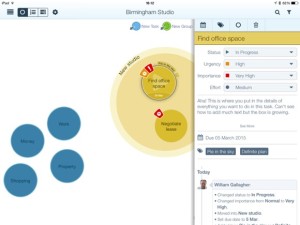
It’s also got a true Dwight Eisenhower grid view of your tasks: Eisenhower used to divide jobs into Urgent, Non-Urgent, Important and Non-Important. I’ve not been a fan of this, I think the time spent assigning priorities is usually better spent on doing the things but when you have a lot on, it’s a neat view. It’s just your tasks written out in squares but it works simultaneously for visual thinkers as well as word ones.

That’s in the app’s Dashboard view and, oddly, I’m least keen on this. It’s a simple overview with your calendar and that grid but I found I was always tapping on Project, People or Actions just to move on to those screens. It’s only an aesthetic thing: I’m not taken with how the app shows notes as pieces of paper at the foot of the screen. That’s a lot like the way Evernote used to do it and actually Beesy integrates nicely with Evernote. (So much so that Evernote wrote a blog about it.)

Very nicely, Beesy is being worked on extensively. I took a lot of screenshots as I was learning how to use it and then the software was entirely updated to an iOS 7 look. I was thinking about how you need your iPad always with you to use it – and then the company released Beesy.me, a web-based service that you can use anywhere.

Not to make this a Beesy vs OmniFocus scrap – they are both powerful, both take some learning but both are aimed in different directions – but it has been a common criticism of OmniFocus that it doesn’t have a web version. That doesn’t bother me but it does others and I see the benefit of a web version.

Take a look at the new video Beesy has done about its software and its web version.

Beesy for iPad costs £3.99 UK or $5.99 US. If you want to manage just one project you can use the web-based Beesy.me for free otherwise pricing starts at 5 Euros per month. It’s in Euros because Beesy is based in Paris: if I’d looked up their website while reviewing the software, it turns out that I could also have just looked up and seen them. I spent much of the time using Beesy in Paris myself, coincidentally just a couple of miles from their offices. This doesn’t help you or matter at all, but it tickles me. I love Paris and it’s good to see a French firm doing well internationally.

It’s interesting that it is so firmly an iPad app. I’d like there to be a native Mac and PC one as well but I suppose that itch is served enough by the online version. It’s also interesting that it’s so cheap. This is the kind of software tool that would’ve cost businesses hundreds of pounds in the past and I would call its £3.99 UK or $5.99 US a bargain if that weren’t such a huge understatement. Pricing helps you get noticed on the App Store but I do wonder if Beesy is undermining its own worth by being so cheap.

Still, that’s the firm’s choice: grab it now before they change their minds.

You can get Beesy for iPad here and there is much more detail about the software and its services on the official site here.

UPDATED 14 AUGUST 2014: Changed the official site address from www.beesy.me (where you can find the web version of the software) to www.beesapps.com where you can find everything.

The worthy and best way to present

What’s it called when a book as one title followed by “Or” and another one? As in Frankenstein or The Modern Prometheus? This is The Worthy and Best Way to Present or A Longer Term Review of David Sparks’ Presentation Field Guide.

This iBook was released on 21 July and I started reading it immediately. I remember saying on the launch day that:

This book was released sometime overnight, I got it around 8am, I’m maybe a third of the way through the text – I’ve not looked at the many videos yet – and I have a complaint.

He’s so persuasive about preparing your presentation before you ever go near Keynote or PowerPoint that I resent the bejaysis out of him. I have one presentation to give tonight and three tomorrow. I wanted a quick fix! I wanted a magic sauce!

David Sparks’ Presentation book now out – William Gallagher, The Blank Screen (21 July 2014)

In the end, I actually gave five over those two days, 21 and 22 July. It’s complicated. But it was also true what I said about how good it made me feel that I was already doing some things Sparks recommends: that’s how persuasive and convincing he is, I read this book and feel that he’s right. Therefore whatever I do that is the same is also right, therefore I am right, therefore I feel good.

And then there’s the stuff he recommends that I don’t do. It was quite hard doing those five presentations with the book’s advice about planning in my head. The book’s very specific advice about how using Keynote is actually the last step, or at least toward the last step, as you should know what you’re going to say through planning and thinking first. The fact that I thought I had three and it became five rather tells you that I didn’t plan or, in my defence, couldn’t plan ahead.

I have not given a single presentation since then. But I have some coming up and I am using Sparks’ advice from this book. That may be the best review I can give it except that I think this leaves you only with the idea that the book is useful. It doesn’t tell you that it’s also fun.

Those five presentations went well but they were hard and they were part of a bigger project I enjoyed yet I’d got at the last moment. Even so, even with trying to plan in the gaps during the first day and then learning I really had to rework everything overnight, I was still going back to this book to read it at points because I was enjoying it.

Actually, as I write this to you, I still haven’t watched the videos or listened to the audio interviews. The book works without them but I’m expecting to find that they’re a good watch and listen too.

The therefore hugely recommended Presentations: a MacSparky Field Guide by David Sparks is available now in the iBooks Store for £5.99 UK, $9.99 US.

Long term review: Belkin Ultimate Keyboard Case for iPad Air

At the end of last year, I wrote a snap review of how great the Belkin QODE Ultimate Keyboard Case for iPad Air was. Now after seven months of use, it’s not so great. But what was good continues to be excellent and there’s been one positive surprise.

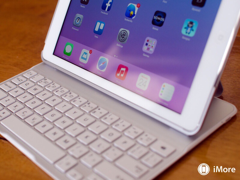
But first, it looks like this:

20140719-202240-73360753.jpg

(Image from iMore.com)

You get the idea. It’s an external keyboard for the iPad Air. I went through a long time of resisting these and just typing directly onto my iPad but it’s true: these keyboards can speed you up tremendously. They just add bulk to the previously very light and slim iPad, they’re just another thing to cart around. But this Belkin one is also a case: the iPad snaps into it and together the two are quite small.

But.

The reason I borrowed that photo from Imore.com is that I couldn’t take one that looked as good. Because mine is not in that great a state. Take a look:

20140719-202604-73564833.jpg

That’s a rubber protective cover that goes over magnets in the case. Or they should. Mine came off within a week or so and I complained to Belkin via their 24-hour guaranteed response support service. After a week of no reaction, I went to their twitter and Facebook pages and that got attention. Eventually, it got me a replacement keyboard.

It just took weeks.

I opened it up, snapped the iPad Air into it and began emailing them a thank you.

But.

The spacebar didn’t work.

I tell you, you know that when a company makes thousands of a device there are going to be some that are wrong. It’s a pain when you’re the one who gets a fault but it happens and the company will replace it. Sheer statistics mean it has to happen and the fact that my second one had an even worse fault was just another fluke. That’s the attitude I had when I began the social media chase again and when I got into long phone calls but by the end I was the disgruntled, annoyed and I’m embarrassed to say also rude customer that I hate being.

They wanted to know if I were sure that the space bar didn’t work. They were willing to take it into their lab and if their technicians agreed that it didn’t work, they’d get me a replacement. “If your technicians don’t agree that it doesn’t work, fire your technicians,” I said. “And I have already been without this for longer than I’ve been with it, why should I wait for you to prove what I already know?”

They promised to skip that whole step and just replace the keyboard. If they did skip it, I can’t tell because it took longer for the third keyboard to arrive.

That one had a working spacebar and the rubber protective feet lasted a fortnight. Three faults in a row means a design fault to me so I don’t see a point going back to them. I’ve continued using the keyboard and just accepted that it looks awful with bare, exposed metal.

As a keyboard, the working version, it works. The feel of the keys is good, I am writing thousands of words on it. In December, I said this:

I don’t like the arrangement of the apostrophe, colon/semi-colon and enter keys: they’re taking me some while to get used to but otherwise, the feel is a lot like the Apple Wireless keyboard one – not as great but still good – and the speed difference it makes is marvellous.

Snap review: Belkin Ultimate Keyboard Case for iPad Air – William Gallagher, The Blank Screen (30 December 2013)

That all still stands. I had hoped that I’d get used to those mis-placed keys and unfortunately I haven’t.

But it’s good enough. I am disappointed that what was an expensive Christmas present for myself has proved less than satisfactory but before it all went wrong, I did recommend the keyboard to a friend and she’s happy with hers. I’m not happy with mine but I use it a lot. I’d like to enjoy using it more than I do, but.

Let me cautiously recommend that you take a look at it on Amazon UK, though, especially as the price has dropped by £30 to £69.99. The black version is here, the white is there.

In America, the price has only dropped around $20 to approximately $120 and the black is on Amazon USA here, the white is there.

But the reason I’m writing this today when it’s been on my mind to tell you for months is that Macworld just updated its roundup of the best iPad keyboard cases and this one doesn’t make the cut. It does get an also-ran mention but there are five other cases that the magazine recommends more. So do take a look at their list too, would you?

Bad review: Moment for iPhone

I loathe doing this: I think the maker of the new app Moment for iPhone has worked hard to make a slick-looking app and I don’t doubt that it was done to scratch an itch, to do something its creator genuinely wanted an app to do.

But I just ran a story here about how to get a refund from the App Store and I only found out the way to do it because I so wanted a refund on this particular app.

Moment tracks your usage of your iPhone. It does that in time, how many minutes and hours you’ve used it today, and it does a little map of where you went. I was curious about this because I’ve wondered how much I actually use this thing. And – this was entirely my mistake, purely my fault – I believed Moment gave me more detail about what I did. I can only apologise for that: it was a thick misunderstanding of mine and I don’t criticise the app for it.

However, the app costs £2.50 UK or $3.99 US. There is then a paid in-app purchase that gets you a premium edition and for some reason that purchase is free. So I bought it.

Unfortunately, that adds the ability to set limits on how long you use your iPhone and it lets you set how often you get little alarm notifications of how long you’ve been running it. And the unfortunately is that there is no way to switch these off.

And more unfortunately, the app’s primary and nearly sole function of telling you how long you’ve been running your iPhone today is just a pretty version of what the phone already tells you.

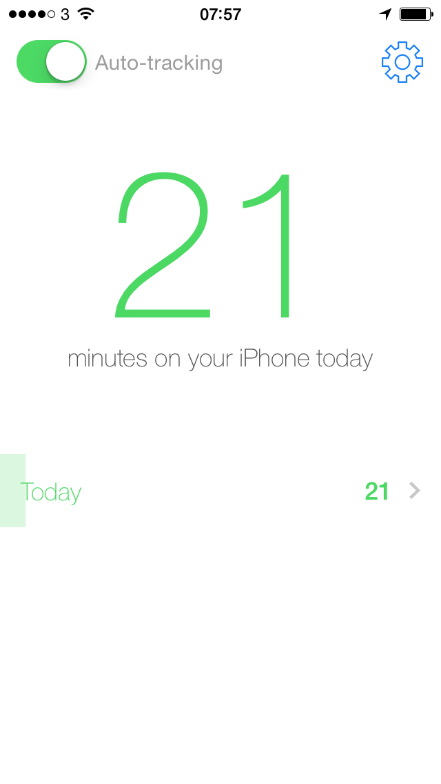
Here. First, Moment for iPhone. It’s got a lot of whitespace and I want you to see how good it all looks so, sorry, there’s what looks like a gap before the next bit below:

photo 1

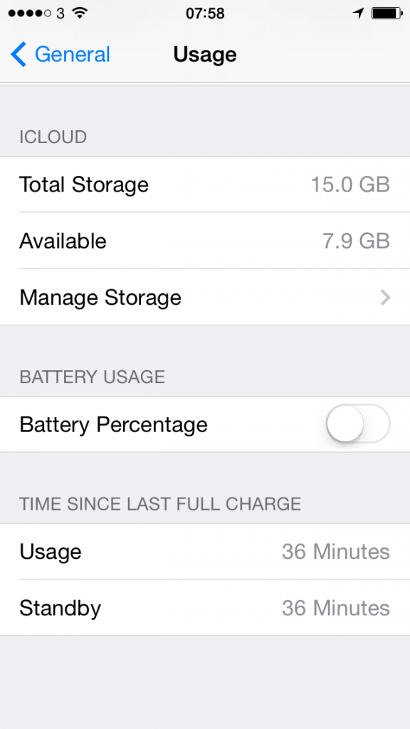
And now the same information at the bottom there in this screen grab from iOS 7, exactly what you’ve got on your iPhone right now. Have a look on yours by going to Settings/General/Usage:

photo 2

You definitely can’t miss that Moment says I’ve been using my iPhone for 21 minutes. Very clear, very good. But look at the system one: that says 36 minutes. I took these shots only a minute or two apart.

And I knew the system was more correct.

So the primary/sole function of the app is already available to you on your existing iPhone and Moment gets it wrong. I believe the accompanying map is accurate, but for the 40 minutes (according to iOS, 23 minutes according to Moment) that I used the app, I was in the same spot.

Sorry. I do believe this app was built from the finest of intentions, but I asked for a refund partly to get my money back, chiefly to send a message to the developer.

Have a look for yourself if necessary, here it is on the App Store.