Get more out of that expensive computer of yours

I’m not saying you and I should spend more time in front of our computers. I’m saying that while you’re there, you can make these things work harder for you.

Seriously, how much did that thing cost you? And you’re just switching it on to write in Word, check out Facebook and send the odd email?

Take a minute to just look into it a bit more. You spend a lot of time writing, for one thing: start there. Start with how no matter what word processor you use, I know that it is replete with shortcuts. You know how much, much, much faster it is to open a document by pressing Control-O on PCs or Command-O on Macs? There’s more. Google the name of your word processor and the phrase “keyboard shortcuts”. You will recoil at how many there are, but learn a couple of them now and they will become muscle memory.

This isn’t about teaching yourself something, not really, and it’s not even exactly about getting faster at the repetitive things you have to do on your computer. It’s about removing obstacles. Someone asked me recently about the whole Blank Screen thing and why I prattle on in workshops, books and online. Among many reasons – you know me, I can’t be concise – I remembered that I’d shown someone how to speed up a thing on her website.

I created a button for her which meant to write something on her site, she pressed that instead of schlepping through the most tortuous series of steps to get into where she could right. The result is that, yes, it’s quicker for her, but the real result and the reason I talk to you so much, is that because it’s quicker, she does it.

She does it more. She does it a lot. It is great to see her dusty old blog become this active, sparkling new thing.

My book goes as far into this as you usefully can while keeping you awake and more specific issues have cropped up in most mentoring sessions I do. I wouldn’t want to force you to become as technology dependent as I am – but you already are, you already have that computer, get more out of it.

I wanted to say this to you now because it’s on my mind and it’s part of a project I’m working on for later in the year. But you say something and then you realise it: do take a look at my Blank Screen mentoring service as this is just one thing you’ll find it good for.

That’s the way to do it: Alfred 2

I’ve looked at what are called launchers – software that means with a keystroke or two you can zoom off launching apps, doing google searches, working just about anything on your Mac – and I did not do it as well as these people.

Curiously, I came to the same conclusion: Alfred 2 is the best. But reading their reasoning has both sold me on my own option and quadrupled how useful I think the app is:

We wouldn’t consider the OS X app launcher space a crowded one, but there are enough options out there that could make oneself think twice about clicking the download button. After numerous keystrokes and much reflective deliberation, we think that Alfred is the favorite launcher for Mac OS X.

Our favorite OS X launcher – The Sweet Setup

Read the full piece the whole thing but wait until you have a few minutes. It’s a good and detailed piece.

All Contacts apps should work like this: BusyContacts for OS X

I’m writing about ten pieces a week for MacNN.com to do primarily with software and given my obsessions, naturally productivity stuff crops up a lot. I mean, a lot. I’ve had the chance to evangelise software that has transformed my working life and I’ve also had the chance to try a range of new applications I wouldn’t – to be truthful here – have been able to afford.

Of the 100+ pieces I’ve written so far, there are many standouts but a recent one that was entirely new to me is BusyContacts. It’s a Mac-only address book and it is tremendous. I don’t think it’s gorgeous, I long to change parts of its look, but for features, it’s great. In fact, it is excellent – and chiefly because of one single feature in it.

From my MacNN review:

That feature is the Activities List. Like any other Contacts app, you can look up someone’s details and get all the regular stuff, like their many phone numbers, email addresses, and so on. In BusyContacts, though, you also get Activities. Right next to their contact card, you get a list of the last emails you two have sent each other (this only works with Apple Mail at present). You also get your most recent iMessage exchanges. Their latest tweets or Facebook updates. All there, all the time and immeasurably useful.

If you know you’ve got to call Bert, look up his contact card — and right there is when you last emailed him. You get the date, time, subject and opening lines, so you are instantly briefed on what you were last doing together. The more people you have to juggle and the more projects you are doing, the greater and greater this feature is.

Hands On: BusyContacts (OS X) – William Gallagher, MacNN, 17 February 2015

That was posted nearly two weeks ago now and I’ve only come to like this app more. Here’s an example of something I’ve found useful that has previously been enough of a chore that I didn’t do it. There is one group of people I need to email from time to time. I could set a group email address but those are oddly awkward to do on Macs and the groups don’t cross over to the iPhone or iPad. It’s not that groups cross over in BusyContacts either, they don’t, but awkwardness and inability to use groups everywhere meant I didn’t bother with them at all.

I used to just find the last email I sent the group, quickly check through the names to make sure I remove a person who asked to be let out of the set, then I write the new email.

With BusyContacts, I can assign tags to contacts. As you read their address book card, type a keystroke and add a tag. It’s easy to do and as you go along merrily adding things like “Writers’ Guild” to a name, you build up a list of such tags in the app. Now I can drag someone’s name to the tag and have it applied.

I can click on the Writers’ Guild tag and only see those people who I’ve tagged with this. So far, so underwhelming, except that once this is what I see in my contacts app, I can Select All and email everybody. BusyContacts lets me send an email to everyone in that list – and it lets me send separate emails to each of them.

That plus the Activity List, it is just startlingly useful. I wish there were an iOS version, I’d be on that like a shot. Read the full piece.

Essentials: TextExpander

I just wrote this on MacNN.com:

Get this essential Mac tool for speeding up your typing

Here’s the thing: yes, TextExpander speeds up your typing, but some of us like typing — and some of us are 120 words per minute. If you’re one of the latter, that doesn’t automatically rule out that you wouldn’t be interested in the venerable TextExpander’s speed, but we figured it wouldn’t be that much use to us; or so we thought. Doubtlessly, if you are a slower typist, then the speed is the key reason to buy TextExpander — but it does so much else, it is so useful in other ways, that we are now dependent on it, and wish we’d bought it ten years ago.

Hands On: TextExpander 4 for OS X, TextExpander 3 for iOS – William Gallagher, Electronista (18 January 2015

Well, I wrote that and then I wrote a lot more, almost every bit of it finding new ways to enthuse about this software. It is that good, seriously. I found out while writing this review that I’ve been using TextExpander for 10 months. Can’t believe it – and yet I find that easier to comprehend than the fact that there was ever a time I wasn’t.

Read the full piece.

Utility counts every word you type – in Facebook as well as your writing

Some rogueishly handsome fella over on MacNN.com wrote a review of a OS X utility called WordTarget:

It’s a menubar utility for OS X which simply counts every word. Every time you hit the space bar, that’s another word counted, and that’s fine. No debate there. It does also count hyphens, though, so self-starter is treated as two words, which seems like cheating. To balance that out, however, it does not subtract words when you delete them. Actually, we found that if you highlight some words and delete them all, your word count goes up by one.

That’s probably a bug, and it’s not a significant error: the odd word here or there is not going to make much difference if you’re writing a 170,000-word book, for instance. However, it is significant that it won’t recognize that you’ve deleted whole passages. If you are really doing this to hit a Charlie Brown-like mandated word count, you’ll have to keep this in mind.

But WordTarget is meant for people who are aiming at an ideal number of words rather than a specific commissioned length. Novelists who decide they’re going to write 1,000 words per day no matter what, for instance, they’re the market here. You can presume that WordTarget sales go up every November during NaNoWrMo, where hopeful writers need to hit an average of 1,600 words per day.

Hands On: WordTarget menubar word counter (OS X) – William Gallagher, MacNN (30 December 2014)

Read the full piece because it tells you more, it has screenshots and I worked very hard on it.

Details matter

IMG_0810.PNG

Apple pays more attention to the details then anyone else. Sometimes the details they pay attention to are so small, you don’t notice them at all for a long time… but once you see what they’ve done, you can never unsee it, or accept anything less.

Here’s a great example from OS X Yosemite. Compare the two images above. The top is from OS X Yosemite, the bottom from Windows 7. Notice anything? One of these images has much better typography than the other. But can you tell why?

Apple has tweaked the typography in OS X Yosemite so that link underlines skup over the descenders. What’a descender? It’s the little dangling parts on letters, like the tail of the lowercase ‘p’, ‘g’ or ‘y’.

Once you see this small typography tweak Apple made in OS X Yosemite, you can’t unsee it – John Brownlee, Cult of Mac (27 October)

I love this stuff. It’s like the way you can tell when a writer cares or has just knocked a piece out for the cash. Previously I’ve thought this about things like the way Microsoft can’t be bothered to translate all of Windows’ dialogue boxes: you can be working a PC in France and after a few French warnings, there’s an important one in English. I think details matter anyway, always, forever, but when you’re making something that literally millions and millions of people will use and see for eight hours or more every day, details are special.

Read the full piece.

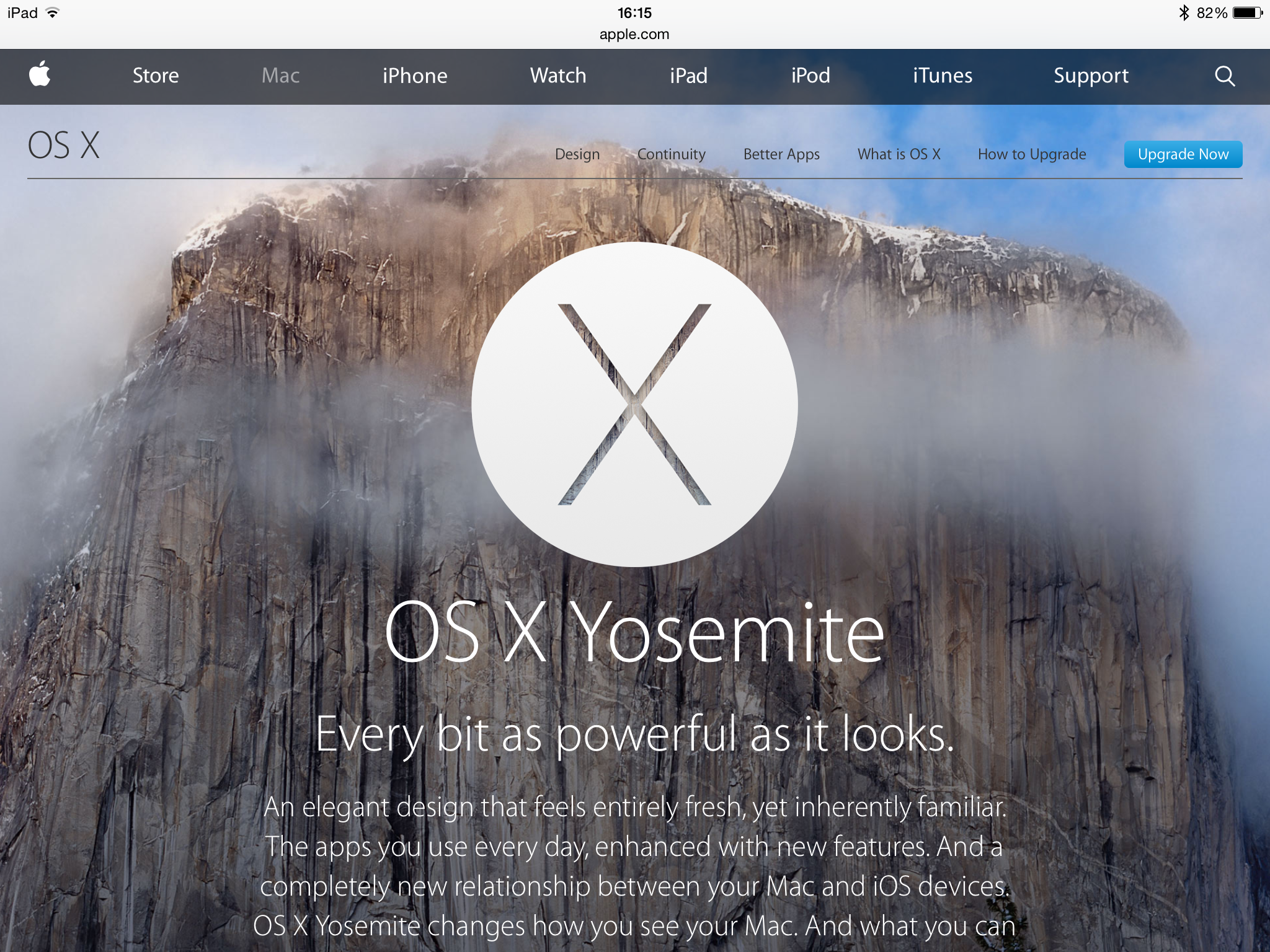
Here it is: the novella-length review of OS X Yosemite

You know whether you’re going to read this or not. Each time Apple releases a new operating system, John Siracusa reviews it at length. Specifically, at novella length. Typically he takes 40,000 words to say what Apple’s heavily illustrated web page does.

But Siracusa is not Apple and Siracusa is also serious. This time out, he practically leads with a complaint:

For the most part, a new look for an operating system doesn’t need to justify itself. It’s fashion. We all want something new every once in a while. It just needs to look good. But things start to get complicated when fashion butts heads with usability—then we want reasons.

OS X 10.10 Yosemite: The Ars Technica Review –John Siracusa, Ars Technica (16 October 2014)

Do read the full piece. As ever, it is very interesting and really well done. I would rather that it didn’t come on 25 pages as it feels like that’s done just to get 25 clicks out of you, but as an article and as a read, it is excellent.

Scrivener updated to play nice with OS X Yosemite

Apple is expected to at least announce a definite shipping date for the new OS X Yosemite in a few hours and may even do that “available today” tricky the company loves doing. In anticipation of that, the writing platform – I struggle to find a phase for it as it’s much more than a word processor – has been updated to work with the new operating system. It’s also got a couple of twiddles and a temporary stop to your sharing Scrivener documents directly to Facebook and Twitter. Never knew it had that in it.

But then I am a particularly new and light user of Scrivener. Let Bryan Chaffin of The Mac Observer tell you more:

The binary code love of my life—Scrivener—was updated to version 2.6 Thursday morning. The update includes support for OS X 10.10 Yosemite, which Apple is expected to either release later on Thursday during a media event, or announce a release date.

Scrivener is the premier writing environment for the Mac, and it’s aimed at novelists, screenwriters, playwrights, and researchers. The release includes a ton of general bug fixes, as well as a couple of new features specific to Yosemite.

Literature and Latte also included a new import/export option relating to which version of Java gets used, removed Draft, Research, and Trash folder results from searches,and changed the way items dragged to the Binder are viewed.

Lastly, the company said that a 64-bit version of Scrivener was coming in the future. Until that time, Twitter and Facebook sharing services won’t be available in Scrivener in Yosemite.

Scrivener Updated to Support Yosemite – Bryan Chaffin, The Mac Observer (16 October 2014)

Read the full piece.

Prototypr for Mac (briefly) free

You know how when you need something, it seems to be everywhere? I’m going to be working on an app and so everywhere I look I am reminded of this.

Sometimes it’s useful, as in references on various podcasts. Sometimes it isn’t, as in Community season 5, episode 8, “App Development and Condiments”.

Look out for it.

And then there are times when it’s handy. As in tonight, when there’s a Mac app called Prototypr that has briefly gone free. Usually retailing for £6.99, it’s for building a kind of demo version of your app idea: showing the screens and what it will look like without it actually being able to do anything.

It means you can try things quicker and get to the design you need sooner.

Have a look at Prototypr. I’ve not used it, but while we were talking, I was downloading it.

Fantastical for Mac (briefly) half price

This is the Mac version of the genuinely acclaimed calendar software. I use Fantastical 2 for iPhone and iPad a lot and it took a lot to get me to try it. Apple’s iPhones and iPads ship with a calendar that I’m happy with so to even get me to look at another, less then getting me to change over to it, tells me a lot about how useful Fantastical is.

And yet I’ve not bought it on the Mac yet. On iOS devices, it works in the same way as the regular calendar – its functions are better, I would say, but it’s an app and it fills your screen, it’s the same in that sense. On a Mac, though, not so much. Back in April when I had realised my love for Fantastical 2 for iPhone was true, I explained my reasons for not buying the Mac one thisaway:

I don’t need Apple’s Calendar any more. Not on my iPhone and iPad. It’s still the calendar I use on my Mac: currently Fantastical for Mac is a menu drop down and I think I heard it may become a more fully-fledged app so while I continue getting used to it, I’ll stick with what I’ve got.

Three Calendars, No Waiting – William Gallagher, The Blank Screen (11 April 2014)

We’re now a few months on and Fantastical 2 for iOS has been updated, there’s no sign of a new version for the Mac. Plus, the current version looks rather good. I should bite a bullet and try it – and now is the right time since it’s on sale for half price.

That makes it £6.99 UK or $9.99 US on the Mac App Store.

Read more on the official site which also has this explanation of what Fantastical does:

The Mac calendar you’ll actually enjoy using

Creating an event with Fantastical is quick, easy, and fun:

Open Fantastical with a single click or keystroke
Type in your event details and press return
…and you’re back to what you were doing with a shiny new event in your calendar!

Fantastical’s natural language engine is expressive and intelligent so you can write in your own style. Even better, Fantastical automatically recognizes the location of your event and can even invite people from Contacts (Mavericks and Mountain Lion) or Address Book (Lion and Snow Leopard) to your event.

Fantastical for Mac – official site