Apple pays more attention to the details then anyone else. Sometimes the details they pay attention to are so small, you don’t notice them at all for a long time… but once you see what they’ve done, you can never unsee it, or accept anything less.
Here’s a great example from OS X Yosemite. Compare the two images above. The top is from OS X Yosemite, the bottom from Windows 7. Notice anything? One of these images has much better typography than the other. But can you tell why?
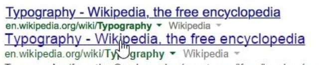
Apple has tweaked the typography in OS X Yosemite so that link underlines skup over the descenders. What’a descender? It’s the little dangling parts on letters, like the tail of the lowercase ‘p’, ‘g’ or ‘y’.
I love this stuff. It’s like the way you can tell when a writer cares or has just knocked a piece out for the cash. Previously I’ve thought this about things like the way Microsoft can’t be bothered to translate all of Windows’ dialogue boxes: you can be working a PC in France and after a few French warnings, there’s an important one in English. I think details matter anyway, always, forever, but when you’re making something that literally millions and millions of people will use and see for eight hours or more every day, details are special.
Read the full piece.