If you can buy only one OmniFocus, get the iPad version

That used to be obviously true. Today, it’s obviously true.

The thing is that in between those two sentences lies a huge amount of movement on the Mac and the iPhone versions which went through revisions to become OmniFocus 2. Now OmniFocus 2 for iPad is out and it’s not only regained this ground as the best version, it now really works on its own.

Officially, all three do. There is no requirement to buy OmniFocus 2 for Mac, iPhone and iPad, you can get any of them. Or none, obviously, but you wouldn’t have be missing out on the single best productivity tool I know.

But in practice, it has been that you start with one version and you are drawn to the others. Partly through how useful each one seems, partly because they work best as a set. Or put another way: they don’t work so well on their own.

The Mac edition has always been the closest working on its own. Its problem used to be that it was just hard to use. Hard to grasp, somehow. Now with OmniFocus 2 for Mac that’s gone, that’s completely gone and the app is as improved in ease of use as it is in features. Today I’d argue that the only problem with the Mac one is that it’s necessarily less portable. You need your To Do list with you everywhere you go because it’s through this that you can make best use of an unexpected delay or a chance meeting.

So if you were intending to buy just one version you would look at the iPhone and the iPad editions first.

Rule out the iPhone one. It is very good. I’ve used it directly perhaps ten times today. I’ve added tasks to it via Siri a couple of times. I’ve now used the new Today View maybe seven or eight times. The iPhone version of OmniFocus is very good and I’d call it essential.

However, it doesn’t include the Review feature that the iPad and the Mac one do.

That’s a really important feature and I think a big omission from the iPhone OmniFocus. It’s how you take a step back and go over every task to see what’s on your plate and think about it all. You do that one or more times a week, then you forget stepping back and instead dive in to do things. It keeps you focused but it also keeps you concentrating on what needs to be done now.

Review is in the iPad version. Now with the new edition, so are improved Perspectives. This is a tool to slice up your tasks in myriad ways so that you can see what you can use and what you can do right now.

OmniFocus comes with some baked-in Perspectives such as the Forecast view that shows you what’s on your plate today plus lets you look ahead to tomorrow and the rest of the week. It used to be that you could only create these Perspectives on your Mac but now, there they are, right there, in the iPad version.

I imagine that OmniFocus 2 for iPad lacks some of the power of the Mac one but in my stress-testing today, I’ve not seen any of that.

So I would say that if expense means you can only really get one version of OmniFocus that it should be the iPad one. But I won’t say that. Because you won’t do it. Whichever OmniFocus you buy, you will pretty soon want the set and pretty soon after that you will be buying the lot.

It’s just that today all three versions are genuinely superb.

Enough already: Omni Group also updates OmniOutliner

omnioutliner
It’s a small update compared to the OmniFocus and OmniGraffle ones announced today but also I use OmniOutliner so I’m going to be getting this when it drops too.

Wait. Makes a mental note:

1) Get iOS 8
2) Get OmniFocus 2 for iPad
3) Update OmniOutliner for iPad
4) Update TextExpander for iPhone and iPad
5) Install TextExpander keyboard for iPhone and iPad
6) Update 1Password

I’d best get on with some work before iOS 8 drops then, hadn’t I?

For once there are no more real details about the OmniOutliner for iPad update: I found out via a tweet that just said it “will fix compatibility issues with iOS 8 and restore ‘Dark Mode'”. (Ken Case, @kcase, 17 September 2014). But you can read much more about OmniOutliner on my review covering the iPad and Mac versions or you could horse’s mouth it on the official site. With videos.

Launching today: OmniFocus 2 for iPad

I lied to you. I said that the instant, the instant that OmniFocus 2 for iPad is out, I’m buying it. My heart was telling the truth: OmniFocus 1 for iPad has been that useful and the version 2 releases for the Mac and iPhone are great, I will be buying.

But OmniFocus 2 for iPad requires iOS 8 and until you have that, you can’t even see it in the App Store. I don’t know if it’s there yet: I can’t see it because I don’t have iOS 8.

The new iOS 8 is coming today and is likely to drop around 6pm UK time. By when I’ll be off working for the evening.

So let me amend all this to say that the instant, the instant I’m back from the work I’m doing, if iOS 8 is out then I’m getting that free upgrade immediately and if OmniFocus 2 for iPad is therefore revealed in App Store, I’m buying that instantly, instantly.

Not as pithy as my original line, is it?

While we wait, there are more details on The Omni Group blog which says in part:

Beyond its new design, OmniFocus 2 for iPad offers two great new iOS 8 extensions, interactive notifications so you can immediately complete or snooze a reminder, improved searching, and background syncing. And, of course, all of the great features pioneered in the original iPad app, such as the built-in Forecast and Review perspectives.

OmniFocus 2 will be available for just $29.99, and its Pro upgrade will be available as an optional in-app purchase for $19.99.

For those of you who purchased the first version of OmniFocus for iPad, we have a very special deal: we appreciate the support you’ve given us through the years, and we’re showing our appreciation in a very concrete way by giving you the $19.99 Pro upgrade for free.

Introducing OmniFocus 2 for iPad – Ken Case, The Omni Group (17 September 2014)

I do like how well this company treats its customers: the upgrade pricing is unnecessary, given that I would still just buy it, but obviously very welcome.

Small but gorgeously formed: OmniFocus gets Extensions

If you have an iPhone or an iPad, just look at this:

New_OmniFocus_extensions_-_iPhone

One of the good things about OmniFocus is that you don’t tend to spend all day in it. You don’t go in, look at your next task, do it and then pop back for the next. It’s like you stock up your head with the things you need to do today and then you toddle off. But it’s handy to be able to check quickly and that’s what is going on there.

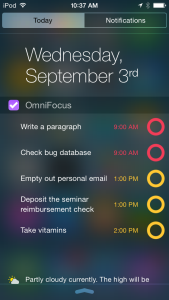
That’s the notification screen you get from swiping down on an iPhone. You can swipe down without unlocking the phone so it’s pick up phone, one swipe, read your OmniFocus tasks, done.

This Today view, as Apple calls it, has been around since at least iOS 7 but I can’t be certain when it started because I use it so rarely that I’ve forgotten. This is going to change now.

More details on The Omni Group blog.

Very nice: Microsoft OneNote adds superb iOS 8 feature

The new iOS 8 for iPhone and iPad – which will be available for free from tomorrow – includes a new feature called Extensions. And one Extension is a Sharing one that Microsoft has leapt on for its OneNote app.

If you use iPhone or iPad at the moment, you know that there is usually a Share button somewhere on the screen: it looks like a rectangle with an up arrow coming out of it. When you tap that, you get the option to share whatever is on your screen with anybody you like via email, for instance. Or AirDrop. If you’re looking at a photo you can Share it to your own photo library.

Now you will be able to share it right into OneNote. See something, write something, watch anything, tap and pop it straight into OneNote. It is a great feature from iOS 8 and it is really well adopted by Microsoft.

I’d say that I can only hope Evernote does the same thing but there is more to it than hope: you can be pretty sure that Evernote will. My Share button is going to get crammed with this stuff.

Not including OneNote. I don’t use OneNote. But it’s good touches like this that would make me think about it. Have a look at all this in action in Microsoft’s video.

Paper not better than ebook for reading, except…

I love ’em both, paper and ebooks. But it has been said and I have wondered whether I retain more from things I read on paper than on screens. Maybe so, but if it’s true, it looks like that may be more down to me than to the technology – except in one key respect.

Time.

A new study which found that readers using a Kindle were “significantly” worse than paperback readers at recalling when events occurred in a mystery story is part of major new Europe-wide research looking at the impact of digitisation on the reading experience.

The study, presented in Italy at a conference last month and set to be published as a paper, gave 50 readers the same short story by Elizabeth George to read. Half read the 28-page story on a Kindle, and half in a paperback, with readers then tested on aspects of the story including objects, characters and settings.

Anne Mangen of Norway’s Stavanger University, a lead researcher on the study, thought academics might “find differences in the immersion facilitated by the device, in emotional responses” to the story. Her predictions were based on an earlier study comparing reading an upsetting short story on paper and on iPad. “In this study, we found that paper readers did report higher on measures having to do with empathy and transportation and immersion, and narrative coherence, than iPad readers,” said Mangen.

But instead, the performance was largely similar, except when it came to the timing of events in the story. “The Kindle readers performed significantly worse on the plot reconstruction measure, ie, when they were asked to place 14 events in the correct order.”

Readers absorb less on Kindles than on paper, study finds – Alison Flood, The Guardian (19 August 2014)

‘Course, I only read the full piece on my iPad so maybe it really says something completely different.

Weekend read: the end of in-flight video

At least, the end of those terrible, terrible screens in the back of the seat ahead of you.

Earlier this year, I boarded a United flight from Newark to San Diego. After passing the first few rows, a young boy turned to his mother and asked, “Why aren’t there any TVs?”

“It’s probably an older plane,” she responded — but that couldn’t be further from the truth.

The aircraft, a 737-900 with Boeing’s Sky Interior (a Dreamliner-esque recessed ceiling lit with blue LEDs), had only been flying for a few weeks. It looked new, and it even had that “new plane smell” most passengers would only associate with a factory-fresh auto. But despite the plane’s clean and bright appearance, the family only noticed the glaring absence of seat-back screens. To them, our 737 might as well have rolled off the assembly line in 1984.

Why your brand-new plane doesn’t have a seat-back TV – Zach Honig, Engadget (6 August 2014)

You’ve already guessed that it’s because we watch more on our iPads with their gorgeous screens and just about anything we fancy watching. It’s not hard to beat those dreadful airline screens with a limited selection – all of which has been edited. They’re edited to take out material that might upset you as you fly in an airplane – I believe Snakes on a Plane gets shown as a three-minute music video – and they’re cropped to fit the crappy screens.

But what interested me in this full Engadget article is why airlines hate those screens too. That’s what sold me: this is true, this is how it is going to be on all aircraft, everywhere, just as soon as they can pull it off.

Wunderlist 3 – the best free To Do app?

Usually a question in a headline means the article will conclude ‘nope’ but this time, it’s more ‘perhaps’. When I do The Blank Screen as a full-day workshop, I include a section on To Do apps that begins with why you should use OmniFocus but pretty quickly goes on to why you shouldn’t and what you can use instead.

The reasons you shouldn’t use OmniFocus boil down to two: it doesn’t work on PCs or Android so if you do, there’s no point. And as reluctant as I am to say this since it has been such a big part of my life for a couple of years now, OmniFocus is not for everyone. It’s powerful and it’s complex and it costs a lot more than free.

Personally, it’s worth it. But if you’re just looking into this whole business of To Do apps, it’s hard to slap down a lot of cash straight away. Still, any To Do app is better than none and all of them are better than working on Post-It Notes that you keep losing.

So I recommend Wunderlist. Full disclosure: I’ve barely used it myself as I came across it after I’d swapped to OmniFocus. But I like what I see very much and, more importantly, it’s been recommended to me by attendees of The Blank Screen workshop too.

Now version 3 is out and the makers say:

Ten months ago – after launching Wunderlist 2, introducing Wunderlist Pro and Wunderlist for Business – we set out on a journey that we knew would take some time. Seeing millions of you organize your daily life with Wunderlist, share your grocery lists, track your favorite movies and run your business, we made a plan to rebuild Wunderlist from scratch, with the goal to make it better, faster and most importantly, ready for the future.

Although you couldn’t see the complex technology behind Wunderlist 2’s simple interface, you certainly felt the bumps in the road. Your lists didn’t always sync smoothly from your phone to your computer, you were missing a more modern interface or you wanted Wunderlist to be integrated with your calendar and others apps you were using.

Today, with Wunderlist 3 we are introducing the product we’ve always envisioned. One that sets the foundation for all the great new features and regular improvements that are going to come until the end of the year and beyond. It’s the fastest, simplest and most powerful Wunderlist you’ve ever used.

Wunderlist 3 is here – Wunderlist official site

Take a look at the makers’ video:

And now go download Wunderlist for iOS, Android, Mac, PC and more on the official site.

Review: Beesy, the bionic productivity app

This is going to be like reviewing a car by detailing how good the radio is. I’ve been using Beesy for a few weeks and I like it but I’m very aware that I’ve used it to scratch just one specific itch.

I have been, I remain and I suspect I will long continue to be an OmniFocus devotee but I have two problems with that. The first is a minor one, for me, in that OmniFocus is designed for individuals so whenever I have to delegate a task out to someone, it’s a bit convoluted. Beesy is more project-management-like with its ability to assign tasks to people.

Two or three times a month, though, I also have meetings where I come away with a lot of tasks. When Beesy approached me, I was struggling with how to both make notes during meetings – I’m secretary for some of them – and collect tasks. I’d ended up with a process whereby I’d make lots of notes and interrupt them with lines like this:

— William to phone Acme re delay

Then at the end of the meeting, I’d look for every line that began with those two dashes and I would copy them into OmniFocus. It works, and I have a Drafts thing that lets me send a pile of them into OmniFocus in one go, but not always successfully and always with a bit a of a fiddle.

Plus because I was writing all the notes, I found that my own little tasks got written so briefly that I would later struggle to know what they were about. Which particular delay? Who at Acme? When has this got to be done by?

So Beesy came along with its ability to take meeting notes and tasks simultaneously. Fairly simultaneously: I still have to break off from the minutes to tap a task button but, for instance, with that Acme one I’ll tap the Call button and the task goes in as that, a phone call, rather than me having to specify it. Since this is my To Do list, I can presume that all tasks as mine unless I say otherwise so that’s another time saving.

I find I use those moments to make the task clearer:

Tell Jeff at Acme that Project Diatribe is waiting on test results

That kind of thing.

I found that very quick and rather useful. It’s taken me a time to get used to where everything is in Beesy: there is so much you can do with entering tasks, assigning details, managing projects, managing calendars that it is overwhelming and you will not pick this up in twenty minutes.

But if you dive in with a particular need, as I had, then I think you pretty swiftly get to use that. Then you can expand out to the rest. You need to devote some time to this and I think you really benefit from jumping in completely. Don’t try to run your life through both Beesy and OmniFocus, as I have, make it your only system. It is more than capable of that, it just does take some effort.

However, I think it’s effort that pays off and that over time you will become immersed in it to the point that it is both easy and automatic to use. The company has a nice line about how Beesy is really a note-taking app, that you just use it to make notes and then everything else comes from that. It handles tasks, it produces proper meeting minutes for you, it’s the To Do manager for people who loathe To Do lists.

I think the complexity of Beesy comes from the volume of options and that the ease of it comes from how those all work together. Look at your projects, look at your calendar, look at your tasks and you see the same things in different ways. You don’t tend to have to think about much when you’re entering a task, you just know that it is in the pot and that when you need it, it’s there.

It’s also got a true Dwight Eisenhower grid view of your tasks: Eisenhower used to divide jobs into Urgent, Non-Urgent, Important and Non-Important. I’ve not been a fan of this, I think the time spent assigning priorities is usually better spent on doing the things but when you have a lot on, it’s a neat view. It’s just your tasks written out in squares but it works simultaneously for visual thinkers as well as word ones.

That’s in the app’s Dashboard view and, oddly, I’m least keen on this. It’s a simple overview with your calendar and that grid but I found I was always tapping on Project, People or Actions just to move on to those screens. It’s only an aesthetic thing: I’m not taken with how the app shows notes as pieces of paper at the foot of the screen. That’s a lot like the way Evernote used to do it and actually Beesy integrates nicely with Evernote. (So much so that Evernote wrote a blog about it.)

Very nicely, Beesy is being worked on extensively. I took a lot of screenshots as I was learning how to use it and then the software was entirely updated to an iOS 7 look. I was thinking about how you need your iPad always with you to use it – and then the company released Beesy.me, a web-based service that you can use anywhere.

Not to make this a Beesy vs OmniFocus scrap – they are both powerful, both take some learning but both are aimed in different directions – but it has been a common criticism of OmniFocus that it doesn’t have a web version. That doesn’t bother me but it does others and I see the benefit of a web version.

Take a look at the new video Beesy has done about its software and its web version.

Beesy for iPad costs £3.99 UK or $5.99 US. If you want to manage just one project you can use the web-based Beesy.me for free otherwise pricing starts at 5 Euros per month. It’s in Euros because Beesy is based in Paris: if I’d looked up their website while reviewing the software, it turns out that I could also have just looked up and seen them. I spent much of the time using Beesy in Paris myself, coincidentally just a couple of miles from their offices. This doesn’t help you or matter at all, but it tickles me. I love Paris and it’s good to see a French firm doing well internationally.

It’s interesting that it is so firmly an iPad app. I’d like there to be a native Mac and PC one as well but I suppose that itch is served enough by the online version. It’s also interesting that it’s so cheap. This is the kind of software tool that would’ve cost businesses hundreds of pounds in the past and I would call its £3.99 UK or $5.99 US a bargain if that weren’t such a huge understatement. Pricing helps you get noticed on the App Store but I do wonder if Beesy is undermining its own worth by being so cheap.

Still, that’s the firm’s choice: grab it now before they change their minds.

You can get Beesy for iPad here and there is much more detail about the software and its services on the official site here.

UPDATED 14 AUGUST 2014: Changed the official site address from www.beesy.me (where you can find the web version of the software) to www.beesapps.com where you can find everything.
Did I say this already? Buy 1Password right now

I definitely urged this in the latest edition of The Blank Screen email newsletter – do sign up for your free copy – and if I’ve met you on the street in the last few days I’ve undoubtedly pressed you on the issue. But I don’t think I’ve said it here and I must.

Buy 1Password for iOS now.

As in now. Please rush.

Well, you can take a little bit of time because it’s on sale and will be for at least a short while: it’s not one of those instant on, instant off sales. And as ever with things I recommend on sale, it is more than worth its full price so if you miss the discount, shrug it off.

So you know, the sale price goes thisaway: 1Password for iPhone is briefly £6.99 UK or $9.99 US (instead of £9.99 UK or $17.99 US). Check the maker’s website, though, because there are many options if you’re using more than one device: 1Password official site.

It’s a password manager – creates great passwords for you and then, this is the key part, both remembers them all and pops them into websites for you – and it’s also especially good at holding all your credit card details and, again, popping them into websites when you say Go. It’s also very cross-platform: I use it daily on Mac, iPhone and iPad but there is also a PC, Windows and Android version. They all play nicely, too, so if you’re a PC user with an iPhone or a Mac user with an Android phone, you’re fine. Possibly schizophrenic, but fine.

If you are on a PC or Android, my reason to urge you to buy 1Password is solely that it is so very good. Indispensable. I went from wondering why anyone would want such a thing to having it on my iPhone’s front screen and using it literally every day. Literally literally: there’s a thing I have to do every single day and I do it through 1Password because it’s so much quicker.

But.

If you’re on an iOS device, there is an extra delightful urgency to all this. Buy 1Password for iPhone or iPad on sale today and you will get the next version for free. The next version will be a significant upgrade but it won’t cost existing users anything and you will be an existing user.

I am an existing user, I am a now very long-standing existing user, and I’m excited by this – I don’t use the word lightly, I actually am excited – because of what’s coming in the next version.

The next 1Password will be the first or at most among the very first apps to use Apple’s new Extensions feature that lets one app use another. I told you that I do this thing every day: it’s using a website that I have to log in to and on my iPhone, I have to remember to go to it via 1Password in order to have the password app pop my details in. If I’ve just gone there via Safari, I either nip back and forth to 1Password, copying out my secure details and pasting them in to Safari – or I quit it all and start the job again in 1Password.

From the next version and Apple’s iOS 8, I will be able to just call up 1Password right from within Safari and have it do my doings for me. If I have the new 1Password, iOS 8 and a newer iPhone than I currently have, I’ll be able to tap my thumb in order to get it to enter secure details for me.

I’d say that if I were you, I’d buy 1Password now. But if I really were you, you’d already have it.