Google: the search engine that looked at goats

It’s not a metaphor. But it is a warning. Here’s the intriguing bit:

A few weeks ago, I discovered that Google knows the lifespan of a goat. Search for “how long does a goat live” and you’ll see it displayed in a special card above the search results. 15 to 18 years! It’s not an important fact, and I can’t imagine people ask it very often — but there it is. I couldn’t tell you where they got the answer (it’s surprisingly hard to nail down, as I’ll get into later) but I’m pretty sure it’s right. It’s the kind of accidental discovery that Google loves to serve up. I went looking for a fact, and there it was. You come away feeling as if the engine knows the answer to any question you could ask.

The official name for this feature is the Knowledge Graph, Google’s project for converting information on the web into easily managed cards. The sudden appearance of the goat data says a lot about the piecemeal way Google has been building it. How long had they known about goats? I made a few calls and Google got back with an answer: the card was added a year ago, as part of a broader animal expansion that also included a goat’s mass (45 to 300 kilograms) and height (40 to 58cm), with similar specs for other beasts. Unless you’d thought to Google “how long does a goat live”, you would never have known.

Why Google is learning about goats – Russell Brandom, The Verge (28 October 2014)

Read the full piece for the warning bit. Spoiler: what we think of is fact can be just a lot of good guesses.

Google revamping Gmail

I know this is just me, but Gmail is confusing. And sometimes even announcements about Gmail confuse me. Such as this one. I read Google’s news about a new email solution called Inbox and it felt like I was swimming in a little ocean of very gorgeously photographed images but not an awful lot of information. I did get that Inbox by Google wants you to include your To Do list in your email and that’s just a bag of spanners waiting to fall on you.

But a lot of smarter people who do like Gmail have been reading that same information and understanding it. Here’s one:

Today, Google unveiled a new email solution called Inbox, which looks like a marriage between Gmail and Google Now. Currently available by invitation only, this new app takes bits from your email like purchase invoices and bank statements and groups them together for fast access. Like Google Now, Inbox adapts to the way you operate, highlighting key pieces of emails like flight plans, photos, documents and upcoming event information.

Google’s new Inbox app is a marriage between Gmail and Google Now (update) | 9to5Mac (22 October 2014)

Read the full piece and let me know what it means.

It sounds like a joke but addiction to Google Glass is real

Maybe it’s more surprising that anyone has used it enough to get addicted yet. But The Guardian reports of a man who had been wearing one for his job and it’s caused problems:

Scientists have treated a man they believe to be the first patient with internet addiction disorder brought on by overuse of Google Glass.

The man had been using the technology for around 18 hours a day – removing it only to sleep and wash – and complained of feeling irritable and argumentative without the device. In the two months since he bought the device, he had also begun experiencing his dreams as if viewed through the device’s small grey window.

The existence of internet addiction disorder linked to conventional devices such as phones and PCs is hotly debated among psychiatrists. It was not included as a clinical diagnosis in the 2013 update to the Diagnostic and Statistical Manual of Mental Disorders, the official reference guide to the field, and many researchers maintain that its effects are merely symptoms of other psychological problems.

Google Glass user treated for internet addiction caused by the device – Azeen Ghorayshi, The Guardian (14 October 2014)

Read the full piece.

Gmail adds nice Unsubscribe feature

Well, you’ve always been able to unsubscribe from advertising emails but Google is making it easier: if the email has a wee little unsubscribe link hidden at the bottom, Gmail will pop an unsubscribe link right up at the top where you can see it.

Two things to note. First, this is rolling out across Gmail but Gmail is big so this will take time and you may not see it just yet. But hold on, it’s coming.

Second – and trickier – think twice about unsubscribing. You know how you don’t always remember when you signed up to receive something? Occasionally you didn’t and it’s spam. In which case, hitting Unsubscribe sends a message – literally – to the spammer telling them that this is a real email account with a real human being reading it. No chance they’ll go “oh, okay, let’s take ’em off the spam list”.

Previously if I’ve had any doubt I’ve marked the emails as junk and let Mail (I use Apple’s Mail) deal with it. There is a wee problem with that: if the email is not junk, the fact that you junked it gets reported back to whichever company is delivering the emails. If enough people junk the emails, the sender is blocked. You can bet that spammers have ways around that so the only ones who suffer are legitimate companies that you really did sign up to receive emails from.

If you’re struggling with a huge amount of email newsletters and the like, take a look at Unroll.me. When you let it, Unroll.me scans your emails and gives you a list of everything that you can unsubscribe from – and lets you do that with a click. I’ve not used it myself but it comes recommended.

Quickly find something on a website

Google searches everywhere, pretty much, and the search within a particular website is often rubbish. Often seriously rubbish. But you can combine the two to get straight to what you want.

For example, if you wanted to find every mention of OmniFocus on this site, The Blank Screen, then you would need hours of reading but practically no time searching. Just go to Google and type”

OmniFocus at williamgallagher.com

That’s it. Google will now search williamgallagher.com for the word OmniFocus. The search page will go on and tell you more from other places, especially if anyone’s linked to my blathering on about that To Do software, but the top results will be the ones you want on the site you’re searching.

Google Reader: I’m not mollified

Previously… Google took over the world of RSS – an idea that lets websites send their news stories to you instead of you traipsing to them – and when the competition had gone, and all around was peaceful, they dropped it. The same week they dropped this Google Reader service I relied on, they announced a new one called Google Keep: nothing to do with Reader or RSS, it was an Evernote clone that was promoted as the great way to keep all your information for ever.

Or until Google switches it off.

I’m not bitter.

This week, Google’s Jon Wiley did a Reddit Ask Me Anything and the topic of Google dropping features came up. He said:

One thing that’s almost always guaranteed with product design: when you add a feature, no one complains about it outright; if they don’t love it they mostly just ignore it. Whereas if you take something away, you’ll hear about it if people relied upon it… loudly and often. With something like Google Search, even if just a small fraction of people miss a feature and an even smaller fraction says so, that can still be tens of thousands of people. It can seem like a tidal wave of opposition to the removal: “look at all these people who want it back!”

So it would be much easier to leave in everything that’s ever launched. But then you end up with bloatware: an unwieldy array of ill-fitting modules that don’t work well with newer technologies (e.g., the shift to smartphones, or upgraded security, or touchscreens, etc.) and don’t really serve most of your users well either. And nothing comes for free – every feature must be maintained, supported in multiple languages, on multiple devices, and the additional complexity must be accounted for in testing so that the entire service remains reliable. And that cost gets balanced against the impact: is this feature solving an important problem for lots of people?

There are many, many such features that you always have to make tough choices about. We’ve actually cut features that I love. This is one of the toughest but most important parts of designing products – deciding what to trim as you move forward. Sometimes you over-trim – we work to measure the impact and aim to strike the right balance. Sometimes we get it wrong, so it is important that people speak up. We really do listen, and we prioritize according to what seems to satisfy the widest needs given our capabilities.

Google’s Jon Wiley on Ask Me Anything, Reddit.com (24 July 2014)

Makes sense to me. Now, explain why Google didn’t just get rid of a feature, it got rid of an entire service.

Thank you: Google Docs and Drive explained

Because I’ve been getting these confused.

Google’s recent upgrades to Drive have made clear the company’s going head-to-head with Microsoft on productivity services. Unfortunately, in its efforts to emulate the industry standard, Google’s made its cloud-based apps every bit as Byzantine as Office365.

Google’s services overlap and their names aren’t self-explanatory. This problem is aggravated by the company’s propensity to change those names, consolidate services under one moniker, or simply discontinue them.

Fortunately, underneath the confusing nomenclature you’ll find that Google is currently offering three major productivity services to the public. (While you’ll find dozens of additional products on the company’s master list of products , we aren’t focusing on non-productivity business services like Google AdWords, Google Analytics, Google Payments, and so on in this story.) Here’s an analysis of each to help you decide whether one (or more) is right for you.

You don’t know Docs from Drive: Google’s productivity apps, explained – Christopher Null, PC World (7 July 2014)

Read the lot, do.

Persuasive argument for Android Watches

Let’s be clear here, I think this is a persuasive argument for a watch that connects to your phone and relays information. A smart watch. An iWatch, if you will. But I don’t think it’s persuasive enough to make me want to buy an Android phone. Plus, the fella is a fan of Google Glass so you have to make allowances.

But otherwise, I think he has some good points. I have been a bit on the fence about this. If Apple really does release such a watch then I will look at it because of how useful other Apple gear has been to me. If Microsoft really does release such a watch then I won’t – because of previous experience there too. (Remember: Windows for the D’oh!)

I was also put off the topic by recent torrential rumours of Apple’s one being tied to health topics and health monitoring. I don’t want my watch telling me to exercise more.

And I am put back on the topic every time I see a Moto 360 image like this:
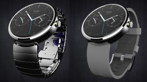
Moto-360

Nobody’s saying when that will be released or what it will cost and there is an issue over how it’s apparently bigger than you think. Plus, I think it requires a phone to connect to and that this phone can’t be an iPhone one. But still, every time I see that, I think I could handle wearing a smart watch.

That’s not a reasoned or experienced analysis, but even though it is heavily Android-weighted, this is:

As was the case with the iPad, the experience of using an Android Wear device is transformative and completely unlike what you might imagine it to be. You have to experience it to understand its pull.

Yes: Android Wear is flawed, clunky and not ready for prime time. The LG G watch I’m using is too bulky and square — the round ones will be much better. And even the coveted round Moto 360 is too big.

But Android Wear watches are the first smartwatches to cross the line from awkward to awesome, because they’re the first to completely abandon the smartphone’s icons, menus and widgets paradigm and massively leverage subtle contextual cues, images, icons and colors to present tiny nuggets of information in their most essential and quickly graspable form.

I jumped back into the car and started slowly clawing my way through city traffic to head back home to Petaluma. At my first red light, I began wondering about the exact definition of a word that I sometimes use with a general but not exact understanding of its definition. Without even removing my hand from the wheel, I turned my wrist slightly and said in completely natural speech: “OK, Google: Define rife.” About a second later, the definition silently appeared on my wrist. I scanned the definition and said “Wow!” Then the light changed and I drove off.

Looking up a word is the least powerful, least interesting thing one might do with wearable technology. Yet it was thrilling because of where and how the interaction occurred. The wrist is a perfect place for instant, quickly scannable data. All the we-don’t-have-to-accept-ignorance qualities of the smartphone revolution are multiplied when an Android Wear watch is on your wrist.

Over the next few hours, simple notifications appeared, which gave me nice nuggets of knowledge without causing any disruptive shift in attention. It was like Google Glass, but more subtle and therefore more intimate and personal.

Here’s the most important takeaway from this column — the wrist is a spectacularly perfect place to get notifications, launch voice commands and get Google Now cards. Like the iPad, it feels so good — you’ll know it when you feel it.

Why Android Wear is the new iPad – Mike Elgan, ComputerWorld (28 June 2014)