Actually, this is about a lot of things including focus and moving on to new tasks and I was just going to quote you an excerpt but I’d like you to see the whole video. It’s a talk by a designer and illustrator I’ve never heard of before and I can’t say I’m exactly drawn to his work now, but there’s interesting stuff about being creative and productive.
design
Take a year off every seven years
So there’s this fella named Stefan Sagmeister, right, and every seven years he closes his design business for the next 12 months. The obvious first thought is that this is nice for him, a second obvious thought is that you hope it’s nice for his staff if he has any – he’s not all that clear on this point – and maybe a third obvious thought is that this idea is bloody expensive.
I suspect that last, least, most unlikely obvious thought is that you’ll do this too or that you could do it too. Still, he’s very convincing about the benefits and actually rather convincing about the necessity too. Enough so that it’s making me wonder whether I’d benefit from closing my business for a minute.
If Omni makes, it’s worth a look
I don’t honestly know what OmniGraffle is for. Hang on:
OmniGraffle is for creating precise, beautiful graphics. Like website wireframes, an electrical system design, a family tree, or mapping out software classes. For artists, designers, casual data-mappers, and everyone in-between.
Thanks. For some reason I read that, I understand it, but I forget it. And the next time there’s a new version of OmniGraffle, I get to wondering: what in the hell is OmniGraffle?
It’s not for me, that’s the other answer and it’s the explanation. I don’t need graphics like this, I don’t create them, I can’t create them. So in my productively-focused brain, it wouldn’t get into my head and it wouldn’t get a spot on The Blank Screen. But it’s by the Omni Group.
I am wedded to this company’s To Do software OmniFocus. If it ran on Windows and Android, I would skip a whole chunk of my workshops and just recommend OmniFocus to everybody. As it is, I recommend OmniFocus to everybody. Buy a Mac first, if necessary.
Then if I’m wedded to that, I’m having a fling with OmniOutliner. This is the outlining software that changed my mind about outlining. I used to do it solely when contractually obligated. Now I am still an explorer on the page but if I have to do anything quickly, I whack down some thoughts in OmniOutliner and let them grow until they find their own form. I’ve done books like this. Interviews. Events. I’ve done things where having juggled the outline around until I’m happy, I’ve then sent that outline directly into OmniFocus where it’s become a whole series of tasks.
I am now planning a lot more events and I’m toying with OmniPlan chiefly because it’s made by the same firm. So when the Omni Group announces a new version of OmniGraffle, I notice and am compelled to tell you about it. I’m just rubbish at actually telling you anything about it. So do go read the full piece on the Omni blog.
Jony Ive: design education is so poor it is “tragic”
He’s surely the most famous living designer in the world and what he’s famous for is the highest of high tech. But Jony Ive says colleges are failing students by giving them too many computers. It’s more than an observation, it’s the result of difficulties the current education system is causing for industry. We keep hearing that arts projects are bollocks and colleges should teach practical disciplines that get jobs but right now education isn’t doing that:
“So many of the designers that we interview don’t know how to make stuff, because workshops in design schools are expensive and computers are cheaper,” said Ive.
“That’s just tragic, that you can spend four years of your life studying the design of three dimensional objects and not make one.”
Read the full piece. Actually, scroll down a bit first: the top is an article about Apple designer Jony Ive’s talk at London’s Design Museum but underneath it is a fuller transcript and puts some of the quotes in a better context.
Sunday read: Design is Eating the World
The industrial revolution democratized consumption. By rationalizing the production process, things were made vastly cheaper and more plentiful. The average person living in a developed country today has access to more products and services than even royalty did a century ago.
Yet there have been some trade offs. In earlier days, craftsmen created products from start to finish, but now each part of the value chain is now highly specialized. As Leonard Read so aptly pointed out in his 1966 essay, I, Pencil, even the manufacture of a simple writing implement is beyond the reach of a single person.
This has been especially true of design. In the days of craftsmen, each product was a singular event. In an industrial environment, however, a design is repeated thousands or even millions of times. That leaves no room for whim or fancy, because each element is tightly integrated into a massive industrial complex. Errors are profoundly expensive.
Design Is Eating The World – Greg Satell, The Creativity Post (21 October 2014)
Read the full piece.
Jony Ive on design, theft and tomatoes
It’s clearly an edited video and you’ll want them to have posted the full thing but Vanity Fair has done an interesting interview with Apple’s Jony Ive:
Vanity Fair editor Graydon Carter and Apple’s senior vice president of design, Jonathan Ive, sat down for a wide-ranging discussion at the Vanity Fair New Establishment Summit in San Francisco.
Ive spoke candidly about what he learned from late Apple founder and C.E.O. Steve Jobs, how he feels about competitors whose products border on “theft,” and his own development as a designer. He also shared the specifics of his daily routine, and offered an in-depth look at the creative process of Apple’s core design team.
Here’s the video.
When you’ve seen it, you’ll like Ive. And if you do, let me recommend the book Jony Ive: The Genius Behind Apple’s Greatest Products by Leander Kahney. I don’t tend to read many biographies, I’m less interested in people’s childhoods than I am in what they’ve done to make me hear of them. But I bought this quite gingerly and then had a really good time with it.
Prototypr for Mac (briefly) free
You know how when you need something, it seems to be everywhere? I’m going to be working on an app and so everywhere I look I am reminded of this.
Sometimes it’s useful, as in references on various podcasts. Sometimes it isn’t, as in Community season 5, episode 8, “App Development and Condiments”.
Look out for it.
And then there are times when it’s handy. As in tonight, when there’s a Mac app called Prototypr that has briefly gone free. Usually retailing for £6.99, it’s for building a kind of demo version of your app idea: showing the screens and what it will look like without it actually being able to do anything.
It means you can try things quicker and get to the design you need sooner.
Have a look at Prototypr. I’ve not used it, but while we were talking, I was downloading it.
Intentionally awkward office furniture for writers
With shelves that are a little out of reach and a chair that requires balancing, the idea is introduce a “bearable discomfort” to make life a little less smooth–and a little more healthy.
Right. I’m thinking that I might be able to solve that “shelves that are a little out of reach” design by pulling the bloody things closer. But:
French designer Benoît Malta, by contrast, is creating products that are purposely a little less convenient, so people are forced to get up more often. And even if they stay seated, they’re forced to sit in an active way.
“Domestic activities are less and less physical,” says Malta. “I decided to work on different typical daily situations like turning on a light or reading email on a computer, and I tried to design objects that modify our habits and try to engage the body differently in everyday life.”
Read Peters’ full piece for photographs of example designs including a chair that you have to balance on rather that flop over. I don’t expect to flip over it either.
This is design
It angers me – actually angers me – when people insist design is making things pretty. You get this a lot from PC users who say Mac ones are fools paying extra for pretty boxes when Windows is just as good. It’s like script writers who claim dialogue is a tasty little extra you add on your final draft. These are both bollocks but they’re pervasive and persuasive bollocks because they’re said by writers who can’t write dialogue and they’re usually said by PC users who couldn’t afford a Mac. I have more time for the PC users, I think scriptwriters who can’t write dialogue are like taxi drivers who can’t drive.
But it’s still bollocks. Dialogue and design are things you see on the surface but which reach down to the very bones – or they don’t work at all.
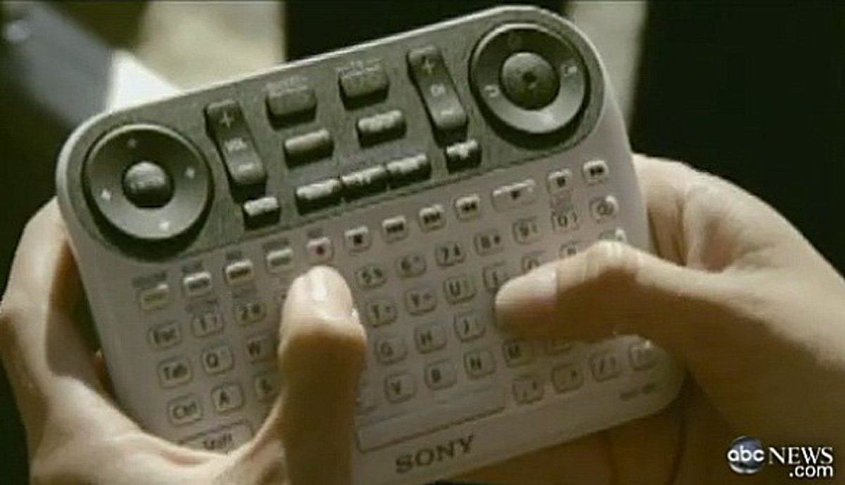
And here’s an example. I got this from an article on Business Insider which ran a report about an internal Apple University. This place tries to convey to new employees what design, and everything else, means to Apple. And it reportedly includes a point where a lecturer will show employees an image of a TV remote control. Business Insider believes it’s this one:
That’s a Google TV Remote built by Sony. It’s a TV remote. A remote control for your TV set. It looks like one of those model helicopter controls coupled to an ancient Blackberry or perhaps a label maker, but it’s a TV remote.
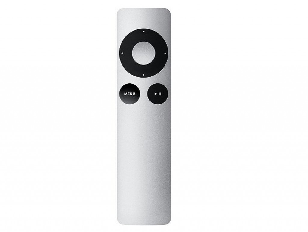
And then of course the Apple professor shows Apple’s equivalent:
Yes, it’s prettier. But you’ll also use it. That’s the thing: not fancy aesthetics, not pretty pictures, but something that you will use to do something you want to do. Design is not about device per se, it’s about you. Making it work for you.
That’s design.
Video: design and creativity by Michael Beirut
The other day I was a bit sniffy about an interview with this designer, Michael Beirut – seriously, if he were any more famous you’d have heard of him – in which he said something about even boring jobs can be important because they touch so many people’s lives. So far, so fine, but then the examples he gave were so interesting I thought he’d list his sense of scale.
Not so much.
Watch him now in full flow in his own talk
Michael Bierut: 5 Secrets from 86 Notebooks from 99U on Vimeo.

