Even boring jobs can make a difference to people

I have a problem with this headline because I think all the work in this video is deeply interesting. But the designer in it insists he learnt the lesson that even work that seems dull may reach out and change peoples’ lives. I don’t need convincing.

Instead of just going through the motions on your next project [says 99U], look for the hidden opportunities you already have. On The Creative Influence, graphic designer Michael Bierut challenges us to look for opportunities in even the most dull assignments. He speaks about his mentor, designer Massimo Vignelli, when he was asked to sort through the chaos of the New York subway signage during the 1960s.

Michael Bierut: Make the Best of What You’ve Got – Stephanie Kaptein, 99U (22 July 2014)

Five personal rules by Swiss Miss

I’ve long been reading the work of designer Swiss Miss, aka Tina Roth Eisenberg. She’s clever and she has taste and I did not realise until this talk that she is also insane. Admirably so.

This is how – and why – she started a new business the day she gave birth to her daughter. Then she decided she didn’t like having clients, so she stopped.

War is heel

High heels make you stand up straighter, they push your shoulders back and you look more confident, they somehow do nice things to how your calves look. What’s not to like? Apart from the way they destroy your feet, hurt like the devil and if men like them so much, let them bloody well wear ’em for a bit and see what it’s like.

Men did wear high heels. We wore them first. We came back to our senses. This is one of myriad tiny moments of information I relished in this week’s edition of the 99% Invisible podcast. It’s a really well-made series about design and it appeals to the part of me that thinks of the details in how we do things, why we do them, and whether they help us or not.

Usually, I just have a good time listening to this show but this week’s one about the engineering and the history of high heels is particularly fascinating. There is something just riveting to me about its detail on how engineering and design solved certain problems in making heels and how that contrasts with how they are the devils’ torture tools.

You’ll wince a lot but you’ll also laugh. There’s a moment when the regular presenter Roman Mars recommends Googling a particular topic but deeply strongly advises that you don’t use the image search. “There are some things you just can’t un-see.”

Do have a listen to this episode of 99% Invisible.

Here’s how well I know the story of the ⌘ symbol that has come to mean so much to Apple users – because we use it so very much – and to mean absolutely nothing to us – because we barely think about it. I used to have a white sweatshirt that had a ⌘ icon on it. Loved that.

Loved it so much I wonder where in the world it has gone. I do know where in the world I got it but unfortunately you can’t still get them. (But keep an eye on the website of Susan Kare, famous icon designer who didn’t design this one. She did pick it, though, and that’s the story of the ⌘:

Known sometimes as the St John’s Arms, it’s a knot-like heraldic symbol dating back in Scandinavia at least 1,500 years, where it was used to ward off evil spirits and bad luck. A picture stone discovered in a burial site in Havor, Gotland, prominently features the emblem and dates from 400-600 AD. It has also been found carved on everything from houses and cutlery to a pair of 1,000-year-old Finnish skis, promising protection and safe travel.

It’s still found today on maps and signs in northern and eastern Europe, representing places of historical interest. More famously, though, it lurks on the keyboard of almost every Apple computer ever made—and in Unicode slot 2318 for everyone else, under the designation “place of interest sign.”

What is Apple’s command key all about? – Tom Chatfield, Medium.com (13 April, year uncertain)

Read on at the full article – and if you find my sweatshirt, please let me know. Last seen in Paris, if that helps.

Share and share sort of, a bit, kinda alike

20140615-121520-44120762.jpg

If there’s one question I get asked about how to do things online, well, actually, I don’t know what it is, I haven’t been keeping track. But I do very often get asked how to send somebody something. It’ll be how to send a photo, how to forward a webpage, all sorts of things and the answer always begins “You see that ‘Share’ icon?”

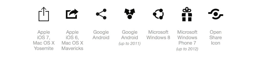
Unfortunately their response nearly always begins with “What ‘Share’ icon?” because there are so many and, arguably, none of them really sing out to you as meaning the thing by which you show somebody something. I think the Apple one up there, the square with an arrow bursting out, is the clearest but I am also certain that I think this only because it’s the one I see most often.

Min Ming Lo sees more of them: that image above is from his blog where he says:

What do each of these symbols have in common? They are all trying to convey the exact same action – share! Sharing to a social network or via email is a ubiquitous action nowadays but designers have still not been able to reach a consensus on what symbol to use to represent it. Not only does each major platform use a different icon, but they’ve each witnessed changes over the years.

I have spent sometime thinking about this, trying to figure out which symbol best conveys sharing to the user.

Share: the Icon Nobody Agrees On – Min Ming Lo

He does come to a kind of conclusion. But it’s the journey that’s worth the read, especially when you see the strange ideas different companies have for what icon to use.

Google’s new design ethos

Previously… I told you about Apple’s long-standing Human Interface Guidelines that I read first as a paperback book in the 1990s but is now a free iBook. I just find the intense thought and detail fascinating, the care and the thought. Take a look at me enthusing and then get the iBook too.

Now Google has something in the same ilk. I’m telling you this moments after learning about it so I don’t yet know how interesting it is. But one of the key reasons I don’t use the free Google Docs is how clunky it is. I do change my mind every time I see that price, but still, it’s just not a pleasant experience and I would be facing that unpleasant design for 12-15 hours a day if I used it.

So I am very interested in what design improvements Google has been doing. If you are too, take a look right here.