Jony Ive interview

The Financial Times has an interesting interview and profile of Jony Ive, chief designer at Apple, the company that today announced details of its Watch. Ive is credited with the Watch and, says the FT, with getting Apple to its current incredible financial worth:

In great part, that valuation rests on the shoulders of a 48-year-old Englishman. Yet as he lopes towards me down the corridor, in his comfortable suede shoes, bright-blue trousers and baggy, long-sleeved yellow top, his kindly features creased up in a welcoming grin, those broad shoulders seem remarkably unbowed.

Ive is arguably the most influential designer in the world, and yet he does that slightly disingenuous self-effacement thing characteristic of confident people who say they are just part of a team. There is a gentleness about him. He talks quietly and articulately in an accent unaffected by two decades in America. Even when he describes those who copy Apple as little better than thieves, it is with a smile and softness of tone that suggests he would far rather the unpleasant subject had never been brought up.

The man behind the Apple Watch – Nick Foulkes, Financial Times (6 March 2015

Read the full piece.

Recommended: Snapselect for OS X

This week I began writing software reviews for MacNN.com and as I was doing this one, I thought of you. While we’re writers, we do have to be so conscious of images and graphics now plus we can’t help but have a great camera in our pockets – because our phones all have them. I think one consequence from this is that we get eleventy-billion images.

I know I did.

Years ago I was enough into photography – I’ve had some published in US books – that I invested in Apple’s professional image application, Aperture. I’d have to check this, don’t make me swear to it, but when Aperture came out, it was so new and in such a new field that nobody quite knew what to make of it. They tried comparing it to Photoshop, where it failed because its image editing is much more basic. They tried comparing it to iPhoto and it failed because it isn’t as easy as iPhoto.

Yet I believe Adobe got it, they understood. Or maybe more likely they were eying up the same issues that Aperture was intended to solve. Adobe Lightroom became the other application in this new genre of serious photo management.

I was a bit fascinated by this because it reminded me of TV drama reviews where at first everyone is criticising a show and then later they’re adoring it. In this case they were poo-pooing an entire form of software and very quickly they were using it. But then I was also a lot fascinated by how they used it and how these two applications did the same thing in different ways.

Very broadly, very crudely, Aperture was a smash-and-grab do-anything kind of application where you bunged in your photos and then you worried about them later. Whereas Lightroom required you to add them in a certain way, process them in certain steps and really go through a particular workflow. I’m not that disciplined and Aperture just seemed to suit me better, so I bought Aperture.

Unfortunately maybe I needed a touch more discipline than I have. Or perhaps Aperture did. Because I added a lot of photos and then by mistake added them again. And again. Over time there are up to five duplicates of some shots and one thing Aperture is bad at is helping you spot those and delete them.

Flashforward a few years. I’ve pretty much stopped using Aperture because it was full brimwards with these duplicates and near-duplicates from when I would over-shoot events. Also, Apple abandoned Aperture. That was a big surprise to me and I think it was a big mistake. As ever with software, you can carry on using something. Nobody comes and switches off Aperture just because Apple doesn’t sell it any more. But there will come a time when they might as well have. There will be some moment in the future when you have to choose between getting some Apple OS X upgrade and sticking with an old one to keep Aperture alive.

I will upgrade. I say this not just because I know myself but because I know that I’ll upgrade before I notice that it kills Aperture.

So I have been mentally preparing to move my images out of it and I haven’t because I’m not mentally prepared to slog through all those bloody shots. Which is where Snapselect came in. Do you remember reading the word Snapselect about five miles up above this line? I reviewed Snapselect and it did – it is doing – the job I need. It’s taking me a time to work through everything because it is slow and I am busy but every few hours I take a minute to schlep through a few images and kill off the duplicates and the bad ones.

And my telling you that tells you the story behind this paragraph from my review:

We imported a fairly disastrous Aperture library that had over 30,000 images, and took up around 300Gb. It took Snapselect 11 minutes to load it, and then not far shy of 150 minutes to produce the thumbnails — which then took over two hours to analyze. Be smarter than us: bring in a few folders at a time. Snapselect makes that easy, but we just wanted to show off.

Hands On: Snapselect photo management app (OS X) – William Gallagher, MacNN (19 December 2014)

Read the full piece to get some screenshots – watch for my finger in frame in one – and details of how to get it. If you don’t need it, you may not even see the point. But if you do, go buy Snapselect because it solves the day.
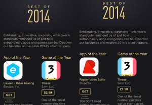
The iPhone App(s) of the Year – as chosen by Apple

Spot the difference:

best-iphone-apps

On the left, Apple’s iPhone App of the Year – Elevate. On the right, Apple’s iPhone App of the Year – Replay Video Editor. The difference is that I took the screen grab on the left on my iPhone while logged in to my USA iTunes account and the other while back on my UK one.

Interestingly, both Elevate and Refresh are available in the two stores. I just don’t know anything about them because I’d not even heard of either until twenty minutes ago. This is another thing that makes me wonder if they are really the best app(s) but then that is being a bit parochial of me. Maybe I’m just looking for my favourite apps of the year and these aren’t them.

If you fancy the brain training utility Elevate – seriously, I don’t know anything about how it elevates your brain, you’re on your own there – or Replay then you’ve just read over the links.

Know when you need help

When the Wright brothers made their historic first flight in 1903, lots of other inventors were trying to fling their own shoddy little planes into the air. And in 1977, when Steve Wozniak and Steve Jobs unveiled the Apple II, there were a zillion other nerds working on building a personal computer.

But Woz beat them to it, and Jobs knew how to sell it.

The Apple II was the product that turned Apple into Apple. It was the iPhone of its era, the product that redefined every machine like it that came afterward.

Its real magic was Wozniak’s minimalism. He integrated many technologies and components that no one else had put together in the same device, and he did it with as few parts as possible. It was, as Wozniak wrote in his autobiography, “the first low-cost computer which, out of the box, you didn’t have to be a geek to use.”

But as genius as Wozniak was, the Apple II almost didn’t make it out of his brain and into a product that the rest of the world could use.

Apple’s first employee: The remarkable odyssey of Bill Fernandez – Feature – TechRepublic

Read the full piece.

Evernote claims people are ditching PowerPoint in favour of the note software

Well, actually, the headline writers at Evernote claim that: the article they head stays a little away from the topic. It’s also even more of an advert than this sounds but Evernote gets some wriggle room here because PowerPoint is rubbish. Treat this less as an ad campaign aimed at PowerPoint users and more at telling you how Evernote has this Presentation Mode.

Hand on heart, I’ve ignored it because I do all my talks with Keynote and like it a lot. But this could be handy.

Meetings are a major part of our daily routine. At their best, meetings foster collaboration and openness. At their worst, they leave us feeling drained and directionless. The frequent culprit: slide decks. The problem can be summed up with one word: preparedness.

In the world of slides, being prepared for a meeting refers not to productive time spent getting your thoughts together, but rather the hours devoted to fiddling with design templates, and turning good ideas into bullets. The result of this preparedness is a presentation that’s more pitch than discussion. It’s locked. Your team’s feedback will have to wait.

There’s a better way, and it overcomes all these shortcomings. It’s Presentation Mode. We use it everyday and it’s had a significant impact on the quality of our meetings. They’re faster, more focused, and more collaborative than they’ve ever been.

The New Presentation Mode will Change Your Meetings – Andrew Sinkov, Evernote Blog (3 December 2014)

Read the full piece.

“Why I Left iCloud Reminders for Todoist”

I’m just after telling you that Things is briefly free now on iOS and I was thinking of saying it’s the second-best To Do app on Apple gear. But there is this: Todoist. I’ve used it and haven’t in fact got one single pixel of a memory of what I thought about it. But MacStories writer Federico Viticci is a fan and a compellingly persuasive one.

In a three-biscuit long article, he talks about how Apple’s Reminders turned out to be much better than he’d expected yet eventually he had to move on:

Reminders isn’t built to scale for people who manage dozens of projects and collaborate with others to assign tasks and keep track of due dates. It’s not Apple’s fault – it’s right there in the name: Reminders. It’s not called “Projects” or “Todo Pro”: Reminders is a lightweight list system with support for dates, alerts, and lists shared with others.

I guess it was naive of me to think that, with a growing business and changes to my personal life, I wouldn’t face an increased amount of responsibilities. Reminders couldn’t keep track of the new complexities and people in my life. I started forgetting about things I needed to do; sometimes I forgot to mark tasks as done so other people wouldn’t know what my status was; and, other times Reminders wasn’t working for them but I was forcing them to use it because “iCloud never had issues for me”. Both the Reminders app for Mac and Fantastical for iOS were overflowing with assignements and notes that were hard to find and that just kept piling on each other day after day.

Why I Left iCloud Reminders for Todoist – Federico Viticci, MacStories (19 November 2014)

Read the full piece.

Jony Ive: design education is so poor it is “tragic”

He’s surely the most famous living designer in the world and what he’s famous for is the highest of high tech. But Jony Ive says colleges are failing students by giving them too many computers. It’s more than an observation, it’s the result of difficulties the current education system is causing for industry. We keep hearing that arts projects are bollocks and colleges should teach practical disciplines that get jobs but right now education isn’t doing that:

“So many of the designers that we interview don’t know how to make stuff, because workshops in design schools are expensive and computers are cheaper,” said Ive.

“That’s just tragic, that you can spend four years of your life studying the design of three dimensional objects and not make one.”

Design education is “tragic”, says Jonathan Ive – no writer listed, DeZeen Magazine (13 November 2014)

Read the full piece. Actually, scroll down a bit first: the top is an article about Apple designer Jony Ive’s talk at London’s Design Museum but underneath it is a fuller transcript and puts some of the quotes in a better context.

Video: the most productive computer you can buy

I think that’s a fair summary, if you rule out that it’s rather costly. And if it isn’t a fair summary, this is: the new iMac has the best display it is physically possible to purchase.

Two years ago I was havering over moving to an iMac and one thing that held me back was that a version with the so-called Retina display was coming. A Retina display, as defined by the iMac’s maker Apple, is one where someone with normal vision, sitting at a normal distance from the screen, can no longer distinguish individual pixels.

I reckon aging does the same job but, still, you see a Retina screen iPhone and you ain’t going back to a non-Retina one. Or at least I haven’t and won’t, so the iMac getting such a screen was a big deal. It didn’t happen then and I bought a 27in iMac that I suppose one must now call non-Retina. It is still the most beautiful display I’ve ever owned and that I get to work on this machine every day is pretty much a treat.

If I am more productive now than ever then I would put it down to OmniFocus and my iMac. That computer has let me get on with things more than ever before, and I’ve owned Macs since the 1990s.

I’m not going to own this one. I’m not. I’m not. I don’t want to see it. Keep it away. But The Verge has done a video review of it and I think convey everything very well. It’s like whenever you see an ad on TV for a new TV, they can go on all they like about the picture being better but you’re still looking at it on your old rubbish screen. There’s an element of that here but I think it’s really protecting me from a purchasing decision I do not need, I do not, I do not, I do not.

Oh! Here’s a fact for you. You know the new 4K TV sets with utterly where’s-my-jaw screens? The new iMac is 5K. Carry on.

The case for ditching Microsoft Office if you have a Mac

Well, I think this is part of the case. It’s a fine enough argument but maybe it’s not stating anything new: Apple’s Pages, Numbers and especially Keynote are in many ways better than Microsoft Word, Excel and especially PowerPoint. For better, I don’t just mean free or that they are installed when you buy a new Mac, I mean actually better.

That’s an easy claim to make when one’s work is not stretching the limits of what word processing, spreadsheets or presentations are doing. Except Keynote vs PowerPoint. That’s a separate argument, less because Keynote is as good as it is and more because PowerPoint isn’t.

But it’s this kind of more-complex, depends-on-your-needs argument that maybe this article from Apple Gazette lacks. But for an otherwise good laying out of the situation, take a look:

For years, Microsoft Office has been the gold standard for productivity software for business. If you took an inventory of the applications on most computers used in the corporate environment, chances are you’d find some version of Word, Powerpoint, and Excel installed on the majority of hard drives. MS Office has gotten so ubiquitous in fact, that it is installed on more than 85% of business workstations worldwide, making it as dominant in the productivity software space as Window is amongst operating systems. Fortunately, Apple has created a viable alternative to Office in the form of Pages, Numbers, and Keynote, collectively known as iWork. These apps provide most of the same functionality as Microsoft’s software, but with the simplicity and ease of use that we expect from an Apple product. Here’s iWork is the better software solution for Mac users.

Why Apple’s Productivity Apps Should Replace Microsoft Office for Mac Users – (no byline), Apple Gazette (24 October 2014)

Read the full piece.