Trello – visual To Dos for teams

 There’s little getting away from the fact that a To Do list is a list. It’s a lot of words, ranged in a column, and if there is anything visual about it, it’s that together they look daunting. But there are things you can do and Trello is a free service that has a good stab at one of them.

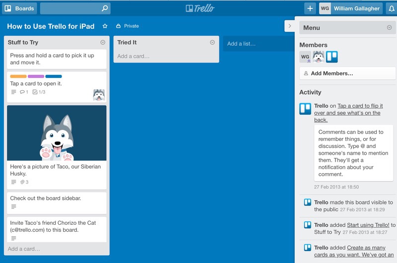
Specifically this. You do end up with lists in Trello but each list is like a stack of little cards and you can drag them around. In an ideal, recommended, go-on-try-it Trello way, you might have one stack for all your tasks, then one very short stack for the thing you are doing now. You might also have a stack for the one thing you will do next. Also a stack for everything you’ve done.

When the time comes to railroad, you can look at your Next Thing To Do stack and slide the card over to the Look I’m Doing It Now stack. And then have a quick look through Everything On My Plate and drag out one card to be the Next Thing To Do.

The visual part is the dragging. It looks and feels like you’re doing this on paper on your desk and that may suit you amazingly well. I learnt of Trello from a friend for whom it works amazingly well: she can see what she’s got to do at all times.

Plus she works in a team and while they haven’t all adopted it yet – she’s the first one to try it out – they now have the option for the entire team to use the same free system and work together. 

It sounds ideal and it could be for them, it might be for you, right now it seems it definitely is for the friend who told me about it. 

It isn’t for me, though.

That’s for a lot of reasons and I think the first is down to how you spend that time picking the next thing to do. Time spent working on your list is time you could be spending on doing the tasks.

Next, the space you put these stacks of cards is called a board and not only can you have many boards, you are encouraged and expected to. Have one board for all the things that your colleagues are working on together but keep a separate, private board for all the secret trysts you get up. (I’m not judging.) 

That’s fine and my friend has many boards already, but for me it’s back down to the business of having one system for everything: how do you know you’re done when there are always other boards to check?

There is also the fact that Trello doesn’t have the oomph of something like OmniFocus. Plus it’s an online service. You use it via iOS apps on your iPhone or iPad, but it’s really an online service and you can’t use the apps when you don’t have an internet connection.

That’s bad. That’s the only thing I’d say is definitely bad: everything else I don’t like is personal preference, but the inability to use this when you’re away from a wifi hotspot is bad.

My friend tethers her wifi-only iPad to her iPhone to get it to work or sometimes she just uses it on her iPhone. So it’s not a dealbreaker for everyone and it does have this unusual visual aspect that is going to be worth a lot to many people.

So especially as it’s free, do go give Trello a spin, would you?
Review: DropTask

If there is anything greater than the number of To Do apps on the App Store, it is the number of productivity gurus who say you should use them. They are right. But unhelpful. If you loathe To Do lists, it may be that you abhor lists of any kind. So telling you to buckle down to it, telling you how great To Do lists can be, it’s never going to work for you. You’re too busy to write out silly shopping lists of tasks, you need to be doing this urgent work. Also, when you’ve got a list, it’s far too much tedium checking it and maintaining it. Nonetheless, if you are a visual thinker, you were out of luck. Until DropTask.

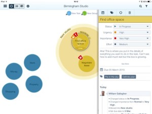
DropTask aims to do two key things. The first and in every possible way the most apparent is that it is a visual To Do list. No rows and columns, no indents and tabs, just circles that you drag around. That dragging is part of the second purpose of DropTask: it wants to be very, very fast to use. You don’t have to fiddle with the onscreen keyboard to do everything, just for adding detail. Drag a blue dot onto the centre of your iPad screen and that’s a task. Drag a green dot the same way and that’s a group: it’s a large circle into which you can then drag tasks.

Picture Venn diagrams but without any overlapping circles.


wg_DropTask-001-580


Set yourself circles for Office, Home and any other main area of your life, then start filling each with tasks. The group circles grow as you add or drag tasks into them. Circles are always the same, big and clear size: they don’t get smaller when you add more, DropTask just widens your canvas. You can tap on a task to set due dates and add details of what exactly it is you need to do to complete the task. Nicely, you can separately set urgency and importance so later you can filter to see just, say, the urgent and important tasks. It’s akin to the Dwight Eisenhower grid method and is very much better than assigning random priority levels.

That’s a nice touch and the visual nature is DropTask’s killer feature. It isn’t going to cut it for you if you have a massive number of To Do tasks and entering details of the task take more taps than we’d like given the speed of everything else in the app.

There’s no OS X version but there is an online one at droptask.com and that is very quick at smoothly keeping in sync with the iPad edition. That’s particularly useful for Droptask Pro which is built to work with groups so that you can assign tasks to colleagues via the app and they can work through them anywhere.

Droptask comes as two separate iPhone and iPad editions, both of which require iOS 5.1.1 or later and both of which are free. For $65/year you get the Pro group features and subtasks. There’s also an Android version, which is free as well.

It’s definitely not for you if you’re currently looking at OmniFocus or Things. But then it’s also not for you if you’re on Wunderlist or Reminders. This is a mid-range powerful To Do manager which is good but has this visual system, which you may find unbeatable.

Pattern Weeks part 3: ready for you to see

Well, there are limits. I want you to see an illustrated plan of my typical or pattern week because I want you to see if it’d be any use to you too. Plus, I hope that showing it you here means I’ll stick to it and find out whether it’s really any use to me.

Previously on Pattern Weeks… really the only thing to check out if you want to know more about this is the first post I wrote back on 31 December. Now read on.

Or rather, look on. Here’s the final thing: a pattern for my week that I’ve made my desktop wallpaper on my iMac and, here, my MacBook. The MacBook and its screen are artistically blurred; the tea mug in the foreground is mistakenly blurred.

TBSmug

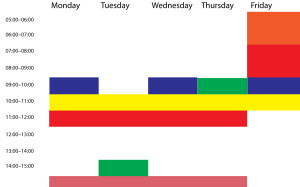
And below it is the actual pattern, albeit without any incriminating text.

Pattern-Week-No-Text

I won’t get any points for artistry. And without the incriminating text, I think there is only a little you can take away from the idea. But it’s a good little. And it’s this: I have put these many tentpoles into the week where at certain times I will do these certain things. That means on the one hand that I’m trying to guarantee that these get done but also on the other that there’s all that whitespace. That’s when the real work of the week will be done. If I planned it out too much, I’d be so often breaking the plan that I’d come to ignore it.

I think what I’m trying to create here is analogous to an ordinary office job’s schedule. Whatever you do, you have certain times in which to do it and there are points when you have to attend meetings or deliver reports. And as I say in The Blank Screen (US edition, UK edition) I believe that when you have a commitment like those, it takes away a lot of the churning stress. It adds other issues, but for that hour or whatever, you know you are doing what you have to do and you therefore don’t spend a lot of energy questioning it. You just get on with the gig.

The one other thing to say is that I’ve got to underline the word pattern. This is what my week should look like, it is the pattern for the future. And I know it won’t be like this. For one thing, I’ve planned out here 05:00-15:00 which I’m finding is a good amount of time to work both in when I’m at my best and in how much I can get done. But this coming Thursday, for instance, I’m definitely working until 21:00 so I might start either that day or Friday a bit later than usual.

But we’re halfway through January already and while I’m getting a lot done, I need to do more and the visual reminder right here on my screen, constantly, permanently, I am hoping that it will help. That it will keep me on track through the week and that it will also appeal to the visual side of me as I go.

We’ll see. But this is something new and just sometimes I suspect I need a new toy to help me work.