Very, very snap review: OmniDiskSweeper for Mac

I tells you, right, I’ve got a 3Tb hard drive in this ‘ere iMac and it got down to just 15Gb free. Without my noticing. How dare it.

If you go below around ten percent free space on your hard drive, you pay for it in a dramatic slowness and that’s what I’ve had lately. This is the fastest machine I’ve ever owned, it is so much faster than my last Mac – a Mac Pro that officially ran for six years but actually I’m still using sometimes – that I could design books using the Adobe CC suite. But suddenly it was a molass at opening a folder.

OmniDiskSweeper saves the day. It’s a tool from the Omni Group and it chunders away across your drive, totting up the figures and tutting a bit, then showing you the lay of the land. You’re spending how much space on movies? Everything’s detailed and shown in such a way that you can quickly zero in on the – in this case – more than a terabyte of files to do with one old job. I am at this very moment copying that lot off to an external drive and intend to luxuriate in an iMac that is restored to life and which has enough room to paddle about in.

OmniDiskSweeper is free. Get it where many fine applications are sold, over at The Omni Group. It interests me, mind, that I would not have heard of or found or considered OmniDiskSweeper if I didn’t happen to be an ardent user of one of the firm’s other products and a pretty ardent user of a second. The Omni Group makes the To Do manager OmniFocus and the outlining software OmniOutliner. I am actually waiting for the chance to give them more money for the next versions of OmniFocus, I like it that much.

Very, very snap review: RescueTime

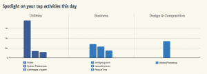
You know how you hear about something and then suddenly it’s everywhere? I’ve been hearing of RescueTime like it’s a new thing but it’s been around at least for a while and it does this (click to see it better):


Screen Shot 2014-02-18 at 11.37.46

If you didn’t click – and honestly who has the time to click? – then what it says is that I have spent about a minute and a half in Photoshop today. And that was the result. A cropped screen grab you can barely see. Oh, and also the wee cropped-even-closer graphic in Save a Whole Second When You’re Installing Software on Macs. A minute and a half. Wasn’t worth it, really, was it?

But it also tells me I stopped by the Omni Group website – not a shock, Omni does my long-beloved To Do manager OmniFocus and my recently-becoming-beloved OmniOutliner – and some stuff about how I piddled about in my Mac’s Finder. As you do.

But if that looks a bit rubbish as a snapshot of my entire working day – it’s now 11:45 and I’ve been writing since 5am so I promise I’ve accomplished more than that – it is a terrific snapshot of the three minutes since I installed RescueTime.

In the free version that I’m trying out, RescueTime does this logging so that you can see where in the world you spent your time. I’m looking forward to how it describes my bacon sandwiches at lunchtime. But armed with all this, you can see where you are effective and where you are procrastinating. You can see what on your computer keeps you working and what keeps you from working too. There’s a paid-for Premium version which lets you work with that information directly: it assigns scores to how distracting various sites or activities appear to be to you and then you can say no more. For the next thirty minutes, or whatever you choose, the premium version of RescueTime will deny you access to what most distracts you.

The premium version has other features and costs $9.99 US/month. The free one is impressing me, a whole four minutes in, so I’m going to keep it around for a time longer. I wrote in The Blank Screen (UK edition, US edition) about software that blocks distracting websites by actually blocking the whole internet but I have never used any of it. This might change my mind.

Save a whole second when you’re installing software on Macs

It’s only a second, but it adds up. Next time you download some software to your Mac, don’t wait for the Verifying. Just immediately click Skip.

skip-button

After all, what exactly are you going to do if it fails to be verified? If it’s going to die on you, take that gigantic gamble of waiting until you run this software. It will always be fine. If there were every anything that would’ve stopped the thing being verified, the application won’t run now and you are no further behind than you were.

I’m wondering if this is all a hangover from the days when we would lose disc 6 of 19. Do you even remember the prehistoric days when you used to have to buy software on disc? I know. Crazy.

Two updates for Launch Centre Pro

The new: Launch Centre Pro's iPhone version has some twiddles including a new keyboard – and there's now an iPad version.

The links: Launch Centre Pro for iPhone, Launch Centre Pro for iPad (they're not the same)

The cost: the new iPad version is £5.49 and the iPhone one is £2.99.

The rest: the point of LCP is that you can pile a bunch of buttons into one spot on your iOS device and with a tap at least open applications quickly. That's enough for many people but really it's not for launching apps per se, it's best for making those apps do something. So, for instance, I have long had a button that fires up OmniFocus and enters a task. Rather than find OmniFocus – though, look, it's right there on my front page, where else would I put it? – and then open it, then tap to add a task, I can be just right in there typing. In, out and gone faster than OmniFocus itself is.

Or rather, was. I've been noticing that OmniFocus 2 for iPhone running on iOS 7 is usually as quick to enter a task as Launch Centre Pro is. Enough so that I keep going straight to OmniFocus instead of LCP.

Right now I am havering over whether LCP earns its keep on the front page of my iPhone. Right now, probably not. But if I relegate it to any other page then I will simply never use it because it will never be quicker to go via LCP.

But if it's of use to you and if I regain my habit of using it myself, Launch Centre Pro is a good application. And now it has added a new keyboard designed to make typing faster. I've not tried it. I may be the only person in the world who can type just fine on the iPhone, but I can so I do and have never even looked into this one.

Whereas I did soon and fairly often look to see if there were an iPad version of Launch Centre Pro. I reckoned I could do something with that and TextExpander to create a quick way of logging sales. But I couldn't because there was no Launch Centre Pro for iPad.

And now there is.

Same idea, same use and for me the same question of whether I'd use it or not. So far while I'm thinking about the iPhone one, I haven't dropped six pounds on its iPad cousin. But I do go in cycles with this app, I may well be back.

Review everything so you don’t have to see it all

Yesterday's post about reviewing one's Evernote notes each day got me a message about how OmniFocus rocks reviews. It does. I even said so. In fact, I said it was because I'd felt the huge benefit of reviews in OmniFocus that I was going to give this similar Evernote one a go. But I didn't say what OmniFocus's review is.

I'm not sure I've even said what OmniFocus is. That's rare. Usually you can't shut me up about this software. It even comes up in my otherwise application- and platform-agnostic book about productivity for creative writers, The Blank Screen (UK edition, US edition)

Songs will be sung of the day I finally shut up about it. OmniFocus is a To Do manager but as I'm sure I've said before, that's like saying War and Peace is a stack of paper with some ink on it.

So, you may guess, I'm a fan. Rather than fan on at you about it now, though, I want to make sure we're clear on what a review is in this context. If you have OmniFocus, great. If you can get it – it only runs on Macs and iOS so Windows and Android users are out of luck – well, that's great too. But if you don't have it, you can still do this part.

Maybe not so well.

Actually, no, there's not a maybe about it. OmniFocus does reviews really well, most especially in the iPad version.

But you can and even more than I would go on at you about OmniFocus, I would go on at you about reviews.

Here's the thing.

Right now I have several hundred tasks in my To Do manager, arranged in probably a couple of dozen different projects. Everything I ever have to do, everything I ever think of gets chucked into OmniFocus. Now, many of them never get done. If it occurs to me, I'll add it to OmniFocus and think about it later. When that time comes, often I've done the thing already. Very often I'll find it occurred to twice so it's in there twice. And fairly often I'll look at it and decide no, I'm not going to do that.

But otherwise, it's all in here and it's all live.

Except.

I have a busy day today and OmniFocus is showing me 24 things. Just 24. Actually, hang on… I see I've done four of them this morning. Okay, that's 20 left. But as much as 20 is, it's nowhere near as much as several hundred. I can completely forget all the rest of them, I can pretend they don't even exist and because I do that, I am doing these twenty – wait, just remembered another one I've done, it's now 19 left – I am doing these 19 at a clip.

That's nice for me.

But the reason I can do it all is that OmniFocus is hiding the rest until I need them. And the reason OmniFocus can do that is because I review regularly.

On Mondays, Wednesdays and Fridays I open up OmniFocus and check every task in every project. If you think ticking one thing off as done is good, imagine how great it was just now ticking off five or doing a review and seeing you've already done thirty tasks. I look at every task and if it isn't done yet, I have a ponder about why. Do I need to do something else before I can get that done? Fine, add another task. I rattle through these remarkably quickly and at the end I still have the hundreds of tasks but I know what they all are.

And most importantly, I know they're being dealt with. Those things I have to wait for Bert to call me back, they'll wait there until he rings me or I chase him. Those things I know I have to do on Tuesday, I'll see the list on Tuesday and not before.

You end up trusting your system, whether it's OmniFocus or anything that works to David Allen's Getting Things Done ideas (UK edition, US edition). And that trust is amazingly liberating. Knowing that you list is only showing you what you need to know now, it means that the list is doable.

And that means you do it.

This is one of the key things that makes a To Do list something I use rather than hide away from. And it's just this simple idea of a review.

Seriously, you don't need OmniFocus to do this. But, seriously, OmniFocus could just be the finest piece of software I've ever used and it is certainly the one thing that has made me productive. You'd think they were paying me.
Unread RSS app review – bright and appealing but not there yet

If you already use RSS and have any Apple news sites in your set, you will today be reading raves about Unread, an RSS reader for iPhone. This is not one of them. But it's close. And the more I use Unread, the more I like it – but the more it bothers me, too.

There are two elements that make Unread notable and very attractive: gestures and text. The text reportedly uses a font called Whitney and it is visibly small yet particularly clear. Reading is a true pleasure on this app. I wish there were an iPad version: Unread feels like the thing to kick back with and relax while you read rather than when you're darting about.

Then you don't have buttons anywhere, you have gestures: you just pull at the screen. Tug left to go into an article, tug right to go back. Unread uses iOS 7's swipe-to-go-back feature that is so natural you keep trying to do it in apps that haven't got it yet. In Unread, it feels natural but also very quick: it's as if thinking what you want to do is enough to make it happen. See an article, start reading an article, and don't notice that you gave a short tug on the screen to go into it.

Then a tug inside an article will get you a menu with options for sharing and for marking articles as read.

That was my first irritation. I had a website's feed that I scrolled through, reading the headlines and the short stand-first introductions to each article but I didn't especially want to read further on any of them. To clear the list of unread, I had to tug to get a menu, choose Mark All as Read, then confirm that before continuing. You can switch off the need to confirm but I confess it took me a surprisingly long time to find the Settings page that allows this. (You just keep swiping left, across from the article, across from the feed, across from the list of feeds, just keep swiping. Once you know it's there, it's far faster than it sounds.)

Getting rid of the confirmation was a boon but I still had to do that Mark All for every feed. Read every article or Mark All as Unread. Those are your choices and it's the same for every RSS reader yet in Unread it is a pain. Reeder has a little button at the foot of a list of articles: tap that and you mark all as read – and you also go immediately back to list of feeds. With Unread, you swipe to get the Mark All option, tap on that, and it does go to the list of feeds but with a beat pause at the list of articles you've just marked as read.

Maybe that's all part of the unhurried feel to the app, which is appealing and is a stated intention of its design. But where in Reeder tapping that Mark All button is natural and quick, somehow having to elect to bring up a menu first makes Unread feel like a chore. I like the lack of buttons and I very much like the swiping around gestures, but this one is a niggle.

An annoyance is that Unread shows you the list of all your newsfeeds – whether they have any unread articles in them or not. You always get the list and there's either a number next to them or there isn't. The designer of Unread says the app isn't meant for people with hundreds of feeds as I have, but that's what I have, so the fact that I have to scroll past many that don't have anything in them is another chore for me.

But I was persuaded enough by reviews to buy Unread – for a brief time it's on sale at £1.99 UK, $2.99 US – and I'm trying it as my only newsreader. Part of the appeal of it, though, is just having a new view after a long time with a familiar one.

If there were an iPad version, I can well imagine my using that for a relaxed read in the evenings and sticking to Reeder in the day. For now, it's iPhone-only and for me it's a mix of great elements and chores: I really don't know whether I'm going to become a fan or drop it as I have so many RSS readers before.

Free online storage, small catch

For the next couple of weeks, you can get 50Gb of online storage space for free by downloading the new iPhone and iPad app Box.

That's the small catch: it's 50Gb alright and you don't have to pay for that, but it's another place to have more storage. I've got 9Gb of space on Dropbox that I pummel, I've got 15Gb of iCloud space that I strain, I've apparently got some more on LogMeIn's Cubby.com. Does Evernote space count too? I would like more of it and I would certainly use it to the hilt if I did, but I'm spread everywhere.

I might have a Skydrive too. Never looked.

Box is nearer Dropbox and Skydrive than it is iCloud and if you've just nodded then you may well be in the market for what the company calls “the best content viewing and collaboration experience available today for your iOS device”.

Box is free and you can download the iOS app here.

http://feeds.gawker.com/~r/lifehacker/full/~3/Jm0eQ1INgcg/grab-50gb-of-free-storage-for-life-on-box-by-downloadin-1501956228

First world problem solved: copying between Mac and iOS

Short and simple: buy Scribe and thereafter you can type something on your Mac and it'll just be there on your iPhone or iPad when you turn around. Scribe is free in iOS and US$2.99 for Mac.

Slightly longer and less simple: isn't that what iCloud is supposed to do? Yes, kinda, and it is definitely true that you can and that I do use Evernote for exactly this. I also use Pages for it. And Numbers. But Scribe is meant to be like the clipboard: just as quickly and effortlessly that you copy something and paste it somewhere else, that's Scribe. It's just that you're copying it on your Mac and pasting it on your iOS device.

Hat nod to 99U which says more.

If you must use email as your To Do list…

…well, you're going to go spare with confusion and the effort you put into managing it all will be achievable but wasted. I'm all for To Do lists but I want to spend the least time on the list and the most time doing the things I have to do. Email just doesn't cut it – but many people disagree and one group of them has also done something about it. Mindsense has released a Mac version of its iOS app Mail Pilot.

You read your email through it as normal but then mark it as if it is a task. So a previously-accused Email To Do-Er would read a message, see that the sender needed them to do a thing, and then they'd mark it as unread. Now in Mail Pilot, you instead have the option to mark something as Incomplete. Later, when you've finally remembered to do the thing buried deep down in last Tuesday's email – and checked that it only needed you to do one thing, not a dozen – you can mark it as Complete.

I sound like I'm knocking Mindsense and their new software but if I worked this way, I would use Mail Pilot. It has quick keystrokes for marking things up, it can set various reminders for you to alleviate the Last Tuesday Syndrome, it's been working popularly on iOS for some time.

I just think it's Occam's Razor: do you use a stylish-looking, well-made app to try managing your email To Do list or do you stuff email and do this properly in a real To Do task manager?

Mail Pilot is on sale for an intro price of US$9.99

OmniOutliner 4 released today

The short take on this is that if you bought OmniOutliner 3 from the Omni Group's site any time since January 6, 2011, wait.

Wait for an email that is reportedly heading your way with details of how exactly you can get the new OmniOutliner 4 for free. Free. Nothing. De nada.

Similarly, if you bought version 3 of this extremely good outlining application from the Mac App Store in that time, you'll also get it for free and you also have to wait a bit. The app has yet to work its way through the Apple approval system but when it goes live, it's yours.

But otherwise, go to the Omni Group site now with a credit card. If you've ever bought a previous version of OmniOutliner, you'll find you don't have to spend a huge amount to get the new one. And if you never have, wait a second: watch the introductory video about the new version.

And then whip out the card or tap whatever dangerously handy keystroke you have to make 1Password enter your CC details into online store forms.

Full price is $49.99, paid upgrades start at $24.99 and if you're eligible for a free upgrade, you'll never guess how much it will cost you.

I can't say I have a on/off love affair with outliners, it's a bit more of a tepid relationship that that. But I used to loathe them, I still get edgy, but OmniOutliner just got me through so many different and difficult projects that I am a fan.