Self Distract: the end of Kindle?

My personal blog this week is about a claim that ebooks and specifically Kindle have had their day and are now steadying off as just one format instead of the dominant one. I don’t know if it’s true but there’s something to it and I’d be okay if ebooks stayed as one option.

I just wish Kindle books weren’t so ugly.

Read more over on Self Distract.

The worthy and best way to present

What’s it called when a book as one title followed by “Or” and another one? As in Frankenstein or The Modern Prometheus? This is The Worthy and Best Way to Present or A Longer Term Review of David Sparks’ Presentation Field Guide.

This iBook was released on 21 July and I started reading it immediately. I remember saying on the launch day that:

This book was released sometime overnight, I got it around 8am, I’m maybe a third of the way through the text – I’ve not looked at the many videos yet – and I have a complaint.

He’s so persuasive about preparing your presentation before you ever go near Keynote or PowerPoint that I resent the bejaysis out of him. I have one presentation to give tonight and three tomorrow. I wanted a quick fix! I wanted a magic sauce!

David Sparks’ Presentation book now out – William Gallagher, The Blank Screen (21 July 2014)

In the end, I actually gave five over those two days, 21 and 22 July. It’s complicated. But it was also true what I said about how good it made me feel that I was already doing some things Sparks recommends: that’s how persuasive and convincing he is, I read this book and feel that he’s right. Therefore whatever I do that is the same is also right, therefore I am right, therefore I feel good.

And then there’s the stuff he recommends that I don’t do. It was quite hard doing those five presentations with the book’s advice about planning in my head. The book’s very specific advice about how using Keynote is actually the last step, or at least toward the last step, as you should know what you’re going to say through planning and thinking first. The fact that I thought I had three and it became five rather tells you that I didn’t plan or, in my defence, couldn’t plan ahead.

I have not given a single presentation since then. But I have some coming up and I am using Sparks’ advice from this book. That may be the best review I can give it except that I think this leaves you only with the idea that the book is useful. It doesn’t tell you that it’s also fun.

Those five presentations went well but they were hard and they were part of a bigger project I enjoyed yet I’d got at the last moment. Even so, even with trying to plan in the gaps during the first day and then learning I really had to rework everything overnight, I was still going back to this book to read it at points because I was enjoying it.

Actually, as I write this to you, I still haven’t watched the videos or listened to the audio interviews. The book works without them but I’m expecting to find that they’re a good watch and listen too.

The therefore hugely recommended Presentations: a MacSparky Field Guide by David Sparks is available now in the iBooks Store for £5.99 UK, $9.99 US.
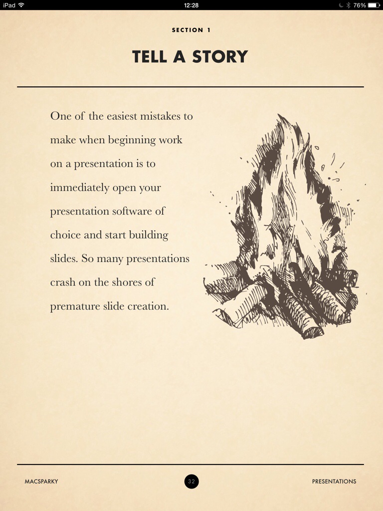
David Sparks’ Presentation book now out

This book was released sometime overnight, I got it around 8am, I’m maybe a third of the way through the text – I’ve not looked at the many videos yet – and I have a complaint.

He’s so persuasive about preparing your presentation before you ever go near Keynote or PowerPoint that I resent the bejaysis out of him. I have one presentation to give tonight and three tomorrow. I wanted a quick fix! I wanted a magic sauce!

I do have the very smugly gratifying fact that a few of the things he says I do already swear by. So it’s not as if my talks this week will be bad, exactly. God, I was nervous enough already, thanks a bunch for this. But I do also recognise and am persuaded of how they could be better. So you just wait for next week’s talks.

Presentations: A MacSparky Field Guide is now out in the iBooks Store (and only the iBooks Store) for a truly ridiculously cheap £5.99 UK or $9.99 US.

This week’s MacPowerUsers podcast is all about the book and the topic of presentations so you can get a good idea of whether you’ll like the book from that. But, spoiler alert, you will.

20140721-123802-45482250.jpg

Bugger. Got to buy this.

I bought an iBook called Paperless by David Sparks some time last year – wait, this is iBooks, this is the 21st Century, I can tell you in a flash… I bought it on 10 January 2013. It’s a very good read, it changed how I do a lot of things in my work, all’s good.

Then the same fella released a book about Email and I thought nah, I know from email. Then caught some of his MacPowerUsers podcast about the topic and thought, well, okay, possibly I don’t know quite as much as I thought. So on 15 November 2013 I bought the MacSparky Field Guide to Email

But that’s it. No more. What can this fella cover that I’d need?

Cue this morning and this announcement:

I’m pleased to announce the newest MacSparky Field Guide, Presentations. Most presentations are terrible. That, however, does not need to be the case for your presentations. This book explains how to create your own exceptional presentation. This Presentations Field Guide explains how to plan a presentation that will connect with your audience, the technical wizardry to create a stunning presentation, and walks you through presentation day to make sure it goes off without a hitch.

New MacSparky Field Guide: Presentations – David Sparks, MacSparky (30 June 2014)

I do a lot of presentations now. I have no choice. I’ve got to buy this. I would’ve bought it immediately and now be telling you what I think of it, but it’s not out yet. You can pre-order it for £5.99 UK or $9.99 US and it will ship on 21 July 2014. While we wait, here’s a short video trailer for it:

Now, don’t skip this too quickly…

Apple has released its iOS Human Interface Guidelines as a free iBook. And the thing of it is that even if you don’t like Apple, even if you’re looking at me like that because you can’t conceive of being interested in interfaces, the book is a good read. I think everything is interesting, except football, and behind anything is a lot of thought. Read this to see what lies behind the apps we use every day.

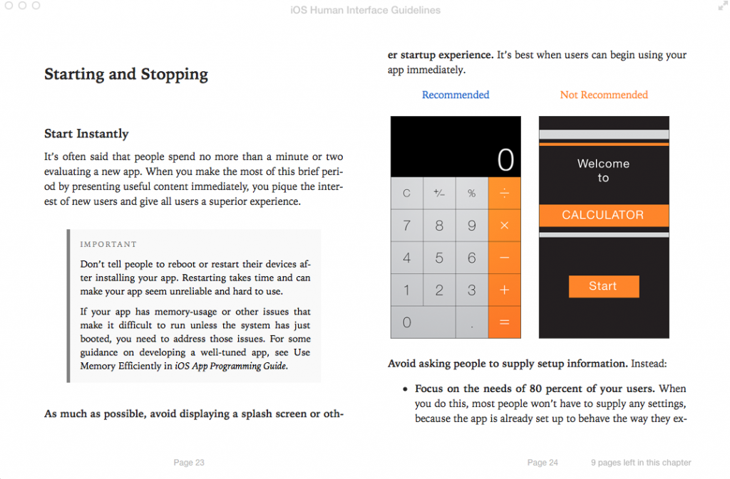
Screen Shot 2014-05-14 at 07.49.47From iOS Human Interface Guidelines, free on the iBooks Store


That’s a page recommending that an app just gets on with it. No fancy startup screen, just wallop straight in there.

Startup screens, sometimes called splash screens, are where a company’s logo or the app’s name are displayed at the start. Lots of people hate these and argue that they’d rather get on with using the software but the splash is often there because it takes time for certain apps to load and the alternative is that you have nothing to look at. The alternative is that you wouldn’t be sure it had even started. So they can be necessary. But Apple is really keen on you making apps that load quickly enough that you don’t need them.

I read the old Mac Human Interface Guidelines in paperback a lot of years ago and I’ve never designed a Mac app. It’s still like getting a peek at a philosophy of craft. I don’t believe there’s a Microsoft or an Android equivalent book but I’d read it if there were. Mind you, Microsoft has done something similar in blogs and I did read those until they suddenly took a daft turn into being demonstrably ridiculous. That’s where I read about a redesign of Microsoft Word and its last blog post showed a final screenshot and you could see what huge flaws remained.