Very, very snap review: RescueTime

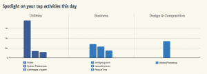
You know how you hear about something and then suddenly it’s everywhere? I’ve been hearing of RescueTime like it’s a new thing but it’s been around at least for a while and it does this (click to see it better):


Screen Shot 2014-02-18 at 11.37.46

If you didn’t click – and honestly who has the time to click? – then what it says is that I have spent about a minute and a half in Photoshop today. And that was the result. A cropped screen grab you can barely see. Oh, and also the wee cropped-even-closer graphic in Save a Whole Second When You’re Installing Software on Macs. A minute and a half. Wasn’t worth it, really, was it?

But it also tells me I stopped by the Omni Group website – not a shock, Omni does my long-beloved To Do manager OmniFocus and my recently-becoming-beloved OmniOutliner – and some stuff about how I piddled about in my Mac’s Finder. As you do.

But if that looks a bit rubbish as a snapshot of my entire working day – it’s now 11:45 and I’ve been writing since 5am so I promise I’ve accomplished more than that – it is a terrific snapshot of the three minutes since I installed RescueTime.

In the free version that I’m trying out, RescueTime does this logging so that you can see where in the world you spent your time. I’m looking forward to how it describes my bacon sandwiches at lunchtime. But armed with all this, you can see where you are effective and where you are procrastinating. You can see what on your computer keeps you working and what keeps you from working too. There’s a paid-for Premium version which lets you work with that information directly: it assigns scores to how distracting various sites or activities appear to be to you and then you can say no more. For the next thirty minutes, or whatever you choose, the premium version of RescueTime will deny you access to what most distracts you.

The premium version has other features and costs $9.99 US/month. The free one is impressing me, a whole four minutes in, so I’m going to keep it around for a time longer. I wrote in The Blank Screen (UK edition, US edition) about software that blocks distracting websites by actually blocking the whole internet but I have never used any of it. This might change my mind.
Save a whole second when you’re installing software on Macs

It’s only a second, but it adds up. Next time you download some software to your Mac, don’t wait for the Verifying. Just immediately click Skip.

skip-button

After all, what exactly are you going to do if it fails to be verified? If it’s going to die on you, take that gigantic gamble of waiting until you run this software. It will always be fine. If there were every anything that would’ve stopped the thing being verified, the application won’t run now and you are no further behind than you were.

I’m wondering if this is all a hangover from the days when we would lose disc 6 of 19. Do you even remember the prehistoric days when you used to have to buy software on disc? I know. Crazy.

Evernote and Pocket – together they fight crime

If it is always risky to rely on one piece of software – companies shut them down often enough – then relying on two is either doubly risky or twice as smart. But sometimes two totally separate applications from unrelated companies just happen to go together and produce something new. Ity that hydrogen and oxygen get together; two gasses team up to become a liquid.

This is what you can do with Evernote and Pocket: the former being the note taking application and the latter a Read It Later one.

Evernote is excellent for collecting notes but sometimes you don't want to keep them. If you just want to have a read and then decide whether you need to keep something around…

The solution is to dump all of the clippings from the web, Twitter, and your RSS reader to Pocket. Pocket makes it easy to check off the things you've read. Then, if you want to save the article for future reference, send it to Evernote. This way, Evernote becomes more of a long-term yet uncluttered storage tool.P

Evernote comes with a we clipper that is handy for grabbing pages yet somehow I only use it extremely rarely. It's just handier to save to Pocket. It's become automatic for me to do that where I have to positively think to use Evernote. Funny how some things stick with you and others don't.

Read more from writer Jamie Todd Rubin.

Review everything so you don’t have to see it all

Yesterday's post about reviewing one's Evernote notes each day got me a message about how OmniFocus rocks reviews. It does. I even said so. In fact, I said it was because I'd felt the huge benefit of reviews in OmniFocus that I was going to give this similar Evernote one a go. But I didn't say what OmniFocus's review is.

I'm not sure I've even said what OmniFocus is. That's rare. Usually you can't shut me up about this software. It even comes up in my otherwise application- and platform-agnostic book about productivity for creative writers, The Blank Screen (UK edition, US edition)

Songs will be sung of the day I finally shut up about it. OmniFocus is a To Do manager but as I'm sure I've said before, that's like saying War and Peace is a stack of paper with some ink on it.

So, you may guess, I'm a fan. Rather than fan on at you about it now, though, I want to make sure we're clear on what a review is in this context. If you have OmniFocus, great. If you can get it – it only runs on Macs and iOS so Windows and Android users are out of luck – well, that's great too. But if you don't have it, you can still do this part.

Maybe not so well.

Actually, no, there's not a maybe about it. OmniFocus does reviews really well, most especially in the iPad version.

But you can and even more than I would go on at you about OmniFocus, I would go on at you about reviews.

Here's the thing.

Right now I have several hundred tasks in my To Do manager, arranged in probably a couple of dozen different projects. Everything I ever have to do, everything I ever think of gets chucked into OmniFocus. Now, many of them never get done. If it occurs to me, I'll add it to OmniFocus and think about it later. When that time comes, often I've done the thing already. Very often I'll find it occurred to twice so it's in there twice. And fairly often I'll look at it and decide no, I'm not going to do that.

But otherwise, it's all in here and it's all live.

Except.

I have a busy day today and OmniFocus is showing me 24 things. Just 24. Actually, hang on… I see I've done four of them this morning. Okay, that's 20 left. But as much as 20 is, it's nowhere near as much as several hundred. I can completely forget all the rest of them, I can pretend they don't even exist and because I do that, I am doing these twenty – wait, just remembered another one I've done, it's now 19 left – I am doing these 19 at a clip.

That's nice for me.

But the reason I can do it all is that OmniFocus is hiding the rest until I need them. And the reason OmniFocus can do that is because I review regularly.

On Mondays, Wednesdays and Fridays I open up OmniFocus and check every task in every project. If you think ticking one thing off as done is good, imagine how great it was just now ticking off five or doing a review and seeing you've already done thirty tasks. I look at every task and if it isn't done yet, I have a ponder about why. Do I need to do something else before I can get that done? Fine, add another task. I rattle through these remarkably quickly and at the end I still have the hundreds of tasks but I know what they all are.

And most importantly, I know they're being dealt with. Those things I have to wait for Bert to call me back, they'll wait there until he rings me or I chase him. Those things I know I have to do on Tuesday, I'll see the list on Tuesday and not before.

You end up trusting your system, whether it's OmniFocus or anything that works to David Allen's Getting Things Done ideas (UK edition, US edition). And that trust is amazingly liberating. Knowing that you list is only showing you what you need to know now, it means that the list is doable.

And that means you do it.

This is one of the key things that makes a To Do list something I use rather than hide away from. And it's just this simple idea of a review.

Seriously, you don't need OmniFocus to do this. But, seriously, OmniFocus could just be the finest piece of software I've ever used and it is certainly the one thing that has made me productive. You'd think they were paying me.

Unread RSS app review – bright and appealing but not there yet

If you already use RSS and have any Apple news sites in your set, you will today be reading raves about Unread, an RSS reader for iPhone. This is not one of them. But it's close. And the more I use Unread, the more I like it – but the more it bothers me, too.

There are two elements that make Unread notable and very attractive: gestures and text. The text reportedly uses a font called Whitney and it is visibly small yet particularly clear. Reading is a true pleasure on this app. I wish there were an iPad version: Unread feels like the thing to kick back with and relax while you read rather than when you're darting about.

Then you don't have buttons anywhere, you have gestures: you just pull at the screen. Tug left to go into an article, tug right to go back. Unread uses iOS 7's swipe-to-go-back feature that is so natural you keep trying to do it in apps that haven't got it yet. In Unread, it feels natural but also very quick: it's as if thinking what you want to do is enough to make it happen. See an article, start reading an article, and don't notice that you gave a short tug on the screen to go into it.

Then a tug inside an article will get you a menu with options for sharing and for marking articles as read.

That was my first irritation. I had a website's feed that I scrolled through, reading the headlines and the short stand-first introductions to each article but I didn't especially want to read further on any of them. To clear the list of unread, I had to tug to get a menu, choose Mark All as Read, then confirm that before continuing. You can switch off the need to confirm but I confess it took me a surprisingly long time to find the Settings page that allows this. (You just keep swiping left, across from the article, across from the feed, across from the list of feeds, just keep swiping. Once you know it's there, it's far faster than it sounds.)

Getting rid of the confirmation was a boon but I still had to do that Mark All for every feed. Read every article or Mark All as Unread. Those are your choices and it's the same for every RSS reader yet in Unread it is a pain. Reeder has a little button at the foot of a list of articles: tap that and you mark all as read – and you also go immediately back to list of feeds. With Unread, you swipe to get the Mark All option, tap on that, and it does go to the list of feeds but with a beat pause at the list of articles you've just marked as read.

Maybe that's all part of the unhurried feel to the app, which is appealing and is a stated intention of its design. But where in Reeder tapping that Mark All button is natural and quick, somehow having to elect to bring up a menu first makes Unread feel like a chore. I like the lack of buttons and I very much like the swiping around gestures, but this one is a niggle.

An annoyance is that Unread shows you the list of all your newsfeeds – whether they have any unread articles in them or not. You always get the list and there's either a number next to them or there isn't. The designer of Unread says the app isn't meant for people with hundreds of feeds as I have, but that's what I have, so the fact that I have to scroll past many that don't have anything in them is another chore for me.

But I was persuaded enough by reviews to buy Unread – for a brief time it's on sale at £1.99 UK, $2.99 US – and I'm trying it as my only newsreader. Part of the appeal of it, though, is just having a new view after a long time with a familiar one.

If there were an iPad version, I can well imagine my using that for a relaxed read in the evenings and sticking to Reeder in the day. For now, it's iPhone-only and for me it's a mix of great elements and chores: I really don't know whether I'm going to become a fan or drop it as I have so many RSS readers before.

The good, bad and dangerous of email signatures

Automatically putting your contact details at the end an email can be great, handy, daft, silly or even sometimes a little bit dangerous.

You want to know about the dangerous bit, don't you? And I want to tell you. I'm going to be a little circumspect because the person involved could conceivably read this and I don't to either upset her or open the story back up again.

It's like this. I'm a freelance writer, it is handy for me to give you a way to phone or email if you have some work you think I'd enjoy. So a long time ago, back in the 1990s, I used to include my mobile phone in the signature on all my emails. All my emails. That's the point, isn't it? You write this automatic block of text called a signature, you write it once, you never think about it again. I never thought about it again. Until a woman saw it – I'm going to do that anonymous name thing and call her Pentangle. No idea why.

I knew Pentangle but it had been a gigantic number of years since we'd been even in the same city, I believe, so whatever way we found each other online, I was glad and it was fun. Except I sent her a cheery email and it included my phone number as all my emails did.

She went quiet.

And after a few days emailed back saying she'd been in some turmoil about my giving her my number like that. Did I expect her to give me hers? What would her husband say? If you're reading this like it's a joke then I'm doing a bad job: she was serious and it was a big thing for her. I'm ashamed to say I joked it off: it didn't occur to me that she could really be this serious. I tell you, nobody fancies me, it just doesn't happen, I wouldn't notice or understand if it did. But something like it was happening then.

I hadn't met her since those years before, this was all innocuous email stuff and actually to this day I have not met her. But it spiralled off into her consulting her minister for advice about what to do, it went to late night phone calls from her, it went to my being CCd on emails about me that she'd sent to her friends.

It only stopped when she went in to hospital to be treated for some mental health issues. I don't know what, I didn't really dare ask her for fear of exacerbating whatever was happening, and it's now a long time since I heard from her. I often think of her and hope she's okay, but.

So that took longer to tell you than I expected. Sorry about that. Let me skip straight to the happier, sillier, dafter end of things. There is a tremendous spoof of legal email signatures written by the site McSweeney's.

For real examples of how not to do it, advertising guy Ken Segall wrote back in 2012 about the signatures that came on his phone by default – and one that is a lot worse than “Sent from my iPhone” – and he has suggested alternatives.

Yet it genuinely is handy for certain people to have your phone number. You want them to. And you can say that to them in one email but nobody remembers which email you mentioned your number in. So whacking it at the end of them all, could genuinely be useful.

The issue is not the usefulness, it's not the bit about it being at the end of your email, it's the word 'all'. That's where this goes so very badly wrong.

So right now, I have no signature at all. Not one. Not a pixel. I've certainly deleted the “Sent from my iPad” and not just because I was emailing someone who believed I was working for them on the Mac in my office. Instead, most emails I send out get no signature – and all the ones that could use one, do.

I do it through TextExpander from Smile Software. When I'm at my Mac and I'm emailing you, if any part of the back of my head thinks you could use my contact details, I type “;sigw” (without the quote marks) and, wallop, it's all there. An entire signature with contact details and a couple of links. That's my work signature; I intended to do a “;sigp” with my personal signature, but I've never bothered.

It's great on my Mac because even though I type very quickly, that just means I've rattled off “;sigw” at lightspeed and the rest of the text is there within a beat. It's not so good on my iPad and iPhone: there is a TextExpander for iOS but it can't insert itself into Mail in the same way. If I'm that fussed, I will go to the TextExpander app, type “;sigw” and copy-and-paste it into the email but generally I don't tend to be that fussed.

But I am fussed enough, especially on my Mac, that I do this TextExpander lark a lot – and it has paid off as an email to one person gets forward to another and suddenly I'm getting work from strangers.

First world problem solved: copying between Mac and iOS

Short and simple: buy Scribe and thereafter you can type something on your Mac and it'll just be there on your iPhone or iPad when you turn around. Scribe is free in iOS and US$2.99 for Mac.

Slightly longer and less simple: isn't that what iCloud is supposed to do? Yes, kinda, and it is definitely true that you can and that I do use Evernote for exactly this. I also use Pages for it. And Numbers. But Scribe is meant to be like the clipboard: just as quickly and effortlessly that you copy something and paste it somewhere else, that's Scribe. It's just that you're copying it on your Mac and pasting it on your iOS device.

Hat nod to 99U which says more.

If you must use email as your To Do list…

…well, you're going to go spare with confusion and the effort you put into managing it all will be achievable but wasted. I'm all for To Do lists but I want to spend the least time on the list and the most time doing the things I have to do. Email just doesn't cut it – but many people disagree and one group of them has also done something about it. Mindsense has released a Mac version of its iOS app Mail Pilot.

You read your email through it as normal but then mark it as if it is a task. So a previously-accused Email To Do-Er would read a message, see that the sender needed them to do a thing, and then they'd mark it as unread. Now in Mail Pilot, you instead have the option to mark something as Incomplete. Later, when you've finally remembered to do the thing buried deep down in last Tuesday's email – and checked that it only needed you to do one thing, not a dozen – you can mark it as Complete.

I sound like I'm knocking Mindsense and their new software but if I worked this way, I would use Mail Pilot. It has quick keystrokes for marking things up, it can set various reminders for you to alleviate the Last Tuesday Syndrome, it's been working popularly on iOS for some time.

I just think it's Occam's Razor: do you use a stylish-looking, well-made app to try managing your email To Do list or do you stuff email and do this properly in a real To Do task manager?

Mail Pilot is on sale for an intro price of US$9.99

OmniOutliner 4 released today

The short take on this is that if you bought OmniOutliner 3 from the Omni Group's site any time since January 6, 2011, wait.

Wait for an email that is reportedly heading your way with details of how exactly you can get the new OmniOutliner 4 for free. Free. Nothing. De nada.

Similarly, if you bought version 3 of this extremely good outlining application from the Mac App Store in that time, you'll also get it for free and you also have to wait a bit. The app has yet to work its way through the Apple approval system but when it goes live, it's yours.

But otherwise, go to the Omni Group site now with a credit card. If you've ever bought a previous version of OmniOutliner, you'll find you don't have to spend a huge amount to get the new one. And if you never have, wait a second: watch the introductory video about the new version.

And then whip out the card or tap whatever dangerously handy keystroke you have to make 1Password enter your CC details into online store forms.

Full price is $49.99, paid upgrades start at $24.99 and if you're eligible for a free upgrade, you'll never guess how much it will cost you.

I can't say I have a on/off love affair with outliners, it's a bit more of a tepid relationship that that. But I used to loathe them, I still get edgy, but OmniOutliner just got me through so many different and difficult projects that I am a fan.

But I hate computers

Writers tend to think I am very technical. Every technical person I know thinks I'm an idiot. I'd like to say that the truth is between the two, but that suggests it's in the middle whereas I suspect I'm only a pixel away from the idiot side. But it's a significant pixel to me because whatever I am capable of ever understanding technically, I did also choose to walk away. I chose to leave computing and go into first media, then journalism, then drama. And I wouldn't change that.

But you don't forget any dabbling you do in technology, just as you never really forget anything if you were raised Catholic. And it is certainly true that I spend my days surrounded by this stuff and might even be said to wallow in it all.

Except it's not technology. It's not computing. At least, it isn't to me.

There is a very easy way to say that, for instance, this morning I have been heavily using iTunes Radio, Pages, Numbers, Excel, Word, Mail, OmniFocus, Editorial, Final Cut Pro X, iMessages and possibly more. Reeder. That's another one. Pocket, a bit.

But I had to think about that. If you had asked me what I'd done so far today I'd have told you I cooked breakfasts, drafted a radio proposal, emailed a lot of people about a lot of things, done my regular financial stuff, got up to date with everything I'm supposed to be working on. I put the bins out and emptied the dishwasher. I would never imagine, never conceive of telling you the make and model number of my dishwasher. It's my dishwasher and I cannot remember what type it is, I just know dirty plates in, clean plates out.

When I like technology, it is enabling me to do something more interesting than play with technology. Yet telling you any of this always sounds like a list of software and hardware – usually iPads more than dishwashers, but there you go – and I'm thinking that's a barrier.

Yes, if you use all these tools they will help you stay creative yet become more productive. Guaranteed.

What I can't guarantee is which tools will help you: for something as abstract and technical as software, applications are vividly too personal to make grand recommendations or rules. I know this, you know this, but in the talking about it all and what might help you most with what, I end up sounding like a geek rather than a writer. I'd be okay with that if I thought I were and if I knew it would be of use to you, but I geek out and imagine every real technical person I know stepping away from me.

Use this stuff. Start with whatever you've already got: you're a writer, you write on a computer, there is no question but that it can do more for you than you realise or you let it. And when you've poked around a bit with that, then start looking into other applications and tools to help you more. You will find them, at some point you will become addicted to them, and you will find that they are not just useful, they are transforming.

I'm not kidding.