Full screen mode on notebooks

And the unexpected benefits of what seemed like a thing I’d never use.

So, previously: my gorgeous 27in iMac is away off with the faeries – i.e. being seen to by Apple – and while it’s gone, I’m working on my old and I had thought underpowered MacBook Pro. It’s not underpowered. For the most part it’s doing its job well, I am doing my job fine. It’s got a broken keyboard but I’ve plugged in my iMac’s one and that’s all tickety-boo fine.

What’s really changed is that I’ve started using the Mac’s Full Screen jobbie. In pretty much any software you use on a Mac, you can tap a button or press a key to make that app fill the screen – and hide everything else. I have never used it before. I don’t want 27 inches of white blazing out at me when I’m writing.

Plus, it’s a slightly clunky idea because of the way you get back from this full screen lark to regular larking. You mouse up a bit until the menu bar reappears, then you find the button. Somehow a bit ugly.

Yet with a much smaller screen, I tried using this in one app and I’ve liked it so much that I’m using it in every app. I find I can swap between these full screen applications like moving from Word to Safari without closing the full screen, moving to the other app and reopening the full screen. Just the usual Command-Tab takes me through full screens.

Not always very smoothly. I seem to end up paused, hovering over the desktop for a time while it all figures itself out. But usually, I’m in Safari now, I’m in Mail next, it’s a quick thing and not anywhere near as disruptive to concentration as I thought.

But here’s the thing. Concentration. What I didn’t appreciate was that full screen apps hide their menu bar and that means they hide the clock. Hiding the clock turns out to be excellent: I could focus on the thing I was doing and spend whatever time it took. Of course, I have to leave for a meeting in a while so I couldn’t ignore time altogether but for about 90 minutes, I could.

Time passed but I was entirely focused on the job and if I sometimes longed for a tea break, I didn’t once stop to think about whether I had enough time to carry on.

If you’re not on a Mac, thank you for reading this far, and go find a way to switch off that damn clock. It’ll help you.

Video: the most productive computer you can buy

I think that’s a fair summary, if you rule out that it’s rather costly. And if it isn’t a fair summary, this is: the new iMac has the best display it is physically possible to purchase.

Two years ago I was havering over moving to an iMac and one thing that held me back was that a version with the so-called Retina display was coming. A Retina display, as defined by the iMac’s maker Apple, is one where someone with normal vision, sitting at a normal distance from the screen, can no longer distinguish individual pixels.

I reckon aging does the same job but, still, you see a Retina screen iPhone and you ain’t going back to a non-Retina one. Or at least I haven’t and won’t, so the iMac getting such a screen was a big deal. It didn’t happen then and I bought a 27in iMac that I suppose one must now call non-Retina. It is still the most beautiful display I’ve ever owned and that I get to work on this machine every day is pretty much a treat.

If I am more productive now than ever then I would put it down to OmniFocus and my iMac. That computer has let me get on with things more than ever before, and I’ve owned Macs since the 1990s.

I’m not going to own this one. I’m not. I’m not. I don’t want to see it. Keep it away. But The Verge has done a video review of it and I think convey everything very well. It’s like whenever you see an ad on TV for a new TV, they can go on all they like about the picture being better but you’re still looking at it on your old rubbish screen. There’s an element of that here but I think it’s really protecting me from a purchasing decision I do not need, I do not, I do not, I do not.

Oh! Here’s a fact for you. You know the new 4K TV sets with utterly where’s-my-jaw screens? The new iMac is 5K. Carry on.

Thirty years of new resolutions

Just wow.

When first released in 1984, the Apple Macintosh shipped with a black-and-white 512 x 342 display. Fast forward 30 years to the release of the iMac with Retina 5K display, which ships with a 5,120 x 2,880 display with support for millions of colours. That’s an increase from 175,000 pixels to more than 14.7 million – an 8,400% increase. 80 of the original Macintosh displays fit within a single Retina 5K display1.

The stats are astounding, but to really put things in perspective, take a look at the image below, showing the original Macintosh display overlaid on a promotional image that Apple has been using to showcase the massive size of the new iMac’s display.

The Difference 30 Years Makes: iMac with Retina 5K display vs. the Original Apple Macintosh – Kent Akgungor, Things of Interest (22 October 2014)


Here’s a small version of that image but go read the full piece for a better shot and also an explanation of how it works and why it’s only sort-of true. Read the full piece.

It’s the little things

I’m spending today running a workshop for the Federation of Entertainment Unions: that means I’ll have people from the Writers’ Guild, the Musician’s Guild, NUJ and Equity. It’s a day-long workshop version of The Blank Screen and I’ve done it many times but it is always different.

I don’t mean because every person is their own special little snowflake and the day runs in different directions, though it does so I suppose they are. I mean it’s different because I change it.

Sometimes I’m just changing the presentation and the workshop plan because something new has come up and I might do that any time between these days. But there is also one thing that I don’t write and don’t change until the morning, until just before I leave.

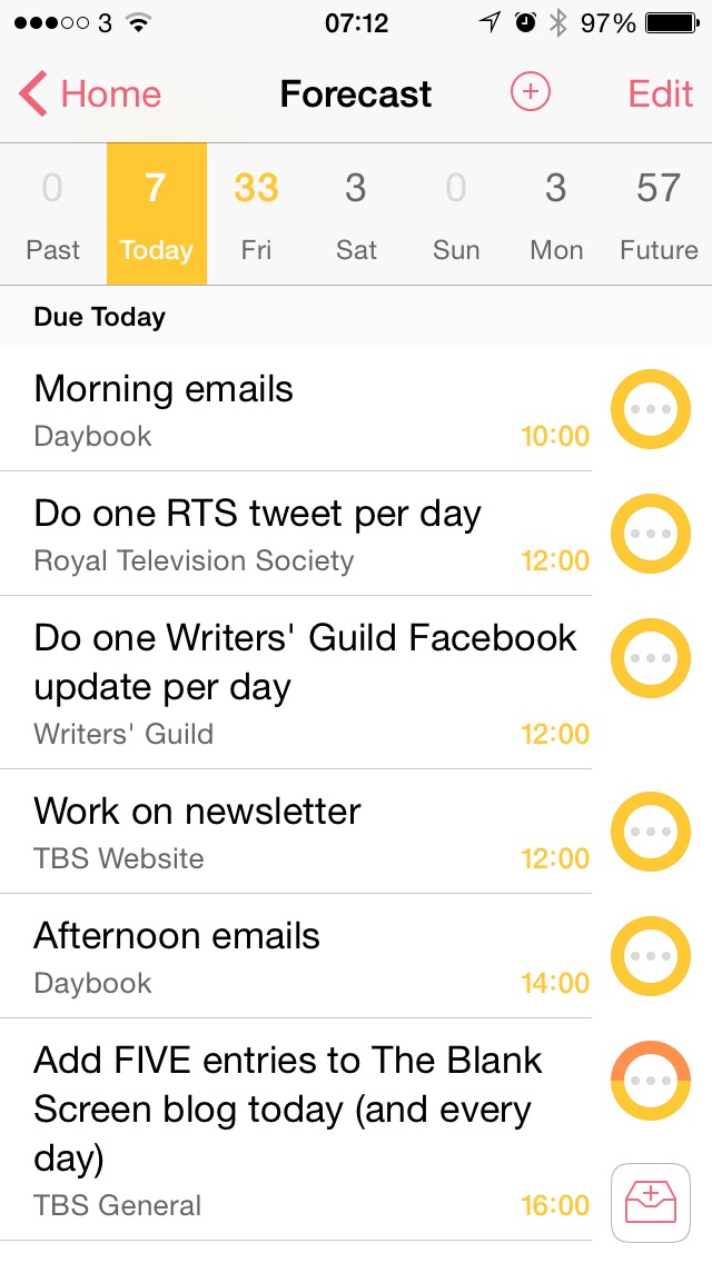
It’s just this. I spend a lot of time in the workshop talking about To Do lists and how to make them something you use and that you enjoy using rather than something dreaded that you avoid. And I feel obligated to include my real To Do list. So I do, I add in a slide that (today) has this:

What I like very much is the simple thing that is doubtlessly complex yet I don’t have to care, I can just relish it. This. I added that To Do list image and I made various twiddles to the presentation on the 27in iMac in my office. I present from a MacBook Pro. And as I turned from the iMac to set up that MacBook Pro, my new presentation was already there. It was already on the MacBook and I didn’t do anything. Didn’t AirDrop it across, didn’t use a USB thumb, didn’t email it.

I wrote it on the iMac and it is on my MacBook as if I wrote it there.

And here’s another thing. I’m writing to you in Drafts 4 on my iPad and that image above of my To Do list comes from my iPhone. I didn’t send it over to my iPad, didn’t copy it, didn’t do anything. It’s just there where I need to use it.

As I say, this is doubtlessly complex stuff behind the scenes but to me, it’s just that everything I need is where I need it, when I need it. I think that is heady and gorgeous stuff.

What I’ll be buying after yesterday’s Apple announcements

Nothing. That’s no reflection on the new hardware, it is a semantic reflection on how the three things I will take away are all free software. Apple announced OS X Yosemite and I know this is good because I’ve been using it for months.

It’s one of those that, like OS X Mavericks before it and iOS 8 now, you can’t necessarily point to a feature that is overwhelming and an absolute must-have, but you try going back to the iOS 7 or the previous OS X.

Tell a lie. Continuity. I’ve experienced this feature already and it’s going to become normal. Start a message on my iPhone and finish it on my Mac without doing anything in between. Just pop the iPhone down on the desk, if I like, and carry on typing mid-sentence, mid-word on my Mac. Answering calls on the iPad when my iPhone is in another room. Definitely a killer feature.

So much so that if you have a Mac that will run OS X Yosemite, go get it. Available now and free on the Mac App Store.

An update to iOS 8 is also free but coming on Monday. The biggest new feature is Apple Pay and I don’t yet know how that will work here in the UK but for the States, it’s great.

Just to wrap up the three, there are actually two more three free things and Apple calls them all iWork. I honestly don’t know whether anyone else ever uses or remembers that term now as I think of the three parts of iWork as separate things. They’re Pages, the word processor, Numbers, the spreadsheet and Keynote, the presentation software. All very good, now all updated – twice. Once for OS X Yosemite, once for iOS 8.

In late 2012, I think it was the possibility of a Retina-screen iMac that made me look at replacing my ancient Mac Pro. They didn’t bring out a Retina one, not until yesterday, but I am so very happy with the 27in iMac I did buy that I’m not fussed. And I will remain unfussed until I see one in the flesh and covet its screen.

Down at the cheaper end of the Mac line, there is the newly revamped Mac mini. If I were in the market, I’d be looking seriously at that.

Still, who knew that Apple’s advertising line for yesterday’s event would be a gag? “It’s been way too long,” it said, and I don’t know what people expected but not that it was a reference to the iPhone 6 launch a few weeks ago.