If there is anything greater than the number of To Do apps on the App Store, it is the number of productivity gurus who say you should use them. They are right. But unhelpful. If you loathe To Do lists, it may be that you abhor lists of any kind. So telling you to buckle down to it, telling you how great To Do lists can be, it’s never going to work for you. You’re too busy to write out silly shopping lists of tasks, you need to be doing this urgent work. Also, when you’ve got a list, it’s far too much tedium checking it and maintaining it. Nonetheless, if you are a visual thinker, you were out of luck. Until DropTask.
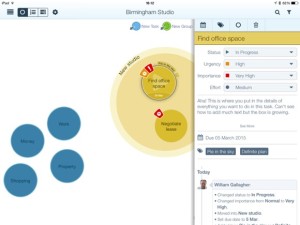
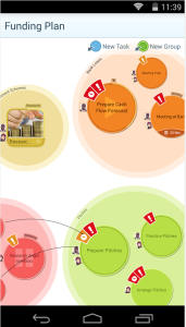
DropTask aims to do two key things. The first and in every possible way the most apparent is that it is a visual To Do list. No rows and columns, no indents and tabs, just circles that you drag around. That dragging is part of the second purpose of DropTask: it wants to be very, very fast to use. You don’t have to fiddle with the onscreen keyboard to do everything, just for adding detail. Drag a blue dot onto the centre of your iPad screen and that’s a task. Drag a green dot the same way and that’s a group: it’s a large circle into which you can then drag tasks.
Picture Venn diagrams but without any overlapping circles.
Set yourself circles for Office, Home and any other main area of your life, then start filling each with tasks. The group circles grow as you add or drag tasks into them. Circles are always the same, big and clear size: they don’t get smaller when you add more, DropTask just widens your canvas. You can tap on a task to set due dates and add details of what exactly it is you need to do to complete the task. Nicely, you can separately set urgency and importance so later you can filter to see just, say, the urgent and important tasks. It’s akin to the Dwight Eisenhower grid method and is very much better than assigning random priority levels.
That’s a nice touch and the visual nature is DropTask’s killer feature. It isn’t going to cut it for you if you have a massive number of To Do tasks and entering details of the task take more taps than we’d like given the speed of everything else in the app.
There’s no OS X version but there is an online one at droptask.com and that is very quick at smoothly keeping in sync with the iPad edition. That’s particularly useful for Droptask Pro which is built to work with groups so that you can assign tasks to colleagues via the app and they can work through them anywhere.
Droptask comes as two separate iPhone and iPad editions, both of which require iOS 5.1.1 or later and both of which are free. For $65/year you get the Pro group features and subtasks. There’s also an Android version, which is free as well.
It’s definitely not for you if you’re currently looking at OmniFocus or Things. But then it’s also not for you if you’re on Wunderlist or Reminders. This is a mid-range powerful To Do manager which is good but has this visual system, which you may find unbeatable.

