Oh, the pleasure I get from great software: it’s immeasurable and terribly surprising. Today the Omni Group released a new beta of OmniFocus and I shouldn’t talk about it. Not because I’ve signed anything, not because of spoilers, but because it is a bit mean of me when you can’t get the new version yet.
You will soon. You will.
But I’ve been waiting for one feature in this beta and was taken by surprise by another one.
The one I was expecting was that when this comes out in the next few days or weeks, we will finally be able to do a Review on the iPhone. Previously, Review was a feature of the Mac and iPad versions of OmniFocus but not the iPhone one. I’ve said this before and lamented it before and scratched my head before, but no longer.
It is weirdly freaky seeing such a familiar feature in an unfamiliar place. But then I’m also beta testing OmniOutliner which is coming to the iPhone for the first time ever. That is seriously odd, just seeing the icon my iPhone home screen. Mind you, it’s only odd in that one way. In every other way it is fantastic to have this app on my iPhone and it went straight onto my home screen.
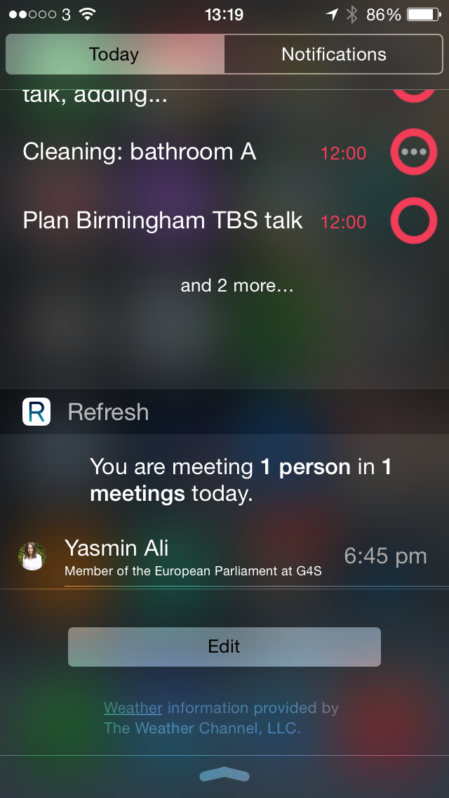
The unfamiliar feature, the one that took me by surprise, was that the Omni Group has revamped how the iPhone and iPad handle Notification Centre. Previously, even just a few days ago, I wrote a piece for MacNN about Notification Centre and how To Do apps were using this. At that time, OmniFocus was doing okay with this thing: whatever you’re doing on your iOS device, just swipe your finger down from the top and you get Notification Centre. Within that, OmniFocus showed you the most urgent To Dos on your list.
Or it did. Now it can show you that or it can show you other things that you decide within the main app. I expect to be fiddling for days and I expect to be using Notification Centre more.
And every time I do, I promise I’ll feel rotten for saying there’s this great OmniFocus update and you can’t have it. Not yet. Not quite yet. But soon. Honest.
