What was that about not being evil?

Google is not and never will be a super villain. But it will shortly have its own space fleet.

It’s bought a firm called Skybox Imaging which is launching satellites in order to step up just how finely detailed a company can map the world or even see preposterous details. Skip straight to the excuse-me-what part of this news, as reported by Macrumours:

Skybox says they are already looking at Foxconn every week and are able to pinpoint the next iPhone release based on the density of trucks outside their manufacturing facilities.

So, seriously, Google will be able to see when trucks leave the iPhone factory. It takes quite a long time for Apple to get as many iPhones out as it needs for a launch, so the shipping must start – what, days? weeks? before the announcement. That means Samsung will have time to make and release another dozen phones while the trucks are en route.

The rest of the news is more straightforward, this time from Wall Street Journal:

By the time its entire fleet of 24 satellites has launched in 2018, Skybox will be imaging the entire Earth at a resolution sufficient to capture, for example, real-time video of cars driving down the highway. And it will be doing it three times a day.

Inside Amazon – no exposé, just riveting detail

There is an element of this article that is for the productivity heart in you that wonders how true all these stories of absurdly pressured working conditions are.

But mostly it’s for the tinkerer in you who wonders how Amazon works. Wired Magazine goes inside:

The first thing I saw when I walked into Amazon’s Phoenix warehouse was a man riding on a giant tricycle. Behind him, yellow plastic tubs the size of office recycling bins whizzed by on a conveyor belt. On the wall above, six massive words called out to the 1,500 workers who pass through metal detectors each day as they enter this million-square-foot cavern of consumerism: “work hard. have fun. make history.”

Tricycle aside, the “fun” quotient was hard to spot. But I couldn’t help but register a certain historical significance to the operation humming inside this enormous building erected in the industrial flats of Phoenix. The Amazon warehouse–known in company jargon as a “fulfillment center,” or FC–is a uniquely 21st-century creation, a vast, networked, intelligent engine for sating consumer desire. The FC is the anchor of Amazon’s physical operations, the brick and mortar behind the virtual button you tap on your phone to summon a watch or a shirt or a garden hose or Cards Against Humanity or just about anything else to your doorstep.

A Rare Peek Inside Amazon’s Massive Wish-Fulfilling Machine – Marcus Wohlsen, Wired (16 June 2014)

Via The Loop

Cameras started lying in 1987

You know that Photoshop is used to manipulate images of women but I didn’t know that was what was going on with the very first photo it edited. Why are we not surprised?

There is more to it than you think, if less than you’d hope, but first, here’s the image:
20140616-135817-50297614.jpg

It’s called Jennifer in Paradise and was taken on film by John Knoll, one of the people behind Photoshop. I can’t find out what this Jennifer’s surname was at the time of the shot but she married the photoshop guy and is now reportedly Jennifer Knoll.

So they married, that happened, and somehow this one shot has become known as the first-ever Photoshopped image. No more than I can find her maiden name, I can’t prove what exactly was Photoshopped here. But I think the answer is nothing. This is, I believe, the original film shot and what has happened is that myriad people have subsequently edited it to produce whatever it is their heart desired.

Only, one fella has got seriously into this shot:

[Dutch artist Constant] Dullaart’s reverence for the picture may be extreme, but it is hard to overstate Photoshop’s importance. David Hockney, who was invited to test the program soon after its release, predicted that it would spell the end of film photography. And although, as Knoll is quick to point out, photos were being altered long ago in Soviet Russia, it was only Photoshop that democratised that ability. In a way Jennifer was the last person to sit on solid ground, gazing out into an infinitely fluid sea of zeros and ones, the last woman to inhabit a world where the camera never lied.

Jennifer in paradise: the story of the first Photoshopped image -Gordon Comstock, The Guardian (13 June 2014)

There’s a lot more detail of Dullaart’s campaign to celebrate the shot in The Guardian’s whole story..

About that flirt-fave thing

I’ve been utterly unaware of such a thing until just now when I learnt of why people favourite tweets but the flirt-fave is sticking with me.

It’s worrying me, to be frank. I’m trying to remember every tweet I’ve favourited. Only Suzanne Vega has ever favourited me so that’s something for me to glow about later.

That previous story about reasons for favouriting linked out to many resources including this definition of my flirting:

Flirt Fav

Deployed almost exclusively on personal tweets about your undateability or selfies where your hair looks good. Also applies to people who fav any and all things you tweet, even if they are banal/stupid/something you’re going to delete in the next five minutes.

A Simple Guide to Twitter Favs – Jessica Roy, Time (4 February 2014)

I’m not liking the word ‘favs’. But I would more dislike the next entry, the Hate Fav, if I weren’t ignoring it and going la la la.

Read Roy’s full feature.

What does it mean when someone favourites your tweet?

Bugger-all.

Now, I’m telling you this despite the fact that I got very excited one day as I reached for my iPhone exactly as a notification popped up that Suzanne Vega had favourited a tweet of mine. That’s different. That doesn’t factor into any of the following whatsoever.

What’s in a Twitter fave? It’s a gesture – just the click of a button – that can mean any number of things given the context. We’ve developed an entire ecosystem of Twitter faves over the past few years. There’s the hate-fave. The flirt-fave. The fist-bump fave.

Now, researchers have gone one step further and developed what purports to be a scientific taxonomy of favoriting behavior, based on survey responses from 606 active Twitter users. The biggest surprise? Over a third of Twitter users said they weren’t even aware the favoriting function existed. Among the rest, only 3/4ths of users had ever favorited a tweet.
The researchers asked the remaining 290 users open-ended questions about why they favorited things. They coded the responses into a number of categories, and the taxonomy above was born.

The most popular reason for faving something? People simply liked the tweet. For many people it’s analogous to Facebook’s “like” button. Not surprisingly, bookmarking things for later reading or recall was the second most popular reason.
Others used it as a conversational feature, to let someone else know they had seen their tweet, or to signal agreement. 25 people favorited tweets that made them feel special. Six people favorited tweets but had literally no idea why they did so.

What Does it Mean When Someone Favourites Your Tweet? Here are 25 possible answers – The Washington Post (4 June 2014)

Actually… I like the sound of that ‘flirt-fave’.

Via Katharine D’Souza

The Complete History of Android

Or near enough. There are reasons why the earliest days of the phone software will never been told and – this is the bit that interested me – there are reasons why the history has to be written now because soon so much of it will be lost.

Nonetheless, you do have to like Android. I managed about 10,000 words of this 40,000 and it is interesting, I just had little reference: I can’t remember which Android versions I’ve tried, I just have this vague memory of surprised how slow and unfinished they all seemed. Plus the article is very in favour of Google’s apparently very fast development cycles where it sounds to me like a cacophony of trying everything, then trying to fix everything, and just possibly noticing something that happened in 2007.

But the site Ars Technica has been promming ahead about this article and it is the big deal they say: they’ve done a good job and I’m fascinated by the top where they explain why it had to be done right now. Have a read, would you?

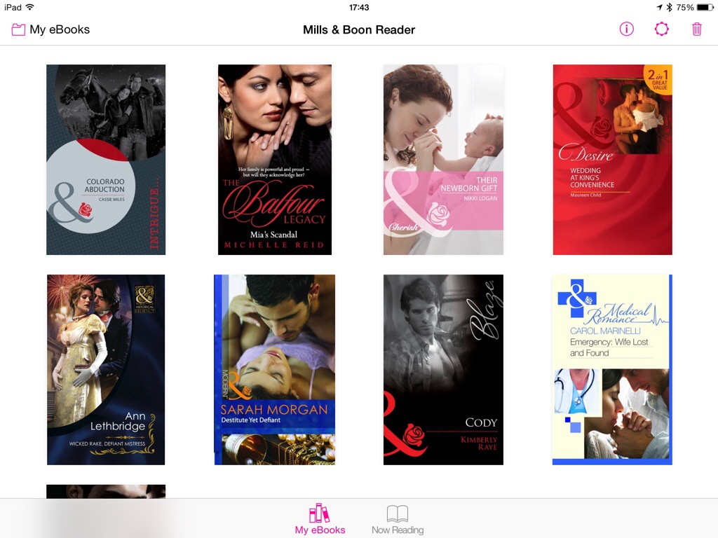
Mills & Boon ereader

20140615-180935-65375074.jpgDon’t we have enough ereaders? Alongside the hardware ones like Kindle, Nook and Kobo, we have the software ones: you can read Kindle books on iPads. And iPads have iBooks.

That’s my personal favourite: iBooks. The range of titles available is clearly much smaller than on Kindle but wherever a book is on both, I’ll buy the iBooks version. Even if it costs a little more. It’s only ever a little bit more and the reading experience is worth it. Kindle feels very clunky-ugly to me, like you’re accepting a substandard product in order to get the convenience of an ebook. Whereas iBooks just feel like books.

So I think we’re well served by iBooks and it’s pretty clear that we are very well served in volume by Kindle. What we aren’t doing is making enough money for publishers. Amazon takes money from the publishers for Kindle, Apple does the same for iBooks. Mills & Boon has decided to circumvent that by selling its own books in its own reader.

I’d be surprised if they also took the titles off iBooks and Kindle but you would certainly make the publisher happiest if you bought from them and you then read their books in their reader.

It’s not a bad ereader, either. It’s basic and it feels like you’re reading a PDF chopped up into pages but maybe you are.

What’s less clear is how much the books cost compared to other services. It’s a clunky process to sign up: you need both a Mills & Book account and an Adobe ID; I have an Adobe ID but it wasn’t recognised and I got a bit bored schlepping through setting all this up again so I admit I stopped.

I’m reminded of UltraViolet: a bunch of companies decide they don’t like paying Apple a cut so they go their own way but can’t quite pull it off. It’s as if the companies can’t agree with each other so users end up having to log in here and there and elsewhere. The need for both a Mills & Boon ID and an Adobe ID is that kind of thing.

If you’re a fan and you already have a Mills & Boon account, I’d have a go at signing up but then compare prices across all the services. I’m seeing prices vary from free to £3.49 and can’t fathom a pattern to it.

But the Mills & Boon ereader is free: you can get there here now and it comes with a few books.

Here’s how well I know the story of the ⌘ symbol that has come to mean so much to Apple users – because we use it so very much – and to mean absolutely nothing to us – because we barely think about it. I used to have a white sweatshirt that had a ⌘ icon on it. Loved that.

Loved it so much I wonder where in the world it has gone. I do know where in the world I got it but unfortunately you can’t still get them. (But keep an eye on the website of Susan Kare, famous icon designer who didn’t design this one. She did pick it, though, and that’s the story of the ⌘:

Known sometimes as the St John’s Arms, it’s a knot-like heraldic symbol dating back in Scandinavia at least 1,500 years, where it was used to ward off evil spirits and bad luck. A picture stone discovered in a burial site in Havor, Gotland, prominently features the emblem and dates from 400-600 AD. It has also been found carved on everything from houses and cutlery to a pair of 1,000-year-old Finnish skis, promising protection and safe travel.

It’s still found today on maps and signs in northern and eastern Europe, representing places of historical interest. More famously, though, it lurks on the keyboard of almost every Apple computer ever made—and in Unicode slot 2318 for everyone else, under the designation “place of interest sign.”

What is Apple’s command key all about? – Tom Chatfield, Medium.com (13 April, year uncertain)

Read on at the full article – and if you find my sweatshirt, please let me know. Last seen in Paris, if that helps.

Share and share sort of, a bit, kinda alike

20140615-121520-44120762.jpg

If there’s one question I get asked about how to do things online, well, actually, I don’t know what it is, I haven’t been keeping track. But I do very often get asked how to send somebody something. It’ll be how to send a photo, how to forward a webpage, all sorts of things and the answer always begins “You see that ‘Share’ icon?”

Unfortunately their response nearly always begins with “What ‘Share’ icon?” because there are so many and, arguably, none of them really sing out to you as meaning the thing by which you show somebody something. I think the Apple one up there, the square with an arrow bursting out, is the clearest but I am also certain that I think this only because it’s the one I see most often.

Min Ming Lo sees more of them: that image above is from his blog where he says:

What do each of these symbols have in common? They are all trying to convey the exact same action – share! Sharing to a social network or via email is a ubiquitous action nowadays but designers have still not been able to reach a consensus on what symbol to use to represent it. Not only does each major platform use a different icon, but they’ve each witnessed changes over the years.

I have spent sometime thinking about this, trying to figure out which symbol best conveys sharing to the user.

Share: the Icon Nobody Agrees On – Min Ming Lo

He does come to a kind of conclusion. But it’s the journey that’s worth the read, especially when you see the strange ideas different companies have for what icon to use.